In this two-part series, you will learn about the ins and outs of working with tabular data in React using the React Bootstrap Table2 component. You’ll be able to create sophisticated and professional-looking tables with little effort and yet be able to customize every aspect. In this part, we’ll continue the journey by expanding rows, pagination, cell editing, and advanced customization.
Overview
This is part two of a two-part series about React Bootstrap Table2. In part one, we created a simple React application using react-create-app and created the table shown below.
.png)
We also populated a table with data, worked with columns, styled the table, and selected rows.
In this part, we’ll continue the journey by creating expanding rows, allowing cell editing, and doing some advanced customization.
Expanding Rows
Expanding rows is one of the coolest features of React Bootstrap Table2. When displaying tabular data, you may want to see additional data on one or two rows, but you might clutter the display if you show all the data for all the rows.
One option is to show tooltips, but tooltips require that you hover with the mouse over the target area, and you can only see one tooltip at a time. Expanding the rows lets you display additional data for each row in a kind of drawer that stays expanded as long as you want, and you can collapse it back when you’re done. You can expand as many rows as you want at the same time. Here is how it’s done with React Bootstrap Table2.
Let’s take a look at our data.
const product = [
  {id: 1, name: 'Headphone  Fusion', value: '100'},
  {id: 2, name: 'Headphone Beats', value: '80'},
  {id: 3, name: 'Headphone Modus', value: '70'},
  {id: 4, name: 'Headphone Jam', value: '100'}

];
We’ll use the prop expandRow to specify how rows will expand on click.
const expandRow = {
  renderer: (row, rowIndex) => (
    <div>
      <p>{ `This Expand row is belong to rowKey ${row.id}` }</p>
      <p>You can render anything here, also you can add additional data on every row object</p>
      <p>expandRow.renderer callback will pass the origin row object to you</p>
    </div>
  )
};
We then add the expandRow property to our table.
 <BootstrapTable
        // striped
        hover
        keyField='id'
         keyField='id'
          data={ product }
           columns={ columns }
           // apply the expandRow property here
          expandRow={ expandRow }
/>
This is how the table will look when you click on a row.

Pagination
So far, we’ve displayed just four rows of data. Tables are designed to display a lot of data that doesn’t necessarily all fit on the screen simultaneously. That’s where pagination comes in. React Bootstrap Table2 supports many pagination options.
Let’s populate our table with additional data by adding a few entries, as shown below.
const product = [
  {id: 1, name: 'Headphone  Fusion', value: '100'},
  {id: 2, name: 'Headphone Beats', value: '80'},
  {id: 3, name: 'Headphone Modus', value: '70'},
  {id: 4, name: 'Headphone Jam', value: '100'},
  {id: 5, name: 'Headphone Auto', value: '50'},
  {id: 6, name: 'Headphone Byte', value: '70'},
  {id: 7, name: 'Headphone Duo', value: '150'},
  {id: 8, name: 'Headphone Modular', value: '80'},
  {id: 9, name: 'Headphone Pivot', value: '150'},
  {id: 10, name: 'Headphone Optimizer', value: '70'},
  {id: 11, name: 'Headphone Rave', value: '50'},
  {id: 12, name: 'Headphone Mach', value: '40'}
];
Let’s now implement pagination on our table. First, use NPM to install the react-bootstrap-table2-paginator package.
npm install react-bootstrap-table2-paginator --save
Next, open App.js and import the paginationFactory function.
import paginationFactory from 'react-bootstrap-table2-paginator';
Customize the pagination by declaring the following configurations.
const options = {
    page: 1,
    sizePerPage: 5,
    nextPageText: '>',
    prePageText: '<',
    showTotal: true
  };
We then apply the property to the table, as shown below.
<BootstrapTable
        // striped
        hover
        keyField='id'
         keyField='id'
          data={ person }
           columns={ columns }
          expandRow={ expandRow }
          //apply the pagination function here
          pagination={ paginationFactory(options) }


            />
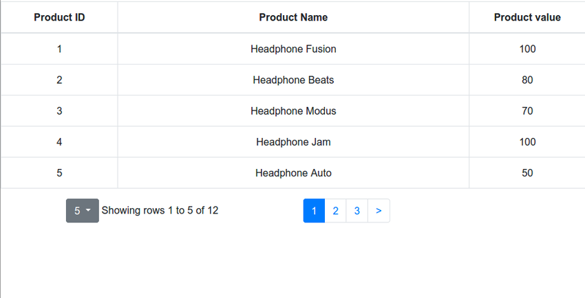
The table will be displayed starting from the first page and will show five entries per page.

Cell Editing
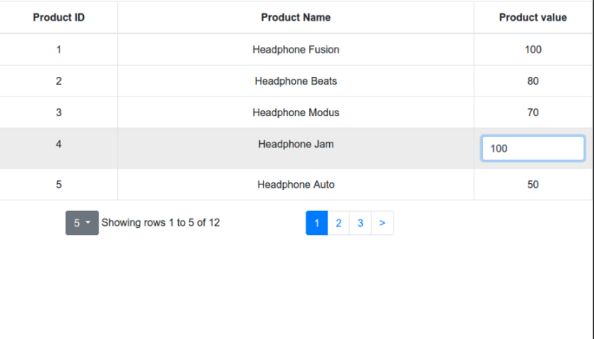
Another form of data manipulation is in-place editing (a.k.a. cell editing). Cell editing can be triggered by a click or double-click. To enable this property, first install the react-bootstrap-table2-editor.
npm install react-bootstrap-table2-editor --save
Then import it at the top of App.js.
//App.js
import cellEditFactory from 'react-bootstrap-table2-editor';
This is how you enable cell editing on a table.
<BootstrapTable
 hover
 keyField='id'
 data={ product }
 columns={ columns }
 expandRow={ expandRow }
 pagination={ paginationFactory(options) }
 cellEdit={ cellEditFactory({ mode: 'click' }) }

    />
You can also specify non-editable rows and hook functions. For example, the code below restricts cell editing on row 3.
<BootstrapTable
 hover
 keyField='id'
 data={ product }
 columns={ columns }
 expandRow={ expandRow }
 pagination={ paginationFactory(options) }
 cellEdit={ cellEditFactory({
                     mode: 'click',
                     blurToSave: true,
                     nonEditableRows: () => [0, 3] }) }


 }) }

    />

Exporting Your Data
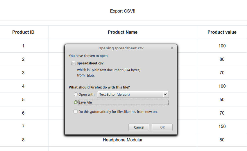
Sometimes, viewing your data in a web UI is not enough, and you need to take your data and feed it to other tools. Import the exportCSV attribute (and optionally a filename), and an export button is added to the table. When you click the button, it allows you to save your data to a CSV file.
Install react-bootstrap-table2-toolkit.
npm install react-bootstrap-table2-toolkit --save
The export feature is available via the exportCSV prop in the ToolkitProvider wrapper. To display and enable CSV export, wrap the BootstrapTable in a ToolkitProvider.
import ToolkitProvider, { CSVExport } from 'react-bootstrap-table2-toolkit';

const { ExportCSVButton } = CSVExport;

//  the rest of the code here

<ToolkitProvider
  keyField="id"
  data={ product }
  columns={ columns }
  exportCSV
>
  {
    props => (
      <div>
        <ExportCSVButton { ...props.csvProps }>Export CSV!!</ExportCSVButton>
        <hr />
        <BootstrapTable { ...props.baseProps } />
      </div>
    )
  }
</ToolkitProvider

|
Table Search
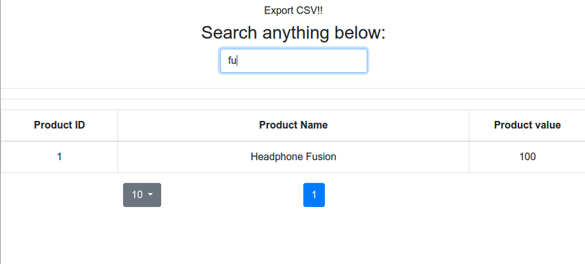
This property works the same way as the Export feature. First, import the Search property, enable it on ToolKitProvider, and wrap the SearchBar as a child of ToolkitProvider.
import ToolkitProvider, { CSVExport} from 'react-bootstrap-table2-toolkit';
import { Search } from 'react-bootstrap-table2-toolkit';

const { ExportCSVButton } = CSVExport;
const { SearchBar } = Search;

class App extends Component {
  render() {
    return (
      <div className="App">
        <p className="Table-header">REXO</p>
       <ToolkitProvider
        keyField="id"
        data={ product }
        columns={ columns }
        exportCSV
        search
 >
     {
    props => (
      <div>
        <ExportCSVButton  { ...props.csvProps }>Export CSV!!</ExportCSVButton>
        <h3>Search anything below:</h3>
        <SearchBar { ...props.searchProps } />
        <hr />

        <hr />
        <BootstrapTable

                pagination={paginationFactory()}
                {...props.baseProps}
              />
      </div>
    )
     }
</ToolkitProvider>

Summary
We covered a lot of material in this tutorial, but React Bootstrap Table2 has a lot more in store. Practically every aspect of the table can be customized. Read the full documentation on how to customize a table.
Here are all the features offered by React Bootstrap Table2:
- row customization
- column customization
- table sort
- table search
- row selection
- column filter
- cell edit
- pagination
- expandable row
- overlay
- remote tables
Conclusion
React Bootstrap Table2 packs a powerful punch. It provides a pleasant user interface for displaying, searching, and manipulating tabular data out of the box. The API is very consistent—major features can be enabled by specifying a simple attribute and optionally customized with additional attributes that often can be dynamic functions. While the default behavior and the basic configuration should satisfy most users, if you need more advanced features and customization, the official documentation has lots of examples of how to go about it.

