This tutorial will show you how to organize a style guide using Sketch. Additionally it will teach you some core skills for using Sketch in other situations. We will go over everything from setting up typography, using assorted grid types, to best practices for using “symbols” and “shared styles”.
Typography
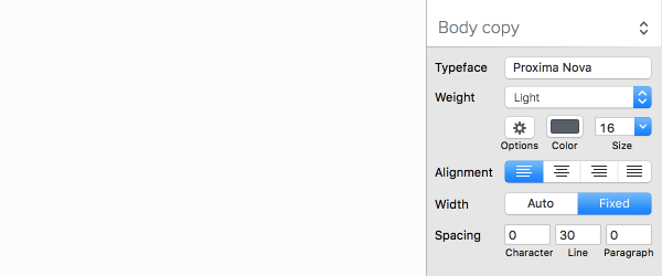
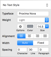
Setting reusable type styles in Sketch will save you loads of time. With the text tool selected you’ll see a small box to the right hand side of the app which lets you set all sort of type styles like font family, font weight and even character spacing.
Let’s see how we can use it in our own style guide document.
Creating Your Styles
Every time I work with typography I like to use real copy (as opposed to generic filler copy). I think it makes the design experience easier, and it gives the end result more context and genuine voice.
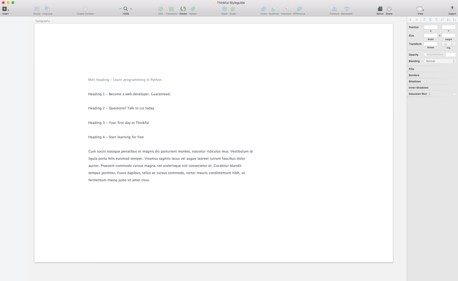
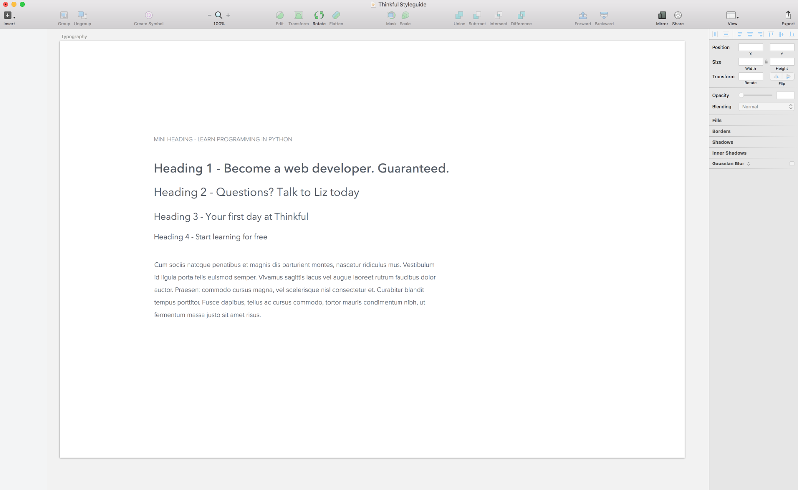
Begin with the different text types your design will have. In this file we have four headings, not six, as we don’t need that many.
Note: Each of these is a separate text object.
The first item to be designed is the sub heading, which goes along with the H1, but more on that later. Sketch doesn’t have a setting to dictate the character “case”, so in order to get the sub heading to be uppercase I have to enter it as such manually.
Do this where relevant for every text element you have. Don’t worry about spacing on the artboard yet, we will go over that later.
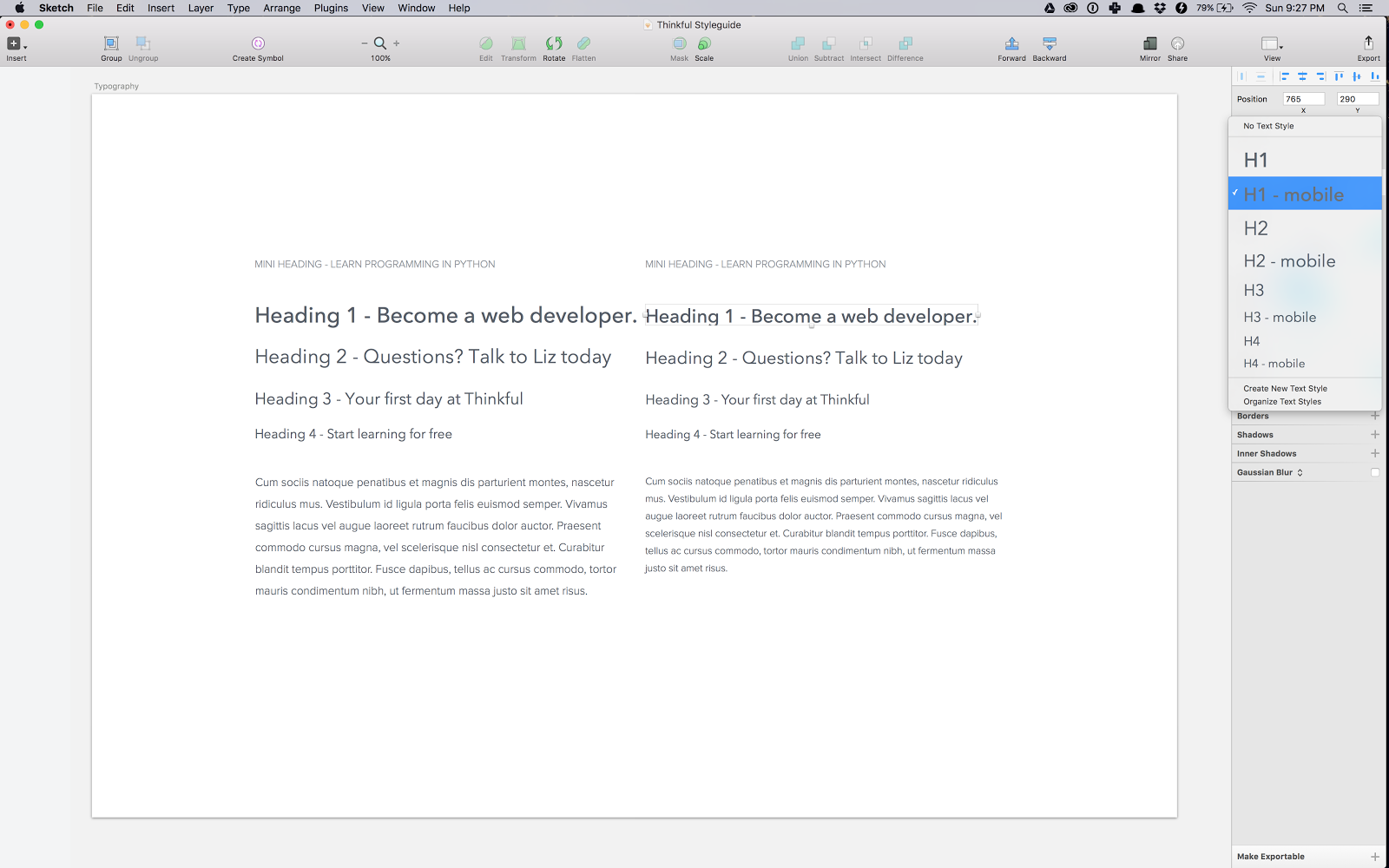
Creating a Reusable Text Style
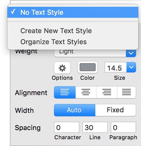
You can create reusable text styles in two ways. First, select a text with the style you like then click No Text Style from above the type settings on the right. Then, select Create New Text Style from the stop down.
Note: To transfer these styles into other files copy and paste the desired text objects and the styles will be transferred automatically.
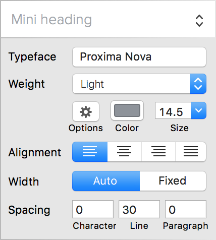
The second way to create a text style in Sketch is to create the new text style in the drop down, like you saw above, and then add the styling for that style. It doesn’t matter which one comes first. What does matter is that you understand that any change to the styling of a text style will affect all the other text elements that use that style. Therefore, if I changed the colour of Mini heading, it would reflect this change on every single item.
Mobile Typography
There is no easy way to adjust styling for different screen sizes. My current work around is to create separate text styles for mobile screens in addition to my desktop styles.
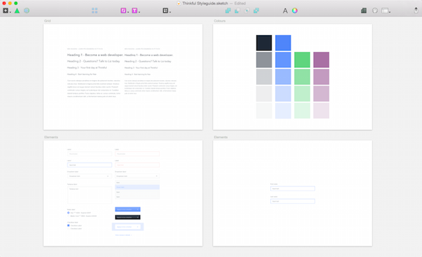
Grid
There are three references for measurements in Sketch: grid, layout and ruler. Let’s go over all three of them really quickly and see how they should be used. With that done, we’ll talk about using them for setting up your page’s layout.
Ruler
To toggle the ruler view press ctrl + R (easy to remember). Rulers should not be used as the main form of grid in Sketch, the other two options are much better suited for that. Use the ruler to align things or to double-check alignment like in the screenshot below.
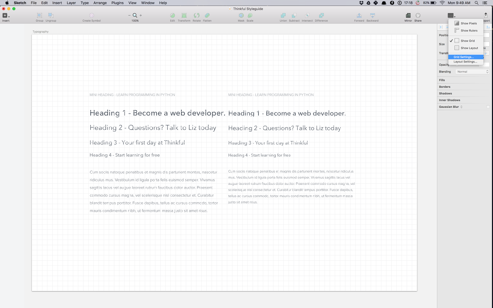
Grid
Similarly to the ruler, to toggle the grid view press ctrl + G. The grid is a system of squares which you can adjust the side of. I use them for layouts that don’t necessarily stick to a typical centered web page style. The great thing about the grid in Sketch is that it covers the whole artboard (if you increase the size of the artboard, the grid will grow).
You can set the size of the Grid units to be anything. You can also highlight a set of rows, the default being every 10.
Layout
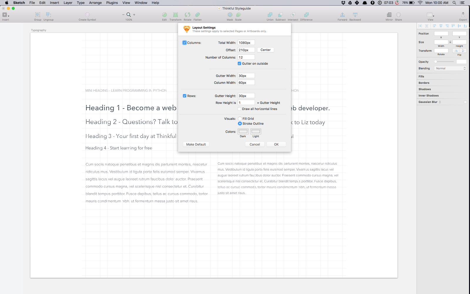
To toggle the Layout you press (guess) ctrl + L. This a touch more complicated in terms of all the different data points you need to provide, but it does get you a perfectly customized layout grid; perfect for designing websites!

Our grid is based on units of 30px, so all the numbers you see in the screenshot below reflect that. Once you know what your grid is, input it into the Layout Settings.
If you don’t know what your grid should be, use the Layout Settings to play around–it keeps the proportions and recalculates everything for you. Say, for example, I want my layout to use eleven columns instead of twelve, but still keep its total width. If I decrease the column count, Sketch will give me updated column and gutter widths. Play around see what happens.
Inflexibility of Sketch’s Grids and Pages
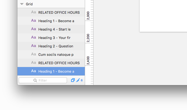
The down side with grids in Sketch is that you can’t have a new grid for new artboards. Maybe that’s a good thing, but it’s not how I tend to work. If I have two art boards side by side, one of which is for desktop and the other for mobile, it’s impossible to work on them at the same time. This is where Pages come in handy. If you have Layer List view open, you can see up at the top something called Pages.
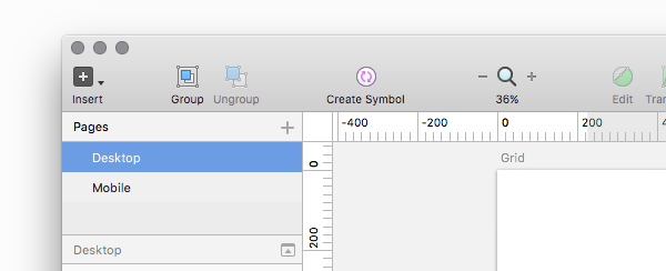
Pages are very useful, because they allow an additional layer of designing within a single document. You can change Grid and Layout within pages and they will stay the same within that page only.
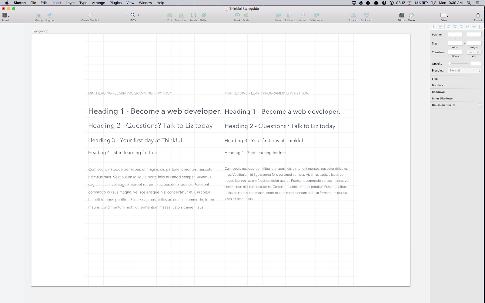
Aligning Your Typography
You may have noticed in my screenshots that my typography is not aligned to the grid lines. Having grid lines doesn’t mean things that were previously there will align magically. Whenever you change the placement of your grids you’re going to have to align your items back to it. Typography is different because it doesn’t start or end where the whole element’s area is. You can place the baseline of typography however you want in relation to the grid. It’s up to you. I put it on top of the lines. So let me realign it for you.
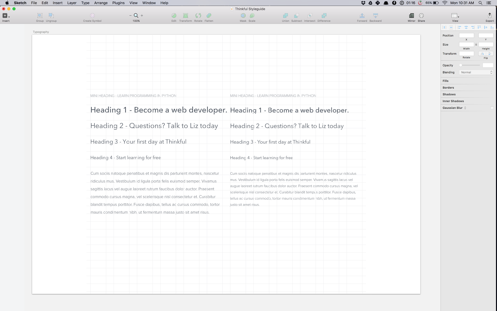
As you can see, the mobile paragraph doesn’t align; its line height is 24px. It therefore needs its own page and grid layout. But for the purpose of this walkthrough it can stay misaligned.
Learn More
Colors
Let’s take a look at how to save colors within Sketch so you can reuse them.
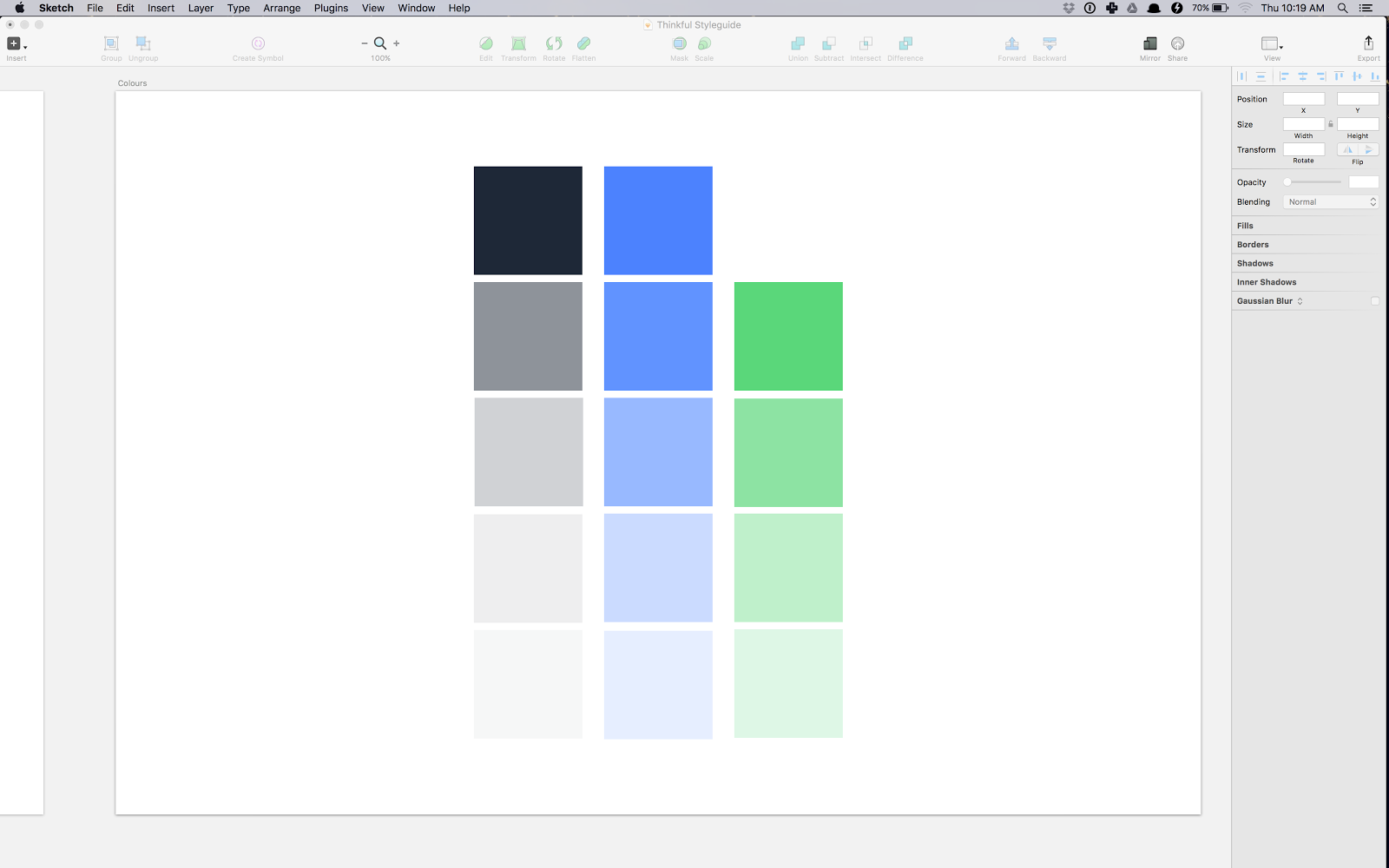
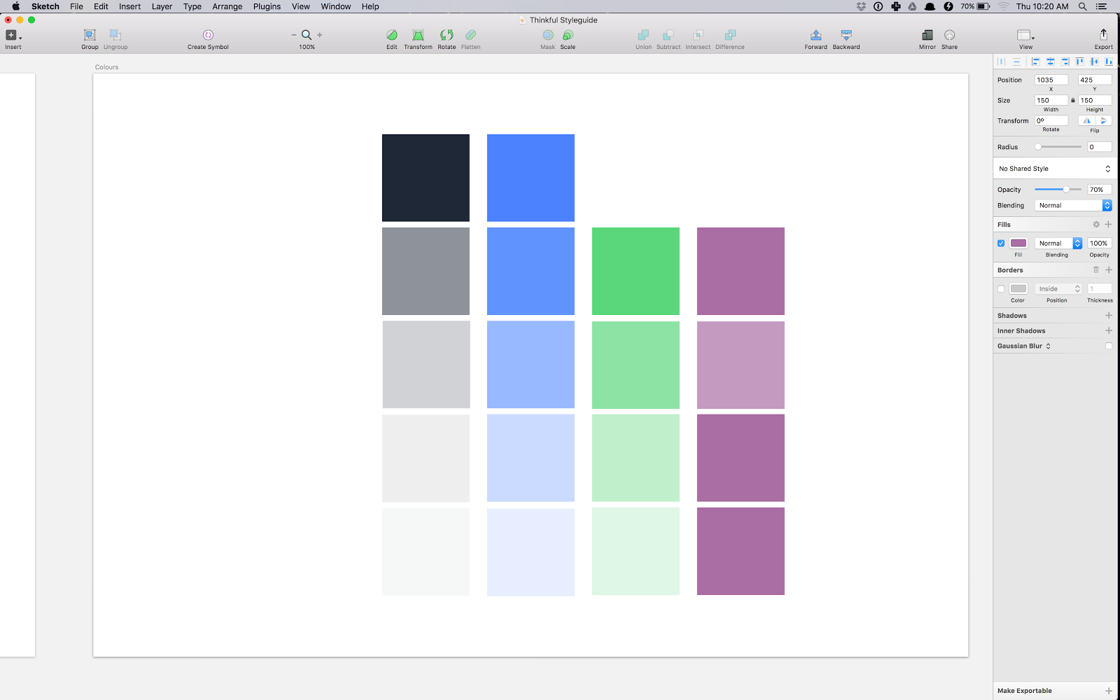
Let’s say I’d like to add a row of purple to use as accents in this design. I’ll copy and paste the green row and pick a purple. To make things much quicker, I decided on the lighter shades of purple by changing the opacity of the original colors to 70%, 50% and 20% respectively.
What you do next in order to get the color is use the Colour Eyedrop Tool and select the new hue. Don’t forget to change the opacity back to 100%.
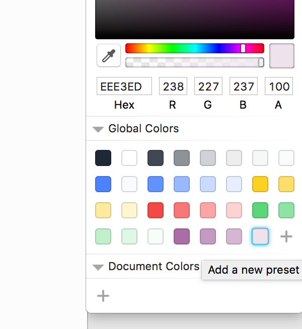
Next, use the little + at the bottom of the color swatches to save the color to Sketch’s palette. The difference between Global Colors and Document Colors is as their names suggest, Global Colors will be saved in Sketch to reuse in all other Sketch files you open whereas Document Colors only stay within that specific document.
UI Elements
I have a bunch of simple UI elements in my Sketch file.
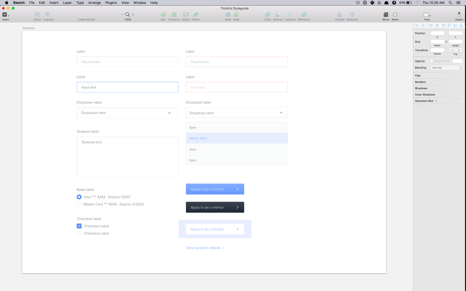
I keep them here so that I can quickly copy the ones I need into the new designs I’m working on. I’m going to show you how to create Shared Styles and Symbols for reuse.
Shared Styles
Shared Styles are the stylings you can reuse over again. Take a look at the active/focused input below. It’s made up of three components, the label text, the input text and the input box.
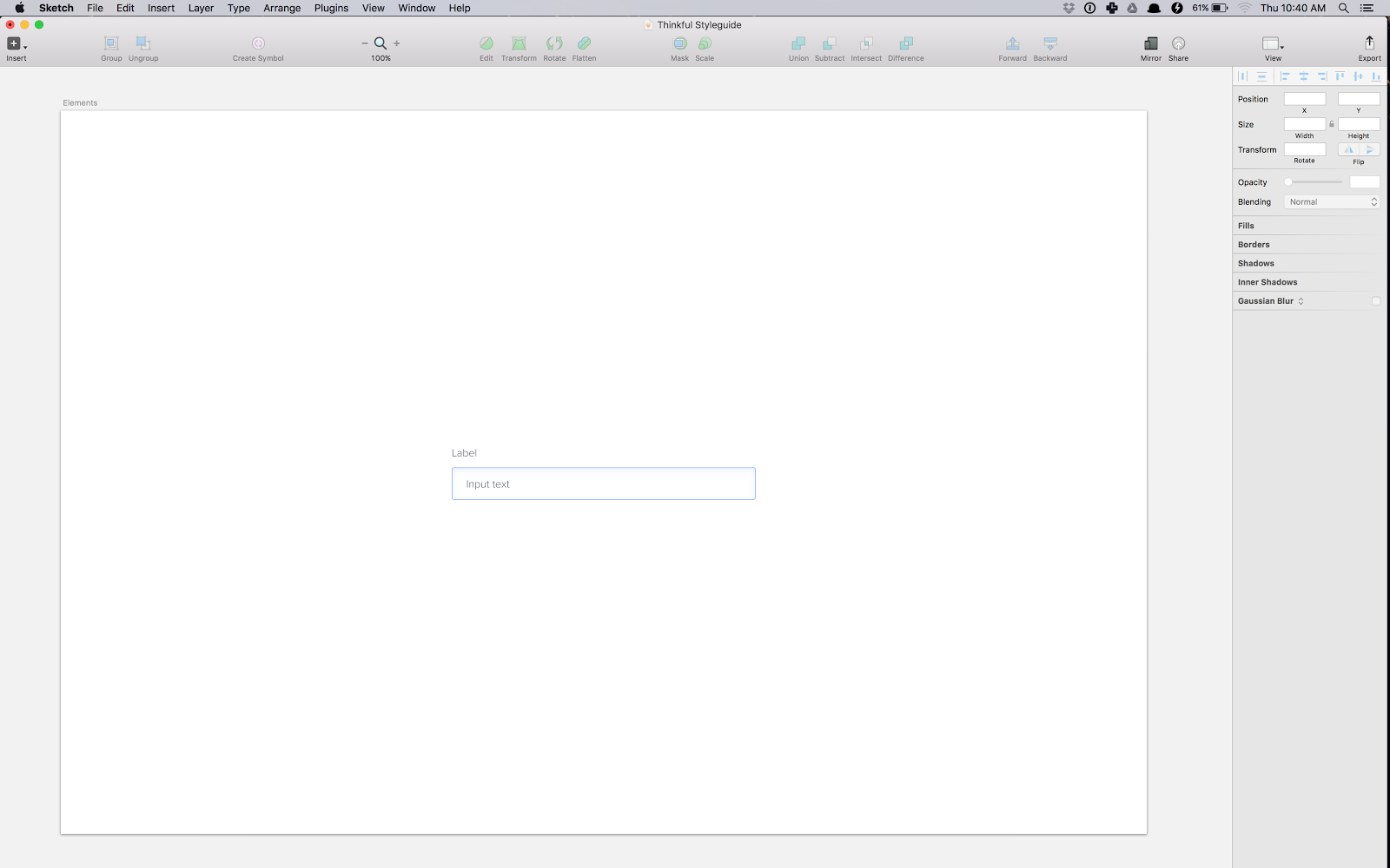
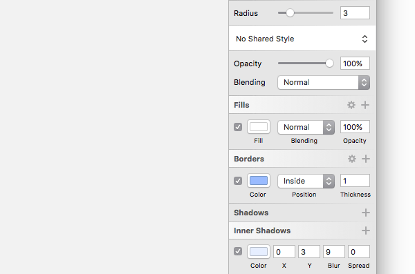
The rectangle has a specific style, it has a white background, a single pixel blue border and light blue inner shadow. That’s something that is reusable if you are working on multiple inputs.
On the right hand side above all the styling I just described you can see text that says No Shared Style. You can save these style characteristics the same way we saved the text styling for our headings. Save it and reuse it as much as you’d like. But please remember that if you change some aspect of the saved style in the future, it will impact every element sharing that style.
I use this feature for a lot of different styles, like error input state and even my three buttons (the blue, the black and the white one).
Symbols
Symbols is a great feature of Sketch that I use a lot. Symbols are recognizable by their purple folder in the Layer List which I don’t have open in my screenshots. To toggle its view go to View > Show Layer List or press Command + Option + 1.
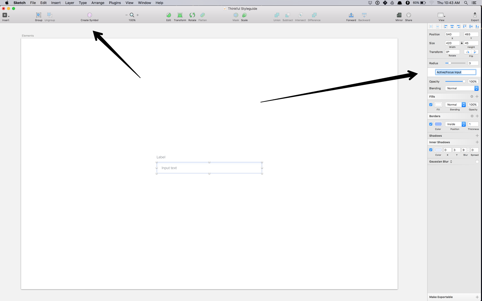
Let’s make the input I used in Shared Styles as the example for Symbol too. First, let’s make it a group. To do that press Command + G.
To make it a Symbol you can use the icon at the top left side of the Sketch app. You can also use the same area for saving a Shared Style to save a group as a Symbol too. Once you do that, name it.
A Symbol differs from the other reusable styling in that it’s a group of elements you can update all over, instead of a single style like the color of the input rectangle or the text style of the label. Symbols keep spacing and sizing of these elements as you reuse them.
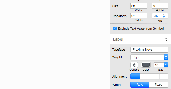
Another cool feature of Symbols it that you can select which text element you’d like to reuse verbatim, meaning the actual text stays the same, or you can exclude the text value of a selected text element. This is an amazing feature that I love. It would be useless to reuse my input Symbols if I couldn’t rename one to “First name” and the other to “Last name.”
Learn More

Wrapping Up
These features will help you create your own style guides within Sketch. Download the source files and play around with what’s been built. I look forward to hearing your suggestions for improvements! And if you’re looking for more inspiration for working with Sketch, take a look at the Sketch file category on Envato Market.