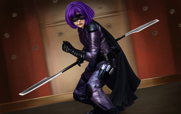
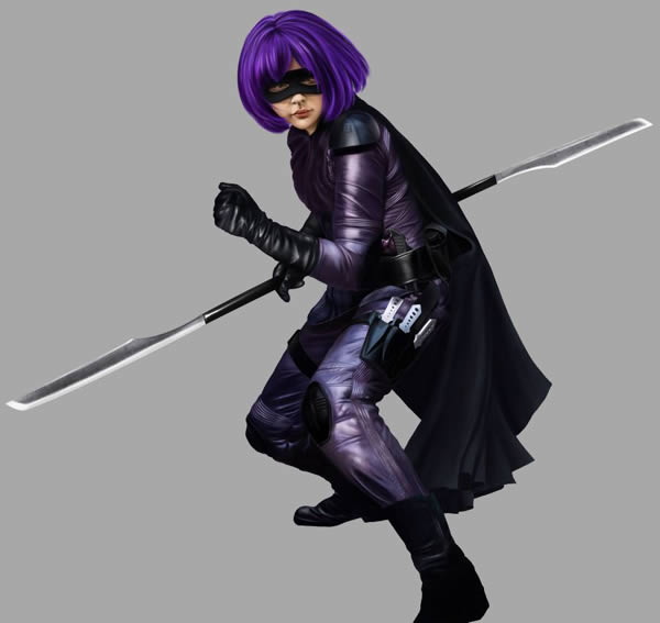
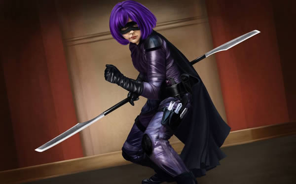
In this tutorial, we will show you how to create an illustration of “Hit Girl,” from the new “Kick Ass” film. In the process, we will show you some simple techniques to help you improve your digital illustration skills and give your artwork an almost comic-like edge. Let’s get started!
Speed Art Video
Tutorial Assets
You will need the following assets to complete this tutorial. Please download them before you begin. If they are not available, you will need to find alternatives.
- Rahll Brush Set
- David Nagel Series 37 Skin Texture Brushes
- Spotted Pattern by SheridanJ
- Scratched Plaster Texture (CGTextures.com)
- Paint Splatter (CGTextures.com)
1. Planning and Sketching
Step 1
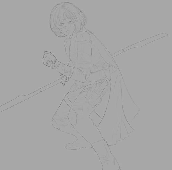
Planning is vital at this stage to organise the composition, foreground, background, focus etc. So creating a quick mock-up sketch and jotting your idea down is rather important when it comes to transferring your vision onto paper (or electronic document, in this case). I have decided on three major elements in this composition:
- Hit-Girl
- Foreground Figures (not pictured in tutorial)
- Background
Using some nice reference imagery, sketch in and refine the details to your liking. For a realistic piece like this, the more detail in the initial line art/sketch, the easier it will be to paint in later. Also, it helps to make the background a light shade of grey instead of pure white. It is just easier to see what you are painting!
2. Character Base Painting
Step 1
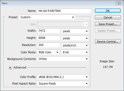
Create a New Document (7472px x 6908px) for painting the center piece of the painting: Hit Girl!
Step 2
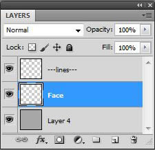
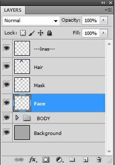
Make a New Layer and title it “Face”
Step 3
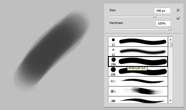
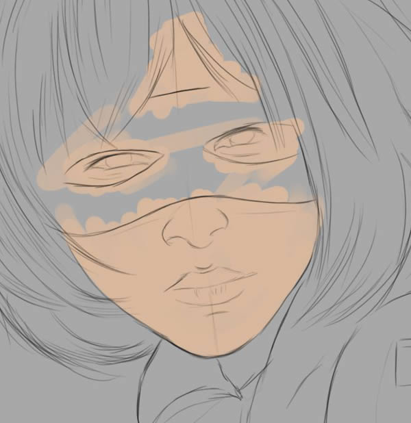
Block in the face color with a neutral tone (#dab89d) using the Hard Round Airbrush. It’s only going to be a small amount of her face showing, but it still needs to be rather strong and stand out on its own.
Step 4
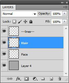
Create a New Layer over face layer and title it “Hair.”
Step 5
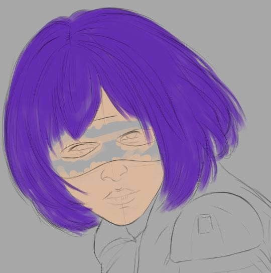
Block in the hair with a strong purple: #642cb1.
Step 6
Create another New Layer over the face, but underneath the Hair layer. Title it “Mask”
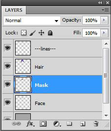
Step 7
Block in the Mask. Not with solid black, but with a charcoal colored grey: #1e1d23.
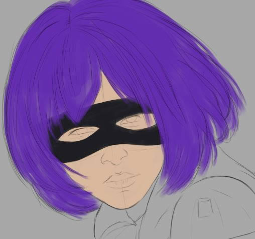
Step 8
Make a New Group and title it BODY. This is where all Layers regarding the Body will go. Create a New Layer within the group, and title it; “Body Base.”
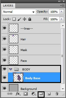
Step 9
Fill in entire body section which will mainly be a dull purple color: #634b6f.
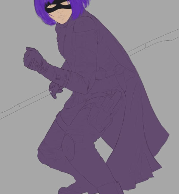
Step 10
Create a New Layer and title it “Cape”
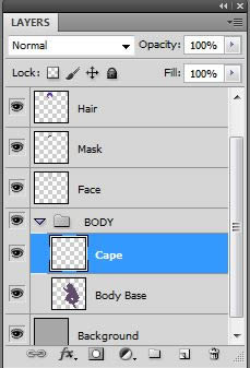
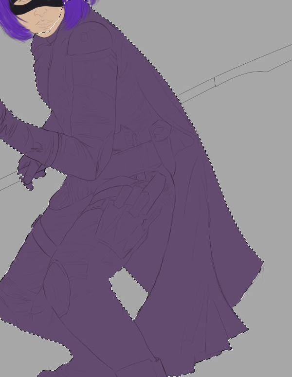
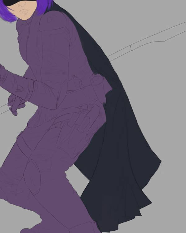
Step 11
Select All the base layer (CMD/CTRL + Click the layer in the Layers Window), and paint in the cape with a dark grey: #262a35
3. Character Toning
Step 1
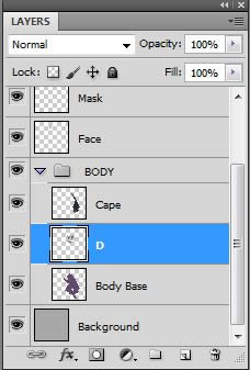
Time to start toning the body. Select the Base Layer, and on a New Layer, begin working in the tones.
Step 2
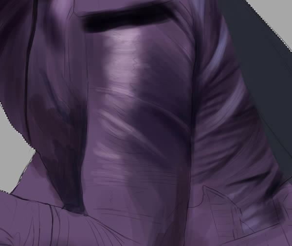
Build up shadows and darkest areas first, gradually distinguishing the creases across the fabric.
Step 3
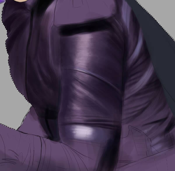
When adding highlights to an area where the fabric stretches around (such as her arm), make sure to paint in a horizontal direction to give the impression that the light is “wrapping around” the shape.
Step 4
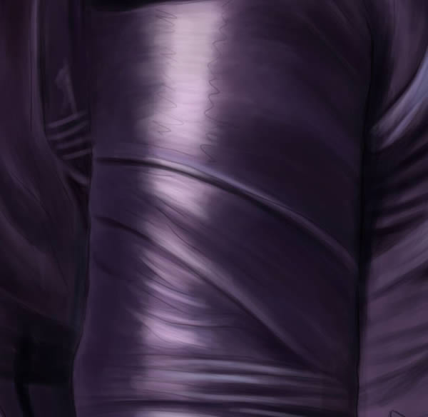
Work in the smaller details and creases as you go.
Step 5
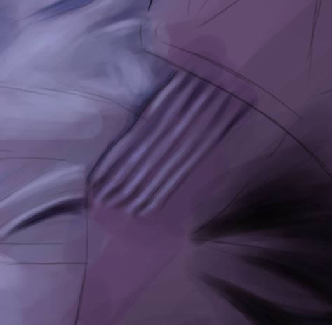
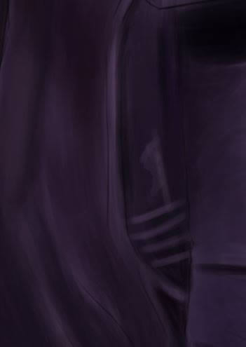
The boots are already quite dark, so it’s OK to do them on the same layer as the rest of the body. No need to make a new layer for this yet!
Step 6
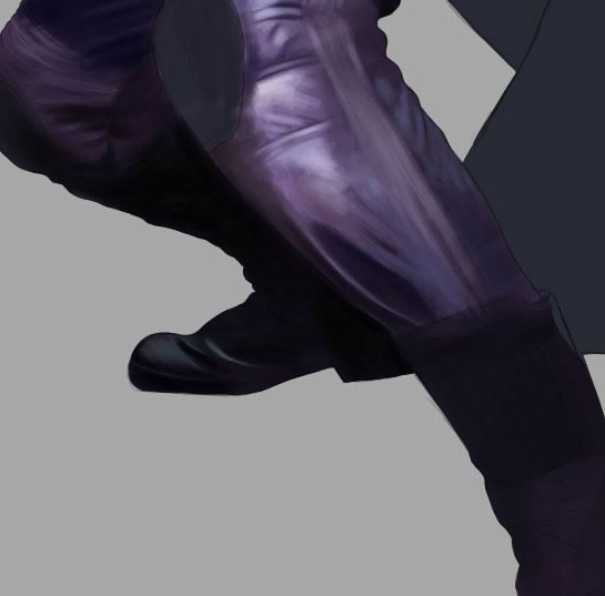
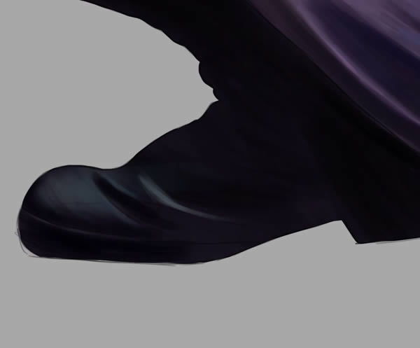
Gradually introduce the darkest tones.
Step 7
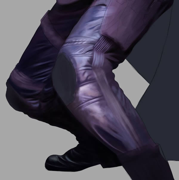
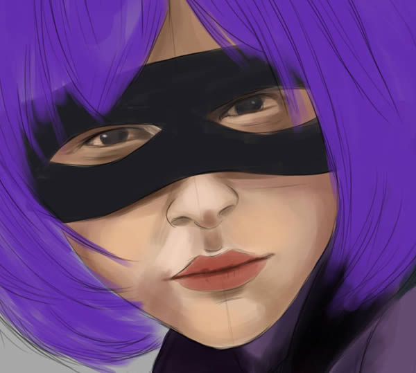
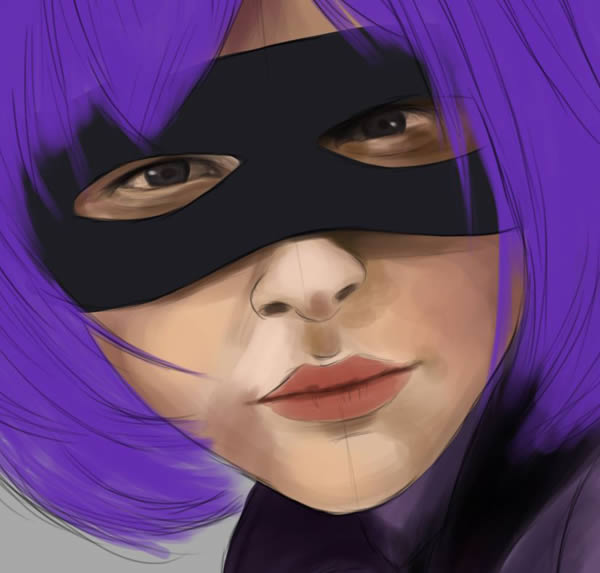
When you are happy with the shadows so far, move up to the Face Layer and work in some tones with the Hard Round Airbrush.
Step 8
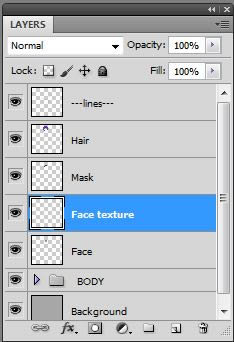
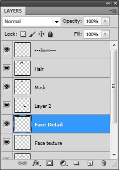
Create a New Layer and title it “Face Texture.” This will be for face texture and tone blending.
Step 9
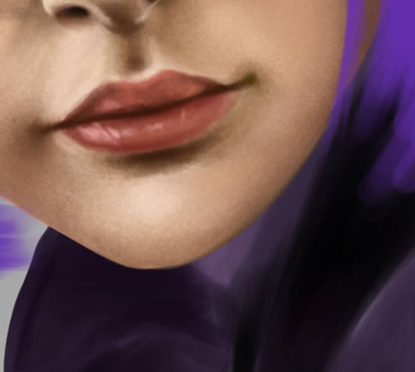
Start working in the tones with Nagal Skin Texture brush “Roughness01.”
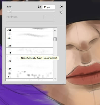
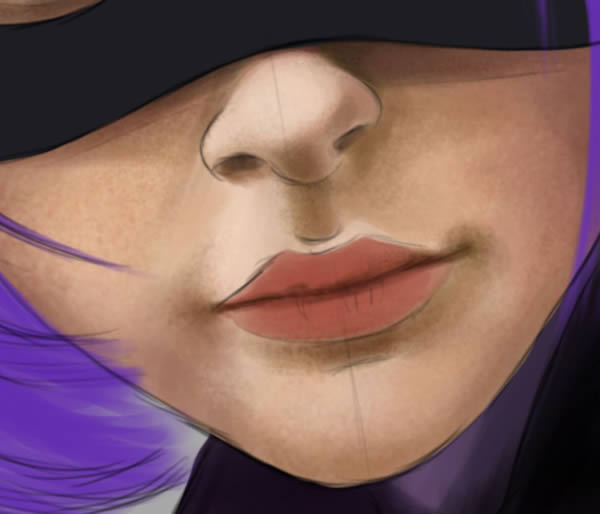
Step 10
Switch to Rahll “Skin Soft” brush to soften texture and blend further.
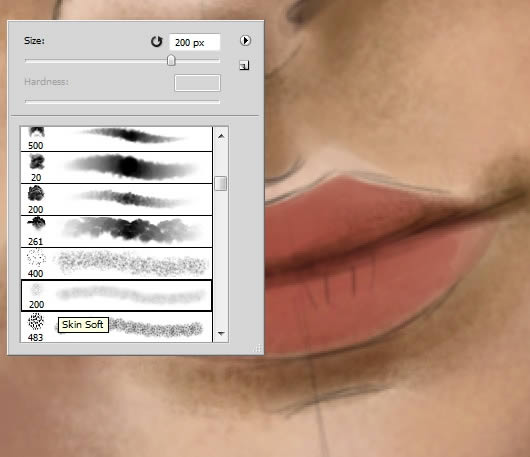
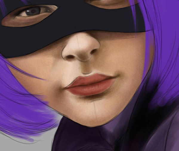
Step 11
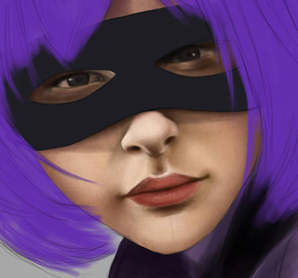
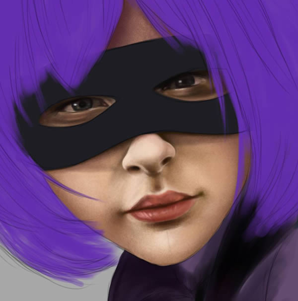
On a New layer (“Face Detail”) paint in the extra details such as lips, eyes, and define the edges of the nose. Also smooth off the chin with the Eraser Tool (E).
Step 12
Create a New Layer to sit underneath the “Face” layer. Title this one “Neck”
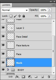
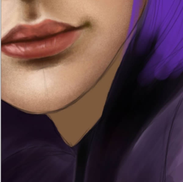
Step 13
Paint in the small area of neck using the same light and dark tonal variations as the face.
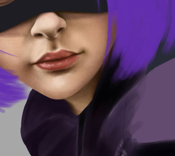
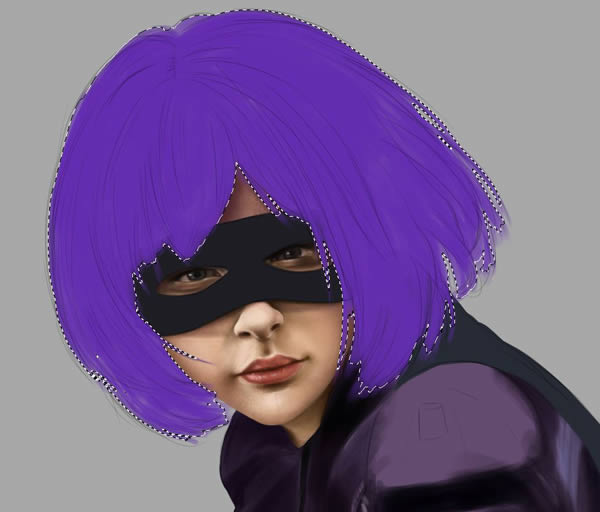
Step 14
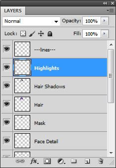
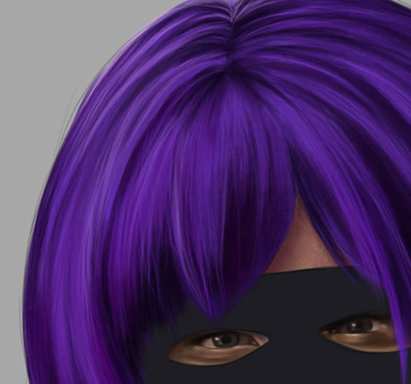
Move back up onto your Hair Layer. Add a New Layer above it titled “Hair shadows,” and begin painting in darkest under tones with a very dark purple first (#1f0c39). Let your brush strokes follow the same direction the hair would grow out (from the roots).
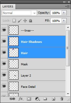
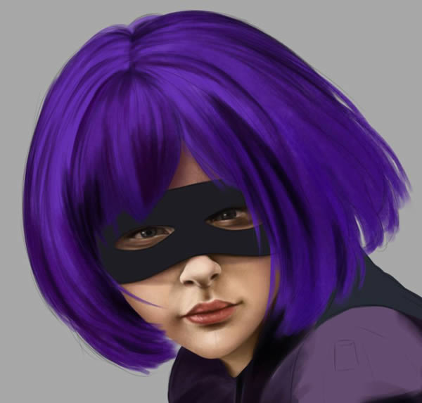
Step 15
Continue building up more hair detail. Use the default Photoshop Bristle Brush (Round Blunt Medium Stiff) to cover more area faster while keeping it very strand-like.
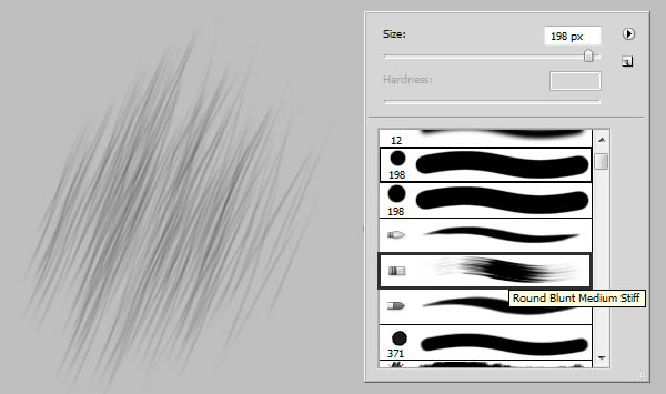
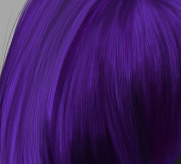
Step 16
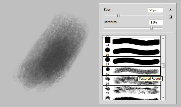
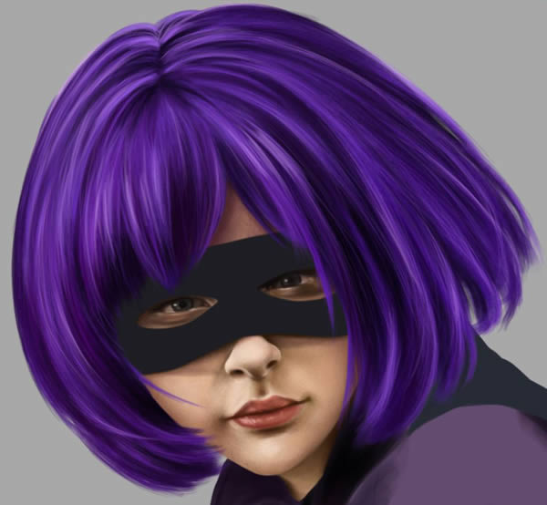
On a New Layer (“Highlights”) begin adding in the lighter hair strands with the Textured Round Brush from Rahll’s Brush pack.
Step 17
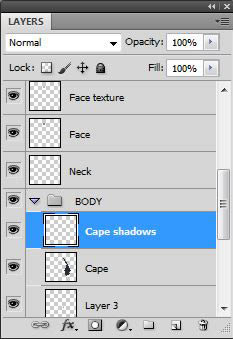
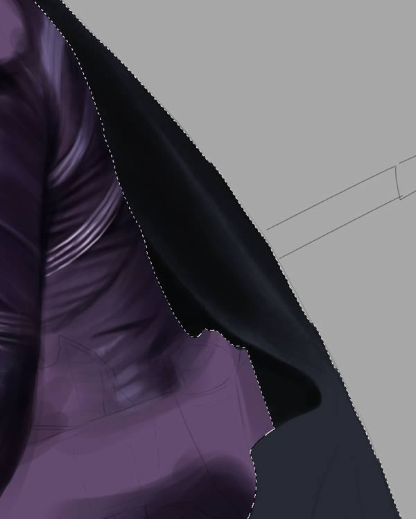
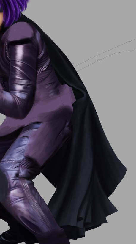
Once you are happy with the hair, move down onto “Cape” layer, and paint in the dark tones on New Layer with the same Textured Round Brush.
Step 18
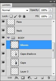
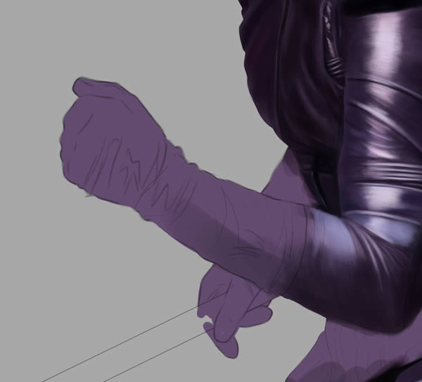
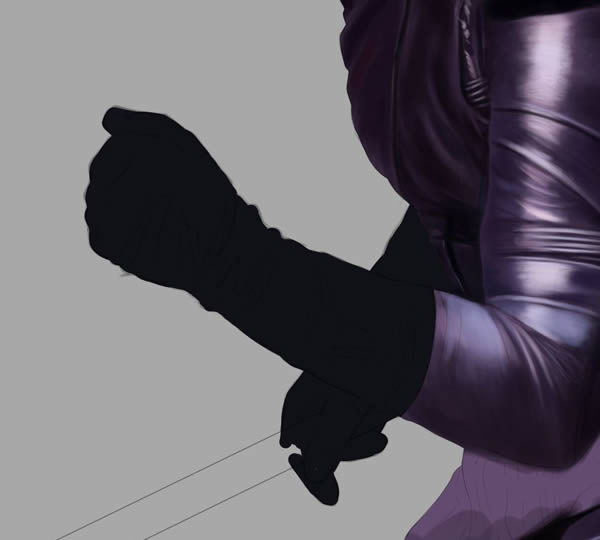
Now it is time to add the final accessories onto her costume. Create a New Layer in the “BODY” folder, and title it “Gloves.”
Step 19
Fill in the gloves: #101117
Step 20
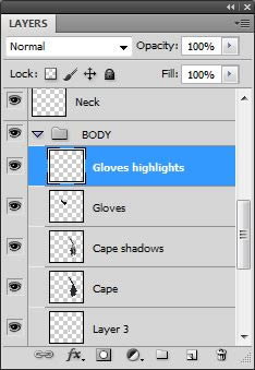
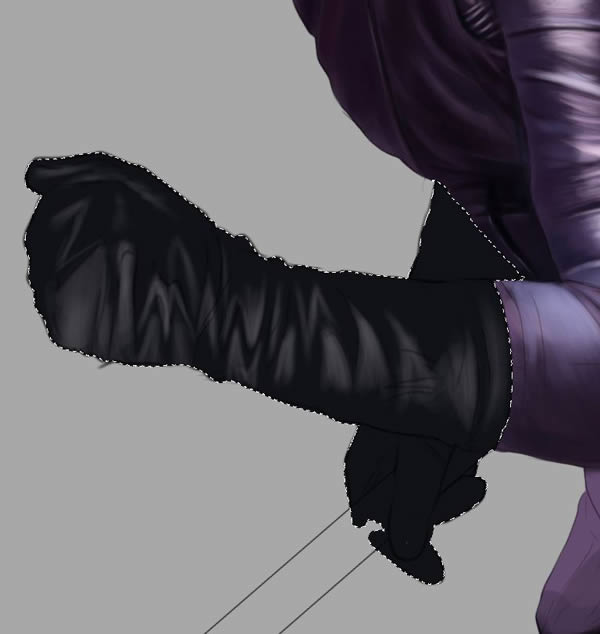
CMD/CTRL + Click your Gloves layer to Select All, and make New Layer. Paint in some highlights on that layer with a light grey: #505053
Step 21
Gradually introduce more white to bring out the lighter areas even more.
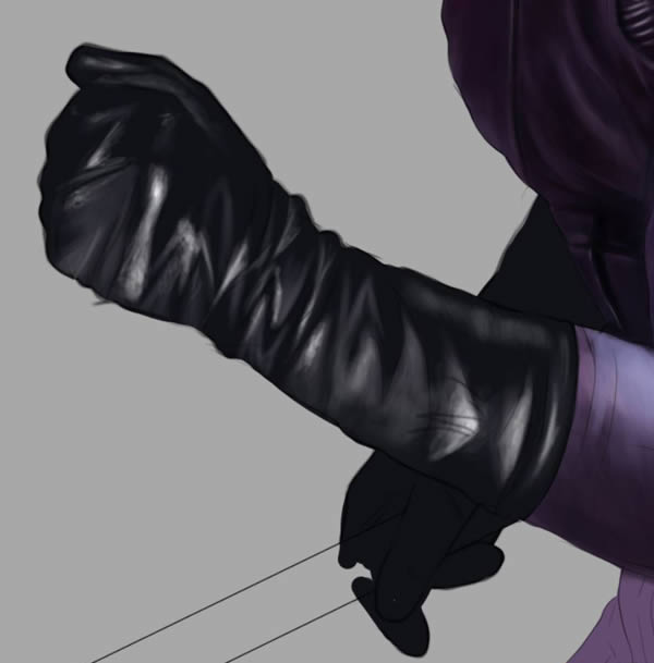
Step 22
Do the same for the second glove.
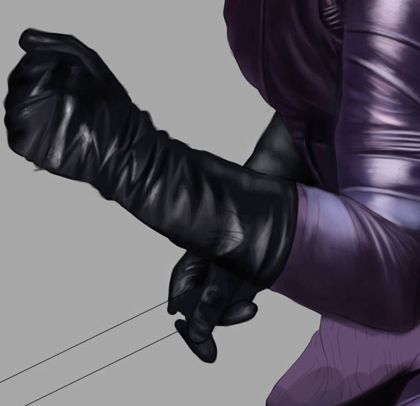
Step 23
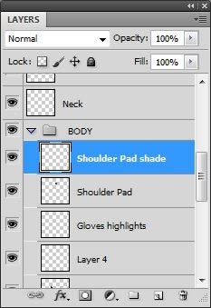
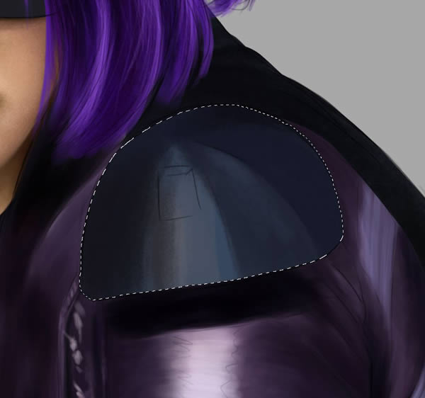
Create a New Layer, and title it “Shoulder Pad.” Paint in Shoulder pad a dull blue: #36465d
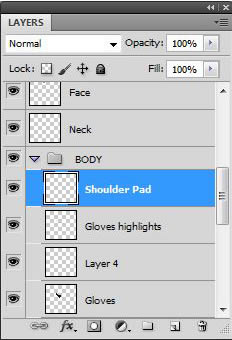
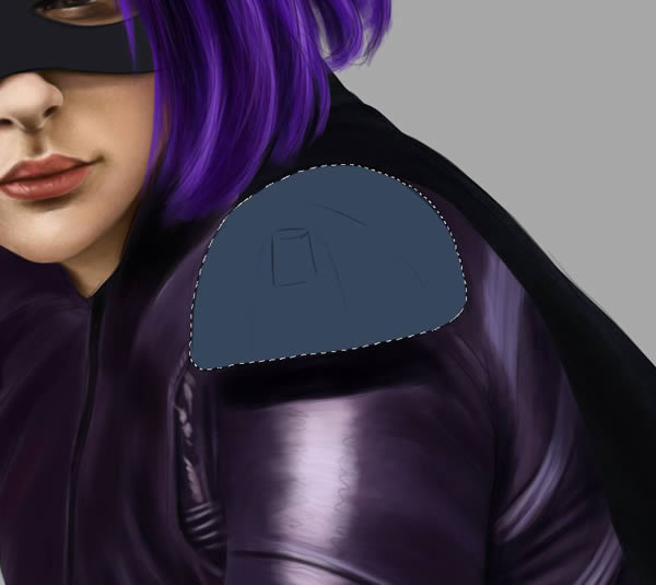
Step 24
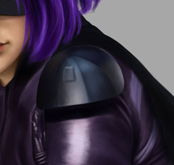
On a New layer (“Shoulder Pad Shade”) begin adding some tones to the shoulder pad to give it some more form.
Step 25
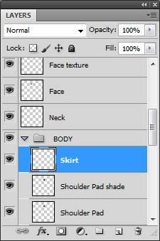
Create a New Layer, and title it “Skirt.” Paint in her skirt a darker shade of purple: #262642
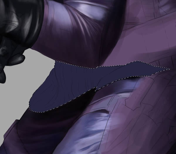
Step 26
Add shadows with the Round Textured Brush on a New Layer.
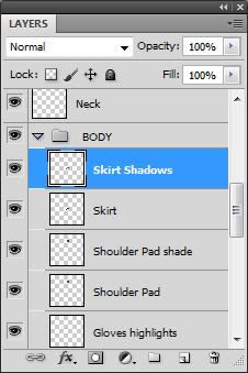
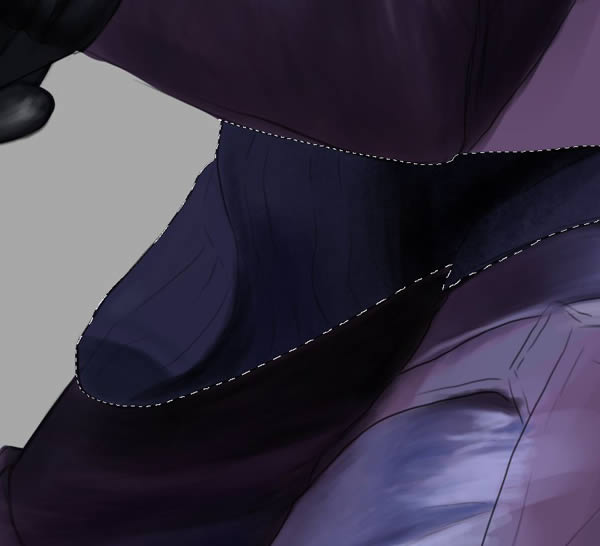
Step 27
Once you are happy with the amount of shading, begin adding the smaller details, stripes and extra highlights along the edges.
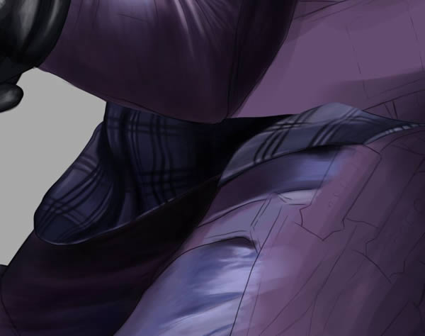
Step 28
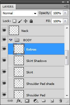
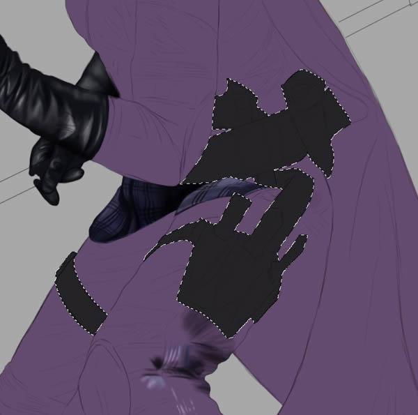
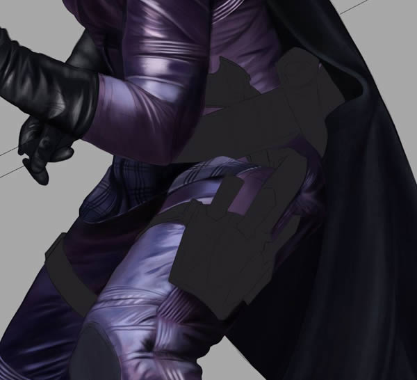
On a New Layer titled “Extras”, paint in the final accessories such as her belt, gun holsters, and leg straps. It helps to hide the other layers underneath so you can see where you are painting more clearly.
Step 29
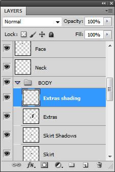
Paint in shades, starting with darkest. Add in highlights as you go.
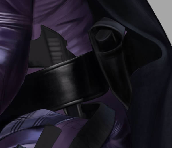
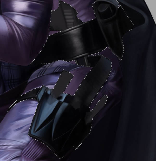
Step 30
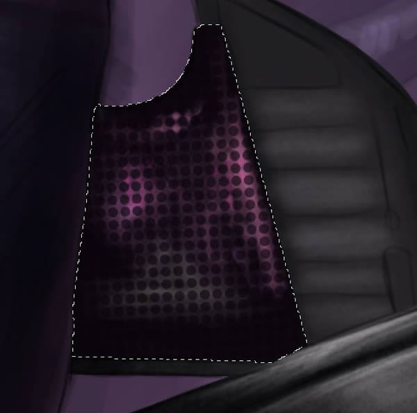
To replicate the pattern on the gun handle, I use a simple spotted pattern as an overlay.
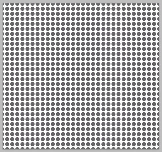
Step 31
Drag the spotted pattern onto your Hit-Girl painting (over the “Extras” Layer) and re size it to cover the area of the gun handle. Erase away the edges where it goes over.
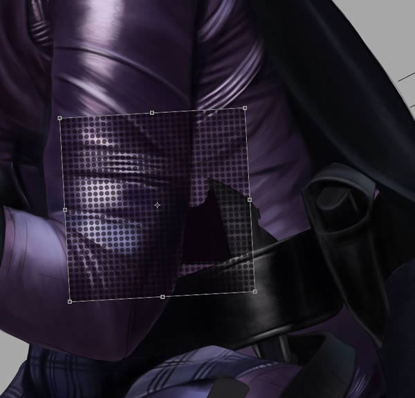
Step 32
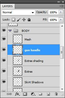
Paint in the little pieces of color on the Gun Handle Layer underneath the spotted layer (titled “Mesh).
Step 33
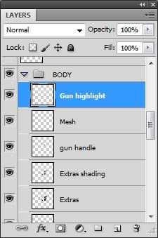
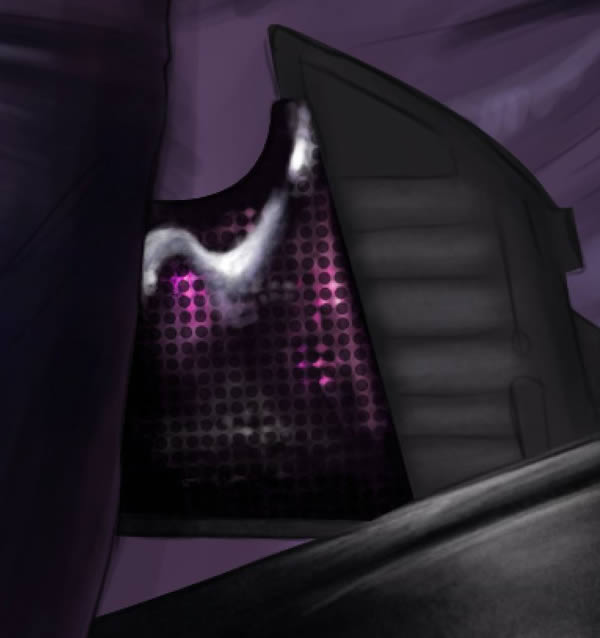
On a New Layer above the Mesh layer, paint in the last of the highlights on the gun handle with white.
Step 34
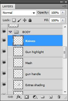
Create a New Layer and title it “Knives”
Step 35
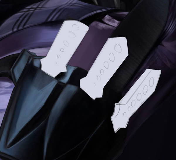
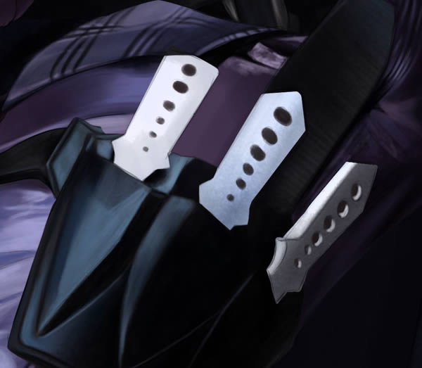
CMD/CTRL + Click the “Extras” layer to Select All and fill in the knives with a light blue: #d3d6e5.
Step 36
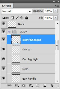
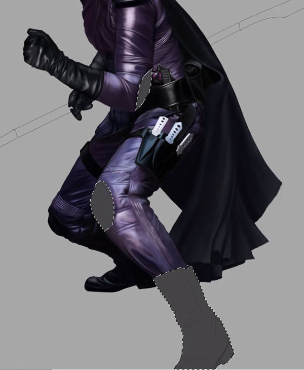
On a New Layer titled “Boots“, fill in the boots and last knee and elbow pad: #454346
Step 37
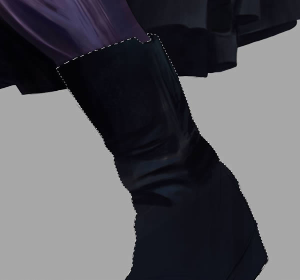
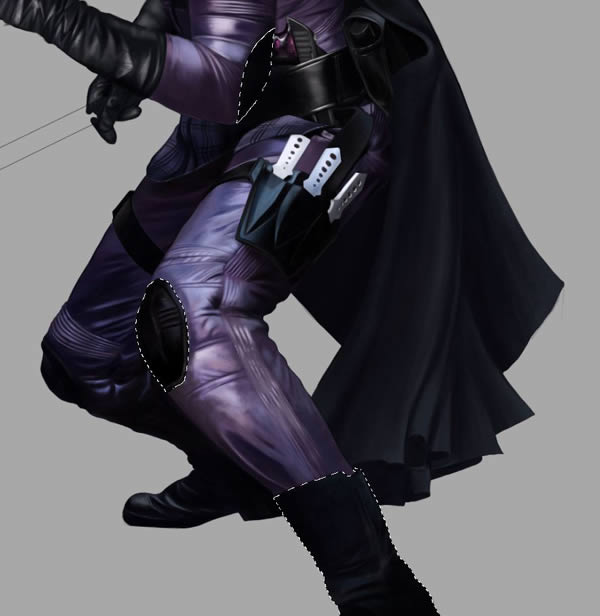
Paint in the dark tones. You don’t need to fuss too much over the foot of the closer boot as it is most likely going to be cut off or obscured in the final composition, so it doesn’t need too much detailing. (This is why initial composition planning is key!)
Step 38
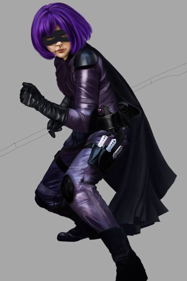
A look at figure process so far shows a nice balance of light and shade, and the highlights bouncing off the shiny material are looking pretty spot on.
Step 39
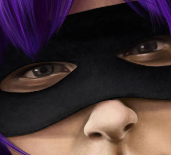
Move back up to “Mask” layer and paint in last shades.
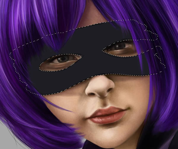
Step 40
Again, detail it with Textured Round Brush to give it that extra dimension and also give the appearance of there being a fabric texture through it. It shouldn’t look perfectly smooth.
4. Rendering the Spear
Step 1
Create a New Folder just above the “BODY folder and title it “SPEAR.”
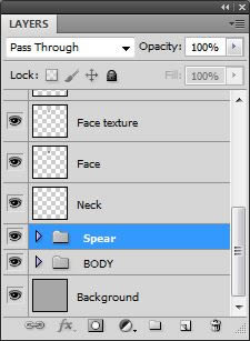
Step 2
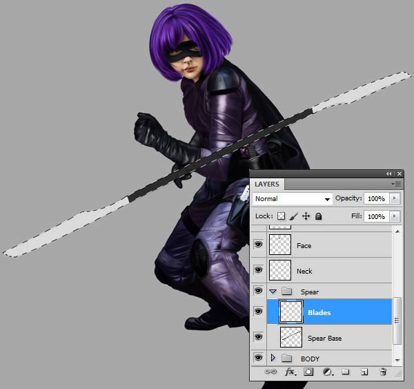
On a New Layer in the SPEAR folder titled “Spear Base”, use the Pen Tool (P) to make a clean path to cover the area.
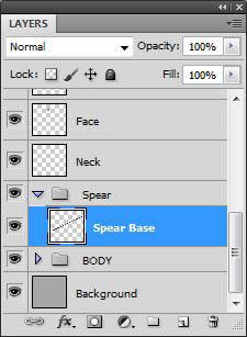

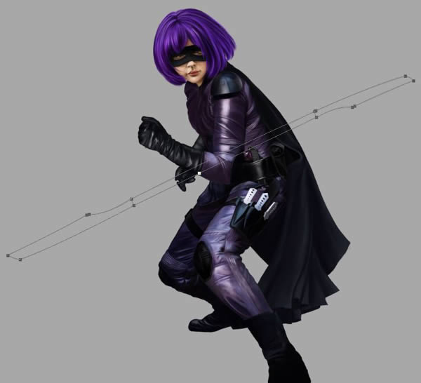
Step 3
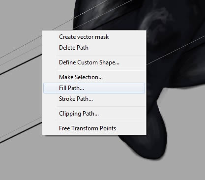
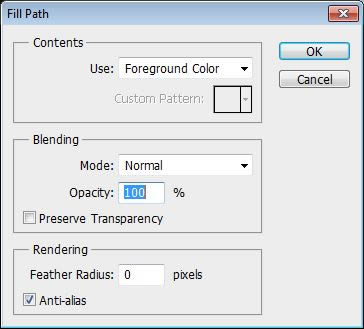
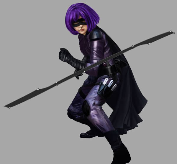
Once you have outlined the spear base, Fill it with a solid grey: #2b2b2b
Step 4
CMD/CTRL + Click on the “Spear Base” layer to Select All, and paint in the two blades on a New Layer (“Blades”).
Step 5
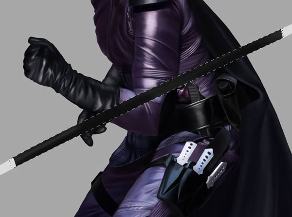
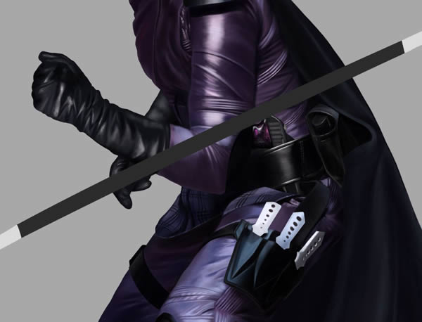
Go back to the Spear Base layer, and paint in the dark tones, followed by some thin highlights to give it a more rounded look.
Step 6
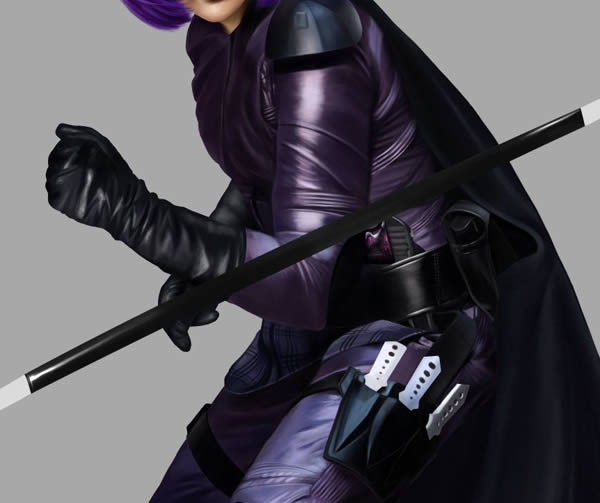
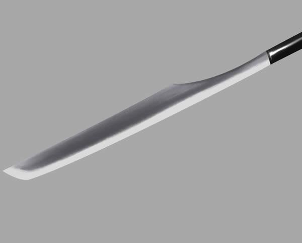
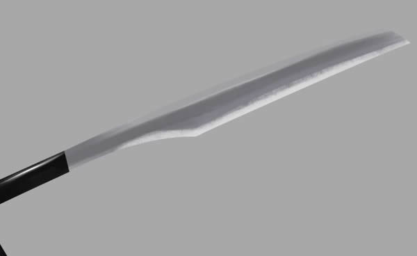
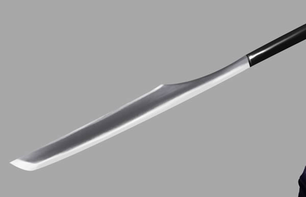
Move onto the “Blades” Layer now, and start with the darker tones before adding in sharper highlights along the edges.
Step 7
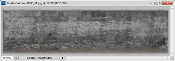
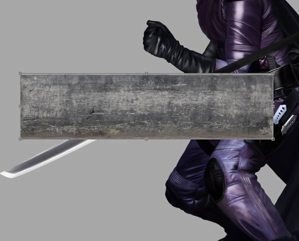
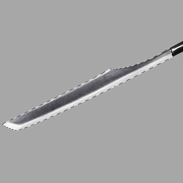
Open Scratched Texture from CGTextures.com. (PlasterColored.jpg)
Step 8
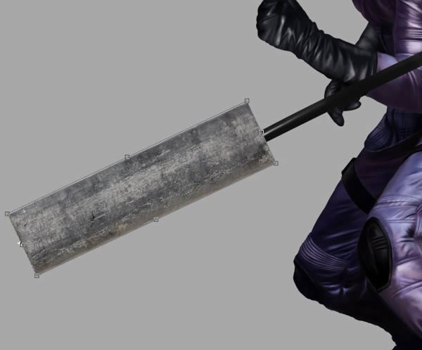
Hold CMD/CTRL, and Drag and Drop it over your “Blades” layer. Scale and Angle it to cover the blade accordingly.
Step 9
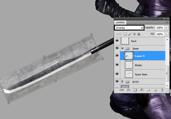
Set it to Overlay.
Step 10
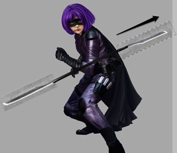
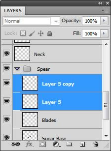
Now hold CMD/CTRL + Alt to duplicate the Texture Layer and drag up to opposite blade. Merge the two little texture layers into a single Layer (CMD/CTRL + E).
Step 11
CMD/CTRL + Click the Blade layer to Select All, then CMD/CTRL + Shift + I to invert the selection. Hit backspace to delete the excess texture that is sitting outside the selection
Step 12
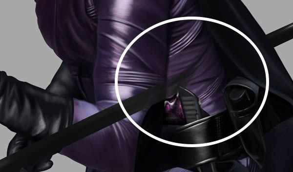
Erase part of the Spear Base layer that is obscuring across the body.
Step 13
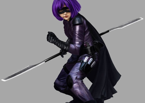
Add the final details, finishing touches and highlights all over body and any parts you may have missed.
Step 14
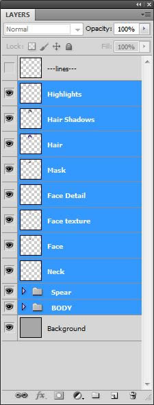
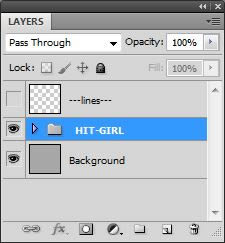
Select all of the layers of the painting in the Layers Window except for the background and the lineart, and group them all together (CMD/CTRL + G). Title the New Group “HIT-GIRL”
5. Painting the Background
Step 1
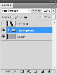
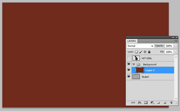
Now it is time to work on the background. Hide the Hit-Girl layer, and create a New Group underneath. Title it “Background”
Step 2
Fill a New Layer a dull red (#6f2a1b). Drop its Opacity down to about 60% for now so you can still see where your background guide lines are.
Step 3
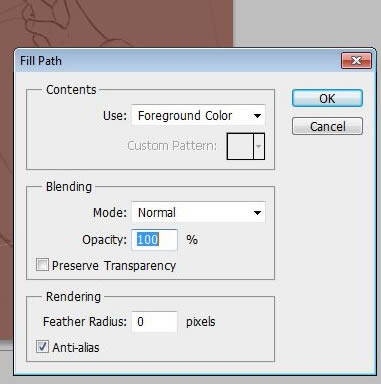
On a New Layer, use the Pen Tool (P) to path in a diagonal line where the floor will be. Fill with a solid brown: #3b3127
Step 4
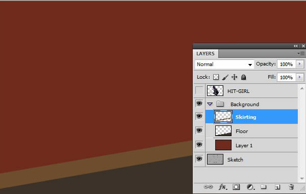
On a New Layer titled “Skirting”, path in another diagonal section where the wall meets floor. Fill it with a lighter brown: #6d4d2b. Now you should have three separate elements of the background neatly divided.
Step 8
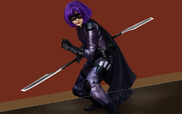
Select All on the “Floor” layer, and begin painting in some tones with the Textured Round Brush.
Step 9
Then add tones to the “Skirting” layer in a similar fashion.
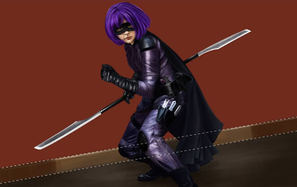
Step 10
Refine more detail with the Textured Round Brush on the skirting and floor.
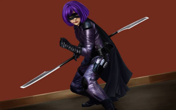
Step 11
On a New Layer over the Background Wall, use the Pen Tool again to path in a rectangular section of wall. Fill it a light brown: #88694a.
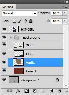
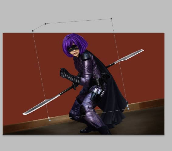
Step 12
When it comes to painting the wall, begin painting tones onto the red background layer first. Add darker reds around edges to create a sort of Spot Light effect.
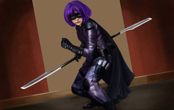
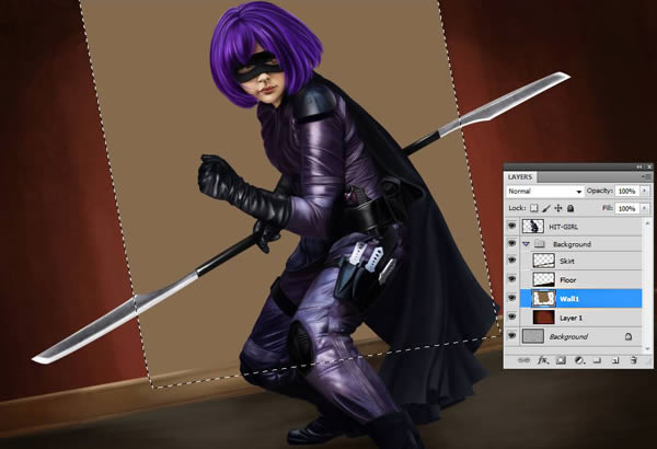
Step 13
Move onto the brown wall panel layer, “Wall1”, and shade accordingly.
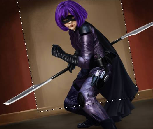
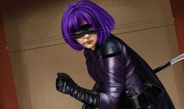
Step 14
Again, use the Pen Tool (P) to make three straight lines, and Stroke them with a 3px Brush.
Step 15
Continue detailing and blending both the red background wall and the brown wall panel until they blend nicely.
6. Building the Composition
Step 1
Now create a New Document. About 3000px x 3000px will do.

Step 2
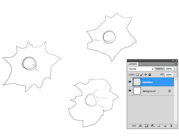
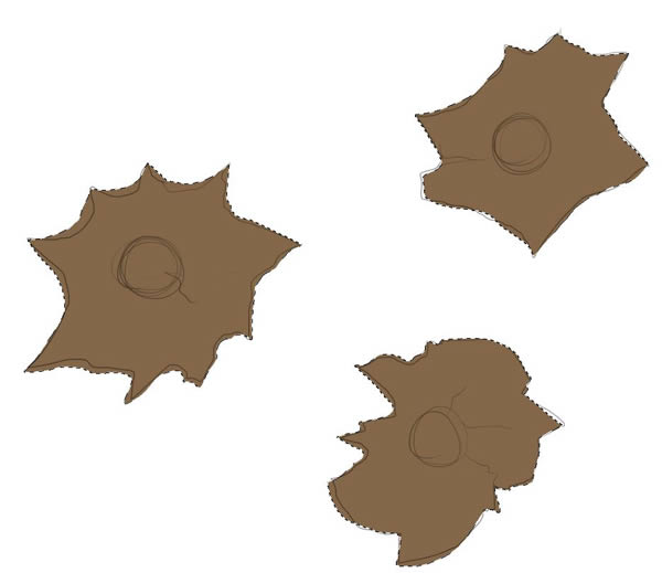
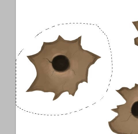
On a New Layer, sketch in some bullet hole shapes.
Step 3
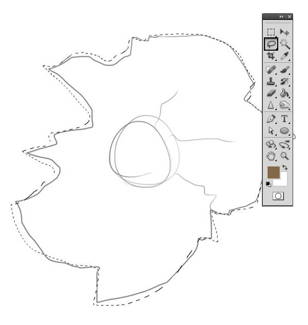
Create a New Layer underneath the sketches, and use the Lasso Tool (L) to trace the shapes. Roughly follow the lines you just sketched in.
Step 4
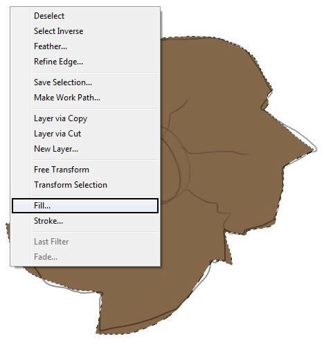
Fill with a flat brown: #846748.
Step 5
Repeat with the other two bullet holes.
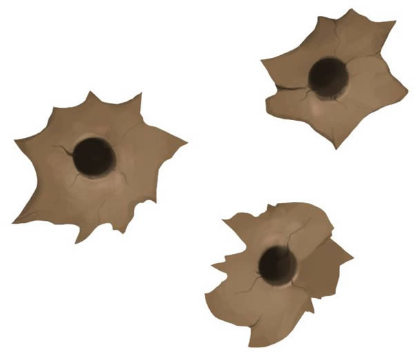
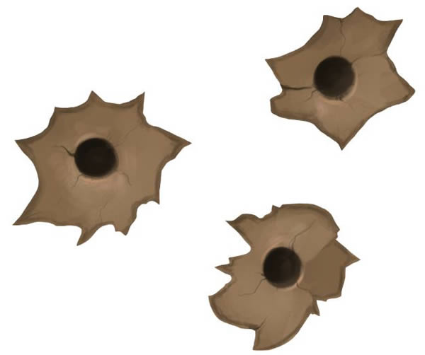
Step 6
Paint in some values and little details such as small cracks and highlights for a bit more dimension. Aim to get the values to match with the browns already in the background.
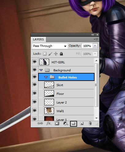
Step 7
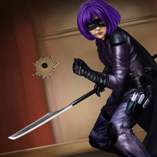
Go back to your Final Painting document, and create a New Folder inside the Background folder and title it “Bullet Holes.”
Step 8
Use the Lasso Tool again, and select a bullet hole. Drag it over to into the “Bullet Hole” folder you just created in your Final Painting document.
Step 9
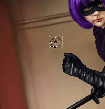
Use Free Transform to scale down a touch.
Step 10
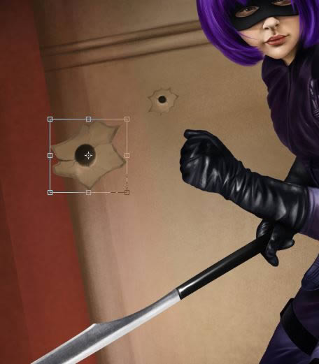
Repeat with other bullet holes; turning some around and adding some variety to their spacing and angles.

Step 11
Merge all the bullet hole layers together to one single Layer (CMD/CTRL + E)
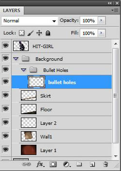
Step 12
Now we just need to darken them slightly. (Image > Adjustments > Brightness/Contrast…)
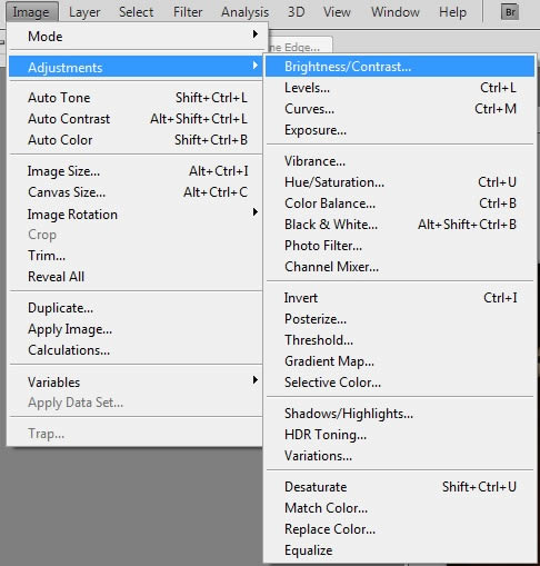
Step 13
Bring down the Brightness of the bullet holes so they don’t stand out too much.
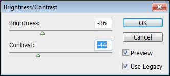
Step 14
Drop Opacity of Bullet Hole layer to about 65% also.
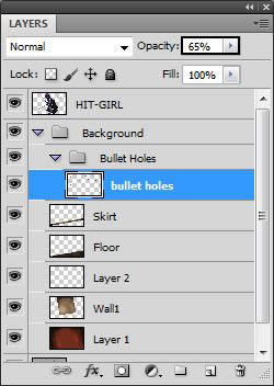
Congratulations! You’re Done.
In this tutorial, we have given you a run down of how to plan and create a detailed digital painting using different elements. We have also shown how creating them in separate documents, and piecing them together can be rather beneficial when you want to experiment with effects and blurs as you go! As always, organized Layers and Layer Groups are extremely useful when working on an complicated piece that has many levels of tones, textures and effects! I hope you can take this information and apply it to your own projects or just follow along for practice! Good luck!
