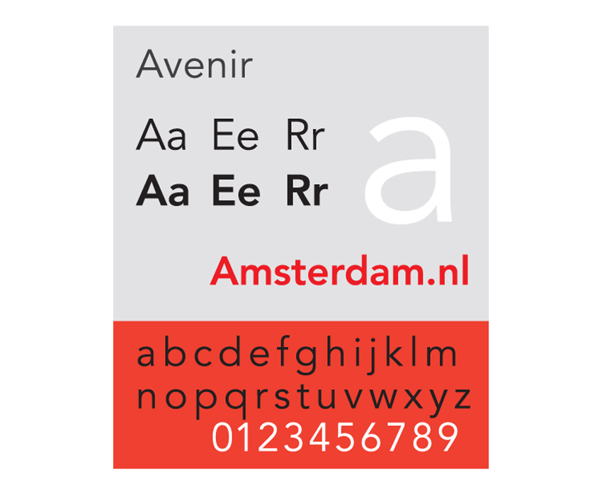
Created by legendary type designer Adrian Frutiger and released in 1988, Avenir is one of the most widely used typefaces in corporate branding. Repeatedly voted by designers as one of the most beautifully designed typefaces, the Avenir font family was Frutiger’s masterwork and continues to be popular in logo design and brand identities today.

Read more about Avenir’s origin story and how this humanist sans serif has gone on to become one of the most iconic fonts in type history. Scroll to the bottom of the article to discover 15 fantastic alternatives to the Avenir font, which offer a contemporary twist on this classic typeface.
Browse hundreds of sans serif fonts, fonts similar to Avenir, Avenir book fonts, and alternatives to Avenir font downloads to use in your design and branding projects on Envato Elements.
What Is Avenir?

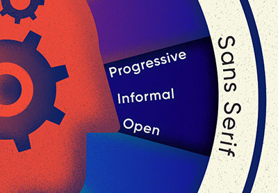
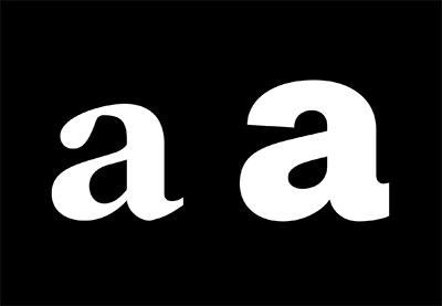
Avenir is a sans serif typeface in the tradition of geometric type styles. Although classified as a geometric typeface, Avenir (which means ‘future’ in French) has some humanist features which bring warmth and openness to the typeface.
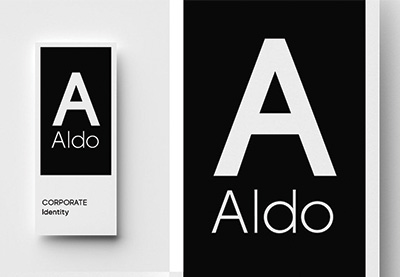
Avenir is one of the most widely used typefaces in corporate branding, with many well-known corporations, including banks, rail companies, and food brands, using the font prominently in their logos and brand identities.
The typeface is exceptionally legible and clear to read, making it highly versatile for use in headers and body text. Avenir paved the way for later humanist geometric sans serifs, such as Freight Sans and Calluna Sans.
Who Created the Avenir Typeface?

Avenir was created by legendary Swiss type designer Adrian Frutiger (1928-2015), who also created Univers and the self-named Frutiger. Frutiger had dabbled in both sculpture and type design from a very young age, and the influence of the strict, formal cursives taught to him in his Swiss schooldays galvanised him to create more modernist and revolutionary alternatives.
He worked on Avenir alone, without the help of drafting assistants, and said he designed the typeface with “human nature in mind”. Avenir was released in three weights in 1988, which later expanded into a six-weight family.
Frutiger often referred to Avenir as his masterpiece, describing it as “the hardest typeface I have worked on in my life”. He also referred to the process of creating sans serif typefaces as his “main life’s work”, noting that sans serifs were more difficult to design than serifs due to their stark simplicity.
Where Is Avenir Used?
The Avenir font family is amongst the most widely used in the world, having been chosen as the corporate typeface for countless companies and organisations.
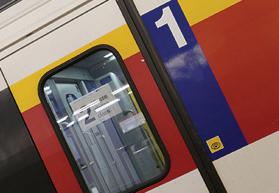
For French residents, Avenir is a common feature of everyday life, having been used by France’s national railway company SNCF (Société nationale des chemins de fer français) as its corporate typeface since 2013.


Because of the typeface’s innate familiarity for French citizens, Presidential candidate François Hollande chose Avenir for his election campaign materials. Perhaps in part due to his choice of font, Hollande went on to win the election in 2012.

British retail and wholesale company The Co-operative Group uses Avenir in its corporate identity. Software company Bloomberg also uses a customised version of Avenir Next (see below) as its corporate typeface.

Tech companies are also not immune to Avenir’s clean, legible appeal. Apple chose Avenir for use on its Maps app and some Siri screens in iOS 6, as well as providing pre-loaded versions of Avenir and Avenir Next on OS X Mountain Lion and iWork for iCloud. Snapchat has also used Avenir as the app’s main font since 2016.
What Were the Different Releases of the Avenir Typeface?
Avenir Next
Following the success enjoyed by the original release of Avenir, type foundry Linotype returned to Frutiger to invite him to work on an expanded reworking of the Avenir font family. Working alongside the foundry’s in-house designer Akira Kobayashi, the pair created Avenir Next, publishing the first release of the typeface in 2004. The designers continued to expand the Avenir Next family over the following three years.
Widely acclaimed on its release, Avenir Next is a subtly edited version of Avenir. The most notable difference is the more generous tracking (letter-spacing) of Avenir Next, which gives it a more contemporary, airy appearance.
Electronics company LG chose Avenir Next for the button lettering of mobile devices, due to its excellent legibility. British TV channel BBC2 also broke away from the use of Gill Sans, which is used across other BBC channels, in favour of Avenir Next on their logos and promotional materials to achieve a cleaner, more contemporary brand identity.
Avenir Next Rounded
Akira Kobayashi returned to Avenir Next with the aim of creating a third generation of Avenir to mark the 25th birthday of Avenir in 2013.

Kobayashi incorporated rounded terminals into the geometric forms of the original Avenir Next typeface, giving the resulting font a ‘sweet-and-salty’ dual personality. Kobayashi pushed the boundaries of Frutiger’s humanist approach to typeface design—Avenir Next Rounded has a distinctly mid-century mood and a bouncy, optimistic personality that sets it apart from other geometric sans serifs in the Avenir tradition.
The Enduring Appeal of the Avenir Font Family
Interestingly, on Fonts.com, Avenir Next is ranked as the #12 best-selling font family, while the original Avenir ranks higher at #5.
While both Avenir Next and Avenir Next Rounded have been met with acclaim and are widely used in corporate branding, designers still look to the original first-generation Avenir as Frutiger’s masterpiece. Arguably as contemporary and versatile in style and use as when it was first released in the late 1980s, Avenir is credited with being a typeface that is the building block of enduring corporate identities.
In other words, if you’re creating a brand for a big business, Avenir is a reliable and effective typeface choice, and is likely to look as relevant and contemporary for many years to come.
Perhaps you’ve used Avenir in a design project and are interested in discovering similar alternatives. You’re not short of options—a wide range of designers have used Avenir as a principal point of inspiration for their own typeface designs, looking to the humanist design tradition established by Frutiger to inform cutting-edge sans serifs which perhaps offer something a little different to the Avenir font family.
From mid-century infused Bw Modelica to faithful Avenir tribute Liber, contemporary type designers always come back to Avenir as a source of creative inspiration.
Discover your next favourite font, from Avenir book fonts to branding fonts, from the list of Avenir tributes below.
15 Fonts Similar to Avenir
Looking for a cheaper alternative to Avenir, or a contemporary twist on the classic typeface? These 15 fonts take their cues from Avenir’s sleek, minimalist styling, with modern-day tweaks to bring the much-loved style bang up-to-date for print and web design.
1. Liber

Designed by Valerio Dell’Edera in 2016, Liber pays tribute to the heritage of Avenir and Futura but refines the style for the 21st century. Built on ‘the mathematical purity of geometric circles and clarity of squares’, Liber is ultra-legible, with a harmonious, calming appearance.
2. Bw Modelica

Created by Alberto Romanos, Bw Modelica is a minimal and reliable geometric sans serif with an open, friendly appearance. With its clean style and generous x-height, this exceptionally broad font family (containing 64 styles) is adaptable for both body and headline copy.
3. BERLIN

Designed by SIGNIA PRO designers Fontastica, BERLIN is ultra-minimal, clean, and contemporary, exaggerating the geometric heritage of Avenir and its counterparts. Use it in headlines, across minimal packaging designs, and in fashion and lifestyle branding to make the most of its cutting-edge good looks.
4. Frank

Inspired by Futura and stricter geometric sans serifs, Frank is available in five weights and more than 300 glyphs. The Avenir-style typeface is designed with display and web design in mind.
5. Lorin

Released by foundry Fontastica, creators of BERLIN (above), Lorin is a quietly designed rounded sans serif that lifts inspiration from Frutiger’s type designs. Stylish and feminine, Lorin is a great fit for branding and poster projects.
6. Hamlin

An ultra-minimalist sans serif also designed by Fontastica, Hamlin lifts influences from Frutiger’s humanist designs for Avenir but adds more contemporary character. Use it across packaging and website layouts for a minimal, clean, and exceptionally stylish look and feel.
7. BROOKLYN

A cosier take on the geometric sans serif style, Brooklyn’s reduced x-height gives it a sturdy, 90s-inspired appearance. Beautiful across logos and packaging, this is a font built for branding projects.
8. Herz

Available in three weights and as both a desktop and web font, Herz has a retro, condensed style that is reminiscent of Akzidenz Grotesk and Futura. Simple, friendly, and versatile, Herz is legible both at large display size and for smaller body copy.
9. Noir Pro

Inspired by the early 20th century sans serifs which also influenced Frutiger’s type designs, Noir Pro is elegant and organic, with a broad range of weights ranging from light to heavy. A beautiful typeface for using on poster designs and other print work.
10. Regime Grotesk

Quoting its inspiration as stemming from 1920s Italian design, Regime Grotesk pays tribute to the quirks of typefaces from this era, such as Futura and Mostra. The font is designed to be balanced, modern, and easily adaptable for web, print, or signage design.
11. Normal

Pure and minimal, Normal is an everyday font with added style. Tailored for logotypes, headlines, branding materials, and corporate identities, Normal looks fantastic paired with colourful, modernist-inspired graphics and black-and-white photography.
12. Konnect

Lifting influences from classical and contemporary type styles, and blending these with more playful elements, Konnect is a sans serif with soul. The curving ligatures give the typeface a dynamic quality that is reminiscent of mid-century and 1960s sans serifs.
13. CA Saygon Text

The sister of CA Saygon, CA Saygon Text was created by the Cape Arcona foundry to provide a calmer alternative to the original typeface. Inspired by early static grotesque typefaces such as Akzidenz Grotesk, which also inspired Frutiger’s designs for Avenir, CA Saygon Text has a large range of stylistic sets with letter variation, making for a fun, versatile font family for designers to use.
14. Bergen Text

Released by Mindburger Studio, Bergen Text is the companion font to Bergen Sans. Designed to be highly legible while retaining personality, this is a bouncier alternative to more traditional geometric sans serifs like Avenir.
15. Bergen Mono
A monospaced take on sans serif type styles and also released by Mindburger Studio, Bergen Mono balances retro functionality with a clean, contemporary style. Use it on magazine design, posters, and signage to make the most of its vintage good looks.
Learn about other classic fonts and alternatives for celebrated typefaces, such as Helvetica:
-

Everything You Wanted to Know About Helvetica
-
15 Fonts Similar to Helvetica
-
The Psychology of Fonts (Fonts That Evoke Emotion)
-
The Rise of the Sans Serif