Today, more and more programs and apps are being developed to cater to cryptocurrency users. If you check the App Store or Google Play, you’ll see a number of crypto wallets like Exodus or Electrum, cryptocurrency calculators, and even trading apps like CryptoTrader which you can read more about. However, while technology has made dealing with cryptocurrency much easier now, there is still a lot to improve in terms of design.
If you’re a designer and you’re looking into offering your services to the blockchain and cryptocurrency industry, the first thing you must do is to understand blockchain and second, look into how you can improve the design of a crptocurrency app next. If you’re looking for some ideas and visual inspirations for a cryptocurrency app, we have some of our favorites listed down below.
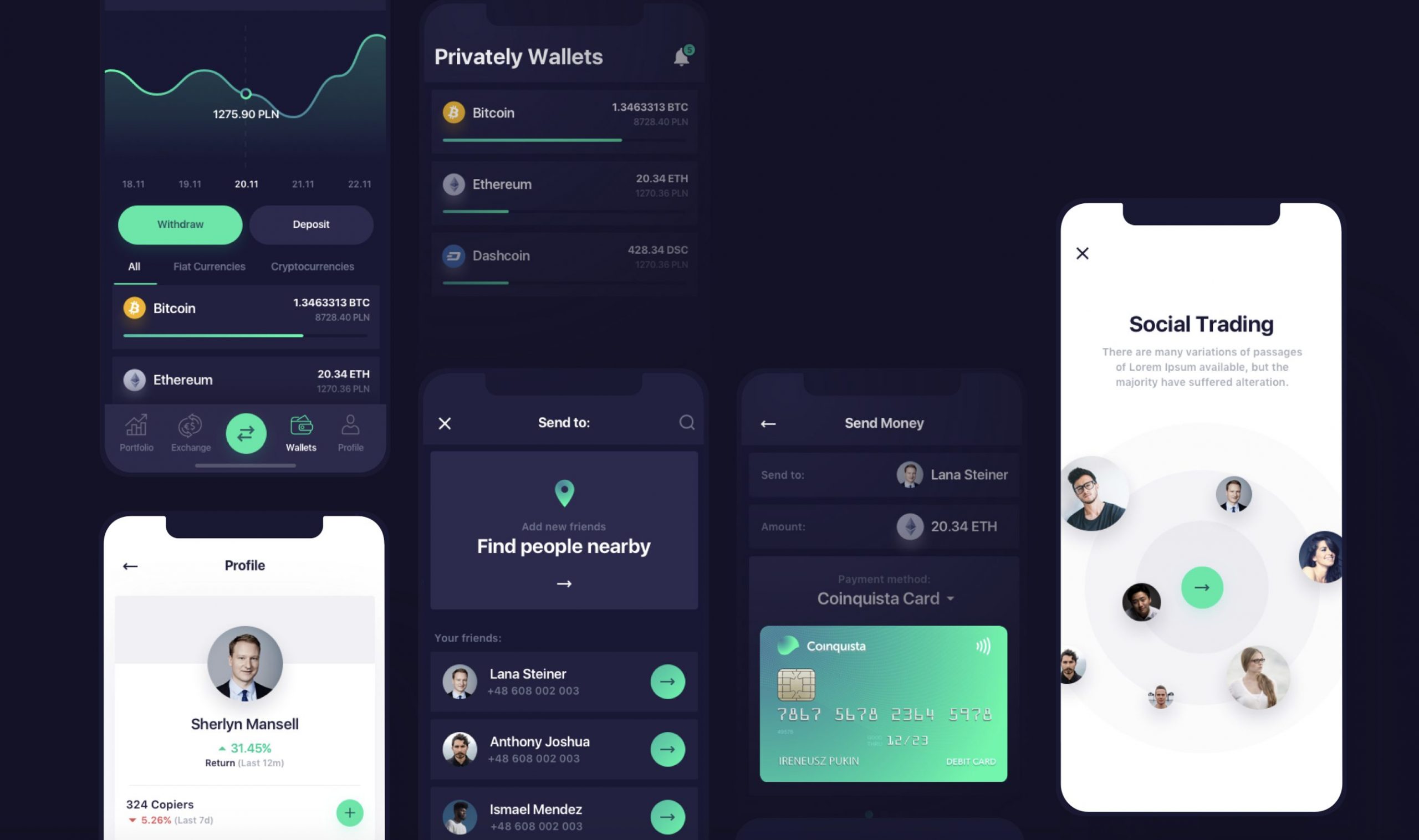
Coinquista is a company that pioneered cryptocurrency trading in Poland. This is an app they developed, designed by 10Clouds, a software house based in Poland. What we like about this interface design is that the darker background helps the information stand out more. Moreover, the app is designed that FIAT and cryptocurrency transactions between users are smooth and fast.
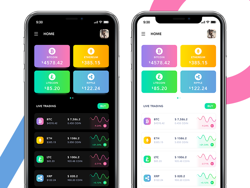
Asha Rajput is the creator of this concept design for a cryptocurrency app. What we like about this design is that it gives its users a quick overview of the market. It’s also visually pleasing because the bright colors work well against the dark and light themes. With its simple layout and attention-grabbing colors, absorbing information from the app makes it easier.
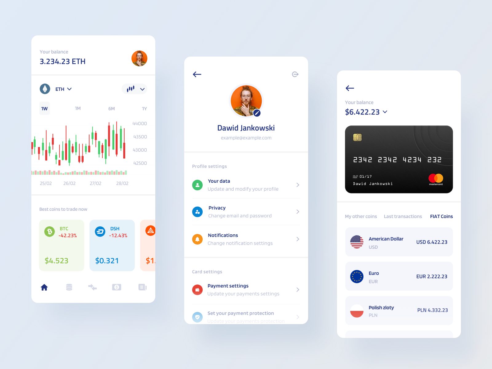
If you’re designing a crypto wallet app with market data, Dawid Jankowski‘s design is a great reference! It has a simple layout, clear labels, and easy-to-understand functions. Another feature he added in his design is that you can easily access crypto articles – helping you be up-to-date with the industry. If your style is clean and simple with a flash of color, this is a great example. The second part of his design can be seen here.
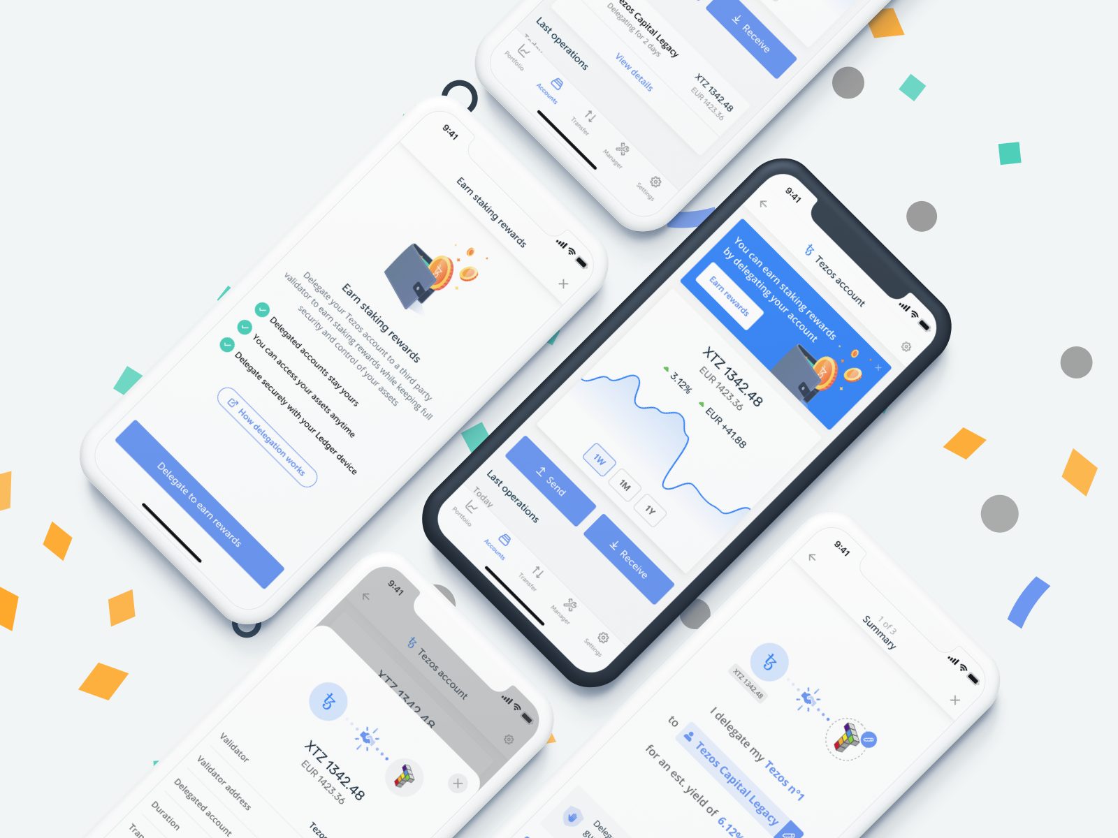
This is a design for an app that does staking. For those unfamiliar with what staking is, it is an alternative to mining. Users hold their funds in a crypto wallet which supports the operations of a blockchain network. In return, they receive rewards for their contributions. If we compare it to bank terms, it’s earning interest in your bank account. Khalil Benihoud‘s the creator of this particular design for the Tezos network. The design only uses two colors, white and blue, making the design very easy on the eyes. Moreover, his design uses an appropriate ratio of white space and words. This makes the app look neat, and makes the digestion of information much easier.
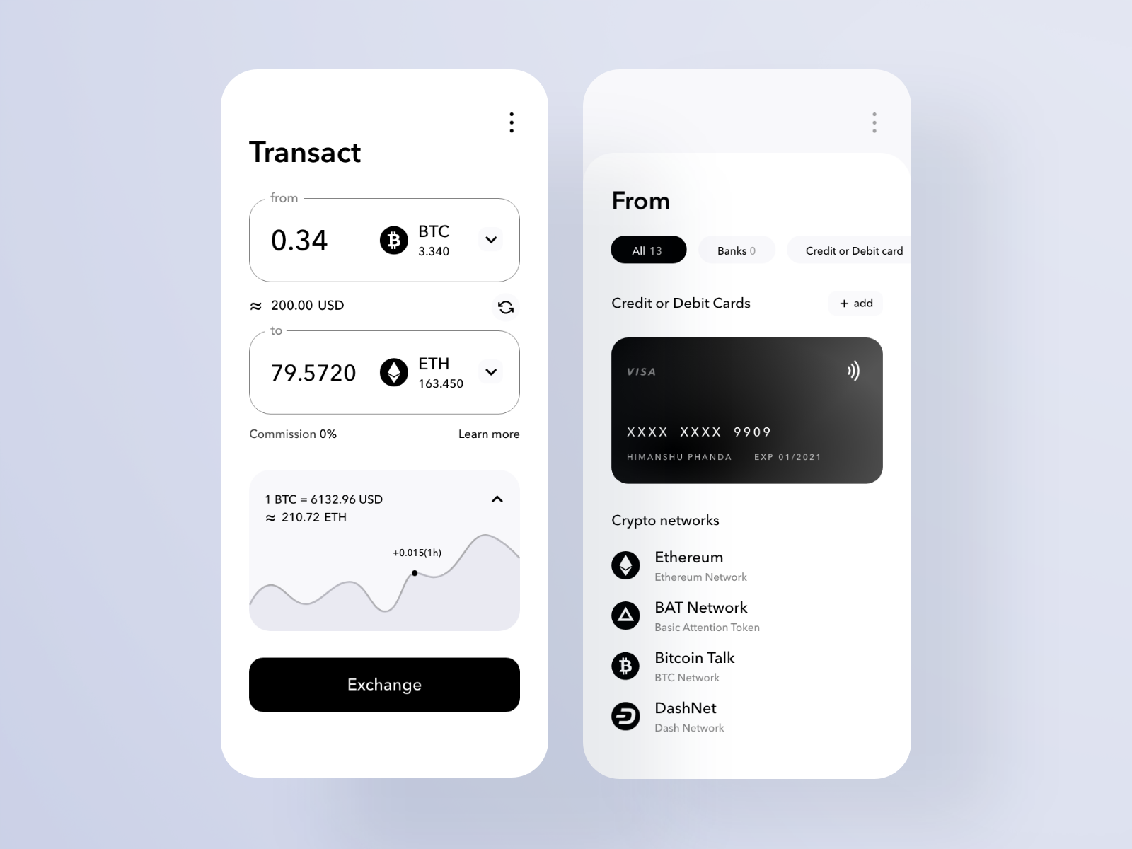
For those looking for a classic, black and white design – this should be a great reference. If we’re looking for a minimalist app, Himanshu Phanda successfully does that with his cryptocurrency app UI design. One of the things to consider when creating a great UX design is to minimize jargons as much as possible – and this app exactly does that. There is minimal word usage and only retaining important labels. With this kind of design, even beginners can easily navigate within the app. Another thing we like about this one is the chart representation by using a single line and a dot. It clearly visualizes the ups and downs of the chart but you can easily pinpoint when the change happens as well.
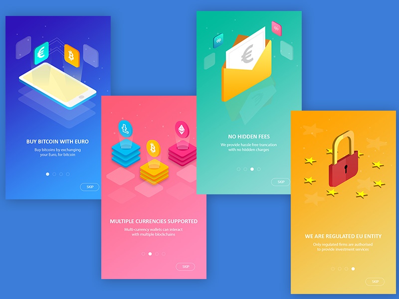
While these are not exactly a complete design for a cryptocurrency app, Kapil UXer designs onboarding screens for apps. For a topic that only limited people are familiar with, onboarding screens are a great feature to add to your designs. These onboarding screens not only educate users about your app, but it also lets them know benefits and even hidden functions that a first-time user would normally never know. If the app that you’re designing has complex functions, onboarding screens like these can greatly help your users.
If you plan on creating a cryptocurrency portfolio tracker app, consider this feature. What’s great about Nina Geometrieva‘s crypto portfolio tracker design is the use of visuals. Her design is a creative way of showing how well your portfolio is doing. Crypto portfolio apps allow you to view and monitor the different assets you have and it may be overwhelming if you have multiple coins owned. With this design, Geometrieva wanted to create a visual aid that would “would require zero brainpower and it would be very glanceable.” Another thing to note of in her design is that each coin owned is represented by a different shape. The shapes change colors depending on whether it goes up or down, plus the size of the shape also represents how much the coin is contributing to the percentage.
For other cryptocurrency app designs, you may visit dribbble and share with us what’s your favorite!