Creating a responsive dropdown menu is a tricky task. There are many decisions you have to make, in both the design and development phases. Recommended solutions usually depend on the characteristics of the website or application you’re building. However, there are also some general best practices that are recommended for all types of responsive dropdown menus.
I collected these best practices while writing my how to build a responsive navigation bar with flexbox tutorial. As it’s more of a hands-on tutorial, I didn’t have much space to explain what design and development decisions had to be made—so here you are. These recommendations are not just for flexbox menus but any kind of responsive dropdowns.
1. Use Mobile-First Design
Problem
Although it might seem easier to design a menu first for desktop screens then adapt it to smaller viewports, this is usually not the case—especially if your menu has a dropdown submenu.
If you design the menu for desktop first, it can quickly get complicated and you can end up with a very long menu on mobile that users just keep scrolling and scrolling without ever reaching the end!
Solution
You can implement mobile-first design by using min-width media queries instead of max-width ones:
@media all and (min-width: 960px) {
    // ...
}
With min-width media queries, the mobile design will be the default and you’ll add rules by moving up first to tablet, then to desktop screens (or, in some cases, you don’t even need a separate design for tablet).
This is also important from a performance point of view. If you use mobile-first design, smartphones (frequently accessing your site over a metered data connection or patchy wifi) have to evaluate fewer style rules, as they can skip over the media query blocks.
2. Reorder Menu Items
Problem
In many cases, you may want to show menu and submenu items in a different order on mobile, tablet, and desktop screens, but want to keep the HTML outline logical and accessible.
Solution
With the order property, you can change the visual order of menu items while keeping the DOM unchanged.
As a rule of thumb, menu items in the HTML outline should follow an order that’s the best for users of screen readers and other assistive technologies. Don’t forget that search engine bots are also similar to screen readers in the sense that they only see the HTML outline but not the visual order.
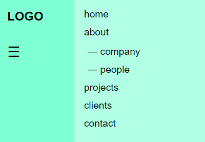
Here’s an example of a menu consisting of call-to-action buttons and menu links. We want the call-to-actions (CTAs) to appear at the beginning of the menu on mobile and tablet and at the end of the menu on desktop. In the HTML, menu links will come first (however, this is not a must, as in some cases, you might want to put the call-to-action buttons first for screen reader users).
<nav>
        <ul>
            <li class="mlink">Menu Link 1</li>
            <li class="mlink">Menu Link 2</li>
            <li class="mlink">Menu Link 3</li>
            <li class="cta">CTA 1</li>
            <li class="cta">CTA 2</li>
        </ul>
    </nav>
As the default value of order is 0, you don’t have to change it for the first element. For the second element in the visual order, its value will be 1. For the third one, it will be 2, and so on. Note that order can also take negative values. So, the CSS will look as follows:
ul {
    display: flex;
}
.mlink {
    order: 1;
}
@media all and (min-width: 960px) {
    .mlink {
        order: 0;
    }
}
Note: the order property works only with the flexbox and CSS grid layouts, so if you want to use it you need to add either display: flex; or display: grid; to the parent menu item.
3. Use Event Listeners on Mobile and Tablet
Problem
On desktop, the submenu is usually activated using the :hover pseudo-class. When users hover the parent menu item, the associated submenu pops up on the screen. When they move their mouse away, the submenu disappears. However, there’s no :hover on mobile, tablet, and other touch devices.
Solution
By using JavaScript event listeners, you can open and close the submenu whenever the user clicks/touches the parent menu item. The addEventListener() method is part of the DOM API and built into every modern browser up from IE9.
The following code example is from my flexbox menu tutorial mentioned above, and it adds or removes the .submenu-active class whenever the user clicks the parent menu item. The display styles of .submenu-active can be added with CSS.
/* Activate Submenu */
function toggleItem() {
  if (this.classList.contains("submenu-active")) {
    this.classList.remove("submenu-active");
  } else if (menu.querySelector(".submenu-active")) {
    menu.querySelector(".submenu-active").classList.remove("submenu-active");
    this.classList.add("submenu-active");
  } else {
    this.classList.add("submenu-active");
  }
}

/* Event listeners */
for (let item of items) {
    if (item.querySelector(".submenu")) {
      item.addEventListener("click", toggleItem, false);
    }
}
The for...of loop loops through all the menu items, then the if block picks those that have a submenu and adds a click event listener to them. The custom toggleItem() function is called whenever the user clicks/taps a menu item with a submenu.
There are many events in the DOM API that you can target with event listeners. For touch devices, click and touchstart are the most frequently used ones. Above, we have used click as it works for both click and touch, while touchstart only works for touch but not click.
Note: you can target only one event type with the addEventListener() method. This is an important difference compared to jQuery where you can add more than one event to the on() method used for event listeners.
4. Choose Between Click and Hover on Desktop
Problem
Now that your submenu works on mobile and tablet devices, here’s another problem: on desktop, you may want to enable users to display the submenu on hover instead of click. However, if you have already added the click event listener to show the submenu on touch devices, the desktop menu will react to both click and hover.
The two user actions can easily interfere with each other, which can lead to confusion or, in some cases, even break the layout of the menu.
Solution
On desktop viewports, you need to decide if the submenu will be shown on hover or click. Generally, I’d say that if you’re building a web app, choose click, as that’s the behaviour most web app users will be looking for. And, if you’re building a website, choose hover, as it feels more natural on a website.
If You Choose Click
If you decide to keep the click event handler for desktop, there’s a small UX issue to fix. When the user navigates away from the menu area, the submenu will not close itself (which would be the normal behaviour on hover). To close the submenu, the user will have to navigate back to the parent menu item and click it again, which is not the ideal user experience.
To fix this issue, you can use the following script that lets the user close the submenu by clicking anywhere on the page.
/* Close Submenu From Anywhere */
function closeSubmenu(e) {
  let isClickInside = menu.contains(e.target);

  if (!isClickInside && menu.querySelector(".submenu-active")) {
    menu.querySelector(".submenu-active").classList.remove("submenu-active");
  }
}

/* Event listener */
document.addEventListener("click", closeSubmenu, false);
It adds an event listener to the document object and removes the .submenu-active class whenever a click happens inside of the document, but outside of the menu area.
If You Choose Hover
If you choose hover, you’ll need to detect the viewport size with JavaScript and add an extra if statement to the event listener to check if the viewport’s width is smaller than the media query breakpoint. You can use the clientWidth property of the document object to detect the viewport’s width (excluding any scrollbar).
So, in the code above, the event listener loop that calls the custom toggleItem() function will change as follows:
if (document.documentElement.clientWidth < 960) {
  for (let item of items) {
      if (item.querySelector(".submenu")) {
        item.addEventListener("click", toggleItem, false);
      }
  }
}
In the CSS, you’ll need to add the rules responsible for the submenu layout on desktop to the :hover pseudo-class.
5. Use the <a> Tag Without the href Attribute for Empty Parent Menu Items
Problem
Many times, parent menu items only serve for opening and closing the belonging submenu, but they don’t link to anywhere. However, if you want to keep the HTML outline consistent and the CSS stylesheet simple, you’ll need to add the <a href="#"> anchor tag to these “empty” menu items as well.
In that case, however, when the user clicks the parent menu item to open or close the submenu, the page will reload and jump up to the top on mobile devices. This is especially bad if you have a long menu.
Solution
A frequent solution to this problem is adding the "javascript: void(0);" value to the href attribute. However, this is considered a bad practice, as it uses a pseudo URL that returns undefined as value that can result in different errors and unexpected behaviour.
The easiest way to handle this problem is using the <a> tag without a href attribute for these empty menu items, which is a valid solution, as href is not a required attribute. According to the W3C docs:
“The
hrefattribute onaand
areaelements is not required; when those elements do not havehrefattributes they do not create hyperlinks.”
However, there are two problems with empty <a> tags:
- They are not keyboard accessible, as they are omitted from the default tab order. You can solve this by adding the
tabindex="0"attribute to each<a>tag that doesn’t have ahrefattribute. - Even if empty
<a>elements are included in the tab order, users can’t open/close the associated submenu by hitting Enter on their keyboard. This can be solved by creating an event listener for thekeypressevent.
So, this is how the HTML will be structured:
<ul class="menu">
    <li class="item"><a href="home.html">Home</a></li>
    <li class="item"><a href="about.html">About</a></li>
    <li class="item has-submenu">
        <a tabindex="0">Services</a>
        <ul class="submenu">
            <li class="subitem"><a href="service1.html">Service 1</a></li>
            <li class="subitem"><a href="service2.html">Service 2</a></li>
            <li class="subitem"><a href="service3.html">Service 3</a></li>
        </ul>
    </li>
    <li class="item has-submenu">
        <a tabindex="0">Plans</a>
        <ul class="submenu">
            <li class="subitem"><a href="plan1.html">Plan 1</a></li>
            <li class="subitem"><a href="plan2.html">Plan 2</a></li>
            <li class="subitem"><a href="plan3.html">Plan 3</a></li>
        </ul>
    </li>
    <li class="item">li><a href="blog.html">Blog</a></li>
    <li class="item"><a href="contact.html">Contact</a></li>
</ul>
For the event listener, you can use the same custom toggleItem() function we created for opening/closing the submenu. You just have to add a keypress event listener to the above for...of loop in the following way:
for (let item of items) {
    if ( item.querySelector(".submenu")) {
      item.addEventListener("click", toggleItem, false);
      item.addEventListener("keypress", toggleItem, false);
    }
}
6. Make Icons Available Offline
Problem
If you use online icon font libraries such as Font Awesome to add icons to the dropdown submenus, such as the frequently used down arrow, the icons will disappear when the website/app is accessed offline. Note that offline availability is also an accessibility issue.
Solution
The solution is relatively easy for this problem. Instead of loading icon libraries from a CDN, you can also load them locally. For instance, here’s how you can host Font Awesome yourself. If you only load the parts of the libraries that you do use on your site, you might even save on page load—even though this also depends on how the particular icon library is structured.

That’s It for Responsive Dropdown Menu Best Practices!
Building a responsive dropdown submenu is seemingly easy, however, there are many details you need to pay attention to. It needs to work on different devices, properly react to different events, be accessible to keyboard users, be available offline, and more.
If you think through the use cases your website or application will be typically accessed, it will be easier to decide how to address all the issues that can arise when users will be trying to use your submenu.
Have any other best practices you think we didn’t mention? Let us know!
Fork This: Responsive Dropdown Menu Solution
Check out my responsive dropdown menu on CodePen, which uses all the best practices we’ve covered in this guide. Fork it, and change it to suit your own projects!
Learn More About Navigation Design on Tuts+
We have many more tutorials on navigation design on Tuts+, dive in and get learning!
 FlexboxHow to Build a Striped Navigation With Flexbox
-
Bootstrap 4How to Make the Bootstrap Navbar Dropdown Work on Hover
-
Navigation DesignHow to Build an Off-Canvas Menu With CSS and a Touch of JavaScript
-
UX3 Principles for Strong User Experience Through Navigation


