To establish a modern business, you need to create a website. Websites are precious. They provide quick access to the essential information and services a company offers. It is great to have an excellent online presence – and sites allow just that. However, many users expect a particular web design one business to furnish. It shows professionalism and sophistication.
After all, a good User Experience (UX) walks visitors between web elements. Not only it gives simplicity and intuitiveness, but it also boosts website conversions. It focuses on understanding the users’ needs, preferences, and capabilities. However, it also acknowledges their limitations.
Since it takes less than a second for visitors to decide about your website, it is vital to create an eye-catching composition. Combine distinctive elements and see how your website performance progresses. With these tips, you can improve your websites UX and flourish your business.
Have a user-first mindset
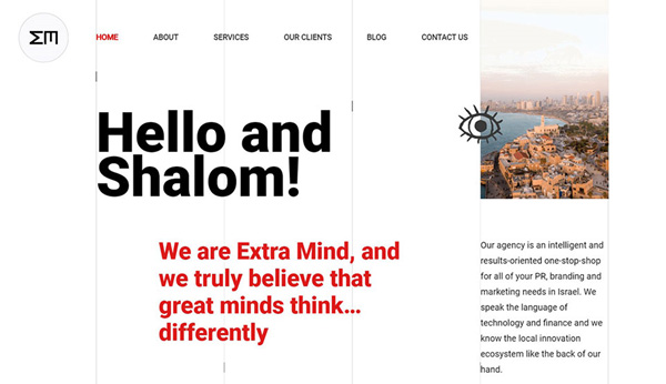
A great website must satisfy the customers and profits from them at the same time. It must deliver a great user experience (UX). You can define UX in many ways but keep it simple. The exciting thing about designing for user experience is you succeed when the design is undetectable to the customer. The user doesn’t experience clutter on your website, and immediately find the content they’re after.
Allow White Space

A crucial key element of a great website is white space. Creating a negative space (margin) around will make your text and illustrations stand out. But filling text and titles with white space is proven to increase user’s attention by 20%. This will make your website sophisticated and easy to use. It shows off the attractiveness and readability of your content.
Color
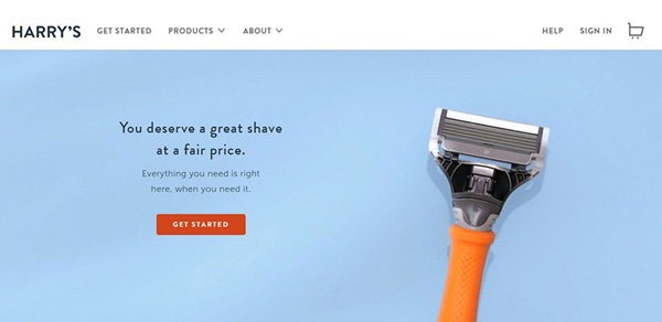
Color is incredibly valuable to web design. Make sure to invest time in researching color psychology. Think about color and how it affects people. Research on how color works in the marketing world. How it changes feelings and inspires actions from people. Also, think about the message you want to send to your users.
Optimize your page speed
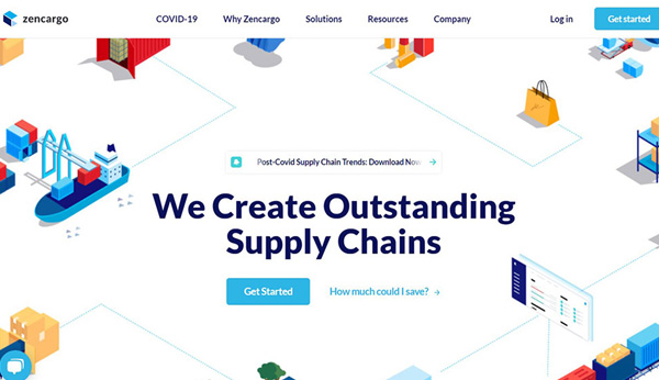
What drives low conversions is a low webpage speed load. Waiting for a page to load can be frustrating. It encourages visitors to go away, thus resulting in less traffic and conversions. To get rid of this problem, you can compress your images for a start. The image file size is one of the leading causes of slow page speed. Make sure you minimize the size before you load it on your website.
Responsive & Mobile-friendly
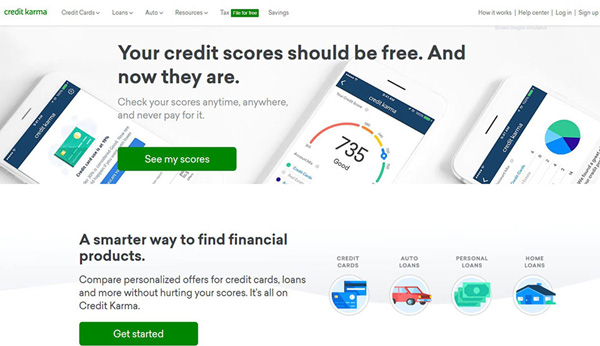
Going mobile-friendly is another secret to success. Nowadays, smartphones drive most of the traffic; this is necessary for your website to be responsive. It ensures better visibility and better response from visitors. Keep in mind that it has to be in high quality as well. That way, you don’t even have to compromise your success.
Write Targeted Headlines
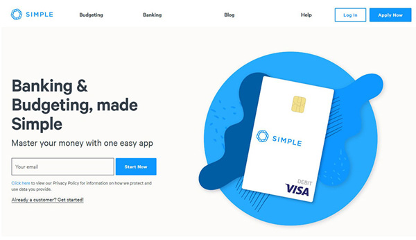
Your headings (and content) should align with what potential customers are looking for. Using keywords in your titles will help you attract the right audience, facilitate browsing, and entice further content consumption. Aside from improving UX, using the correct headlines also impacts search engine optimization (SEO) rankings. Google gives headings more weight than regular content, so targeting the right words will improve your searchability and site experience.
Make the website contact easy
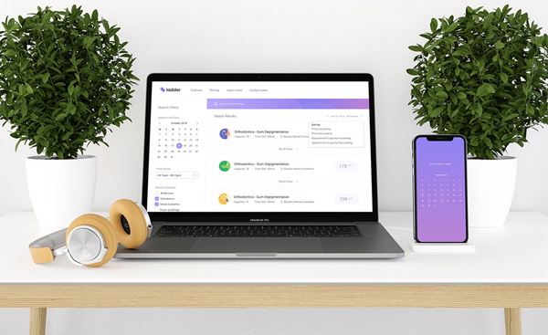
Making your users fill out a form is very old school, especially if you have want to set up a preliminary meeting to filter the people who contact you.
A more smart approach to this is to use a WordPress booking plugin for the prospects to set up appointments with you or one of your team members. Why waste an extra step in your communication when you can set up the meeting in your calendar directly.
Amelia is one of these plugins that you could use. It was created by the people at TMS. If the name sounds a bit familiar, it is because they also created wpDataTables, a neat WordPress table plugin.
Provide Engaging Content
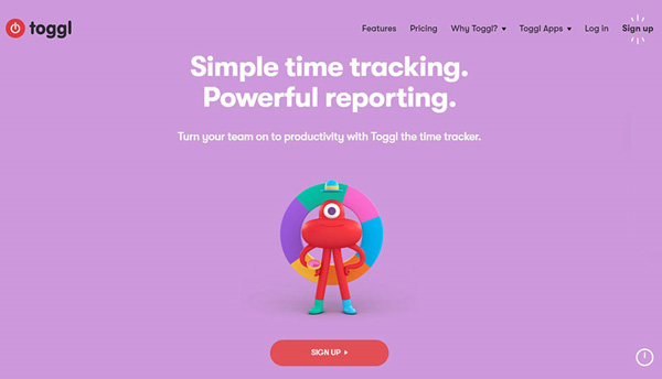
When landing on a page, most consumers are looking for a memorable experience rather than a purchase. You can execute this by providing a fresh and engaging contents strategy. These strategies focus on creating a unique story – something all users connect to. These stories establish a personal and intimate connection between your business and the clients. It will create a trusting bond between them. If they are familiar with the brand’s story, they will be more likely to trust you after reading the content.
Create Appealing Calls to Action
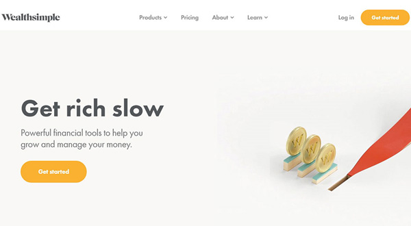
To help your users navigate your website, you need to create visual cues to follow. Buttons and words, also known as CTA(Calls to action), encourage users to take the next step. Again, when creating these buttons, remember the impact of color. Applying different colors can envoke different results. Be careful, since one wrong color can be deleterious to your success.
Segment key information with bullet points
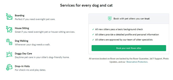
If you want to quickly guide the users thought the necessary information, use bullet points. They are great if you’re going to highlight the:
- Advantages of a product/service
- Your answer to the customer’s dilemma
- Key traits of a product/service
Overall, Bulleting helps you isolate the most significant points you’re trying to make without getting caught up in terminology or specifics.
You can also get creative with the bullet points. They don’t have to be in circles. There are many icons which you can use instead. Get creative and help your readers further with symbols that represent your point.
Motion and Animation
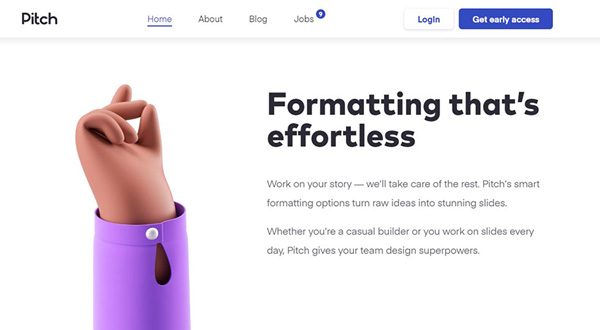
Using movements and animations can benefit you in infinite ways. It can attract users towards a specific activity. They are also good to use them if you want to present characteristics or notifications on the said website. However, keep in mind that using these elements in titles and paragraphs is a big no. They can be diverting the attention away from the content, and look very inadequate if placed there.
Choose Original Images
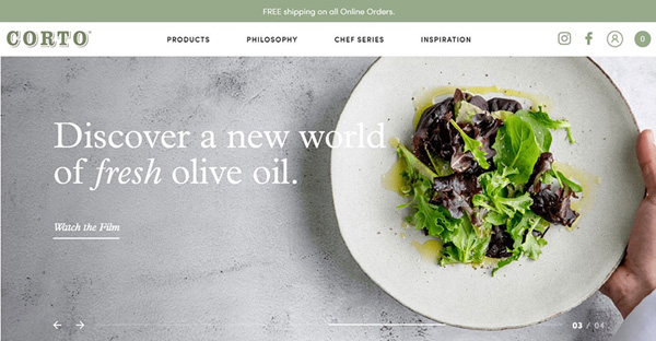
Today’s internet users are harsh judges of company websites, so it’s best to avoid stock photography. Customers easily identify generic photos, which make them quickly ignored and less trustworthy. Visual content is increasingly relevant to consumers. Whether they are photos of employees or your product, authentic images will help create a unique and pleasant web experience your customers desire.
Consider Adding Videos
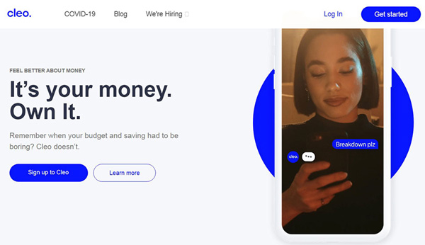
Videos are also an excellent feature to add to your UX design. Apart from keeping visitors’ attention longer, they can also portray things as they are. People trust things that look realistic. Videos can also present the distinct features and characteristics of a product. It can help people get closer to it and understand the product better.
Understanding the value of user experience can help you gain more income. Please think of the websites that you were most impressed with and figure out what makes them so likable. Implement those components to your website and see just how the number of visitors will skyrocket.

