Getting Started with Angular 2
Angular 2 is the shiny new framework that comes with a lot of new concepts. Learn all the great new features.
Wait a minute… What is transclusion?
Understanding Transclusion
Don’t get confused by the term Transclusion. It’s best explained using an example.
Let’s say we have a card component. It has a header, body, and footer.
- The card layout (3 sections) and color (grey background for header and footer) are always fixed.
- The card header and footer always allow text.
- Any content is allowed in card body.
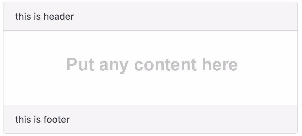
Here are a few examples of how we can use it:
How can we display the content in the card body?
We have a problem now. We want the header and footer content to be fixed, but we also want to allow a user to add dynamic content to the body section.
How can we do this? Transclution is the answer.
Transclusion is a way to let you define a fixed view template, and at the same time allow you to define a slot for dynamic content by using <ng-content> tag.
Interesting? Let’s start to build our card component!
Here is the live example of our demo.
App structure
Here’s our file structure:
|- app/
    |- app.component.html
    |- app.component.ts
    |- app.module.ts
    |- card.component.ts
    |- card.component.html
    |- main.ts
|- index.html
|- systemjs.config.js
|- tsconfig.json
Basic transclusion (Single Slot)
The most basic transclusion is just to define a single dynamic content area, or we call it single slot. Let’s code our card component.
The Card Component Class
// card.component.ts

import  Component, Input, Output  from '@angular/core';
@Component(
  selector: 'card',
  templateUrl: 'card.component.html',
)
export class CardComponent
    @Input() header: string = 'this is header';
    @Input() footer: string = 'this is footer';
@Input is a decorator. It that allow us to pass data from the parent to child. In our case, both header and footer allow string input from its parent component.
The Card Component View
This is how our view look like:
<!-- card.component.html -->

<div class="card">
    <div class="card-header">
         header
    </div>

    <!-- single slot transclusion here -->
    <ng-content></ng-content>

    <div class="card-footer">
         footer
    </div>
</div>
Using our card component
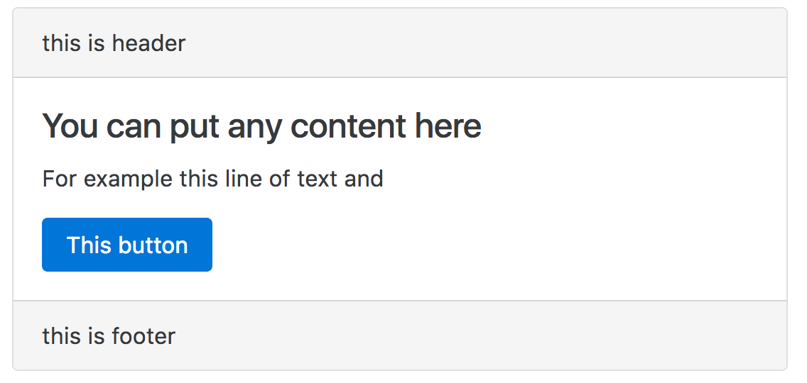
We’ve completed our card component. Let’s use it now. For example, if we want to use it in another component called AppComponent, here is how you can do it.
<!-- app.component.html -->

<h1>Single slot transclusion</h1>
<card header="my header" footer="my footer">
    <!-- put your dynamic content here -->
    <div class="card-block">
        <h4 class="card-title">You can put any content here</h4>
        <p class="card-text">For example this line of text and</p>
        <a href="#" class="btn btn-primary">This button</a>
      </div>
      <!-- end dynamic content -->
<card>
Hook it up in App Module
import  NgModule       from '@angular/core';
import  BrowserModule  from '@angular/platform-browser';

import  AppComponent    from './app.component';
import  CardComponent  from './card.component'; // import card component

@NgModule(
  imports:      [ BrowserModule ],
  declarations: [ AppComponent, CardComponent ], // add in declaration
  bootstrap:    [ AppComponent ],
)

export class AppModule
Done! Save and run it. The transclusion slot <div class="card-block">...</div> will replace the <ng-content></ng-content> in our card component. This is how easy we can do transclusion.
Transclusion Slot Selector
<ng-content> accepts a select attribute, which allow us to sort of name our slot, to be more specific, it allow us to define the selector of our slot. Open our card component view, let’s make some changes.
<!-- card.component.html -->

<div class="card">
    <div class="card-header">
         header
    </div>

    <!-- add the select attribute to ng-content -->
    <ng-content select="[card-body]"></ng-content>

    <div class="card-footer">
         footer
    </div>
</div>
Notice that we add select=[card-body]. The square bracket [] means attribute. It means “Replace me only if the element has card-body attribute”.
Then, we change our app component view to include the card-body attribute.
<!-- app.component.html -->

<h1>Single slot transclusion</h1>
<card header="my header" footer="my footer">

    <div class="card-block" card-body><!--  We add the card-body attribute here -->
        <h4 class="card-title">You can put any content here</h4>
        <p class="card-text">For example this line of text and</p>
        <a href="#" class="btn btn-primary">This button</a>
      </div>

<card>
Save and run, everything is still working as previous.
Now, try to remove card-body from the app component view see what will happen — Nothing will show up in the card body.
It is because we have defined <ng-content> in the card component that only element with card-body attribute can replace the slot.
Selector is Powerful
The select attribute in <ng-content> is very powerful. You can define different patterns of selection. We’ve just demo one just now. Here are some examples on how you can use that.
Using Attribute with Value
Replace only if the element with specific attribute and value.
<!-- card.component.html -->
...
<ng-content select="[card-type=body]"></ng-content>
...
<!-- app.component.html -->
...
<div class="card-block" card-type="body">...<div>
...Using CSS Class Selector
Replace if the element has specific CSS class.
<!-- card.component.html -->
...
<ng-content select=".card-body"></ng-content>
...
<!-- app.component.html -->
...
<div class="card-block card-body">...</div>
...Using Multiple Attributes or CSS Classes
You can define more than one attribute or CSS Classes:
- Atttributes:
[card][body] - Classes:
.card.body
Here is the example of multiple attributes
<!-- card.component.html -->
...
<ng-content select="[card][body]"></ng-content>
...
<!-- app.component.html -->
...
<div class="card-block" body card>...</div>
...Using an HTML Tag
You can use an HTML tag too.
<!-- card.component.html -->
...
<ng-content select="card-body"></ng-content>
...
<!-- app.component.html -->
...
<card-body class="card-block">...<card-body>
...
However, you will hit an error if you use the <card-body> tag now.
Unhandled Promise rejection: Template parse errors:
‘card-body’ is not a known element
Angular 2 does not recognize the card-body tag. card-body is neither a directive nor a component. A quick way to get around this error is to add schema metadata property in your module, set value to NO_ERRORS_SCHEMA in your module file.
In our case, we do it in our app module.
// app.module.ts

import  NgModule, NO_ERRORS_SCHEMA       from '@angular/core'; //
import  BrowserModule  from '@angular/platform-browser';

import  AppComponent    from './app.component';
import  CardComponent  from './card.component';

@NgModule(
  imports:      [ BrowserModule ],
  declarations: [ AppComponent, CardComponent ],
  bootstrap:    [ AppComponent ],
  schemas:      [ NO_ERRORS_SCHEMA ] // add this line
)

export class AppModule
Multi-Slot Transclusion
By using the select attribute, we can define multiple transclusion slots! Let’s modify our card component, to allow transclusion slots in header and footer too.
<!-- card.component.html -->

<div class="card">
    <div class="card-header">
    <!-- header slot here -->
        <ng-content select="card-header"></ng-content>
    </div>
    <!-- body slot here -->
    <ng-content select="card-body"></ng-content>
    <div class="card-footer">
    <!-- footer -->
        <ng-content select="card-footer"></ng-content>
    </div>
</div>
Using our card component:
<!-- app.component.html -->

<h1>Multi slot transclusion</h1>
<card>
    <!-- header -->
    <card-header>
        New <strong>header</strong>
    </card-header>

    <!-- body -->
    <card-body>
        <div class="card-block">
            <h4 class="card-title">You can put any content here</h4>
            <p class="card-text">For example this line of text and</p>
            <a href="#" class="btn btn-primary">This button</a>
          </div>
    </card-body>

    <!-- footer -->
    <card-footer>
        New <strong>footer</strong>
    </card-footer>
<card>
Summary
Which type of selector should we use? Attribute, HTML tag, or CSS class or something else? It depends. My personal preference would be an attribute because it’s readable. An HTML tag is also readable but you need to add schema in module metadata.
I would suggest to avoid CSS class selector if possible because it is not intuitive. It doesn’t tell the user know it’s a transclusion slot at first glance, until you read the card component sourcode. However, it’s up to your decision.
That’s it. Happy coding.