Now that iOS 12 is out and some users have upgraded to the operating system, you’ll want to start revising your application to take advantage of the new features of iOS 12 notifications.
What’s new in iOS 12 Notifications?
iOS 12 brings a number of changes to how notifications work. While no single change completely overhauls the system, notification functionality is now significantly extended. Designers and developers would do well to learn about iOS 12 notifications and incorporate them into their apps.
Designing iOS 12 Notifications
Notification design isn’t just the text and visual appeal. It also includes how often notifications appear, and how the user can interact with them.
Notification Stacking
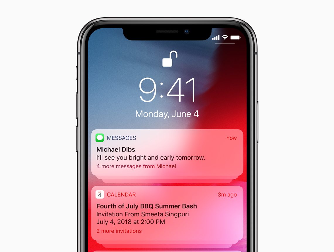
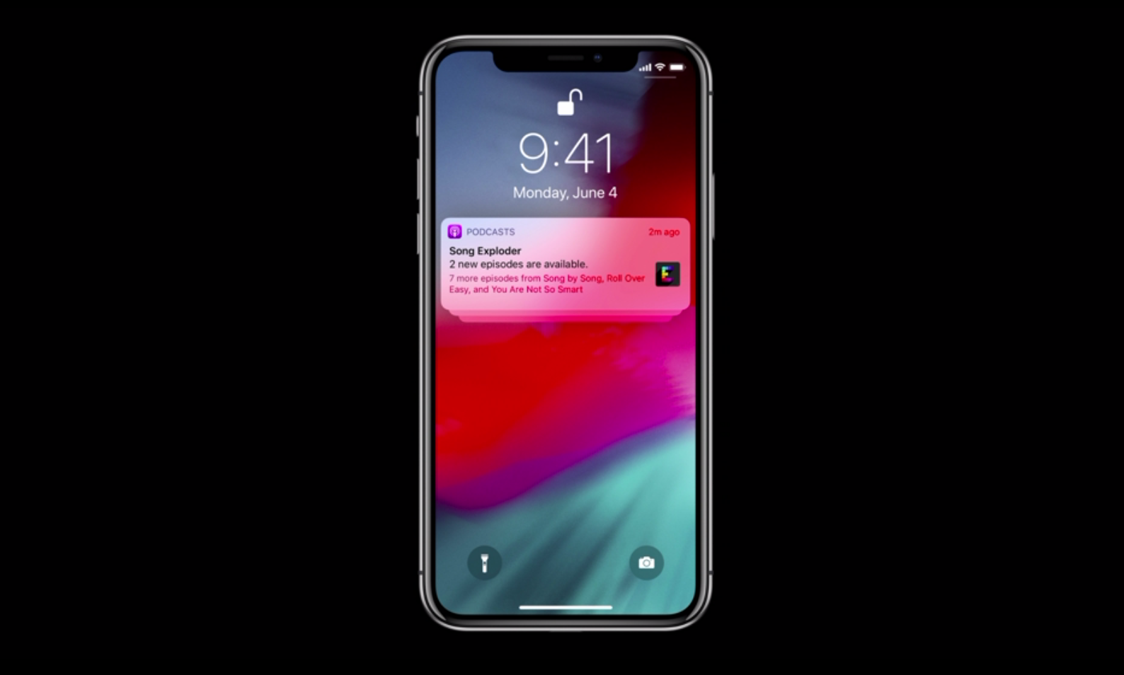
The most obvious visual change to the notification interface is notification stacking. This allows multiple notifications from the same app to “stack” on top of one another, reducing the screen real estate they occupy on the lock screen.
By default, notifications will stack based on their app. Only the top, or leading, notification will be visible. Other notifications from the same app will stack beneath them, with a contextual dialog indicating how many more notifications are in the stack.
However, you can adjust this behavior by changing the thread ID of the notification. You may already be doing this, since thread IDs were introduced in a previous version of iOS. These thread IDs should match the model of your application as well as its functionality.
When organizing your thread IDs, it makes sense to separate things like conversations from one another. This helps the user understand what is actionable and better fits with the typical user mental model of each conversation being a different task. Be sure to also separate about important or vital notifications from the clutter to ensure they don’t get shelved behind less important updates.
Deliver Quietly
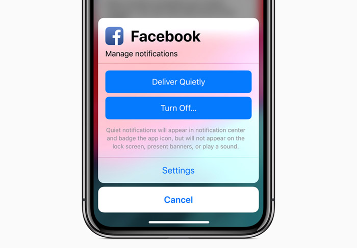
Users can also choose to have notifications from particular apps delivered “quietly.” The goal is that notification-heavy apps won’t go completely silent, but they also won’t buzz the user’s phone ever five minutes. The “Deliver Quietly” switch disables banners and sounds for notifications, but the notifications still appear in the notification center.
This means you should think carefully about how often you’re bothering the user. Since they have the power to effectively silence your app at the flick of a notification, you may want to be more judicious in your use of notifications. Try to only bother the user for important events rather than engagement nags. This will help ensure your app isn’t silenced by an annoyed user.
Building iOS 12 Notifications
Notifications can now do more, however. There’s authorization options, dynamic quick actions, and user interaction within notifications. All these interaction paradigms are new for the notification intent, so you’ll want to brush up on what they are and how to incorporate them into your application.
This all comes from a change to how the notification content extension, UNNotificationContentExtension, works. Previously, the content extension only permitted the use of a view controller to structure the UI of the notification. In iOS 12, the view controller in the content extension now supports user interaction. This means notifications are more powerful and customizable, allowing meaningful interaction with your application’s functionality from a notification.
To make interaction useful, you’ll need to work on adding buttons and switches to your notification UI. Placement of these objects is controlled as ever by the notification content extension. Logic is linked to actions, which are linked to user interaction points.
The notification content extension also allows for considerably more visual customization that most apps take advantage of. If you’re rearranging your notifications to take advantage of user interactivity features, now might be a good time to consider exploring custom layout options.
Using the notification content extension, you can customize the placement of items, change default fonts, include app-specific data and build in custom images and branding. These are all handled through the notification content extension and are revealed when a user taps on the icon. Before they tap on your notification, users will only see the default notification. But as notification interactivity becomes a more common mode of use, users will be more likely to tap on your notification to reveal interactivity options.
Conclusion
iOS 12 doesn’t bring the complete overhaul to notifications that some previous iOS versions have foisted upon designers and developers. But the changes made are significant, and worth noting. This is especially true for user interaction. The more interactive touch points you can have, the more users will engage with your app and content. While this must always be balanced against clutter and noise, user interactivity in iOS 12 notifications marks a brand new tool for designers and developers.
You might also like the following posts: