
The best banner ads capture our attention and are irresistible to click. What goes into these effective ads? Discover ten tips to creating the best banner ads.
Are you struggling to come up with creative and engaging banner ads for your business? Having people interact and be interested in your ads is difficult if you don’t know how to encourage clicks.
Let’s take a look at the top tips for designing the best banner ads, driving lead conversion, and encouraging customer growth.
Tips for the Best Banner Ads
There are some tips that will make your banner ads successful if you implement them into your design today. Not only will they take your design to the next level, but will encourage customer growth.

1. Standard Size Banner Ads
Having the correct banner size is an important detail that should not be missed. There are different sizes of ads depending on what you purchase. Making sure you stick to the correct size will ensure your ad isn’t getting cut off on the ends.
There are four standard sizes you buy that include:
- Large rectangle (336x280px)
- Medium rectangle (200x250px)
- Half Page (300x600px)
- Leaderboard (728x90px)
When you purchase banner ads, it doesn’t matter what the size is if the location is bad. When your ad is above the fold, users are more likely to see it and engage with its content.
At the same time, if you are going to try and make banner ads within an online editor or design software, you can find a list of great design tools in this expert roundup with nearly 20 different recommendations and tips to follow. This allows any blogger, brand, or business the opportunity to create banner ads and split test, without having to blow through a massive budget in the process.
2. Hierarchy of Design
Having a good banner ad design is crucial. If your ad is poorly designed, it’s easy to skip over, ignore or judge it. Hierarchy is an important piece of this design. They need to have specific elements that bring the customer back to your brand and website.
Your company’s logo is an item you must have on your banner ad so potential clients can see who the ad is from and to build brand awareness. A value proposition is also a must-have on the best banner ads as it calls attention. This value proposition can be a coupon, offer, sale or feature.
The hierarchy must have a call to action. What are you asking the user to do? Click on your ad to purchase your product on sale? Give your business a phone call? Determine your call to action and make sure it’s clear and visible.
Your design hierarchy is important and contains a lot of information. Therefore, it’s necessary that your design is simple, concise, and straight to the point.
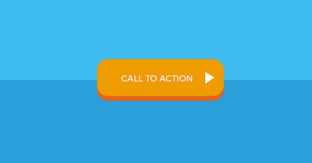
3. Buttons
When you’re developing your call to action, turning it into a button will help improve click-through rates. Use company colors and contrast to entice users to click on the button, and always have the buttons look the same. Adobe banner maker, https://spark.adobe.com/make/banner-maker, helps with designing interactive buttons on banner ads.
You can see a few examples of banners that were created through the Adobe banner maker below.

While the concept of placing buttons within your content or ad creative might not sound that unique or not up to the latest trends, it’s important to realize that some of the most simplistic designs and websites still convert extremely well. Just take a look at sites like Craigslist and eBay, they are both very user friendly and easy to use.
When using buttons within your ad copy and content, always be sure to split test. Changing the text and colors can quickly improve click through rates and conversions.
4. Text
This is not the place to make your text cursive, super fancy, and elaborate. You want users scrolling through a page to be able to identify your text easily and read it quickly. Keep the font bold, non-cursive, and in neutral colors.
Again, sticking with the concept of ‘less is more’ try to keep your text on ad creatives simple and to the point. The more a banner looks like actual content, the more likely it is to get clicked. You can also take a look at any of these recommended paid traffic sources to see the different types of ad copy they are accepting, and some will even listing examples of their top performing ads.
5. Brand
Lastly, it’s important to be consistent with your overall company branding. If it doesn’t look like an ad your company creates, change the elements to match your current branding. This will allow users to identify your brand.
Get Your Ad Out There
Now that you have some great tips in your design arsenal, it’s time to get your ad out there and start testing the waters with a few different designs of your own.
For best results, be sure to go live with at least five different banner designs that you can split test and compare results. Once you find a winner, take that same banner and tweak it a few more times and run the same test. After doing this a few more times, you might be surprised with how much your conversions and click through rates have increased!
Author: Zac Johnson
Zac Johnson is an entrepreneur with 20 years of experience in the world of online marketing and branding. Follow his journey at Blogging.org and ZacJohnson.com.