
Why women in UX?
Ready for an utterly shocking statement? Prepare thyself: women are underrepresented in the tech sector. Oh… you already knew? I should have accounted for the fact that this is a well-documented phenomenon, the Pew Research Center reported that half of all women in STEM-related jobs have themselves reported experiencing gender discrimination at work. (That’s 50% as compared to the 41% of women reporting discrimination at the average workplace. Yikes.)
But UX is different, right? User experience requires empathy, understanding, good listening skills which are all (stereotypically) feminine traits. Women flourish in UX, and oftentimes transition to the role from outside industries such as graphic design, writing, or psychology. In my graduate program at the University of Washington, I enjoyed a whole lot of female company in my UX classes. Many of us aspired to make our favorite sites and apps more intuitive. Professionals that came in to examine our work were women that had made a place for themselves in Seattle’s bustling tech sector.
Anecdotal evidence aside, the majority of senior UX positions are filled by men. Women are a rarity on boards of directors within the tech sector. This is all to say nothing of the fact that there is still a wage gap here and now in an era where certain someones are seriously considering the viability of colonizing Mars. The future is bright, but the present could be brighter.
That’s why I have chosen to write a series of articles on women in user experience. I would argue that there is and perhaps never will be enough acknowledgment of women’s contributions in tech. History has quietly set aside the accomplishments of ladies like the original human computers in favor of the Zuckerbergs and the Musks and the Jobs. I don’t want to participate in this kind of demurring, as I’ll generously call it.
So let’s celebrate women in UX.
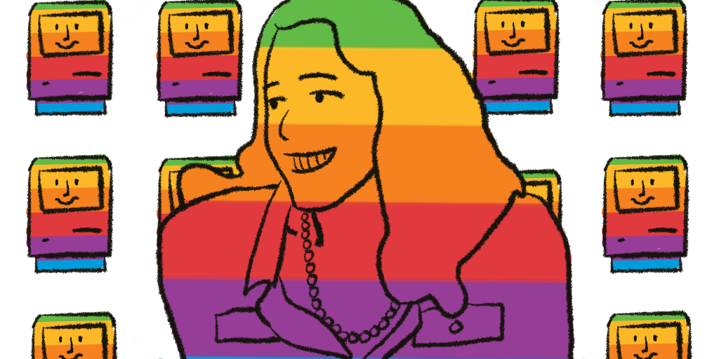
Susan Kare: the OG in user-friendly UX
As UX designers, our goal is oftentimes to make our interfaces seamless, instantly obvious: a shopping cart icon links to a user’s cart, an arrow pointing to the right will lead us to the next step, etc. The cornerstone of human-computer interaction is crafting metaphors like these so that humans can come to understand computers without dipping into the seemingly esoteric world of code. Today, children raised surrounded by screens quickly grasp the visual language of computer interfaces, but it wasn’t too long ago that the term “graphical user interface” seemed like technological gobbledygook best left to the professionals.
Susan Kare was one of the first graphic designers to make computers user-friendly. Previous to her influential tenure at Apple, computers were largely operated through DOS entries that required memorization, patience, and the kind of technological savvy that intimidated the general public. These machines were cold, demanding things that didn’t seem to fit into everyday life. Kare gave “the Macintosh a smile” that welcomed a wider demographic of users. Thanks to her pixel paintbrushes and scissors, Mac’s desktop proved to be a tool that writers, artists, and just about anyone could use.
A few years after receiving her PhD. in fine arts from New York University, Kare received a call from Andy Hertzfeld. We know Hertzfeld as the software wizard who worked alongside other sorcerers on the original Mac OS. Kare, however, knew him as a friend from high school. Hertzfeld was working on that aforementioned operating system, its standout feature an appealing graphical user interface, and he wanted Kare to design icons that had a common-sense approach. Armed with her fine arts education in pointillism, her mother’s lessons in embroidery, and a notebook full of graph paper, she built some of the most iconic icons in Mac’s storied history — including the smiling face that first greeted new Macintosh owners.
Working as what could be construed as one of the first UI designers, Kare was the lone creative in a room filled with software developers. In a 2000 interview with Alex Soojung-Kim Pang, Kare called this arrangement a “relative luxury.” She became familiar with all the functions that she was designing for because of this arrangement and was better able to visually represent what had once been arduous, input-heavy ordeals. Before the dramatic Ridley Scott-directed Super Bowl commercial announcing the Apple Macintosh personal computer, Kare appeared in an Apple ad, explaining the convenience of pressing one single button to print a page.
https://medium.com/media/78bc7b2de0a3c70b82dec29623817783/href
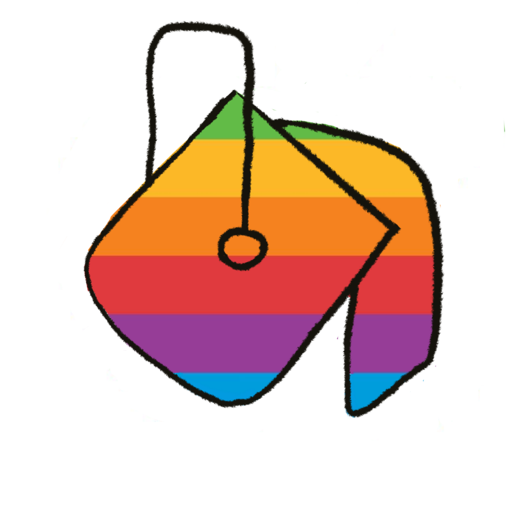
Icons were meant to make things, like printing, easier. But sometimes it wasn’t easy to assign a visual representation to something as ephemeral as the “command” button. Steve Jobs, rather infamously, detested the overuse of his company’s famous icon. So rather than utilizing yet another apple, Kare instead turned to a comprehensive international symbol dictionary and came across “a floral symbol that was used in Sweden to indicate an interesting feature or attraction in a campground.” Andy Hertzfeld remarks in his blog that “twenty years later, even in OS X, the Macintosh still has a little bit of a Swedish campground in it.”
Kare had to keep her international audience in mind when pursuing visual metaphors like the “copy” function. At one point she considered a cat looking into the mirror. Sure, English speakers might catch on to the idea — but what about languages in which “copycats” were a foreign concept? “For while there was going to be a copy machine for making a copy of a file, and you would drag and drop a file onto it to copy it. That was visual for a while, but then it went away. It turned out was hard to figure out what you could draw that people would see as a copier.”
Not only did Kare always try to provide a wealth of designs to choose from, she also participated in what she called “not scientific” user testing, which consisted of gathering opinions of new designs. “When choosing an icon for the fill function in MacPaint, I tried paint rollers and other concepts, but I guess the pouring paint can made the most sense to people. Then there are constraints with a few things that are cursors that have one hot pixel: we tried different things to see what functioned well, and was easy to aim with.”
Ease of use and understanding was at the center of Kare’s designs, and this (arguably) persists in Apple’s visual language to this day. Whimsy was a key part of her process too, something that UX designers like me try to capture in making “delightful” interfaces. There are many things that we can learn from Kare, but here are a few key takeaways from my internet adventure researching the queen of icons:
Take inspiration from unlikely sources
Kare herself was hugely inspired by Paul Rand, the designer behind some of the world’s most recognizable logos. (IBM, ABC, UPS, and other companies who have more than just letters like Westinghouse.) Rand advised artists not to strive for originality, but instead to just try to be good. As another famous saying goes, there is nothing new under the sun. What you’re trying to achieve — even if it is seemingly a first — may have been accomplished somewhere in the annals of history. And thus Kare has turned to various collections of symbols when designing icons: Japanese kanji, hieroglyphs, and even hobo graffiti.
Learn the inner workings of what you’re working on
UX designers oftentimes work as the intermediary between the very technical and the very artsy. It’s important to have at least a rudimentary understanding of both worlds. Kare worked directly with programmers and understood what they were doing enough to fulfill their needs — and vice versa. Early on, Hertzfeld refined the icon editor that she was working with so that she could spend more time designing and less time troubleshooting.
Listen to your users
Of course, Kare cared about what big boss Steve Jobs had to say when he “wandered” in to see what was new, but as we saw, she also cared about what users thought about her icons. Basic advice? Maybe, but it’s something that bears repeating. Even if your user testing is “not scientific” always consider getting input from the people who will actually be interacting with your product.
Who is next?
Let me know who you think deserves recognition and celebration — maybe they’ll be next week’s article!

![]()
Women in UX: Susan Kare was originally published in UX Collective on Medium, where people are continuing the conversation by highlighting and responding to this story.