For quite some time now, Google has given priority to user-centered website and content experiences. More specifically, it wants search results to better reflect user intent, as opposed to just keywords.
In the latest update, content expertise and quality may trump authority, earning higher rankings. That is directly in line with the idea of creating user-centered content on a website. It also shifts to tailored discussions and experiences that offer assistance or support.
But what does it truly mean to create a user-centered website? What should that look like?
1. Make It Fast
Whether browsing on mobile or desktop, the website should be fast, responsive, and easy to use. There’s no excuse for it to be anything but speedy. No one wants to wait around for a site to load content, buttons, or text.
People will leave your site as soon as they experience a bottleneck, too. A load time of 1 to 5 seconds increases the bounce rate probability by as much as 90%. At 1 to 6 seconds the probability is 106%, and 1 to 10 seconds increases the probability to 123%. Even more telling is that those stats are from 2017, and the numbers have likely increased since then.

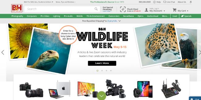
B&H Photo is one of the fastest loading ecommerce websites to date, with a load time consistently under 5 seconds. Some honorable mentions include Best Buy, H&M, and Yoox.
2. Define and Serve Your Core Audience
Who are you talking to and engaging with regularly? What do they want? Why do they come to your site? Where did they come from? These are all elements that should not just shape your marketing efforts but also your content. To boost your site’s visibility in search results, you must be providing useful experiences to your target audience.
That also means understanding your audience’s typical pain points. What problems are they looking to solve and how can you help?
Once you understand these insights, you should incorporate them in your site design. Are most of your visitors looking for DIY guides? Include a direct link on the landing page instead of hiding it away in the navigation menu. Are one of your products or services more popular than anything else? Add a promotional image or blurb to your featured carousel.
3. Reduce Complexity
To garner attention and offer convenience, many websites end up pandering to a large audience. They do this by offering a comprehensive series of choices or actions, to ensure that everyone has what they want, right there upfront.
Yes, it’s important to make the experience convenient for your target audience, but that doesn’t mean making things overwhelming and complex. You should be reducing complexity and offering less on a page, to enhance the focus of content — not more. It also means placing the most important elements in a high-profile location.

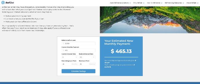
RefiJet does this perfectly. At the top of its auto-refinance page is a button to contact a rep for a loan estimate. Scroll a little further down and you’ll see an estimates tool, for the resourceful folks who want to build a quote on their own.
Everything is at the intended audience’s fingertips, precisely as it should be.
4. Accessibility Is a Requirement
What happens when you visit a website and see an insurmountable wall of text? Most likely, you’re either going to look for a bite-sized snippet, or you’re just going to leave. Ignoring the fact that most people don’t have the time to sort through so much content at once, most people don’t even want to, and it’s not because people have the attention span of a goldfish — or some related insult. If you wouldn’t do it, then chances are, your viewers and visitors aren’t going to do it either.
Inherent to design is user accessibility. How is the website presented? Is the text easy to read and does it offer a pleasant experience? Is there a good balance between text and visual content? Is the general usability of the site pleasant? Do you offer appropriate support features, like a dark mode?

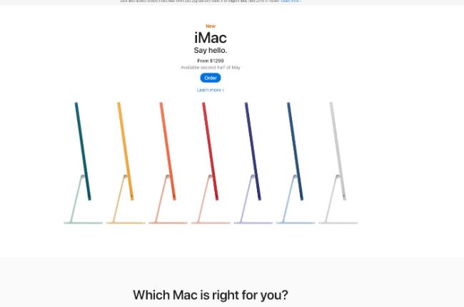
Apple is the king of accessibility, especially on its website. Everything can be consumed in quick, easy-to-read chunks. The most pertinent information is front and center, and there’s a pleasing balance between visuals, text, and other elements. It also looks and feels fantastic on any platform, including mobile, desktop, and even tablets.
5. Check Out the Competition
Take some time before, during, and after creating or redesigning your site to assess the playing field. What features and design elements have your closest rivals incorporated? How does it affect the experiences they provide their customers?
In most cases, looking at other websites can help you discern what you’re missing from your designs and also what works better, or worse. It’s never good to operate inside a vacuum anyway, where you’re oblivious to what’s happening around you. What’s more, you can work closely with your web developers to understand what and how things are different on other sites. It offers a more reliable and professional form of feedback that you can use to your advantage.
6. Keep the Design Consistent
Experimenting with visual design techniques is okay, but if and when you decide to use them indefinitely, make sure you deploy the same types of experiences across your entire site. That is, keep the navigation, visual elements, text, and general interactions consistent.
Don’t start using buttons on a sub-page if you’re not using them on your landing and other primary pages. If you don’t include clickable images on one segment of your site, don’t do it for another. This may seem like a simple practice, but it’s crucial for the user experience.

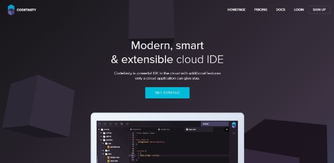
Scroll down the CodeTasty landing page and what do you see? The same “Get Started” button for each section of the page. For the most part, the colors remain consistent, the button style and shape are the same, and the context is also identical. Everything flows well too, from the text to the images and colors.
7. A/B Testing
When you’re creating a site or an experience, you can use A/B testing to help structure the finished product. The idea is to present two or more variants of a design, portal, or page, and then collect feedback about them. By doing this, you can learn, for example, a bright blue background is preferred by audiences over a dark grey one.
Over time, this allows you to design the site and various elements based almost entirely on user preferences and feedback. It also syncs with the next tip, which posits similar ideas, yet in a more comprehensive way.
8. Dynamic Design
This concept is perhaps one of the most challenging and also the most expensive, in time and money. But one of the best ways to create a user-centered experience is to collect and implement feedback from your audience. You let the users speak, share their thoughts and opinions, and then use those insights to build a better portal.
Where it gets challenging is creating a dynamic template or design that can be constantly adapted to meet feedback and user specifications. Most websites are meant to be static, as in created, and then left alone until it’s time for another redesign. In this case, you’d be continually shaping the look, feel, and content on the site to match user demands.
It’s innovative, a bit frightening at first, but makes sense in today’s digitized and hyper-personalized world. It also calls for a nuanced approach to big data and contextual awareness, which might be out of reach for small businesses.
The Best User Experience
Making your content and website user-centric means optimizing the experience so it’s more pleasant, more attractive, and overall, easy to engage with. That will net you higher rankings on search engines like Google, but it will also win you a lot of favor with your target audience.
Stronger audience relationships, better traffic, and higher engagement levels are necessary for today’s hyper-competitive content marketing landscape. The good news is they can all be achieved through smarter, more contextual design, on a user-centered website or portal.
