Okay, I’m going to start this off with one statement; Material Design is great. It has helped unify user interfaces across platforms, and it provides designers with awesome resources (the icons especially ????????). And while some of you may use aterial Design as your UI-North-Star (why are you doing that to yourself), I am not that big of a fan.
Let me give you some background on the short-lived friendship between Material Design and I: It all started in the FABulous Summer of 2014, I was about to enter the 6th grade and my passion in graphic design kick-started. There to help me learn about it, was Google — wo just unveiled their brand new design language, which within the next few months was going to become so overused that you could rename it to any song played on a pop-music radio station. Better yet was the fact that my father and I had just created our startup, which I was the designer for (By the way, you should totally check out the company). Of course, since I was beginning, I used dribbble to guide me through the many upcoming trends of design, including the embarrassing throwback to long-shadows ????, and one of the up and coming trends was Material Design. I was intrigued; as far as I was concerned, Material Design was the easiest way to design interfaces. I mean everything was figured out for you; the color palettes were from a selection of colors, the interface-structures were given, the components all have instruction, they even tell you what the shadows should look like. It was like one of those fill in the blank stories, where you replace certain blank spaces with words — but in this case, you’re replacing given fields with ones pertaining to your application. Of course, being a sixth grader I couldn’t resist filling all those blanks, and with that, I was hooked.

I’ve always seen Material Design as if Google took the style from Google Now illustrations and just ran with it.
Material Design has designers in a chokehold
How many of you followed a design template or language blindly?
Let’s be honest here, by a show of hands, how many of you have tried Material Design or any other super-specific design language and just stuck with it. ✋ Don’t be ashamed, it’s become normal at this point.
Let’s try another show of hands question; How many of you have seen an app which followed the Material Spec so much that if it had a “G” in the logo it could pass as a Google app. ✋✋✋✋✋ Okay, so all the hands went up.
I was guilty of the horrible crime that is conforming to every single standard the folks at Google Design showed us. And by the end of my designing process, my app looked like if Google made an app and just turned the primary color to teal. And that’s my fault. I’m not blaming Google, I’m not even blaming the spec, I’m blaming myself and others who are like that. The kind of people who blindly follow any design language because they think they have to. I was there, and I see many others (not naming names) who do the same thing. And while it is important to have standards for design quality, and even for usability, the problems begin when there is so much to follow, that personalizing a design language gets you an award from Google.
Fixing the issues; Material edition

There a screen, here a screen, everywhere the same screen.
Now what? After a few hundred words of ranting and explaining why I don’t think it works, where do we go?
I understand that I’m not solving any issues by ranting about things I do not like, so the question is; how do we solve them? We need to make sure that we learn how to infuse our brand into everything we do. Whether it’s adding your own style of illustration, or replacing Material Icons with those of your brand. And another big component is messaging; whether it is through colors, navigation, or just messages.
I like to look to these two apps for inspiration on what to do when it comes to following design languages:

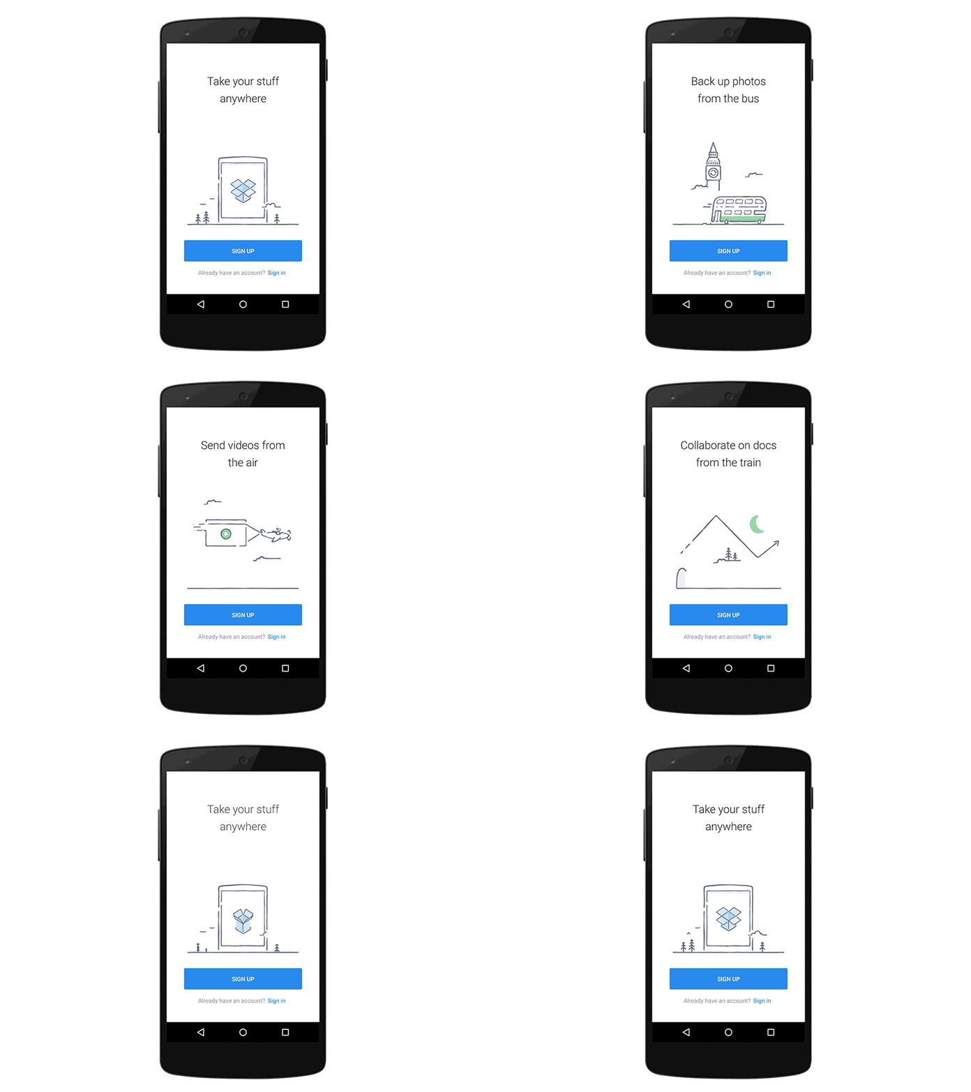
A perfect example of this is Dropbox. I’ve always admired Dropbox in their design inside and out of Material Design. Through clean minimalism and delightful illustrations, Dropbox has mastered the art of making the most of Material Design. Here’s what we can learn from their app.
Despite following the spec, Dropbox was able to customize Material Design to showcase their brand values, which is very important for anyone’s app. By using special elements like illustrations, you are able to maintain your personality even if you decide to use UX-cues from a design language.
- Keep your styles consistent
- Use the same personality throughout platforms
- Have fun with it, and remember that deviation from the spec is not a bad thing.
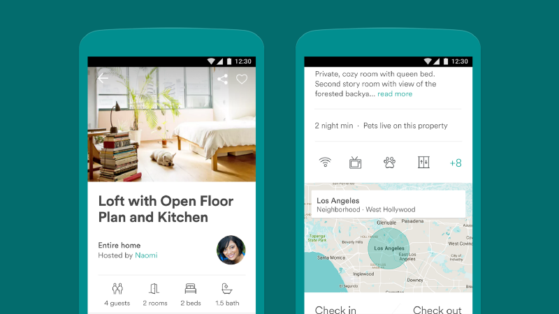
Airbnb is pretty amazing when it comes to their use of Material Design, mostly because they deviate the most from it.

Material design who?
Airbnb has, in my opinion, nailed the art of showcasing brand within design languages. Through the use of custom icons, fresh imagery, custom elements, and some pretty awesome typography, Airbnb was able to get a really nice aesthetic in their apps. Somehow, they do all of this while remaining on spec. So let’s see what we can learn from them:
Airbnb uses a lot of aspects from other platforms, especially web, and this creates an uber-cohesive experience which can be enjoyed by users. So here’s what they did right!
- Typography is important, make sure to make it different.
- Icons don’t have to be from the icon pack!
- Use colors! Lots and lots of colors!
Final thoughts after an article full of rambling
First of all, congratulations on making it this far. This is my first design article and the fact that you dragged yourself to the end shows me immense support. Also, I’m not writing this as a way to shoot down a group of designers, but to offer insight on mistakes I made when I started. I truly believe that design languages like Material provide new designers a great way to learn more about the realm of design, and they also offer opportunities to experiment for the more experienced.
I would love to hear your thoughts (the negatives as well) and I also wouldn’t mind a recommend ????.
Thank you for reading!
