Your weekly list of curated design resources, brought to you by your friends at the UX Collective.

Things were still good on the InVision train, at least for us designers.
But for InVision, the writing was on the wall. Or, it should have been. These new design tools were a sign: each launched with limited prototyping capabilities, giving designers the ability to link screens and create simple interactions without having to make a trip to InVision.
Figma hit hardest, promising the kind of interaction, collaboration, commenting, and handoff features that were InVision’s stock in trade. Slowly, other players dribbled into the market, tearing away at InVision’s feature set bit by bit, including developer handoff tools like Zeplin and Marvel, as well as prototyping tools like Flinto, Framer, and ProtoPie.
I don’t know anyone using InVision Studio, and that’s too bad →
By Michael McWatters
The UX Collective is an independent ad-free design publication that elevates unheard design voices, reaching over 408,500 designers every week. Curated by Fabricio Teixeira and Caio Braga.
Editors’ picks
- The root cause of inaccessibility →
Technology is not what makes accessibility hard.
By Sheri Byrne-Haber, CPACC - Say goodbye to pixel units →
Why are pixels bad for digital design?
By Nick Gard - Stop asking users what they want →
Improving the quality of user interviews.
By Amy Rogers

The iconic watches that inspired Apple Watch faces.
Food for thought
- The service-based design org →
“That’s it: design is a service. Design doesn’t happen in a vacuum; whether we’re art-directing a new brand campaign, producing display ads for re-targeting, writing research plans for user testing, or speccing out a new component in the design system, our work is ultimately in service of our collaborators’ goals.” - What Facebook fed the baby boomers →
“The feed goes on like this — an infinite scroll of content without context. Touching family moments are interspersed with Bible quotes that look like Hallmark cards, hyperpartisan fearmongering and conspiratorial misinformation.” - Is it really a design system? →
“Are we all working under different definitions of what a Design System is? We should not. Even if we had not thoroughly detailed our needs from the start (which I swear we did), there are plenty of converging definitions out there. The notion of a DS isn’t that new or complicated, is it?”

Creating a card game inside Figma. Wait, is that even possible?
By Anthony Conta
Little gems this week

Uniwidth typefaces for interface design →
By Lisa Staudinger
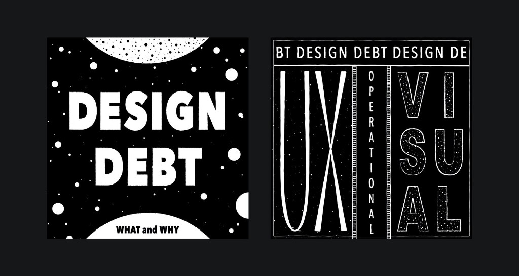
The ‘what’ and ‘why’ of design debt →
By Alicja Suska

How to estimate design work →
By Marc-Oliver
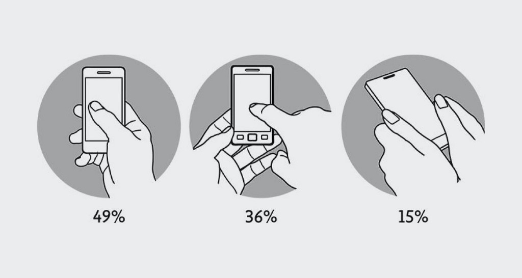
The “thumb-driven design” and why UI is shifting down →
By Maxim Stepanov
More top stories:
- Perfect practice makes perfect →
By Michal Malewicz - The designer’s ironic obsession with big tech companies →
By Jonathan Lee - Mothers that UX →
By Meltem Barcelona
Tools and resources
- Avoiding shifts →
How to avoid layout shifts caused by web fonts. - Pika →
An open-source colour picker app for macOS. - Interns.design →
Find paid internship opportunities and resources.

300,000 faces: A visualization of the scale of COVID deaths in the United States.
We believe designers are thinkers as much as they are makers. So we created the design newsletter we have always wanted to receive. Feel free to forward this to your friends.
InVision hype, card game in Figma, how to estimate design work was originally published in UX Collective on Medium, where people are continuing the conversation by highlighting and responding to this story.
