The Problem
—
I find myself using UberEats (launched early last year) more frequently than the likes of DoorDash primarily because of two reasons:
- Continuous promotions — They have had some really cool promotions all this while. (No delivery cost upto $5 for an order)
- Ordering experience — From searching for food to ordering and waiting for it, the app does a good job with informing the user through out the journey. Browsing restaurants and “adding to cart” is faster as well.
But there is a scenario that happens very frequently that I want to address.
Scenario:
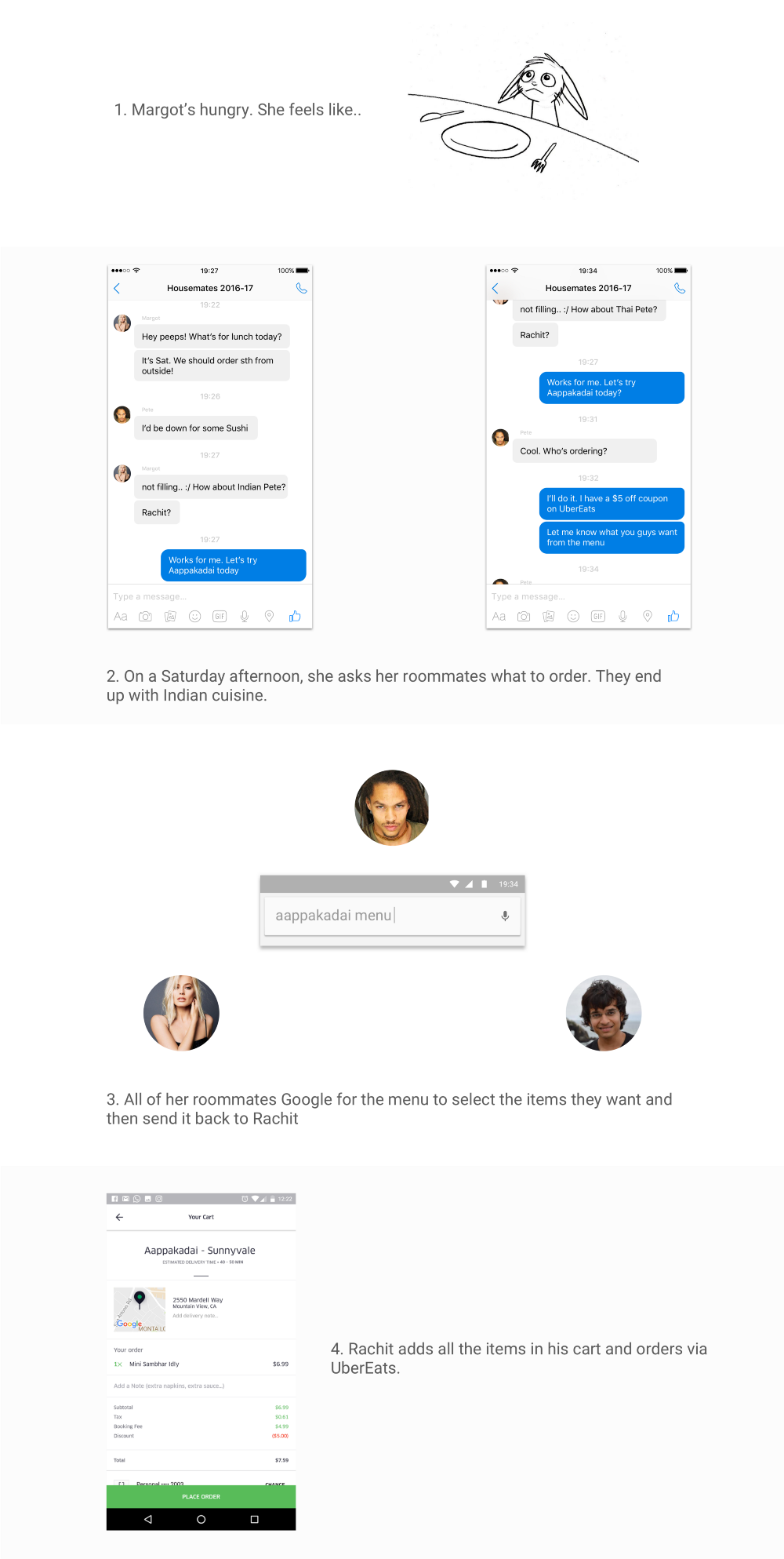
What’s happening above?
- There are three hungry roommates collaborating to order food.
Three different apps were used to place a single order for a single address. (Facebook Messenger, Google search and UberEats)
2. It takes a long conversation to figure out what order needs to be placed.
There is often a conflict between choices of restaurants and menu items.
3. Order is still placed by a single individual.
- It doesn’t make sense to order for the same address multiple times around the same time.
After looking at similar experiences on DoorDash and Postmates, the identified gap is:
UberEats, DoorDash and the likes cater to ordering food for an individual, not for a group.
Why should the UberEats care about this at all?
From my preliminary research, below are a few things I heard:
“I live with two other people. When I order, I ask them if they need anything right now or maybe later.”
“While ordering food, I think about what I’m having for dinner or for the next day if it is already dinner time. I don’t want to pay extra delivery cost.”
“Often times, I go pickup the food myself instead of waiting. That’s cheaper, and faster. But I ask others living with me if they want anything.”
“Why don’t these apps allow ordering from multiple restaurants?”
At work, we use EatClub to order lunch for our team. Everyone can order food individually. It works, but only for large groups or teams. EatClub is rarely on time and food options are minimal.
Others, such as Lunchloop are targeted towards companies and operate in a different domain. Our context exists in a generic scenario where multiple people need to order food at once.
Ordering for groups still requires efforts on a design and product front. Who wants to be the first to fix it?
The Opportunity
—
Think of this like UberPool for UberEats.
Multiple people are ordering at the same time (Instead of traveling together, they’re eating together).
There needs to be a way for all the above to happen within UberEats. This will lead to fewer switching between apps, fewer decision points, and smoother ordering experience for the users.
Let’s start designing
—
UberEats at present
Current experience on UberEats looks like this:
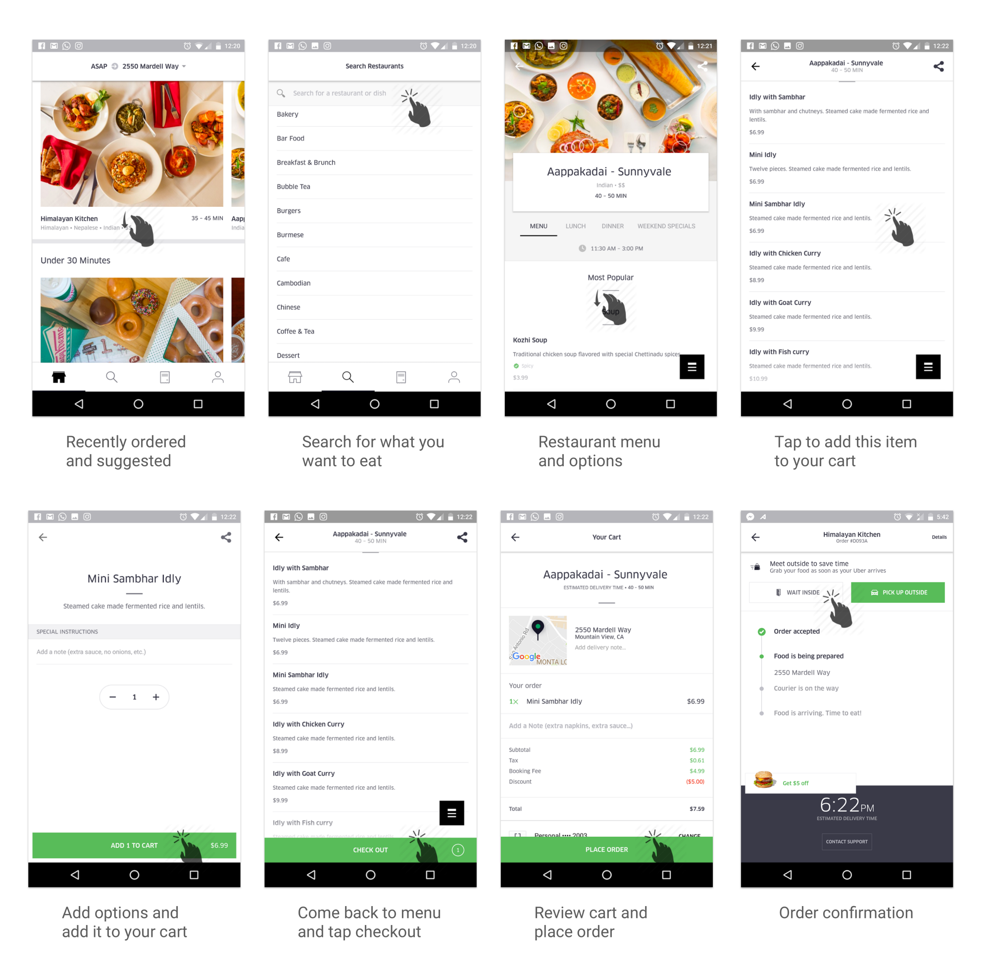
Notice the share button on the top right on menu screens
Apart from the above screens, there are “Order history” and “Profile” screens that can be accessed from the bottom navigation panel. These screens are rarely a part of the “order journey”, so I didn’t include them here.
Given the current experience, let’s fit group ordering in the flow and see how it looks like:
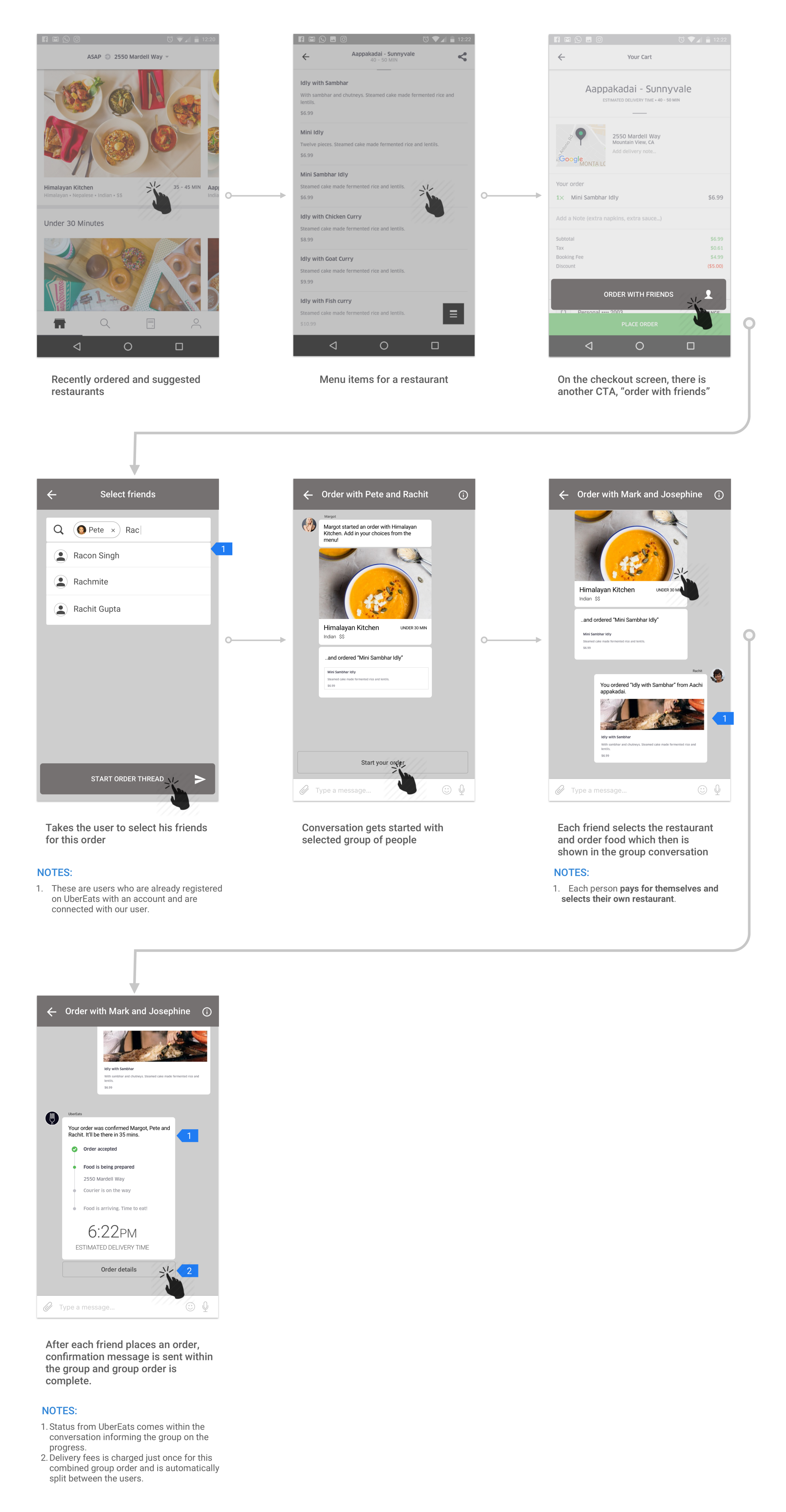
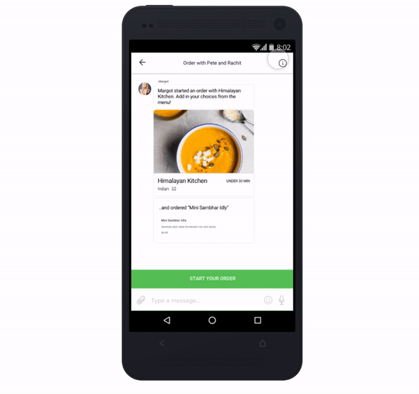
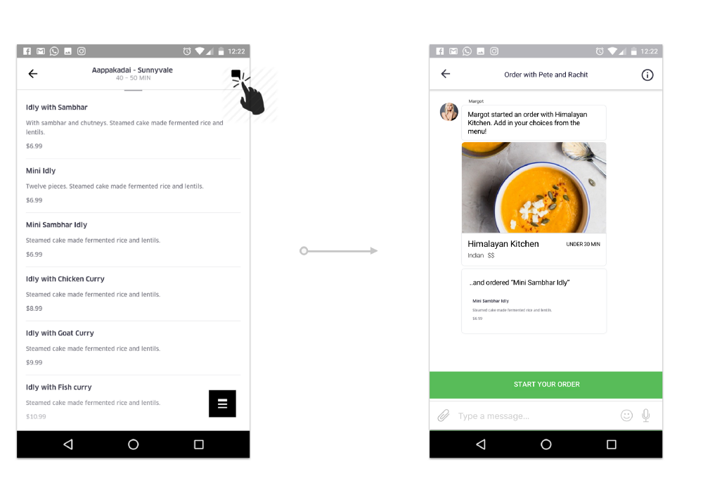
Scenario #1: Creating a group order with individual choices (happy path)
Watch this one more time now that you understand the problem better :-)
- A user starts the group order by selecting a menu item from the app and adding other friends to it.
- Each friend then selects their own choices which are shown in the common conversation thread.
- After each user in the group finishes ordering, the order is automatically placed.
Screen by screen details with the flow:
Scenario #2: User(s) opt out of the group order
Conversation goes away from your experience once you exit
Scenario #3: Accessing order conversations from anywhere in the journey
After a group order has started, the conversation can be accessed by tapping the chat icon on the top right
- In the flow of group ordering, the conversation can be accessed from any touch point in the flow.
Things To Consider
—
Assumptions
- “Searching for friends” — I assumed that users will be able to connect with their friends through a social network.
- “Combined delivery cost and discounts” — the idea here is that multiple orders are getting combined to form one order, and I assumed that the delivery cost will be applied once and a discount will be given on the order total.
- “Delivery cost splits equally among the people in the group” — because that makes sense. :-)
Design decisions I made
- The button “order with friends” is a secondary action button. The thinking behind this was that number of individual orders will still be more than the group orders. So the primary action will still be “Place order” at that point.
- I have kept the conversational UI similar to those that users are already familiar with.
Success for group ordering will be
- A group of people using UberEats to order food and choosing individually without long conversations and switching between apps.
Closing Thoughts
—
I think about possible ideas/product improvements everyday. Very few, such as this, inspire me to put aside a few hours and create a probable solution and share. The best way to grow as a designer is to solve a problem you experience yourself.
This took about four hours and I was able to dig deeper into the UberEats experience. As far as my process goes, I started with validating this problem with my co-workers and roommates. Then, I created a general concept story(vision) to refer back to, and then created flows on paper. That followed with a prototype and this case study to look back. If I could have reached out to larger span of audience and validate this concept with a complete prototype, that would have been ideal.
But I would leave this to you readers to fill in the gaps and give me constructive feedback. Got anything to add? Please share your comments below.
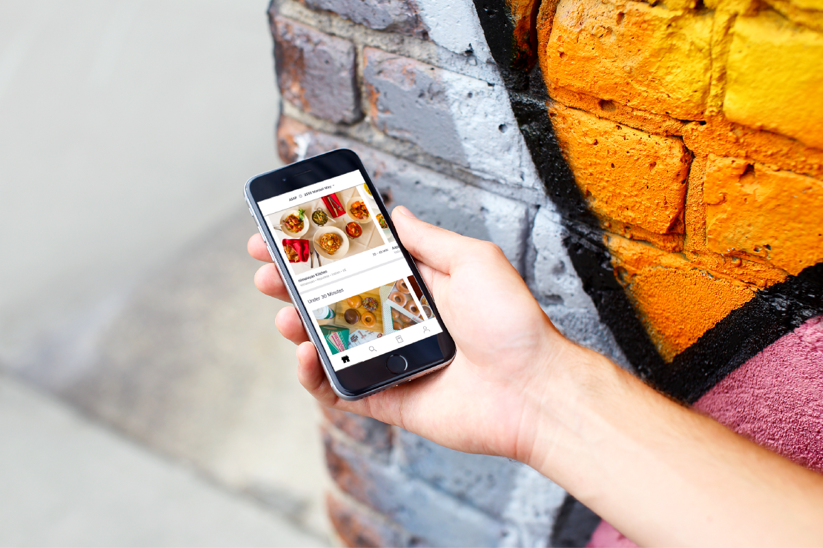
Ordering with friends: Eating alone is never fun
Full prototype here: https://invis.io/P7APU62BE ????
I'm not associated with Uber Design in any way. I did this because I obsess about such ideas. Shout out to the UberEats team for creating a neat UX. I strongly feel a feature like this is worth exploring.
I'm a Product Designer based on Mountain View, CA; working for Walmart Labs. Let's connect here: http://rachit.design/.
And that's a wrap.