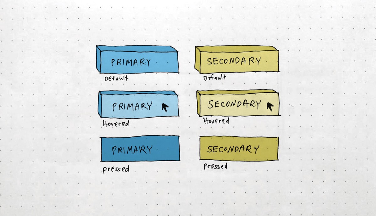
So you want to start your own design system? Congratulations! That means you reached the point where you have a set of components, behaviors, rules, and principles that are ready to be wrapped as a “north star” for the design, product, and dev teams on future implementations. No more simultaneously teams implementing the same button or creating different components with similar functionality. One component for all!
The idea behind design systems is to implement a component only once, approve its performance and push it to a local branch — enabling the front-end developers to pull it and use it, as a shelf product. This way you can ensure high quality in fewer working hours, as well as easy cross-platform updates on the go.
First, sync your common language
I believe terminology has a major role in creating a design system. After all, it binds together designers, developers, and product managers in one place, players who sometimes speak different languages. When having discussions with FE developers, I have noticed that not once they were using a different term than I did for the same component.
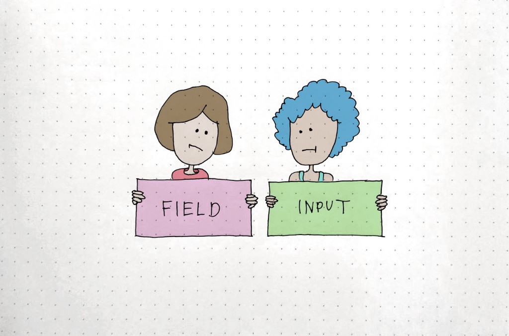
As a designer I can say that those discussions and common work from the very beginning exposed me to the developing process in a way I wasn’t exposed before — by discussing the hierarchy and terms of the components, I could better understand technology perceptions I wasn’t aware of. This, for sure, saves a lot of time and misunderstanding. And above all, it feels you’re building something together, and not just dictating tasks to each other.
How is this going to work?
Here are a few principles I have been using in all design systems I created and managed. And of course, you may decide to adjust them according to your needs and preferences.
Should all components be a part of the design system?
As a rule of thumb, once a component is used more than once across the product, it should be added to the design system.
How to prioritize the components?
It depends on the way you manage it. The design system may have a dedicated team or it can be implemented as a part of the general effort. Either way, there should be someone (usually a PM) who takes into consideration all aspects such as — the dev’s delivery time estimation, the immediate need and amount of expected use, the predicted effect on the product — and prioritize accordingly.
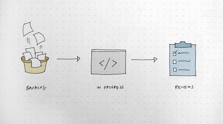
What would be the steps in implementing a component?
Backlog | Ready to be implemented
In progress | Currently being implemented (assigned to a developer)
Reviews | By all stakeholders — Code, functioning, UX, UI
What are the optional statuses of a component?
Pending | From backlog to reviews (still not approved)
Approved | Ready to be used
Paused | Removed or put on hold. Not in use anywhere
The workspaces
Here are the 3 platforms I find getting-the-job-done in terms of serving all stakeholders’ perspectives and needs:
Zeplin | To show the design system including rules and behaviors
Jira | To collaborate and manage the implementation process
Storybook | To show and test the implemented components
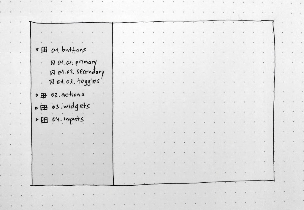
Zeplin — artboard per section
Each artboard should be dedicated to a section (e.g. buttons) and get its prefix (e.g. 01.buttons).
Each component (e.g. primary button) should start with the section prefix and get its number (e.g. 01.01.primary, 01.02.secondary, etc.).
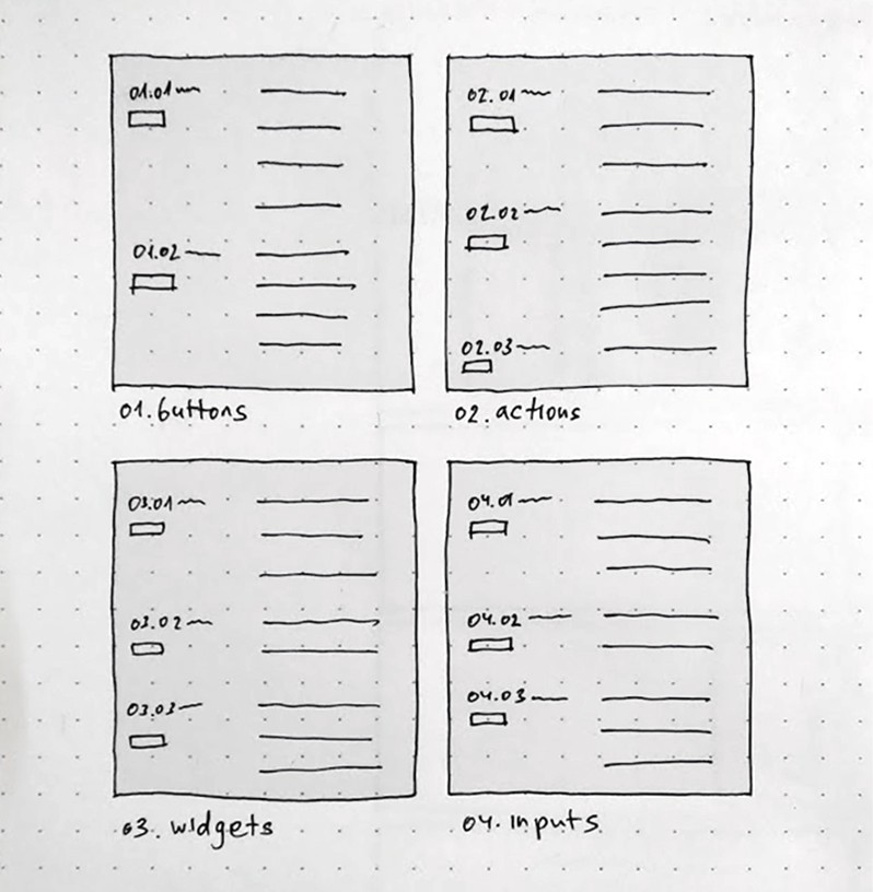
The names should be consistent in all workspaces, as it enhances productivity in terms of communicating fast and easily. So when I tell a colleague — “Let’s use 03.04” — they know how to locate it cross-workspace.
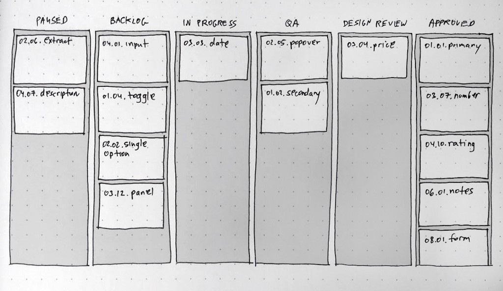
Jira — Kanban board
This combines the process and statuses as previously mapped:
Paused | Removed or put on hold. Not in use anywhere
Backlog | Ready to be implemented
In progress | Currently being implemented (assigned to a developer)
QA | Code and functioning review
Design review | UX and UI review
Approved | Ready to be used
How to reflect components status?
Now, this may seem redundant, but it helps me a lot in syncing with the actual implementation process, as well as getting a bird’s-eye view of each section.
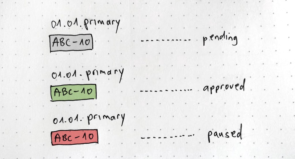
Once I create or update a component, I open a ticket in Jira in ‘Backlog’.
At the same time, In Zeplin — I add (right below the component name) a grayed color label with the ticket’s name in Jira.
Once I approve it (move it to ‘Approved’) I change the label’s color to green. Once it’s put on hold/removed — I change it to red and move the ticket to ‘Paused’.
Storybook — try it
Once the developers finish working on a component, they move its ticket to the QA step and also publish it to Storybook to enable testing its total functionality as shown in Zeplin / described in the Jira ticket.
More sources:
Everything you need to know about design systems / Audry Hacq
Design systems gallery / Design systems repo
Design Systems: a glossary for developers & designers / Eduardo Ferreira
Learn kanban with Jira software / Claire Maynard
A curated list of Storybooks for your inspiration
Good luck!
Got any insight? comment? Let’s discuss it 👇

How to start and manage design systems was originally published in UX Collective on Medium, where people are continuing the conversation by highlighting and responding to this story.
