[unable to retrieve full-text content]

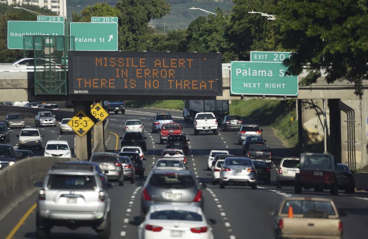
Just in case you were away.

- The Hawaii Missile Alert Culprit: Poorly Chosen File Names
- Redesigning Hawaii’s Emergency Alert System’s Interface In The Open
- Blame terrible interface design for the Hawaii missile alert debacle
- A Hawaiian Missile Lullaby
- A UX Perspective on the Hawaii False Missile Alert
- Design Fail #2 : The tale of Hawaii’s missile alert warning system
- The Hawaii false alert wasn’t user error — it was a failure of design
- What Healthcare.gov has to do with the Hawaii false alarm — and what to do about it
- How To Avoid an Accidental Missile Crisis Using UX Principles
- The Hawaii Missile Alert Was the Software Developer's Fault
- USPS, UX 101, and Missile Alerts
- Bad UI Design: Here's How Hawaii's Ballistic Missile False Alarm Happened – Core77
- Hawaii missile mess: That was no 'wrong button.' Take a look.
- When UX and UI errors go nuclear: The design lessons from Hawaii’s nuclear attack alert false alarm
- What the Hawaii missile scare tells us about the future of software development
- Dangerous Drop-Downs? ️Bad UI Design Caused ⚠️Hawaii’s False Missile Alert
- Missiles, False Alarms, and Bad Design
- When Design Bombs.
- User interface designers are horrified by Hawaii's missile alert system
- This Is the Awful Design That Led Hawaii to Think It Was Getting Nuked
- Hawaii missile false alarm due to badly designed user interface, reports say
- How this dashboard, made in ten minutes, could prevent Hawaii’s missile false alarm
- Hawaii Missile Alert Snafu Shows Why UI Design Really, Really Matters
- Hawaii missile alert: How one employee 'pushed the wrong button' and caused a wave of panic
- What the UI Design of the Hawaii Missile Alert Actually Looks Like, and a Suggested Design Improvement – Core77
- UX & the Hawaii Missile Alert: The Anatomy of Bad Form Design
- What Hawaii’s Emergency Alert reveals about Enterprise App UX
- Hawaii’s false ballistic missile alert was a failure in user experience design
- Pressing the Wrong Button
- What the Erroneous Hawaiian Missile Alert Can Teach Us About Error Prevention
- Hawaii's missile alert fiasco highlights the importance of good design
- “Seek immediate shelter” — Why investing in UX is important
- Pressing the Wrong Button
- The Hawaii Design Crisis
https://medium.com/media/05d5fd32eda31cbd1b83287606744532/href
Here are 34 articles relating Hawaii’s false missile alert with bad design was originally published in UX Design Collective on Medium, where people are continuing the conversation by highlighting and responding to this story.
