Summary:
Dropdown lists can be used in narrow, specific scenarios, but misuse can cause more harm than alternatives.
Dropdown lists are one of the most familiar controls in forms. Designers use them because they’re compact, flexible, and easy to implement. But that convenience comes at a cost: dropdowns hide available options behind a click, adding friction to every selection and slowing decision making.
Definition
A dropdown list (also called a select menu) is a collapsible input control that reveals a list of options when clicked, allowing users to select one option from that list.
“Dropdown” is a commonly used term in interfaces, but it can refer to different patterns depending on context. This article focuses specifically on dropdown lists used as input controls to collect data, not on navigation or command menus that trigger page changes or, respectively, system actions. While these components share a similar visual pattern, they serve different user goals.
The Appeal of Dropdown Lists
Dropdown lists owe their popularity to a few advantages:
- Space efficiency: Dropdown lists are compact, capable of holding any number of options while occupying a single line on screen. When you have more options than space allows, collapsing them behind a click can feel like a tidy solution.
- Input constraint: Users can only choose from predefined, valid options; no typos or invalid entries. This helps keep the data structured and clean.
- Familiarity: Dropdown lists are a standard input pattern that has existed for decades. The signifier is strong — users recognize the down-arrow pattern across platforms.
The Hidden Costs of Dropdown Lists
While dropdown lists appeal to the designer’s need for visual cleanliness, they often don’t make it easier for users to input data.
Low Discoverability
Hiding options by default is a form of progressive disclosure. On one hand, it’s an elegant solution that mitigates visual complexity; but on the other, it undermines the discoverability of hidden options or the input altogether.
In a long form, a compact dropdown list is easy to overlook or mistake for a completed field. Because of this, the selected default becomes a critical choice. Users may not interact with the control to explore additional options beyond the default.
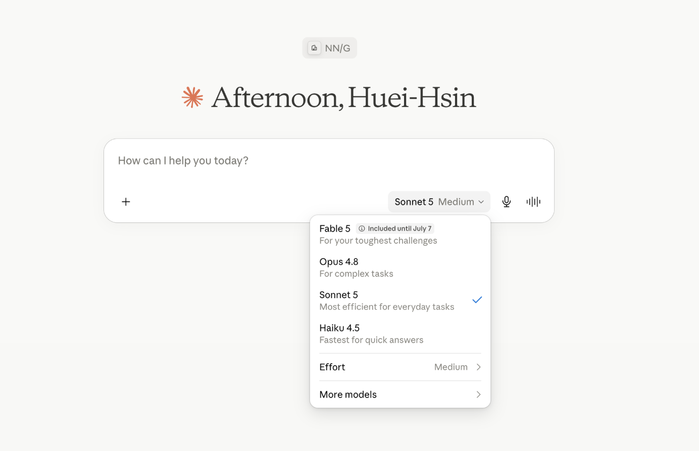
High Interaction Cost
Interacting with a dropdown involves three steps:
- Open the list (via click, tap, or keyboard)
- Scroll to the desired option
- Click again to select it
In custom dropdowns (that is, those not using the browser or OS’s default), accidentally clicking outside the dropdown while scrolling the list often closes the list, forcing users to restart the selection process.
Long dropdown lists, which are commonly used to hide visual clutter, are especially problematic. Users must scroll carefully through the options while maintaining enough precision to select the right one — a task that becomes error-prone on both desktop (where scroll speed can overshoot) and mobile (where fat-finger problems and accidental dismissals are common).
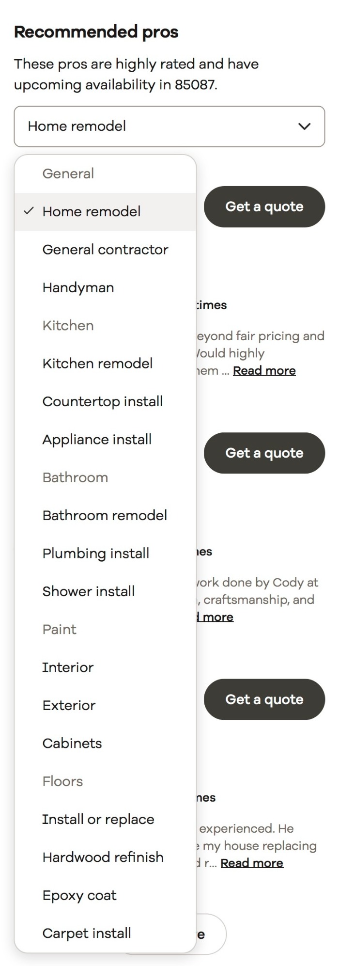
Accessibility Barriers
GOV.UK has done extensive research on dropdowns and documented persistent usability issues for keyboard and motor-impaired users, including:
- Struggling to close the dropdown
- Attempting to type into it
- Confusing focused items with selected items
- Failing to realize they can scroll for more options
- Trying to pinch and zoom options on small screens
This organization explicitly recommends that dropdown lists be used only as a last resort in public-facing services.
Illusion of Clean Data
Dropdown lists are often favored over text inputs because they constrain input and keep the data sanitized, allowing backend systems to receive standardized, machine-readable values. But constraining input works only when the option set aligns with users’ mental models. When it doesn’t, the dropdown amplifies the mismatch in two distinct ways.
There Are Multiple Ways to Present the Same Answer
When all options are hidden until opened, users can’t scan ahead to figure out which naming convention the list follows.
A British user looking for their nationality might expect United Kingdom, UK, Britain, or Great Britain, and has no way to know which one is buried in the list without scrolling through the entire list.
What Users Look For is Absent from the List
Forms often miss edge cases or fail to account for all possible options. For each option presented, the dropdown enforces a single canonical label, while users arrive with rich, context-specific mental models shaped by culture, daily language, politics, or personal identity. These discrepancies in mental models are far harder to predict than simple formatting errors.
When the option they expect is absent from the list, users are forced to:
- Exhaustively review the entire list
- Settle on the closest (but likely inaccurate or wrong) option
- Give up and leave the field blank
Note this is a content-design problem that transcends the control type — radio buttons with the same incomplete options would be equally exclusionary. But the dropdown makes it worse: because the options are hidden until the user has already committed to the interaction, discovering that the desired answer isn’t there feels more disorienting.
You see this issue often with job titles and industries. These lists tend to reflect rigid, internal (and often outdated) taxonomies rather than how people describe their work. For example, Design is often missing from the industry list or lumped into Architecture, Art, or Media.
In these cases, the backend may celebrate clean data without invalid entries, but the data looks clean only because users were forced to pick something, not because they found the right answer.
When to Avoid Dropdown Lists
Too Few Options
When a menu contains only a handful of choices, collapsing them behind a click adds unnecessary interaction cost. Users must open the control just to discover all the options. Worse, the collapsed state offers almost no information scent — there’s nothing to signal what’s inside or help users predict their options before committing to an action.
Radio buttons are a stronger alternative here. They are universally understood, expose all choices immediately, and require only a single click to select an option.
What is defined as “few options” varies depending on context. Multiple design systems have established the minimum threshold for when dropdown lists should be considered. The U.S. Web Design System (USWDS) recommends radio buttons for fewer than 7 items. Google Material Design (M3) sets the threshold at 6 items; IBM’s Carbon Design System draws the line at 3 items. The exact cutoff will depend on your layout and information complexity, but the principle holds: when a handful of options can comfortably fit on screen, a dropdown adds more friction than real value.
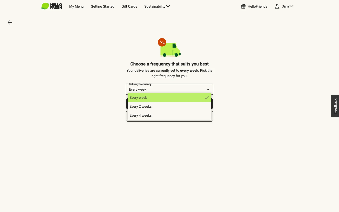
Too Many Options
Long dropdowns are equally problematic. When a list exceeds roughly 15 options, such as a country list (200+ options), the interaction cost of visually scanning it and the fine-motor control required to scroll through it can be overwhelming.
In these scenarios, a combobox — a text field paired with a filterable dropdown list — helps alleviate the burden of searching through a long list. Instead of scanning every option, users type what they’re looking for, and the interface narrows the results. This pattern works well for long lists of predictable options such as countries, states, languages, and universities.
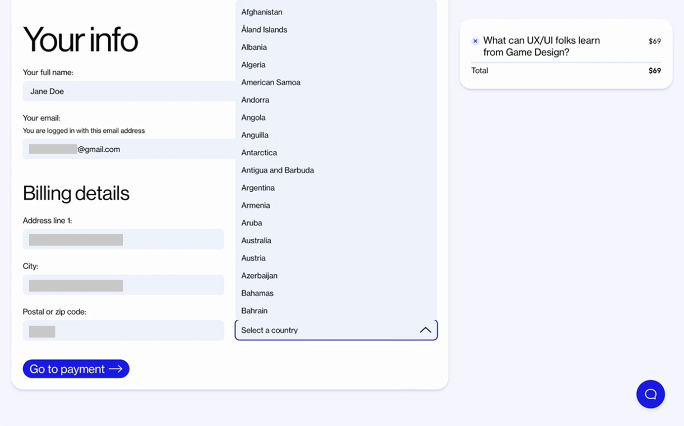
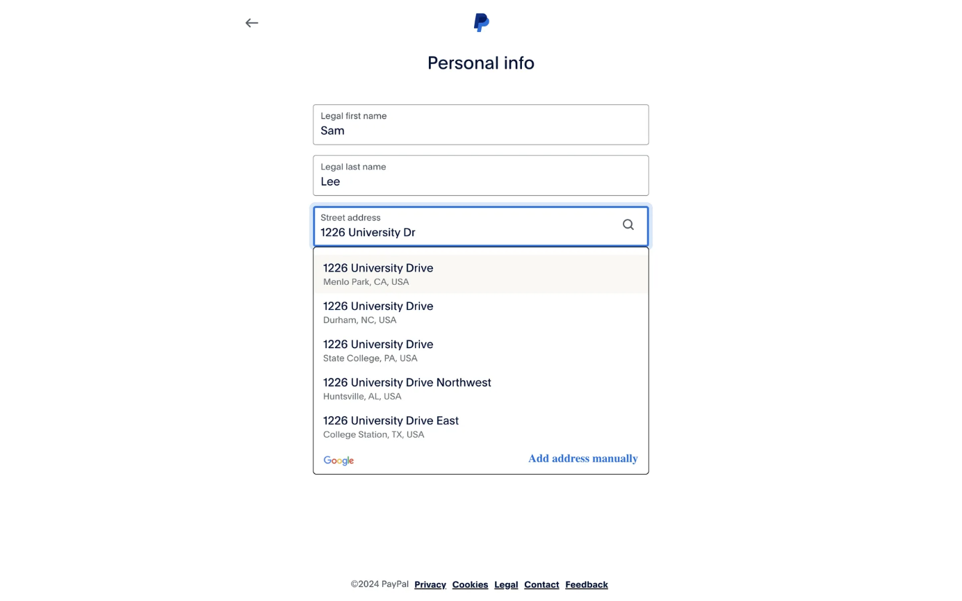
In some cases, selection can be avoided altogether by reconsidering the structure of the data. Using an automatic address lookup can prevent the need to select from a long state dropdown list.
Highly Familiar or Predictable Data
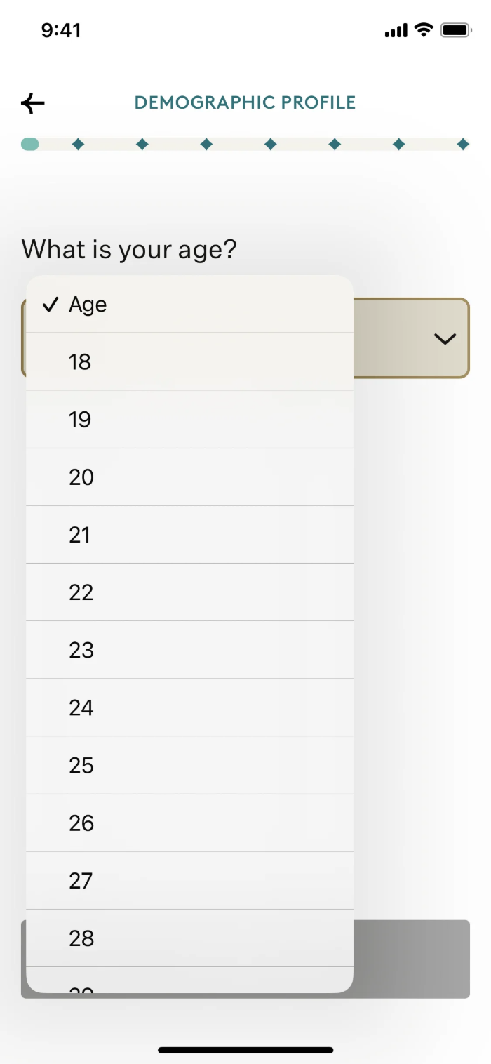
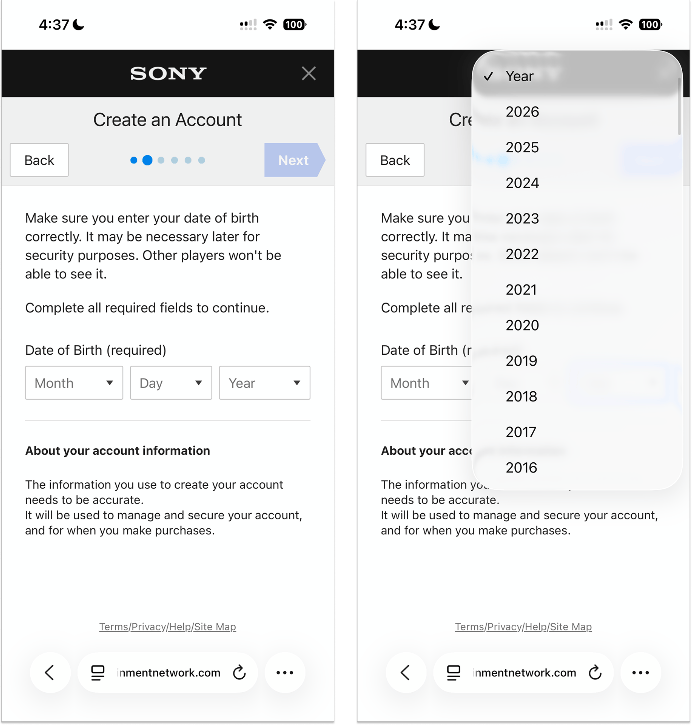
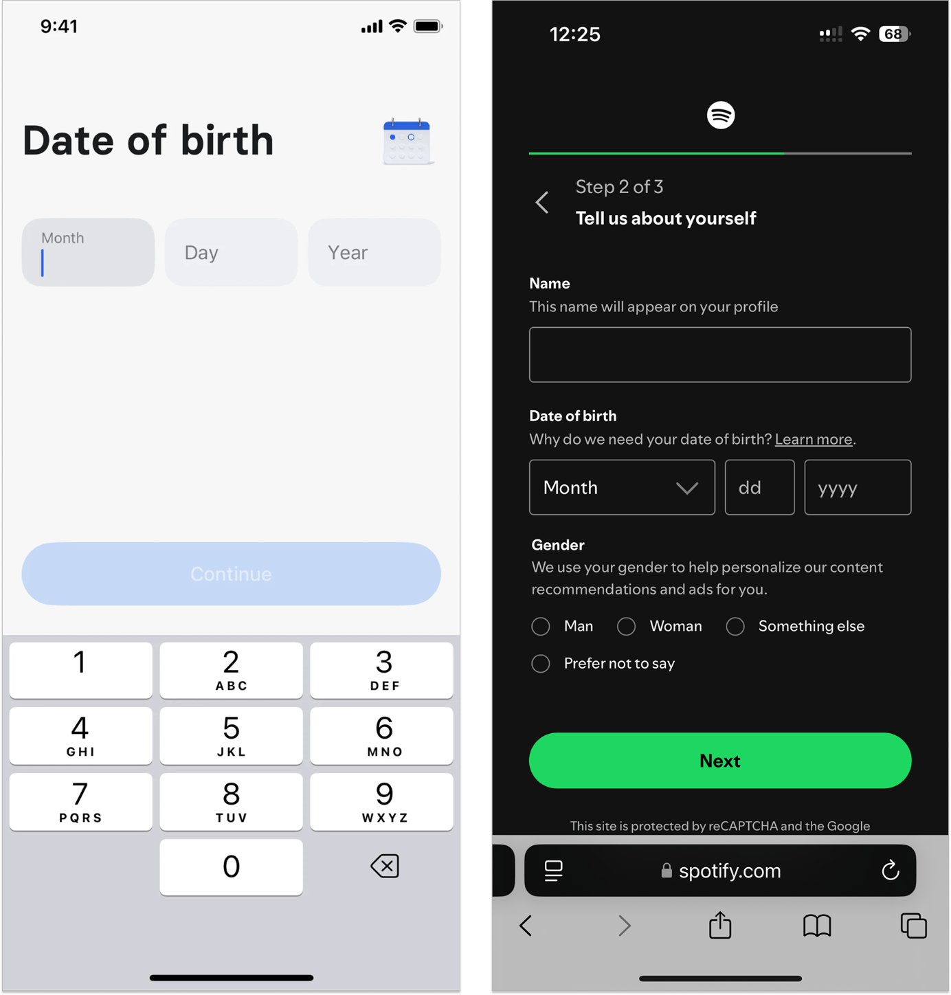
For readily known values — ages, birthdates, heights — typing is often faster than selecting from a dropdown. Forcing users to scroll through a long list to find a value they could type in seconds is an unnecessary burden.
A well-configured text input with the appropriate input mode (e.g., numeric) that automatically triggers the correct mobile keyboard is faster, less error-prone, and more accessible than a dropdown.
Users Need to Make a Visual Comparison
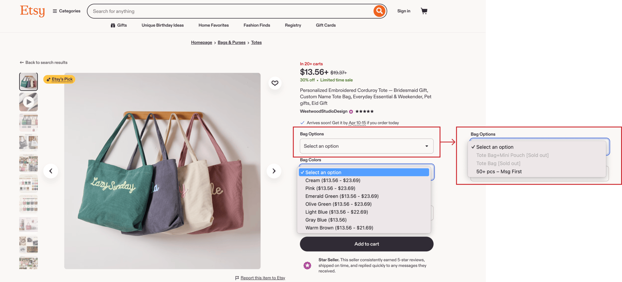
When users need to pick a product variant (e.g., size, color, or material), a selection control is clearly warranted: options are tied to backend inventory, and free text would introduce errors.
However, dropdown lists should be avoided in this case as they block and delay selection by hiding available options behind an extra tap, forcing users to open the menu to uncover them. The problem compounds when availability depends on multiple variants — for example, both size and color — leaving users to juggle separate dropdowns and mentally triangulate combinations.
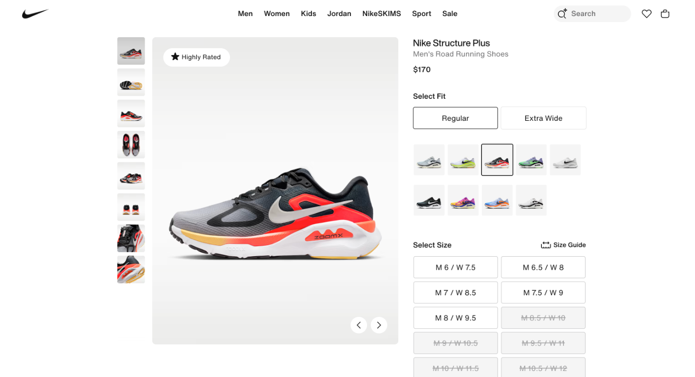
In contrast, laying out options as buttons surfaces all choices at once, allowing users to scan, compare, and select in one step. It also makes out-of-stock variants immediately apparent (e.g., through a grayed-out size), saving users from the frustration of going through a long list to select an option only to learn it’s unavailable. For visual attributes like color and patterns, buttons can display swatches that communicate far more than a text label.
When Dropdowns Still Make Sense
Despite their drawbacks, dropdowns aren’t universally wrong. They remain appropriate in a narrow set of contexts.
Before deciding whether to use a dropdown, first determine whether selection is the right interaction pattern at all.
Selection controls (which, aside from dropdown lists, include checkboxes, radio buttons, and other types of lists) work well when:
- The set of valid inputs is predefined and constrained. Users can choose only from what the business allows, and they may not know these options in advance. For example, available shipping methods must be selected from what’s currently offered.
- Data standardization is critical. Free-text input can introduce inconsistencies, errors, or downstream-processing issues. When the system can’t reliably clean up messy input, constraining choices upfront preserves data integrity.
- The data is categorical, not continuous. Options are finite and discrete and don’t exist on a continuous spectrum. Choosing a t-shirt size (S, M, L) warrants a selection, whereas setting a budget limit ($10–$500) is better suited to a slider or numeric input.
- Selection reduces effort. A single click is often easier than typing out an elaborate response. In a subscription-cancellation survey, for instance, users who’ve already decided to leave are unlikely to want to spend time providing detailed feedback — presenting a list of options lowers the barrier and makes it more likely they’ll provide feedback at all.
Even when a selection control is appropriate, a dropdown list is not necessarily the best choice. Use the following conditions to decide whether a dropdown list is justified.
A Moderate Number of Options (Roughly 5–10)
Dropdown lists work best in a narrow middle range: enough options to justify hiding them for space, but not so many that the list becomes hard to navigate. For fewer than 5 options, radio buttons are usually better because they keep every choice visible and selectable in one tap. When the list grows well beyond 15 options, consider a combobox.
The Field Is Secondary to the Main Task
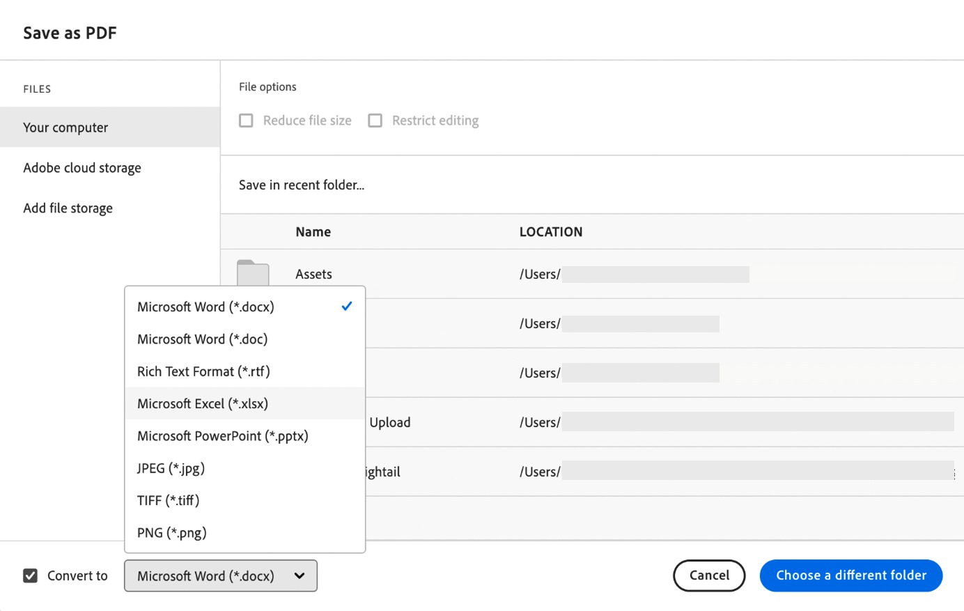
Not every control on a screen carries equal weight. When a field is secondary to the user’s primary goal or its use is optional, its choices don’t need to be visible by default. A dropdown allows those options to remain hidden until they become relevant, preserving users’ attention and screen space for the primary task.
This is especially valuable in dense admin UIs and information-heavy interfaces, where exposing all options upfront adds visual noise, disrupts the compact layout, and increases cognitive load. Here, the compactness of a dropdown earns its keep.
Utility fields, such as format selectors, filters, and sorting menus, are often not the primary focus of a task and are changed infrequently. In these cases, a sensible default that prefills the common answer can spare users from interacting with the dropdown list at all.
The Field Is Part of a Whole
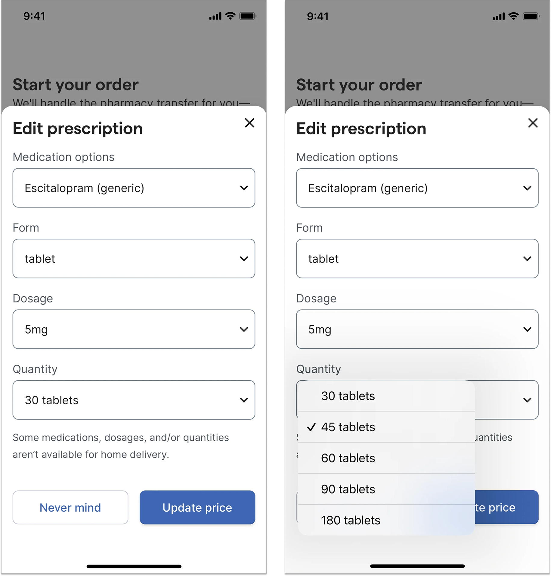
A field doesn’t always stand on its own. Sometimes users interpret multiple fields as a single unit or review them altogether. In these cases, preserving the overall layout is more important than making every option immediately visible.
Dropdown lists keep related fields compact and visually connected. By preserving proximity, they reinforce the relationship between fields and help users understand the group at a glance. In contrast, showing options inline can stretch fields vertically, separate related items, and make the form harder to scan and review as a whole.
In short, dropdown lists earn their place in a narrow sweet spot: when there are enough options to justify hiding them, but not so many that they become a chore to get through. They are most appropriate when the field is secondary to the main task or when users need to consider the field as part of a larger group. When those conditions aren’t met — and they often aren’t — dropdown lists can often cause more harm than good.
Let’s examine a few examples where dropdown lists stand the test.
Example 1: Language Selector
1Password’s website footer used a dropdown list for language selection, offering ten language options. The footer was already information-dense, with dozens of links spanning products, features, solutions, resources, and company information across the width of the page.
A selection control was appropriate here because the language options are a fixed, predefined set: users can choose only from those that 1Password supports, and each option maps to a specific translated version of the site.
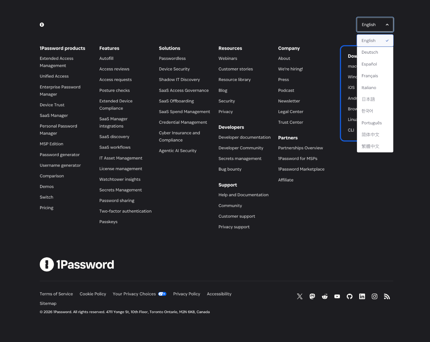
With ten language options, the list falls in the moderate range — too many to show inline without cluttering an already dense layout, few enough to scan comfortably once opened. It’s also a secondary control: most visitors come to the footer to navigate the site, not to change languages and will never interact with the selector because the site already displays the right language by default.
The dropdown keeps language selection available for users who need it while preserving space and attention for higher-priority footer content.
Example 2: Skip-Logic Setting
User Interviews used dropdown lists to build skip-logic rules in its screener-survey tool. Each rule read as a sentence: If [question] [condition] [answer], Skip to [destination].
In this example, a selection control is necessary to enforce precision because the input data is tied directly to the backend. These rules filter participant entries; selected values must map exactly to what the system recognizes.
![User Interviews skip-logic editor: inline dropdowns form a sentence — If [question] [is] [answer], Skip to [destination].](https://cdn.idevie.com/wp-content/uploads/2026/07/1784416527_641_Does-Your-Form-Really-Need-a-Dropdown-List.png)
Even though some of these dropdowns contain only a handful of options (such as is or is not) — few enough that radio buttons would normally be the stronger choice — the four fields sit inline, forming a readable conditional if this, then that statement. Expanding any of those fields into a radio button group would fracture the sentence layout, pushing the remaining fields out of alignment and making it harder to read the rule as a single logical thought. In a builder where users may stack multiple rules, that spatial disruption compounds quickly.
Conclusion
So, does your form really need a dropdown list? Probably not as often as you might think. Before reaching for one, ask: how many options are there, do users need to see them all to choose confidently, and does the layout genuinely benefit from hiding them?
Often, the answer will point you away from a dropdown — toward radio buttons, text input, comboboxes, or a different form element altogether. Treat dropdown lists as a tradeoff, not a default. Use them deliberately, and only when their costs are clearly justified.