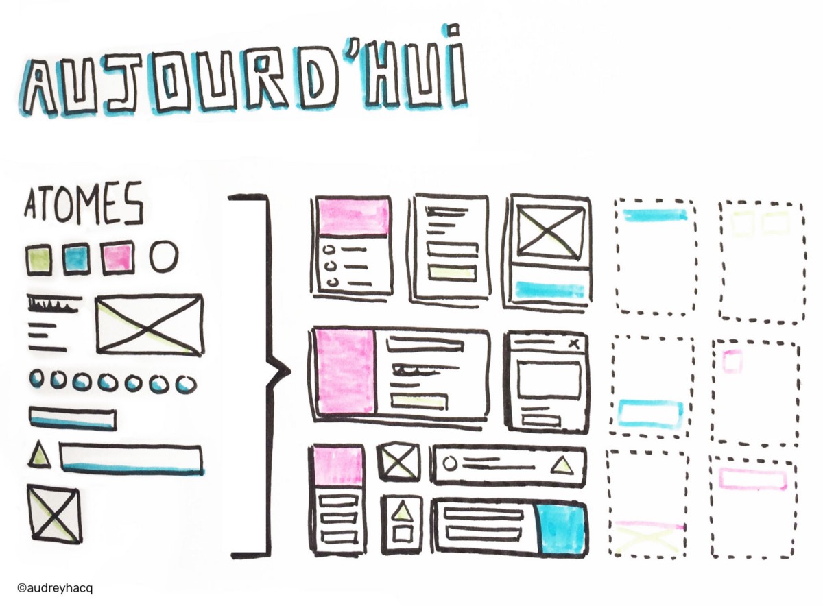
Today, the idea of Atomic Design is to begin with common raw material (atoms) with which we can build the rest of the project:

Today: we start from atoms and we build the rest from there
We have thus not only an “air de famille” between all the screens, but also a system which offers infinite design possibilities!
Everything start with brand identity
Now you might be wondering:
“Where do we begin if we want to design in an atomic way?”
To which I answer, rather logically: with atoms ;)
Thus the first thing which we are going to do is to create a unique visual language for our product that will be our starting point. This is what is going to define our atoms, our raw material and it is obviously very close from the brand identity.
This visual language must be strong, easy to build upon, and free itself from the medium on which it is going to be displayed; it has to be able to work everywhere!
The Gretel agency, for example, made some remarkable work on the Netflix identity:
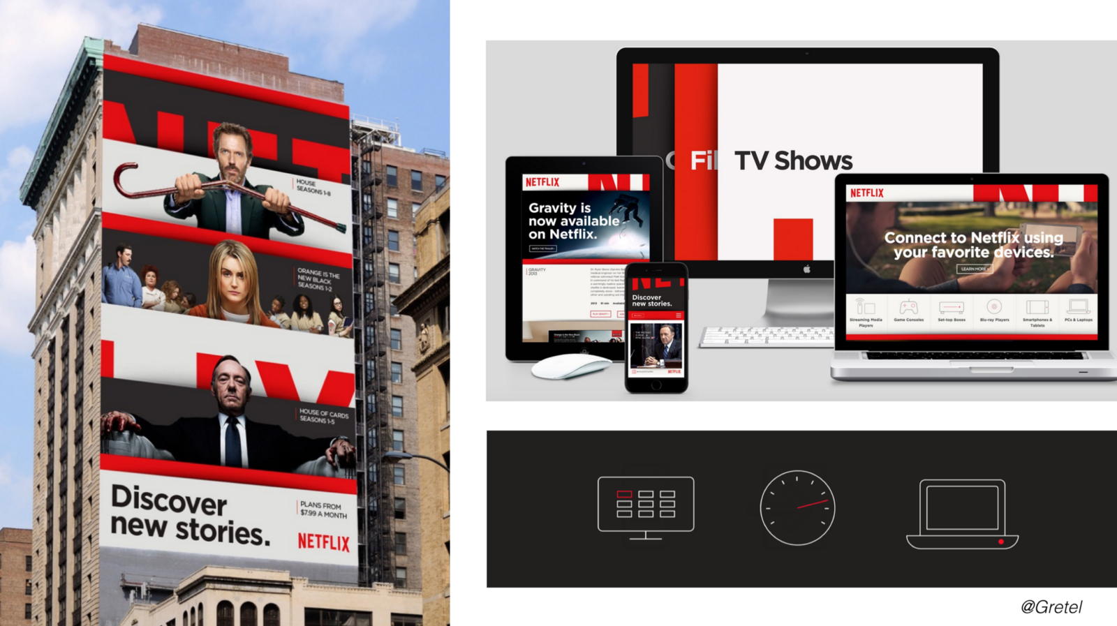
Netflix visual language: strong, recognizable and easy to build upon
And thanks to a strong identity, we feel that we have all the material to release our first atoms: colors, typographic choices, forms, shadows, spaces, rhythms, animations principles…
It is thus essential to spend time designing this identity, thinking about what makes the difference, the uniqueness of a brand or a product.
Let’s continue with the components
Now that we have this raw material (still very abstract for the moment), we can now create our first components according to the objectives of the product and the initial user flow which we’ll have already identified.
Begin with key features
What really frightens designers who begin creating a system of components is to have to make components which are connected to nothing … Obviously, we aren’t going to create a shopping basket component if there is no purchase element in our product! That wouldn’t make any sense!
The first components are going to be closely linked to the product or the brand objectives.
And once more, to get rid of this notion of “page”, I insist on the fact that we are going to focus on features or user flow, not screens…
We want to focus on an action, not a specific screen
We are going to focus on the action which we want our user to do and on the components that are needed to accomplish this action. The number of screens will then vary, according to the context: maybe we’ll need half of the screen on desktop to display this component versus 3 consecutive screens on smartphone…
Enrich the system
Next, in order to enrich the system, we are going to make round trips between the already existing components and new features:
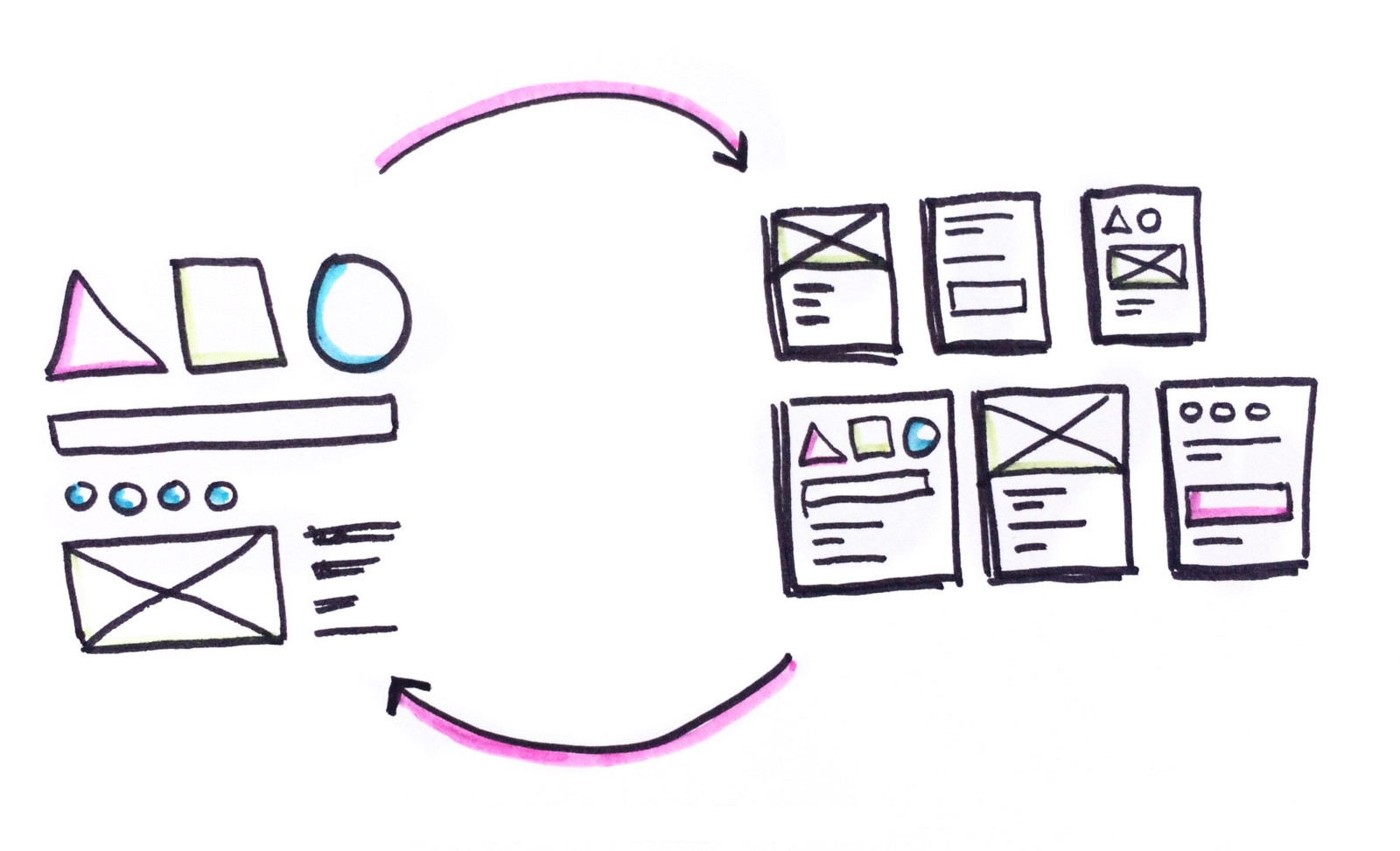
Enrich the system by making round trips between the already existing components and new features
The first components will help to create the first screens, and the first screens will help to create new components in the system or to change the existing ones.
Think generic
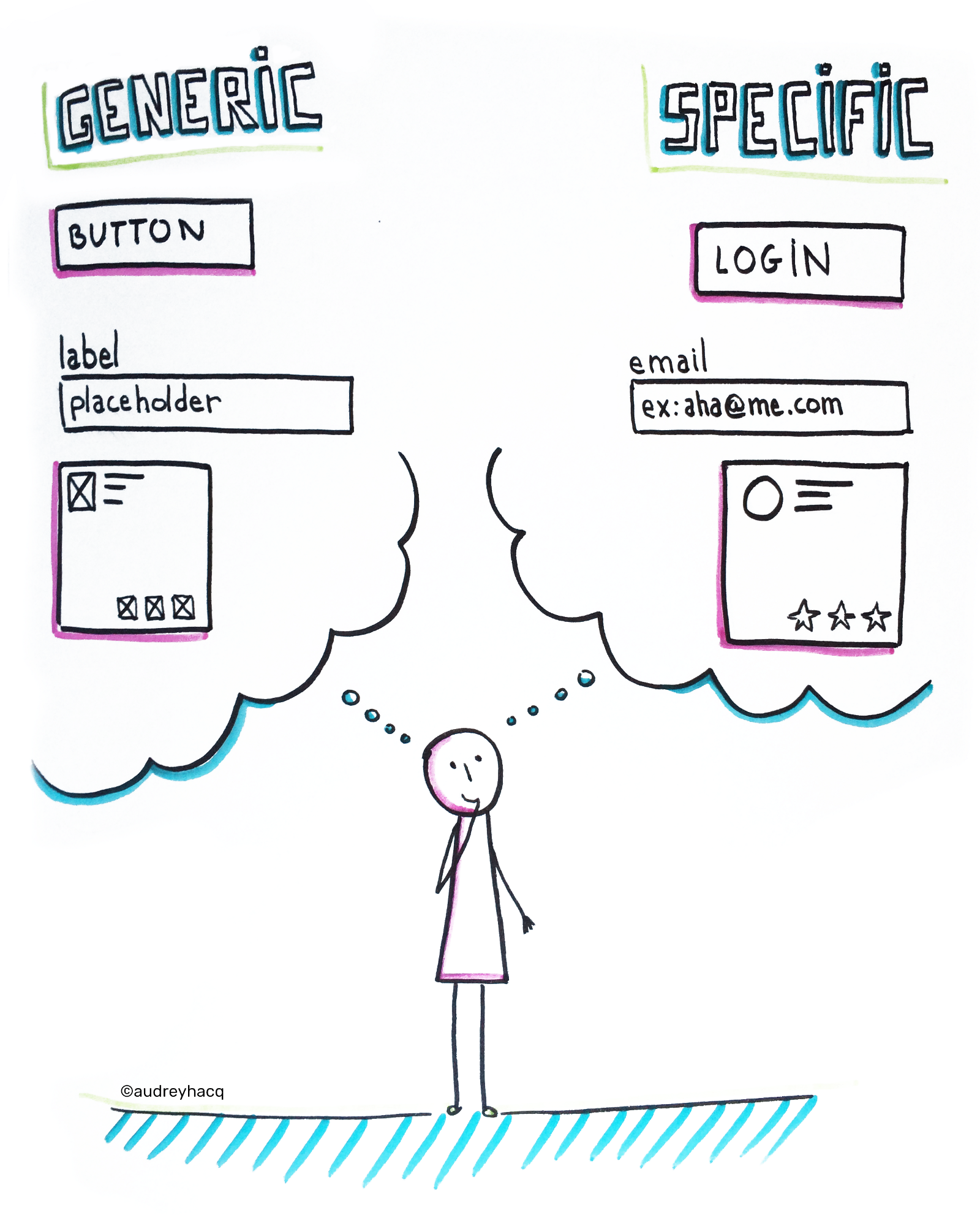
When we design with atomic, we always have to keep in mind that the same component is going to be declined and reused in very different contexts.
We are thus going to make a real distinction between the structure of an element and its contents.
For example, if I create a specific component that is a “contacts list,” I’m very quickly going to transform it into a generic component that will simply be a “list” item.
And I am then going to think about some possible variations of this component: What if I add or remove an element? And if the text runs onto 2 lines? What will be the responsive behavior of this component?
Transforming a specific component into a generic one
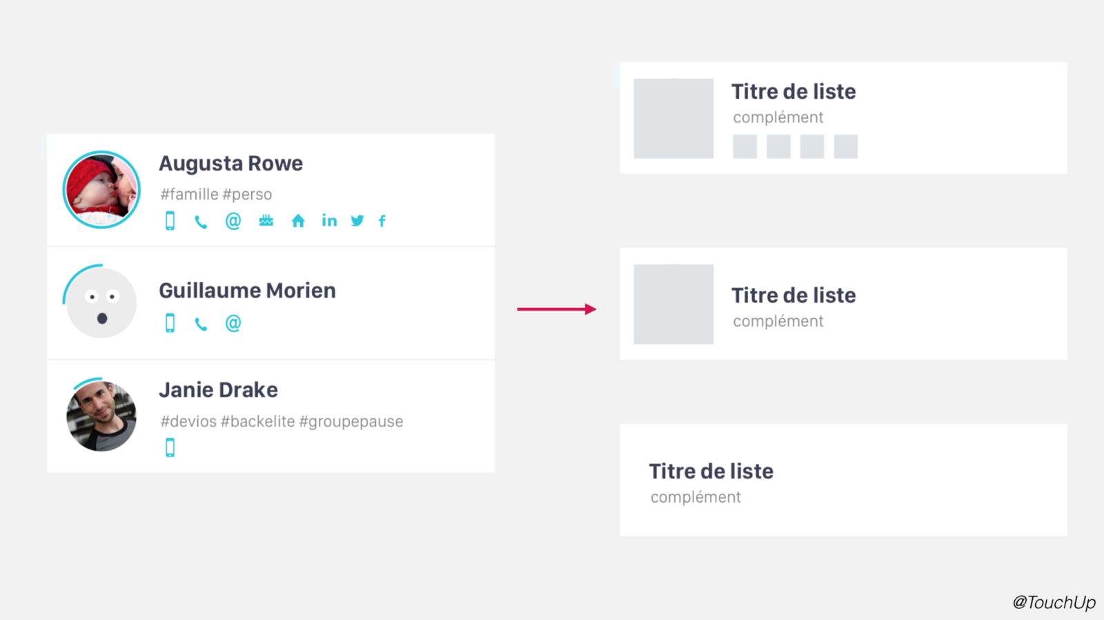
Having anticipated these variations is going to allow me then to use this component to create other ones:
Possible variations of a generic component
This work is necessary if we want our system to be both reusable and rich at the same time.
Think fluid
We still tend to think of responsive design as a reorganization of blocks on specific breakpoints.
Yet it’s the components themselves which have to have their own breakpoints and their own fluid behavior.
And thanks to software like Sketch, we can finally test the various responsive behavior of our components and define what we want to be fluid or what has to remain fixed:
We have to anticipate the fluid behavior of our components
We can also imagine that a component can be totally different in a context or in another.
For example, a button with round corner on desktop may become a simple circle with an icon on a smartwatch.
The part and the whole
One of the really interesting things building a system of components with Atomic Design is that we are conscious of creating a set of elements that depend on each other.
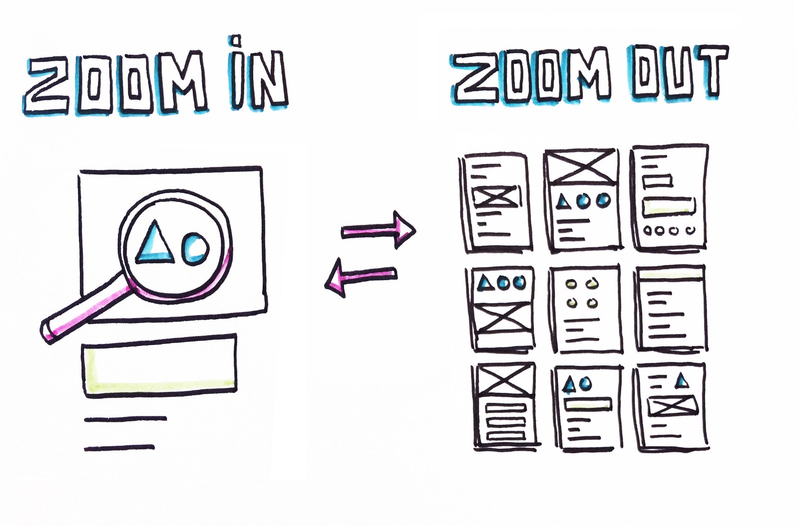
Working out the details before taking a step back to verify the results in the greater scheme of things
We then constantly zoom-in and zoom-out of our work. We are going to spend time on a detail, a micro-interaction, or the refining of a component, before we take a step back to verify what it looks like in context, before taking yet another step back to see what that makes as a whole.
This is the way we’ll refine the brand identity, develop components and verify that the system works.
Mutualize the work
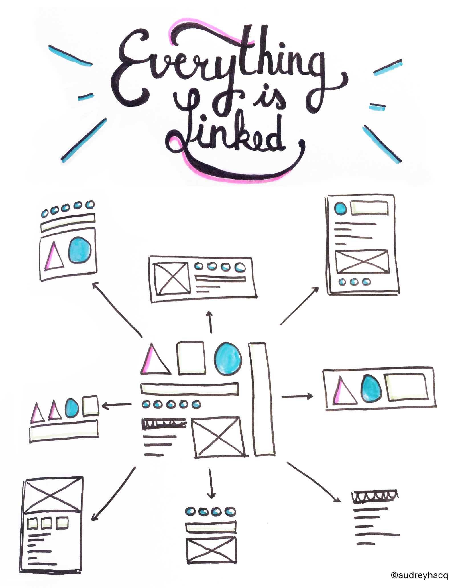
All of our components are linked to our atoms. And as everything is connected, we are going to be able to easily make modifications on a part of the system and verify the repercussion on the rest of the system!
We’re so lucky today as designers: we finally have tools which are adapted to create lively and evolving systems.
Of course, there are programs like Sketch or Figma which allow us to create shared styles and to mutualize the similar components but I’m sure that we are going to see a lot more in the next few years.
We can at last, just like developers, have our own style guides and build entire systems around these style guides. A modification to an atom of our system will automatically reverberate across all the components which use this atom:
All components are linked to the atoms
We realize very quickly how the modification of a component can affect the whole system.
By interlinking all of our components to each other, we also realize that if we create a new component, it’s the heart of the system that is going to be impacted, not just an isolated screen.
Share the system
Sharing of the system is essential to keeping consistency between various products.
We all know that we can very quickly lose this consistency, when we work alone on a project, but it’s even more difficult when we work with other designers, which is happening more and more often.
Here again, we now have tools which allow us to really work in a team around a common system.
There are shared libraries like Craft for Sketch or those of Adobe for example, which allow us to have a single source of truth, accessible by all and always up to date:
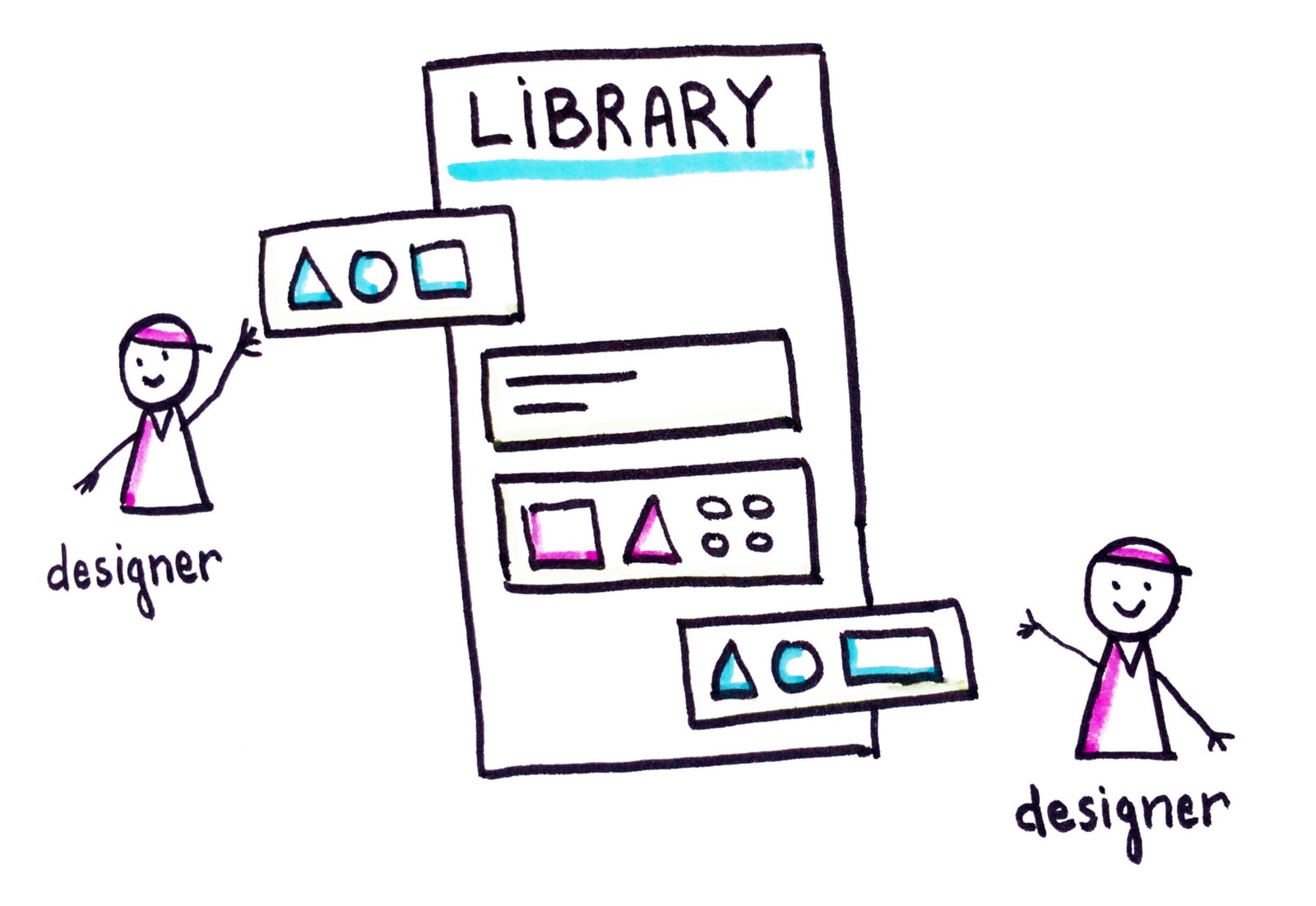
Shared libraries: always up to date and synchronized
Shared libraries allow several designers to start with the same base to begin their designs.
They also allow us to streamline the work because if we update a component in the shared library, the modification will automatically take place across all the files of all the designers which used this component:
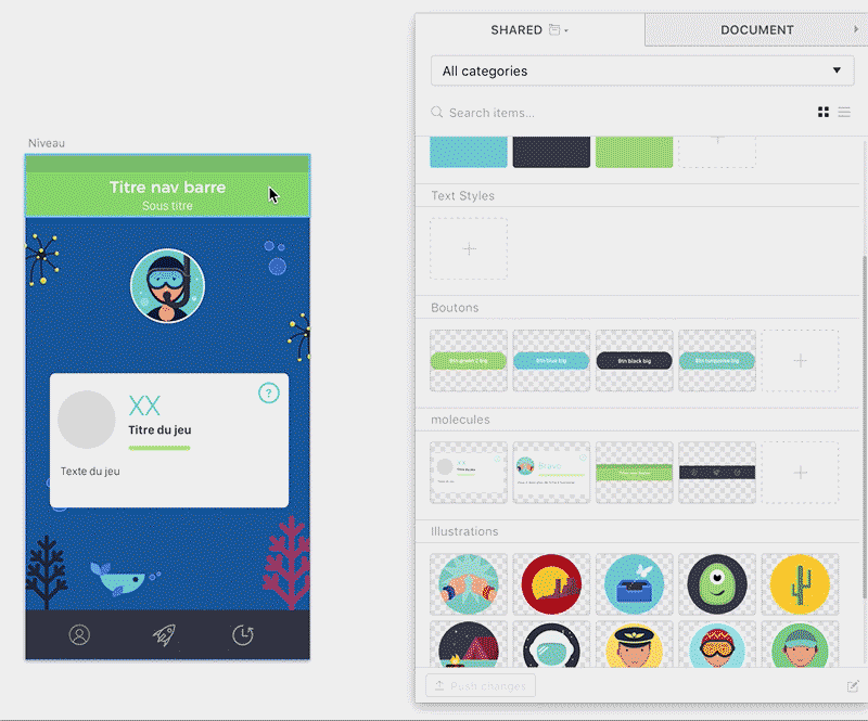
One change in the library automatically changes linked elements everywhere
I have to admit that for the moment, of the various shared libraries I’ve tested, I have not yet found one which is totally adapted to work with Atomic Design… Still missing is this strong interdependence between atoms and components which allows us to create a lively and evolving system.
Another issue is that we still have two different libraries: the designers’ library and the developers’ library… It is thus necessary to maintain both in parallel, which causes errors and requires a lot of additional work.
My vision of the perfect shared library would be the following; a single library which would feed the designers and the developers at the same time:
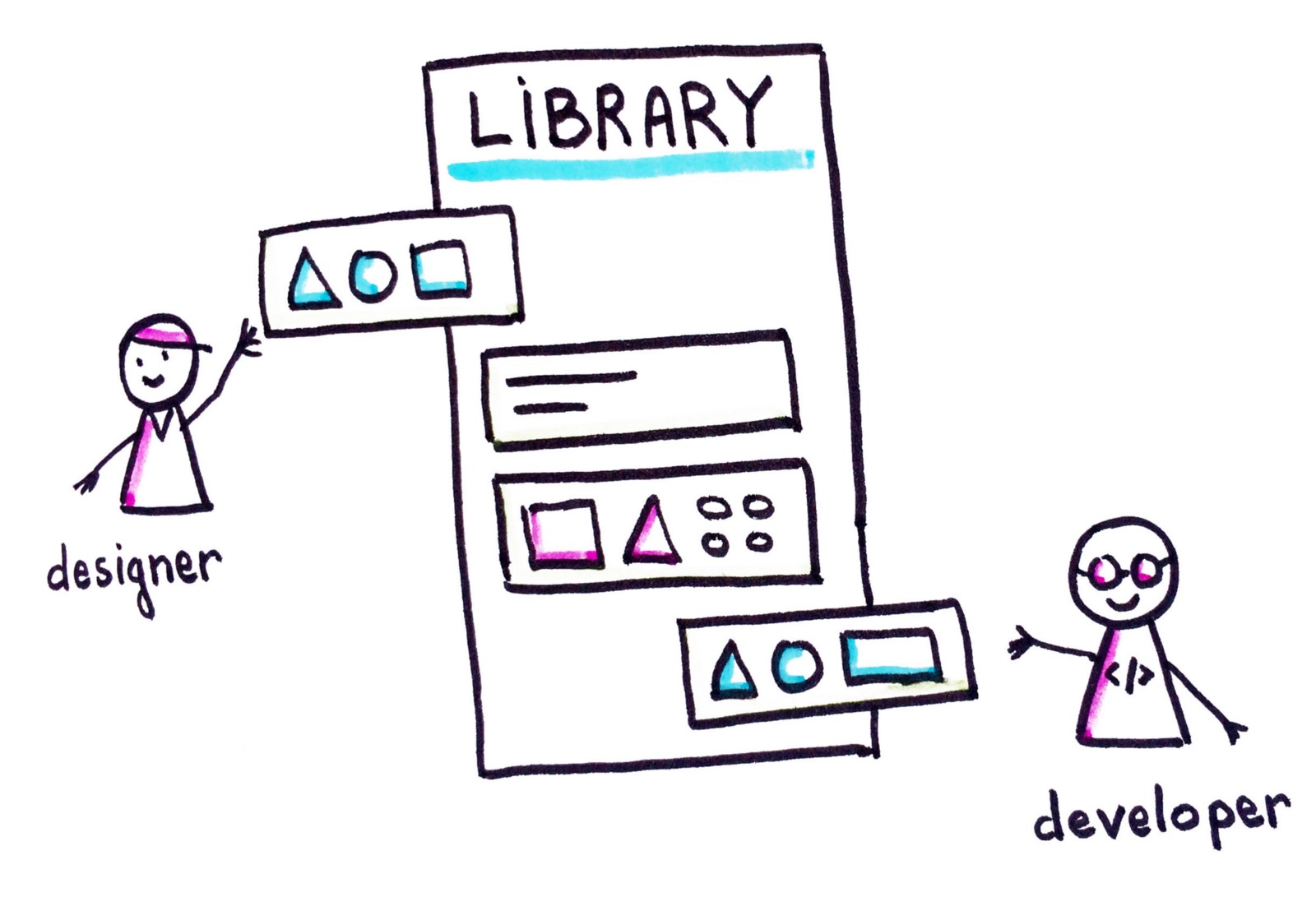
My vision for the future: a single library which would feed both designers & developers
It’s when I see a plugin like React Sketch app (recently launched by Airbnb) which promises coded components directly usable in our Sketch files, that I tell myself that maybe this future isn’t so distant after all…
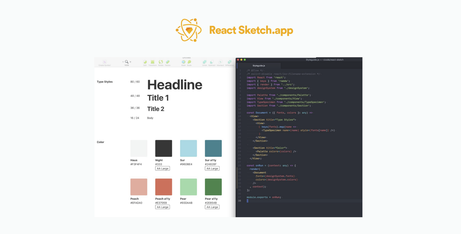
React Sketch app plugin: coded components directly usable in Sketch
Last words
I think you get it: I’m convinced that we need to design our interfaces using components, thinking about lively and evolving systems, and I think that the Atomic Design methodology will help us do it effectively.
If you too have feedback on the implementation of systems of components for small or big projects, do not hesitate to share your experience in the comments!

Audrey wrote this story to share knowledge and to help nurture the design community. All articles published on uxdesign.cc follow that same philosophy.