I hail from a design background and moved into front-end development some years ago. With responsive web design, the requirement of the designer is shifting. Here are a few tips collated to help designers who don’t code.
In an ideal world, everybody designing for the web medium would also be a front-end developer. The reasons for this are simple – design is development. To truly get the most out of your design skills, you need to be at one with the environment in which you design. Interestingly, many designers from an offline/print background get tasked with designing for the web; cue extraneous design concepts that attempt to detail interactivity and demonstrate web pages at different screen sizes.

But the problem with this is they’re just pictures.
I have been in the position a number of times as a developer where I am given designs from a designer that doesn’t understand the web as a flexible, interactive medium. They’re often not aware of common practices, and this stifles their creative ideas. Sure, you can sort of show what you think a drop-down menu should look like, or the various states of a button, but until you get this into the browser for rapid prototyping you’re seriously limiting yourself.
On a more serious level, you might be designing something that would take a huge amount of time to build, or worse still, you might even be designing a usability nightmare!
The point is, you really don’t know until you get away from Photoshop and start prototyping your designs in the environment to which they are accustomed; the web browser.
Tips for Designers
I’m going to get off my soap box now and try to offer some practical tips for designers who find themselves designing for the web, but don’t have a clear understanding of how web pages are technically constructed.
Disparities Between the Web and Your Design Program
It’s fine to design in Photoshop or Illustrator, but bear in mind that these applications render things differently to the web browser. In particular, you will notice that typefaces look different from Photoshop, as well as from browser to browser. The style will of course remain, but the way they are rendered may be rougher, smoother or have marginal size differences.

Many designers also like to use Photoshop filters to achieve background effects. These can really add to the design visually, but try to think beyond the space you’re working in and ensure that these effects can either scale or repeat indefinitely. Ensure they can be extracted as separate files for use as backgrounds, and that you’re not designing something elaborate that can’t be built with reasonable ease. Photoshop filters (i.e. multiply, linear burn etc.) don’t exist on the web.
It should also go without saying – but keep your folders/layers sensibly named and try not to rasterize huge chunks of the design as this makes it tough for the developer to work with.
Responsive Web Design is More than Just “Desktop and Mobile”
Quite often I’ll see a website design that comes in two flavours; desktop and mobile. Typically these will be 960 pixels and 320 pixels in width respectively. The trouble with this is that there’s no such thing as these fixed widths anymore, and everything we do needs to be completely flexible.
All too often the developer finds themselves trying to “fill the gaps” where the designer has not considered the design at 825, 650 or even 1400 pixels wide (for example), and this can result in a real headache for all concerned as content and navigation structure collapse under the requirements of a screen size not considered.
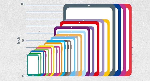
Some examples of Android devices. (Source).
To combat this flawed approach, try to think about page elements as separate, modular entities that all coexist within the same environment. Decoupled, but related, and reusable. Don’t make components look different at different sizes – we’re simply reflowing the same content, as such it would not make sense to add or remove content at different screen widths.
Don’t waste your time designing for an infinite number of widths, but do consider page elements as flexible and simple as possible.
As Brad Frost quotes when talking about Atomic Design – ‘we’re not designing pages, we’re designing systems of components.‘
Explaining Interactivity
This is a particularly tough one because Photoshop and Illustrator are ultimately static environments. Unlike when designing within the browser, where you have access to native responsiveness, CSS animation and real page elements (like buttons and check boxes), in Photoshop you need to laboriously mock-up how something might look in its initial state, its hover state, its clicked state, its disabled state and so on.
Again, because this isn’t immediately apparent until you prototype it, many designers overlook it and the developer needs to fill in the gaps.
UI kits can help this process. A UI kit is essentially a catalogue of page elements laid out in a file to visually describe interactive states.
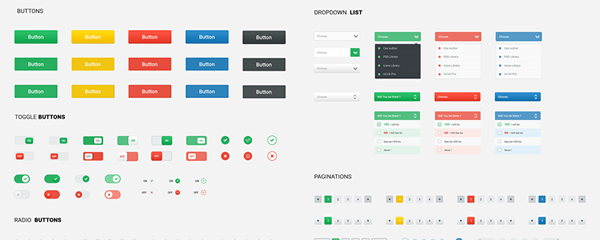
But this only half fixes the problem. What if we want a transition between states – how do we show this? For example, a checkbox may turn a different colour when you hover over it – but is this a binary “flick” or a fade? Or does it do something completely different entirely? In the example above, do the percentage tips fade in? Do they slide up as they fade, or slide down? Or do they just appear?
Start With Content!
It sounds like a no-brainer, but design around real content! Even with the best intentions in the world, you’re still just guessing when you use Lorem Ipsum. Sometimes real content may not exist, in which case get guidance from your client – they are as responsible as you are when it comes to content so don’t be afraid to put on the pressure.
If you’re designing around user-generated content, always consider fringe cases. How likely is it that “Sarah Jones” will upload a nice picture of herself to her profile? Consider “Jermaine Worthington-Redmond” who doesn’t upload a picture at all – what does this look like? Don’t force your developer into working this out for you.

The Apple Watch – this is a lovely, ideological image but it’s completely useless for anything other than marketing collateral. How likely are you to have professionally photographed, nicely-framed headshots of your friends who incidentally all have short names?
Location, Location, Location
I believe in practicality more than ideology so will reluctantly resign to the fact that designers will, in many cases, not understand code (or even have a desire to learn). If this is the case, my final tip would be to have a constant dialogue with your developer. There really is no room for ego, and long gone are the days of the production line when a design simply gets handed to a developer to build (I know these days aren’t actually gone, but they really should be).
By sitting next to each other throughout the process of design and build (of which, we now know there is a massive overlap), you’re going to eliminate design ambiguity, squeeze the most out of front-end technologies, ensure a much smoother process and create a better product.
Has this struck a chord with any designers or developers out there? Let us know in the comments, I’d love to hear what you think!