Image source: thestorefront.com[2]
Well-executed and beautiful icons look like tiny and cute images, but they are much more than that. They are extremely advantageous to every website because they attach visual cues to the essential elements of a website (headings, sections, buttons, etc) and they make the site/app look professional and sophisticated.
Generally speaking, icons play the same role as paragraph breaks-what they do is to divide text in smaller, less intimidating parts. Well-organized text can be easily accessed and marked with icons, visually attractive and sustainable. Therefore, forget about plies of textual information and begin using icons!
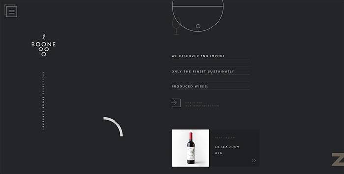
Image source: booneselections.com[3]
As we already mentioned, users don’t read content, but glance on the site in order to find something visually interesting. Designers use icons to promote content, and they place them wherever considered necessary. On the long run, icons help the recognition of a website and they direct users towards the important parts of the content. The final result is excellent organization of content.
Beautiful icons are crucial for web design, as they perform the role of content ‘breather’ and they ensure an intuitive workflow for your users. Icons help you avoid those situations where users click on a link and leave your site without paying attention to your attention. It is not enough to have good content-you have to make it accessible!
Icons in the service of your web content
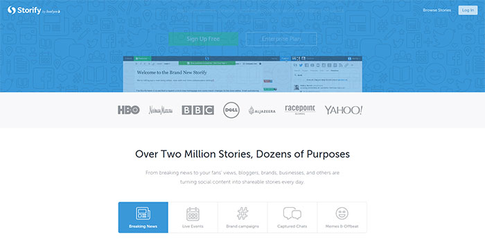
Image source: storify.com[4]
Icons shortly summarize the content of each website section. Both smaller and larger ones are equally powerful to attract attention. At the end of the day, icons can ensure bigger readability and better appeal for your website.
Aim and placing
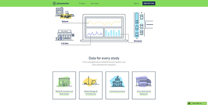
Image source: placemeter.com[5]
Icons play a welcoming role on the website-they attract users with a friendly and inviting tone, and they show that you took care even of the tiniest details. Therefore, be brave and use your creativity-icons can be placed on the headings, sidebars, lists, or whatever other part of your website.
Use icons to explain your products
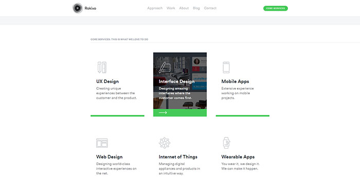
Image source: rokivo.com[6]
Well-executed icons are the perfect mean for displaying product lists. A small, interesting icon standing next to the product link can give users a pretty good idea of what you’re offering them. This is the shortcut to creating urgency, anxiety and great expectations. Soon after, a good icon can become the recognition symbol of a particular product (just as a logo would be).
Use icons to attract attention
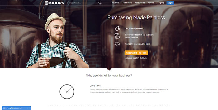
Image source: kinnek.com[7]
One of the main tasks of icons (the same as other pictures) is to kick boredom out of your websites. You can always add them to your attractive headlines and catchy content, and make the website more visually appealing.
However, experienced designers know that icons are more than a decoration-they are a designer’s main tool for separating content and differing between functions.
Determine your style
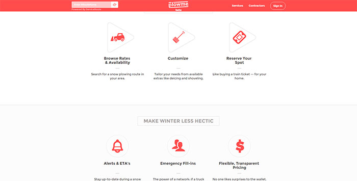
Image source: plowme.com[8]
Style is not just about appearances, but also effectiveness and functionality. Even if you’re attempting to be original, choose effective icons, rather than unique ones. Have in mind that their purpose is to help the readability of your content, so make sure they match the style of the other parts of your website. It means that downloading a premade, fancy set of stock icons may not be enough.
Icons can also be applied for services
Image source: brownowlcreative.com[9]
As we already pointed out, icons make your website welcoming and your workflow intuitive. Even more-they show users that you care about them and that you’ve been thinking about every single detail.
Therefore, you should relate each service you offer with a particular icon that will ‘ring a bell’ whenever your users see it. Furthermore, icons are worth thousands of words when it comes to finesse and professionalism.
With or without text?
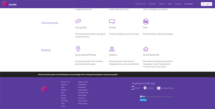
Image source: life360.com[10]
This is a very important question for every designer. The experienced among them know that the essential task is to ensure that users need to understand the meaning of every icon and to be able to differ them from each other.
It is true-text can be a solution to this problem. A small heading next to the icon can help users interpret its meaning and to use it without second thoughts. However, you need to be careful and to balance between imagery and text, so consider using the proximity principle.
Use icons for innovations in your features
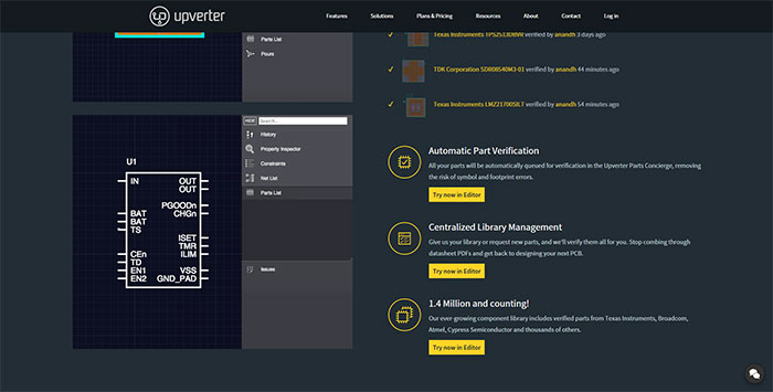
Image source: upverter.com[11]
You want users to familiarize with new, positive features on your website? There is no easier way to do it than to associate them with creative icons. In such way, users will feel attracted to check them out even without a clue of what they might find inside. The better the icon is, the less likely visitors are to overlook it.
What does a well-executed icon mean?
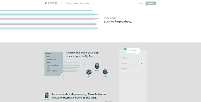
Image source: pagodabox.io[12]
There’s no narrow set of rules or guidelines for creating icons. The only common rule that ought to be respected is that icons are images which visualize the meaning of your items or direct users toward a particular action. Therefore, their success depends on whether users are able to understand them and whether your information is clearly highlighted. In order to achieve this, you need to keep your icons set consistent.
As stylish as you want your icons to be, don’t overdo them. Apply details carefully and stick with the basic parts which clearly match your brand.
Final thoughts
Image source: Kenil Bhavsar[13]
It is important not to underestimate the meaning of icons in web design. As small or modest icons may be, they play a crucial role and contribute essentially to the accessibility of your content. Icons are the items that are most capable of grabbing attention and helping users estimate what is really worth of reading.
Icons inspire positive and welcoming feelings on your website and they make the workflow intuitive. In order not to overdo them, stick with the basic metaphors and don’t frustrate users with complicated images. Final remark: have in mind that the icons have to match the style of your website and the main features of your brand.
If your icon set is specially created for the purpose, or you are uncertain whether people would understand it, attach a bit of descriptive text to the icon. Sometimes, a single word could be enough for a visitor to associate the icon with a particular action.
However, don’t forget the proximity principle and take care of margins and sizes. The simpler your design is, the easier it will be to understand.
References
- ^ Web Design (www.designyourway.net)
- ^ thestorefront.com (www.thestorefront.com)
- ^ booneselections.com (booneselections.com)
- ^ storify.com (storify.com)
- ^ placemeter.com (www.placemeter.com)
- ^ rokivo.com (www.rokivo.com)
- ^ kinnek.com (www.kinnek.com)
- ^ plowme.com (www.plowme.com)
- ^ brownowlcreative.com (www.brownowlcreative.com)
- ^ life360.com (www.life360.com)
- ^ upverter.com (upverter.com)
- ^ pagodabox.io (pagodabox.io)
- ^ Kenil Bhavsar (dribbble.com)
- ^ Say something to Bogdan Sandu about this article. (twitter.com)