Today, we’ll learn how to customize Bootstrap 4’s Sass files with Grunt.
Instead of Grunt, we could just as easily use another task runner like Gulp, webpack, or npm scripts. Regardless of the build tool the process of customizing Bootstrap’s source Sass files will be the same.
Note: This tutorial assumes you have some familiarity with Bootstrap 4, Sass, and build tools.
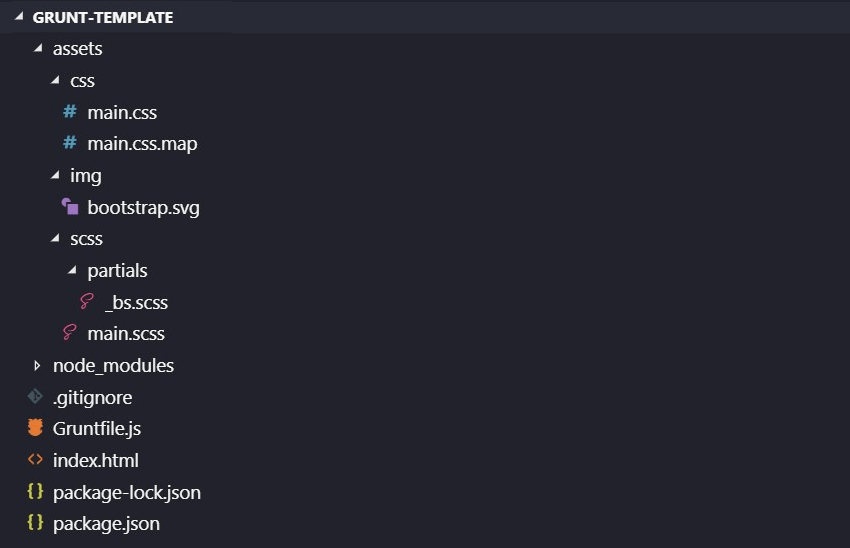
Project Structure
For the purposes of this tutorial, I’ve created a Node project. Here’s its structure:
If you’ve never created a Node project before, Kezz Bracey has you covered in this extensive beginner’s tutorial:

Inside our project you’ll see the “Gruntfile.js” file, in which we list some common tasks. More specifically, I’ve registered tasks which:
- Create a static web server
- Compile Sass to CSS
- Monitor for changes in the
.htmland.scssfiles, and then force a web server restart.
For these tasks, I’ve installed the latest versions (at the time of this writing) of these Grunt plugins:
I’ve also installed the latest version of Bootstrap along with its dependencies (jQuery, popper.js).
I do all that by listing them in the “package.json” file, which looks like this:
{
  "name": "grunt-template",
  "version": "1.0.0",
  "devDependencies": {
    "grunt": "^1.0.3",
    "grunt-contrib-connect": "^2.0.0",
    "grunt-contrib-watch": "^1.1.0",
    "grunt-sass": "^3.0.2",
    "load-grunt-tasks": "^4.0.0",
    "node-sass": "^4.11.0"
  },
  "dependencies": {
    "bootstrap": "^4.2.1",
    "jquery": "^3.3.1",
    "popper.js": "^1.14.6"
  }
}
When we run the project via the Command Line, Node will read through “package.json” and install everything it finds in a “node_modules” folder.
To grab all the starter files for this project, visit this Github repo and download it to your system. As soon as you’ve done so, execute the following things:
- Make sure you’ve installed recent versions of Node.js (my PC runs v10.15.0) and npm (my PC runs v6.7.0) in your machine. To test your machine versions, execute
node -vandnpm -v. - Run
npm install -g grunt-cli. This command will install the latest version (v1.3.2 at the time of this writing) of Grunt’s command line interface (CLI) globally. You can learn more info about what this command does in this page. Alternatively, we could have installed Grunt’s CLI locally in the project’s folder. - Navigate to the project’s root directory.
- Run
npm install. This command will install all the project dependencies (as mentioned, it will create the “node_modules” folder) listed in the “package.json” file. - Run Grunt with
grunt. Hopefully, this task will be executed correctly and you won’t encounter any errors. If errors do occur, make sure that steps 1 and 2 have been completed successfully. - Open your browser and type http://localhost:3000. You should see this landing page:

In the console, you should see something like this, indicating that Grunt is running:

Customizing Bootstrap 4
Now that we’ve automated the development process, let’s customize our installation of Bootstrap 4, which is located inside the “node_modules” folder:

Every Sass variable and map in Bootstrap 4 can be overridden or extended thanks to its !default flag.
With that in mind, let’s have a closer look at the “scss” folder of our project. Here’s what’s in it:

Inside the “_bs.scss” partial file, we’ll put our Bootstrap customizations.
Inside the “main.scss” file, we’ll include the aforementioned partial and the related Bootstrap installation, like this:
@import
  'partials/bs',
  '../../node_modules/bootstrap/scss/bootstrap';
The order we declare these two things matters. Our customizations should come before Bootstrap’s Sass files.
It’s also worth noting that instead of including all of Bootstrap, a better approach might be to pick only the files needed for the project.
Changing the Breakpoints
As a first customization, let’s change Bootstrap’s default breakpoints:
| Screen | Viewport Size | Class Prefix |
|---|---|---|
| Extra Small | < 576px |
.col-* |
| Small | ≥ 576px |
.col-sm-* |
| Medium | ≥ 768px |
.col-md-* |
| Large | ≥ 992px |
.col-lg-* |
| Extra Large | ≥ 1200px | .col-xl-* |
Their definition can be found in the “bootstrap/scss/utilities/_variables.scss” file. It looks like this:

The !default flag effectively says “use the following values for this variable unless they’re already assigned elsewhere”. So to override them we just have to register our own grid-breakpoints map inside the “_bs.scss” file:
$grid-breakpoints: (
  xs: 0,
  sm: 576px,
  md: 768px,
  lg: 1024px,
  xl: 1500px
);
That gives us the values below:
| Screen | Viewport Size | Class Prefix |
|---|---|---|
| Extra Small | < 576px |
.col-* |
| Small | ≥ 576px |
.col-sm-* |
| Medium | ≥ 768px |
.col-md-* |
| Large | ≥ 1024px |
.col-lg-* |
| Extra Large | ≥ 1500px |
.col-xl-* |
Changing Container’s Width
As a second customization, let’s change the container’s width. By default, the container (i.e. .container – not the .container-fluid) has a maximum width as shown in the table below:
| Screen | Viewport Size | Max Container Width |
|---|---|---|
| Extra Small | < 576px | None (auto) |
| Small | ≥ 576px | 540px |
| Medium | ≥ 768px | 720px |
| Large | ≥ 1024px | 960px |
| Extra Large | ≥ 1500px | 1140px |
Note: In the table above, we use the custom breakpoints declared in the previous example.
Bootstrap defines the container’s width in the “bootstrap/scss/utilities/_variables.scss” file.

Just as we did before, to override these values we register our own container-max-widths map in the “_bs.scss” file:
$container-max-widths: (
  sm: 767px,
  md: 1023px,
  lg: 1499px,
  xl: 1500px
);
Note: we can only specify the container’s width in pixels. If we try to use percentages (e.g. 100%), a “Potentially invalid value” warning is thrown in the console.
With this customization in place, the following values apply:
| Screen | Viewport Size | Max Container Width |
|---|---|---|
| Extra Small | < 576px | None (auto) |
| Small | ≥ 576px | 767px |
| Medium | ≥ 768px | 1023px |
| Large | ≥ 1024px | 1499px |
| Extra Large | ≥ 1500px | 1500px |
Using Bootstrap’s Mixins
Bootstrap defines the breakpoint mixins in the “bootstrap/scss/mixins/_breakpoints.scss” file. Let’s take advantage of them and change the body background color depending on the viewport size.
Inside the “main.scss” file, after the imports, let’s put this code:
/*
  variables come from Bootstrap's predefined colors
  e.g. $cyan: #17a2b8
*/
body {
  background: $cyan;
  @include media-breakpoint-up(sm) {
    background: $green;
  }
  @include media-breakpoint-up(md) {
    background: $red;
  }
  @include media-breakpoint-up(lg) {
    background: $teal;
  }
  @include media-breakpoint-up(xl) {
    background: $yellow;
  }
}
That gives us the results shown in the following table:
| Screen | Viewport Size | Body Background Hex Color |
|---|---|---|
| Extra Small | < 576px | #17a2b8 |
| Small | ≥ 576px | #28a745 |
| Medium | ≥ 768px | #dc3545 |
| Large | ≥ 1024px | #20c997 |
| Extra Large | ≥ 1500px | #ffc107 |
This is slightly bizarre behavior for the real world, but you can see it in action here:
For this example we used the mobile-first breakpoint mixins, however desktop-first breakpoint mixins are also available.
Here’s the same example with the desktop-first breakpoint mixins:
/*
  variables come from Bootstrap's predefined colors
  e.g. $cyan: #17a2b8
*/
body {
  background: $yellow;
  @include media-breakpoint-down(lg) {
    background: $teal;
  }
  @include media-breakpoint-down(md) {
    background: $red;
  }
  @include media-breakpoint-down(sm) {
    background: $green;
  }
  @include media-breakpoint-down(xs) {
    background: $cyan;
  }
}
Conclusion
In this tutorial, we covered the process of customizing Bootstrap 4’s Sass files with Grunt. We used Grunt for handling some common tasks, but in your own projects you might well prefer to use a different build tool.
I hope this tutorial has given you a solid understanding of how to theme Bootstrap 4 projects from the ground up. If you have any questions, or if there’s anything you didn’t quite understand, let me know in the comments below!