CSS subgrid is slowly making its way into browsers. The CSS Working Group is actively working on it and the related W3C specification has already reached Level 2. This new feature will enable us to enhance grid items with subgrids that inherit the grid tracks of their parent grid and seamlessly align with it.
As CSS subgrid is not yet implemented by browsers, this article gives only a high-level overview of the upcoming features. Subgrid will likely to be implemented by Firefox Nightly soon where you can experiment with it. Note that the specifications are not yet finalized, so features can still change in the future.
The Problem CSS Subgrid Solves: Inheritance
Only direct children of the grid container become parts of the CSS grid layout. Children of grid items don’t inherit the grid layout. Instead of display: grid, their default display property will be either block or inline, depending on whether they are block or inline elements.
Grandchild elements not being part of the grid does have several advantages. For example, they’re free to implement another layout module, such as flexbox, or their own independent grid with different alignment rules.
However, in many cases, you might want to create a subgrid that inherits rows, columns, and lines from the parent grid. Using the more precise wording of the CSS Working Group:
“… a subgridded axis is one which matches up its grid lines to lines in the element’s parent’s grid …”
and
“… derives the sizes of its tracks through this integration with the parent grid.”
Right now, we can only mimic subgrid-like behaviour using nested grids. However, while the coming CSS subgrid will have the same grid tracks as its parent grid, this is not the case with the currently available nested grids.
Let’s look at an example to better understand how nested grids and CSS subgrid are different from each other.
1. Nested Grid
Here’s a very simple nested grid:
<div class="grid">
  <div class="nested-grid">
    <div class="item"></div>
  </div>
</div>
The outer .grid container has five columns and three rows. I’ve set its height to 300px so that I can use fraction units for grid rows, too:
.grid {
  background-color: deepskyblue;
  height: 300px;
  display: grid;
  grid-template-columns: repeat(5, 1fr);
  grid-template-rows: repeat(3, 1fr);
}
The nested grid takes up three columns (between grid column lines 2 and 5) and two rows (between grid row lines 1 and 3). It also inherits grid-template-columns and grid-template-rows from the outer grid:
.nested-grid {
  background-color: mediumblue;
  grid-column: 2 / 5;
  grid-row: 1 / 3;
  display: inherit;
  grid-template-columns: inherit;
  grid-template-rows: inherit;
}
The item inside the nested grid takes up one column (between grid column lines 2 and 3) and two rows (between grid row lines 1 and 3; the rule is inherited from .nested-grid):
.item {
  background-color: black;
  grid-column: 2 / 3;
  grid-row: inherit;
}
Now, if you switch on the Grid inspector inside your browser’s developer tools, you’ll see the issue at once. Even though the nested grid inherits both the row and column sizing from the parent grid, the two grids’ tracks are still independent of each other:
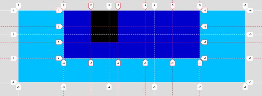
The parent grid has five equal-width columns and three equal-height rows:

The nested grid also has five equal-width columns and three equal-height rows, however they are completely independent of the parent grid’s rows and columns:

Besides this, the .item element uses the tracks of the inner grid rather than the outer one.
With CSS subgrid, we’ll be able to achieve a different outcome. The subgrid will use the parent grid’s tracks over the area it spans, so there will be just one set of tracks, used by both grids.
2. Subgrid Simulation (Still with a Nested Grid)
As CSS subgrid is not yet implemented by browsers, I’ve created a subgrid simulation that uses the currently available syntax to achieve similar (but not quite the same) behaviour as the coming subgrid.
However, there’s an important difference between the simulation and the real subgrid. Although the simulation creates an inner grid that looks as if it had the same grid tracks as the parent grid, they are still two independent grids not tied to each other.
For example, if a larger item overflows a row or column inside the simulated subgrid, the belonging grid lines will move away from their original places. It will also become visible that the simulated subgrid is completely independent of the parent grid, as they won’t move together (like the real subgrid will do).
The markup for the simulated subgrid is the same as before:
<div class="grid">
  <div class="subgrid">
    <div class="item"></div>
  </div>
</div>
The CSS belonging to the parent grid is also the same, however I’ve created a --gridheight variable so that I can later calculate the track sizes of the inner grid:
:root {
--gridheight: 300px;
}
.grid {
  background-color: deepskyblue;
  height: var(--gridheight);
  display: grid;
  grid-template-columns: repeat(5, 1fr);
  grid-template-rows: repeat(3, 1fr);
}
The subgrid spans over the same area as before, defined by the grid-column: 2 / 5; and grid-row: 1 / 3; rules.
The grid-template-columns property defines three columns instead of five, as we want to place the subgrid’s columns exactly over the parent grid’s columns.
The grid-template-rows property has some pretty ugly calc() rule that simulates the placement of the parent grid’s rows. First, we calculate the two thirds of --gridheight, as the subgrid spans over only two rows instead of three (defined by the grid-row rule). Then, we further divide it by 2, as the subgrid should be broken into two equal-height rows.
.subgrid {
  background-color: mediumblue;
  grid-column: 2 / 5;
  grid-row: 1 / 3;
  display: grid;
  grid-template-columns: repeat(3, 1fr);
  grid-template-rows: repeat(2, calc((var(--gridheight) * 2 / 3) / 2));
}
For the .item element, we use the same rules as before, so that we can compare how the covered area changes:
.item {
  background-color: black;
  grid-column: 2 / 3;
  grid-row: inherit;
}
And, success! The Grid Inspector shows that the simulated subgrid has exactly the same grid lines as the parent grid:

The parent grid still has five equal-width columns and three equal-height rows as before:

But now, the inner grid’s lines are identical with the parent’s grid lines:
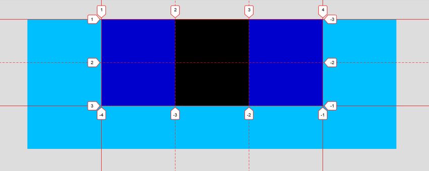
The shape of the .item element has also changed. As the inner grid now has only two rows, .item spans across the entire height of the subgrid, as it has been defined to cover two rows between lines 1 and 3 (grid-row: 1 / 3;).
You have probably noticed that the inner and outer grids use different line numbers. The coming subgrid will count grid lines in the same way as well. It will start counting its own grid lines from number 1 over the area it spans. As a result, we won’t have to track back the line numbers of the parent grid, so it’ll be easier to place items on the subgrid.
CSS Subgrid Syntax
Two-Dimensional Subgrids
Two-dimensional subgrids inherit both the rows and columns of the parent grid. So, we need to assign the subgrid value to both the grid-template-columns and grid-template-rows properties. This is how the code above would look with the new subgrid syntax:
.subgrid {
  background-color: mediumblue;
  grid-column: 2 / 5;
  grid-row: 1 / 3;
  display: grid;
  grid-template-columns: subgrid;
  grid-template-rows: subgrid;
}
The new syntax will save us a lot of time, as we won’t have to calculate the values of grid-template-columns and grid-template-rows. Besides, the subgrid will be tied to the parent grid, as they will use the same grid tracks. So, if we add a larger element to either the parent grid or the subgrid their tracks will grow together.
One-Dimensional Subgrids
Probably the best feature of CSS subgrid is that we won’t necessarily have to use it in two dimensions but we can create column-only and row-only subgrids, too.
1. Column-Only Subgrids
Column-only subgrids inherit only the columns of the parent grid but rows are defined independently. So, we only need to assign the subgrid value to the grid-template-columns property. For example:
.subgrid {
  background-color: mediumblue;
  grid-column: 2 / 5;
  grid-row: 1 / 3;
  display: grid;
  grid-template-columns: subgrid;
  grid-template-rows: 1fr 2fr 3fr;
}
Columns of the subgrid use the tracks and grid lines of the parent grid, while rows behave as separate entities.
2. Row-Only Subgrids
Similarly, row-only subgrids only inherit the rows of the parent grid but columns are defined separately. In this case, we only need to use the subgrid value on the grid-template-rows property. For instance:
.subgrid {
  background-color: mediumblue;
  grid-column: 2 / 5;
  grid-row: 1 / 3;
  display: grid;
  grid-template-columns: 3fr 2fr 1fr;
  grid-template-rows: subgrid;
}
Having access to one-dimensional subgrids will make CSS subgrid pretty flexible and we can expect to see a lot of interesting use cases in the future.
Features of CSS Subgrid
CSS subgrid has multiple features you can browse in the Grid Layout Module’s Level 2 documentation. To save you time, here are the most important features of CSS subgrid (bear in mind that they might still change in the future):
CSS subgrid…
- inherits the named grid lines of the parent grid,
- inherits the named grid areas of the parent grid,
- inherits the gaps of the parent grid,
- can define its own named grid lines that will be added to the named grid lines of the parent,
- can define its own named grid areas that will be added to the named grid areas of the parent,
- can override the inherited gaps,
- starts to count line numbers from 1 (already mentioned above).
Conclusion
CSS subgrid is still under development but we can expect it to be adopted by pre-release versions of browsers in the near future. This highly demanded new feature will allow children of grid items to inherit the grid layout from their grandparent, in either two (rows and columns) or one (rows or columns) dimensions.
Learn More
Although use cases of CSS subgrid have not yet been fully explored, here are two great articles where you can find real-world layout problems it can solve: