Ethics, UX, and our role in all this
We live in a world where our behaviours are accurately being predicted every step of the way. It sometimes feels like apps and products know us more than we know ourselves. This is not necessarily bad, or that we should be scared every time we log on, it’s just that these things are malleable and these things should be different says Roose. A lot of this began with a vision — a dream. A dream of a connected world. A space that would allow us to feel less alone and share experiences at the touch of a fingertip. This dream as scaled far beyond our wildest dreams. This space quickly turned into anything we could imagine and then some… online dating, fact-checking, personal entertainer, online learning, guardian of our memories, and the place that sometimes just leaves us… empty.

Ethics in design
The topic of ethics has gained in popularity over the years and has become a very hot topic. We’ve seen a lot of ethical scandals from major corporations such as Nestle, Nike, Volkswagen and many others which have all faced their fair sum of issues. It seems that the ethical aspect has now turned to the design industry.
F*ck ethics. Money is everything
With everything currently going on in the world and in our every day lives, documentaries such as The social dilemma (2020) and The great hack (2019) all of a sudden has to make us think. What is our role, as designers, in all this?
Ethics and ethical UX design should be something every designer understands. Ethics can be defined as a set of moral principles and values that guide behaviours, by indicating what is right to accomplish beyond the legal requirements — (Steiner & Steiner, 1980; Louks, 1987).
Companies actually benefit from ethical behaviours in numerous ways. The stock price of the 100 most ethical firms outperforms their peers by 300%. This has also been making waves in the design industry. As technology keeps increasing at a rapid pace all around us, we are confronted with social media privacy issues, addictive techniques used in apps and the use of dark UX patterns. We know all these are out there but there seems to be very little attention around them.
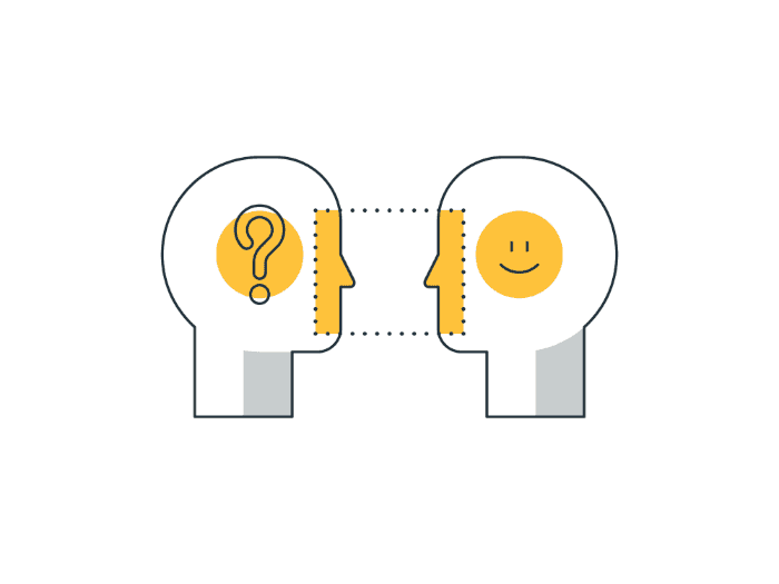
Persuasion is all around us. We are bombarded by it everyday without really realizing it. When done right, it makes our experiences frictionless and easier to use. These techniques, rooted in psychological principles of influence, are based on human behaviours and motivations to help influence the way people behave — nudging them in the desired direction. Designers often use ethical persuasive design methods to get users to take action. In fact, persuasive design can be an invaluable tool that designers use for good, but there may be a flip side to that.
Dark UX patterns
Dark Patterns can be described as deceptive UX/UI interactions, designed to mislead or trick users to make them do something they may not want to do. This term emerged after the boom of eCommerce industries in 2010. It was used by designers and business associates to generate more sales, increase subscriptions and hit their target numbers.
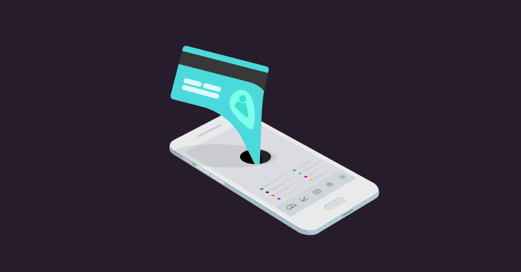
Harry Brignull, a PhD in Cognitive Science describes Dark patterns as:
a user interface that has been carefully crafted to trick users into doing things, such as buying insurance with their purchase or signing up for recurring bills
He also launched the www.darkpatterns.org site witch has the specific goal of shaming companies who use these deceptive techniques in their site. A great way to help users defend themselves by being able to identify some tactics through his site. Dark patterns are actually not only found on the web. Just look at your next Credit Card advertisements you receive in the mail, which often present you with a 0% balance transfer yet, only to find out later that it will shoot up to a much higher number… unless you actually read the long term agreement in that very fine print.
Harry Brignull lists 12 types of dark patterns on his website –
- Trick questions — A sneaky technique, typically found in forms where you respond to a question that tricks you into giving an answer you didn’t intend
- Sneak into basket — Somewhere in the purchasing journey the site sneaks an additional item into your basket
- Roach motel — You get into a situation very easily, but then you find hard to get out of it
- Privacy Zuckering — You are tricked into publicly sharing more information about yourself than you really intended to
- Price comparison prevention — This experience makes it hard for you to compare the price of an item with another item, so you cannot make an informed decision
- Misdirection — The design purposefully focuses your attention on one thing in order to distract you attention from another
- Hidden costs — You get to the last step of the checkout process, only to discover some unexpected charges have appeared, e.g. delivery charges, tax, etc.
- Bait and switch — You set out to do one thing, but a different, undesirable thing happens instead
- Confirmshaming — When a design tries to make users feel guilty for not choosing a suggested option
- Disguised ads — This technique utilizes ads that end up looking a lot like the rest of the content on a page just to get you to click on them
- Forced continuity-When your free trial with a service comes to an end and your credit card silently starts getting charged without any warning
- Friend spam-The product asks for your email or social media permissions under the pretence it will be used for a desirable outcome (e.g. finding friends), but then spams all your contacts in a message that claims to be from you
A fine line
These are some examples of the most recognized UX Dark patterns… the simple ones we may say. What about the ones that are more complex? What about the ones that are created by thousands of engineers using Data and AI?
Never before in history have 50 designers made decisions that would have an impact on two billion people
– Tristan Harris, a former design ethicist at Google
Have you ever stepped back to think where lies the fine line between ethics and profit? Is there such a line? It’s really easy to blame the big tech companies for all this since they have all the money in the world and fame. Some of these “harmless practices”, including using dark patterns have always been used by marketing teams to sell products. Using data against us, or to actually persuade users to change their behaviours is also considered part of the Dark patterns — perhaps even darker.
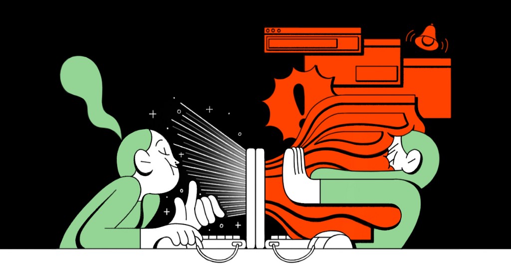
We are constantly connected and companies know it. The constant notifications from our favourite apps, the autoplay feature in Netflix or the up next YouTube video already queued up, are simple ways to keep us engaged — and hooked. The younger generation of kids growing up today interact with smart phones very early on. Should we be alarmed of this or we should see this as an opportunity?
Think of the amount of times you check your phone in a day just to see if something new happened. If you received a new email or if someone liked your latest Instagram picture. We need to remind ourselves that this itch has been intentionally created.
Unfortunately, many of us use our devices to fill a void, or when we just have nothing to do, as if it no longer normal to just sit there and wait. We live in the attention economy where everything is screaming for our attention.
The persuasive equation
Fogg’s Behaviour Model is probably the most recognized framework out there. Dr. BJ Fogg, a Stanford University Professor, founded the Behaviour Design Lab and developed his framework based on a persuasive techniques. It illustrates that all three parameters Motivation, Ability and Prompts must come together at the same time for you to influence behaviour.
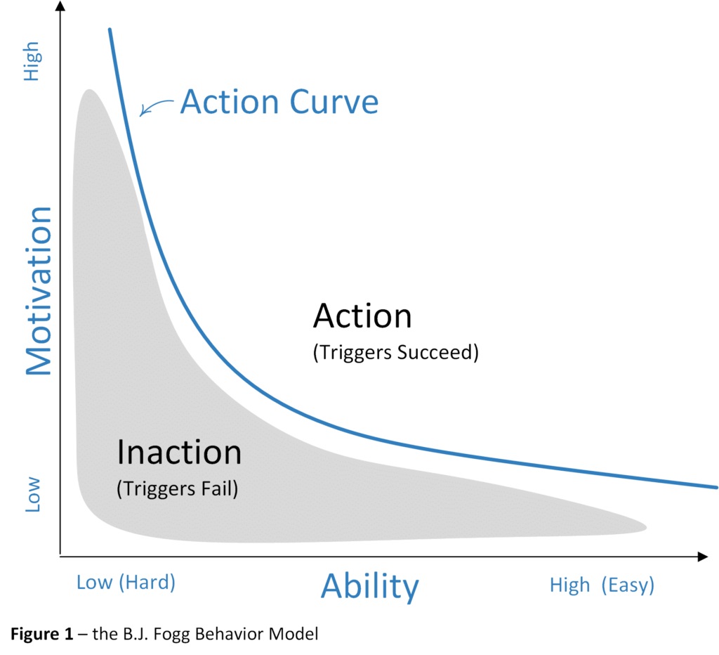
Persuasive design is often seen as part of the toolkit designers use in their day to day activities, but it goes much further. To achieve persuasion, one must first understand the emotions that influence human behaviours and decision-making and using that piece of information to design compelling user interactions. The motivations and cognitive biases are translated into frameworks and patterns that are applied to product design, television advertisements, social media campaigns and even in apps such as Netflix. We have all been caught in the Netflix rabbit hole — spending hours binge watching movies or episodes. Top10, recommended for you and the auto-play feature are just examples of these techniques being used without you even realizing it.
Why do some products capture so much of our attention while others don’t? Some products or apps create such strong habits. We are in a generation where users have a hard time putting down their phones. In fact, in a recent tech survey found that adults check their phones 80 times a day. Could persuasive design be used against us to get us hooked?
If we look back at everything that we may have designed over time through micro-interactions such as a gentle nudge, a notifications or that famous like button I wonder how many of us could have imagined the impact they brought to products and onto humans. These persuasive design techniques created what is called a feedback loop, which keeps every user glued to their devices.
There are many different studies that analyze the increase usage of screen time in kids over the years. According to Common sense media, kids now spend up to 10X more time on their devices compared to 2011 for an average of six hours and 40 minutes. Don’t get me wrong here, technology has many advantages and positive effects. It can help ensure people take their medicine on time, send a nice reminder to meditate allow us to interact with long distance relationships and way more but we just have the think of all the possible impacts.
Humans crave closure. We need a start and an end to our activities however many social media apps seem to go against that. They end up creating these “false loops” where we never end up reaching the end… thus leaving us craving for more.
Only two industries refer their customers as users: Illegal Drug Industry and Digital Apps
– The Social Dilemma
That phrase really resonated with me. I had actually never thought about it before watching that documentary. Behind these devices are real humans, real lives and sometimes they can change our perception of the world and ourselves. Things as simple as the like button feature may have some solid impacts on a young girl’s self esteem.
It is astonishing to know that we, on average, send around 6,000 tweets every second and that every minute there are 510,000 comments posted and 293,000 statuses updated on Instagram.
There is a potential downfall in all this. We are seeing a rise in depression and anxiety, cyberbullying, FOMO (Fear of missing out), unrealistic expectations, negative body image, unhealthy sleep patterns, general addiction just to name a phew. Do we need to worry about this?
Solutions and opportunities
Let’s face it, designers started in this field to help make things better and help improve user experiences across different products and services. Designers have real super powers, and with the right techniques and focussing on the participants, they have the ability to help build products and services that solve real user problems and what actually motivates them to take action. But when these super powers are used to trick users to implement deceptive functionality or into doing things without their interest in mind, we then call these techniques Dark patterns.
We need to start looking into developing some possible ethical frameworks or ethical codes to guide us in our designs and in evaluating them. We need to force ourselves into looking at all our design issues from many different perspectives to ensure we consider the possible impacts of our design decisions.
Will this bring on the birth of a new role? It is fairly common to question some of our designs and to question ourselves if this is ethical or not. We all understand it but, thus far, I have not had the opportunity to work on a product space where an actual design ethicist role existed.
Bellow are some creative ways we can look at design ethics and ensure we approach it from the “right angle”.
- 10 principles for Ethical UX designs: Good and simple way that demonstrates how to properly design against the Dark patterns
- Manipulation matrix: From the book, Hooked, by Nir Eyal. a simple tool to help organizations determine the best (and most honest) way to position your product to your buyers, and consider what the implications of bringing it to market might be
- Tarot cards of tech: A set of cards that are provocative to help creators more fully consider the impact of technology
- Bite-size psychological insights: a physical brainstorm tool created to help UX practitioners implement persuasive design in their daily work
- Inclusive panda: How we should stop using the term users and instead use the term participants. Encouraging ethical, sustainable and inclusive design in all organizations by providing clear and simple guidance on how to get started and keep going. I really enjoy this model personally
Ethical UX design deserves a book in itself. It is such an interesting topic which no one can shy away from. So many other great designers have written articles on the subject and I hope this will help shed a light on this interesting subject and how to best approach it moving forward. I hope I was able to make think.
We need to leverage our powers to develop products without harming, exploiting or deceiving our participants. There is no simple, one size fits all solution here. We need to determine the best practices for utilizing these persuasive design techniques but where do we draw the line to determine what is actually a person’s best interest?
The line is extremely fine and we need to keep our participants best interests in mind, ensure they trust us and feel comfortable using our products. It does not matter if it’s free or expensive, the goal should remain the same. We have a choice and a responsibility.
Good luck and have fun!
I am all ears for your take on anything design, feel free to connect with me on Linkedin.
References
- https://www.interaction-design.org/literature/topics/persuasive-design
- https://www.toptal.com/designers/ux/persuasive-design-principles
- Hooked, Nir Eyal — https://en.wikipedia.org/wiki/Nir_Eyal
- https://www.theverge.com/2019/7/30/20746878/josh-hawley-dark-patterns-platform-design-autoplay-youtube-videos-scrolling-snapstreaks-illegal
- https://medium.com/r/?url=https%3A%2F%2Fuxdesign.cc%2Fethics-in-design-an-interview-with-harry-brignull-from-darkpatterns-org-95489057c440
- https://uxdesign.cc/nazis-designers-dark-patterns-4c381b014b10

Ethics, UX and our role in all this was originally published in UX Collective on Medium, where people are continuing the conversation by highlighting and responding to this story.
