
Below I outline what every timeless web design has in common. These principles take a successful web design to the next level. They make the difference between good and elegant. With a little attention to detail and some extra planning, you can make something that will captivate your audience all the time.
What Makes a Timeless Web Design
The key to making your webpage work is to focus on user-centric content and engaging or inviting UI. Therefore, I’m dividing the 6 principles into two categories: content and interface design.
Content principles
Clarity – I see so many instances of creative websites, blog posts, or promotional materials where the work is absolutely beautiful and well-crafted, but it’s not clear what the company/purpose, message, or product is. If it’s not obvious your audience is not going to stick around to figure it out. If it’s not retaining your audience then it’s not meeting the need you’re developing the website for.
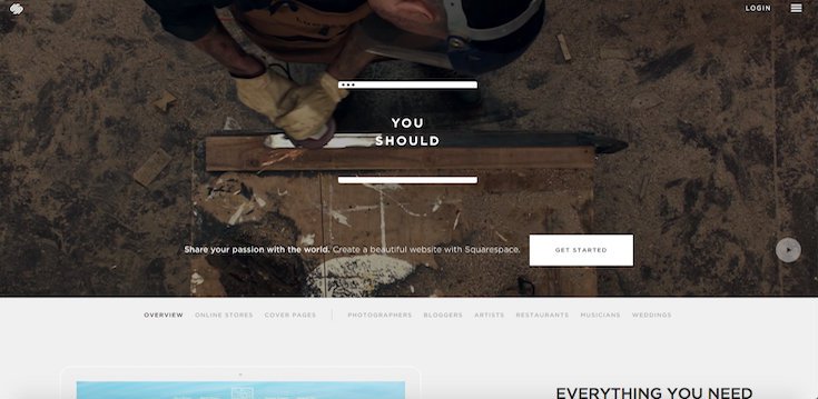
Idea: Use an image that captures and communicates what your website is about, or use one sentence to get the message across. Another idea would be to highlight your call-to-action to the user so they understand the purpose of your website immediately. Squarespace is a great example that demonstrates how clarity can be achieved.
Cohesion – A cohesive website guides the way through all the interface components and leaves no loose ends. Cohesive websites have a solid beginning and end, and often the end goes back to the beginning. Whether or not you want to literally bring it all together, close the loop. Make your audience feel as though they are reading a book.
Idea: Put an intriguing video or slideshow in the first place your audience will look on your website. It helps deliver material and information in an ordered fashion. You can make the user have a complete experience if you hook them from the beginning and ensure they go through each section of your webpage as you intend. Think about your UX goals and how your interface design works to meet them.
Personalization – Make your website resonate with your audience! While your website should not alienate anyone, it should be designed with elements that will be relevant and appealing to your target audience. The more specific your target audience is, the more obvious those elements can be, but while most websites will be for general consumption.
Idea: there are small things you can do to make a website feel more personal. Use words anyone looking for your website will be familiar with. Tell stories or use examples they would find as common ground. The websites people like the best are the ones that make them feel comfortable. Try to intentionally make as many parts of your website as inviting as possible.
Interface Design Principles
Sense of Presence – Every website should cultivate a sense of presence in their UX. Whether that sense of presence is for a person or organization represented by the website or for a greater community that the user engages with through your website, it is important that your website generate the feeling that the user on it is meeting someone or many other people.
That sense of presence could be a feeling of meeting others like them, or people who can help them achieve a goal or meet a need they have. Feeling presence through a website will enhance their experience and improve the likelihood that they will feel positively about visiting your website. Check out this gallery of community websites for some great examples.
Interactivity – The fantastic thing about all the great tools for building websites or developing them from scratch is that the easier it is to get all the pieces together, the more time you have to spend on dimensions of your website such as its interactivity. The more opportunities a user has to engage with your website and the more enticing those opportunities are, the greater impact you can have on them.
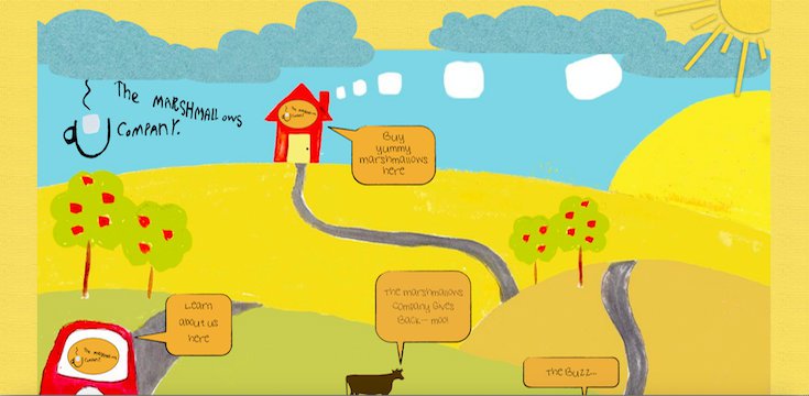
Interactive websites are cool. They are unique, and they can be a whole lot of fun to both develop and use. The image below from The Marshmallows Company is cute and interactive with purpose. The speech bubbles are interactive and help a user navigate the site at the same time. Be aware of when interactivity works and dive in when you get the chance to use it appropriately.
Coherence – Remember that navigating a website is like a journey for the user. Think about all the ways a user could explore your website. Some will go from the top-to-bottom, left-to-right. Others might be driven by their interests or a particular mission to find contact information or an update. Their progression should be linear. What they see and read should build upon itself or else they are liable to give up at any step along the way.
The coherence of your website depends on your understanding of all the different populations in your audience, how they might wind up at your landing page, and what they might be looking for. Solicit feedback from your audience. Have a poll somewhere that asks them who they are, what they do, or what they’re looking for.
With a few key concepts in mind, you can simplify building a timeless webpage for any situation. What works for you? What kinds of website do you find always appealing, no matter what colors or layouts are popular? Share with us what you find to be classic or elegant.