Or why your cookie-cutter portfolio doesn’t cut it and how to fix it

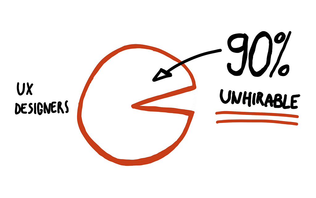
Here’s the harsh truth: I’ve reviewed more than 1,000 portfolios in my design career so far, and I turned 90% of them down because of one thing — the linear design process.
By “linear design process” I mean cookie-cutter case studies that always read the same. The designer learned about a problem, conducted user interviews, created user personas, proceeded to sketches, then mockups and wireframes, made everything beautiful through visual design, created a prototype, and tested it with five users. Everything was perfect so they also created a design system which is not a design system but a style guide. But they call it a “design system” because it’s trendy and a keyword for the recruiters.
It’s like finding a product that you want to buy online and it only has 5-star reviews. When everything is shown as perfect it loses credibility — are the reviews fake? It’s the same when I review your cookie-cutter portfolio — when everything’s perfect I wonder whether it’s all fake.
The 90% is my estimation based on the many portfolios I reviewed, I don’t know what the exact number is, but it’s high. Most UX and product design portfolios have two case studies that are the same, it’s just the details that differ slightly.
I posted a much shorter version of this post on LinkedIn a couple of months ago and it went viral. Many experienced designers agreed:
Many case studies read to me like school homework: they knew what the answer and the process were “supposed to be” according to the textbook, so made up the story to fit. In reality, as you point out, it’s never smooth and linear. It’s messy and loopish. If you’re doing a good job, you rarely end up with anything remotely like you anticipated when you started out. (Source)
A design manager shared their perspective:
If I see another case study that walks me through personas, walls of sticky notes, photos of customers being interviewed, and sketches from a notebook… I’m going to lose my freaking mind and pull out my hair. (Source)
When I review such portfolios I can’t help but think that the designer behind them is either inexperienced, lacks a passion for design, or simply can’t communicate the value of their work. Sometimes, all of the above are true but even if only one is, it’s enough to be turned down by design-mature companies. This brings me to the second point.
A shallow portfolio with cookie-cutter case studies may get you a job in UX. But it’ll most likely be a job with a design-immature company that doesn’t fully understand design. You get stuck doing boring design work and your career stalls because the quality of your work never increases so you don’t have anything better to put in your portfolio. You get trapped in a loop.
When I say 90% of designers are unhirable, what I mean is they’ll be turned down immediately by design-mature companies.
Design mature companies, on the other hand, look for designers who can solve problems in creative ways. Taking the design process that you learned in the UX boot camp and using it to solve every problem you face just won’t cut it for them. When I say 90% of designers are unhirable, what I mean is they’ll be turned down immediately by this type of company.
We teach designers the design process and how their case studies should be structured, but that’s not how design works in practice where it’s a messy, non-linear process. Following this conclusion, there are two major problems when it comes to designers’ processes and how they present their work:
- Designers’ processes are truly linear
- Designers’s processes aren’t linear but they think that case studies need to be linear and perfect
Let’s take a closer look at both of them.
Designers’ processes are truly linear
My assumption, based on interviewing and speaking to designers, is that a relatively small amount of these are truly linear. The rest of them are embellished to seem perfect because designers think that that’s what hiring managers want to see. Or they simply think that’s how case studies should be — a perfect, linear story with a happy ending.

This probably aligns with seniority (or lack of experience), I estimate that 20–30% of designers really use a linear design process. (That’s how many identified as junior or intermediate in my research for Why Designers Quit 2023). I have witnessed such designers. You tell them that an interaction in a UI needs to be redesigned. It’s a small task but they’ll start talking about conducting user interviews and creating personas.
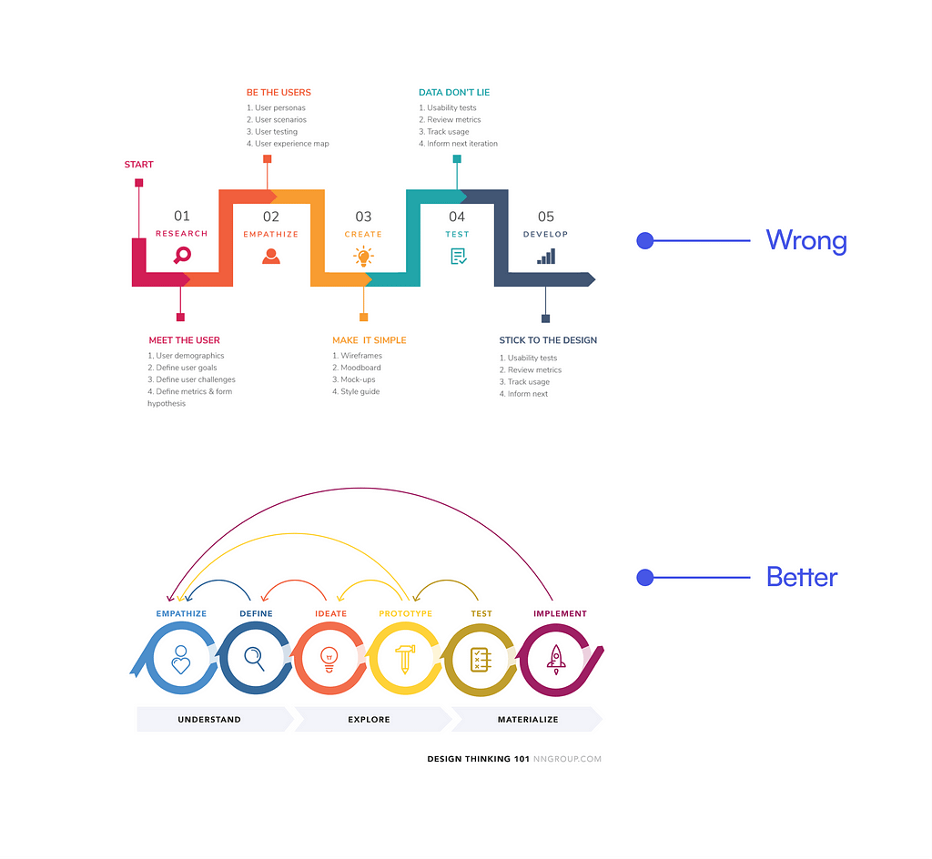
The design process doesn’t have a beginning or an end. It can start at either of the steps of a design process (so numbering them is misleading, top example in attached image), and it never really ends (so it needs to be a cycle, bottom example). This also means that you don’t have to go back to the beginning of “the process” every time you get asked to do something.
A truly linear design process would mean that designers are in full control. Eduardo Hernandez explains this beautifully in Death to the Double Diamond.
The more control you have over influencing factors, the more predictable the problem-solving process can be. The less control you have over influencing factors, the less predictable the problem-solving process can be.
So even the double diamond design process which has been often cited as the design process doesn’t reflect reality. It’s the perfect ideal that designers strive for but rarely achieve. Designers simply don’t have that much control over the influencing factors so a design manager reading through a perfect, cookie-cutter case study, even if it uses the double diamond process, knows immediately that it’s fake.
Doing the double diamond lacks purpose, continuity and context because the designer isn’t reacting to the unexpected and emerging questions or situations they find themselves in rather the double diamond offers answers to questions designers often don’t have, Hernandez elaborates.
Recommendations for these designers
So what should you as a less experienced designer do? You were taught to use a process but now I’m telling you to scrap it. Here are my recommendations:
- In the early years of your career, try to find a balance between being assertive and adopting a learning mindset. It’s time to take off the rose-coloured glasses, open your mind, and face the reality of what it means to be a designer.
- Focus on building your communication and leadership skills. Even if you’re not a lead designer, every designer role requires a level of leadership.
- Build relationships with other stakeholders, they play a vital role in getting things done. Design happens through communication and collaboration.
- Finally, abandon your dogmatic and idealistic view of the design process, and keep learning about how flexible, messy, and beautiful it is.
Designers think that case studies need to be linear and perfect
When I posted that viral post on LinkedIn, one of the things that surprised me most was comments from designers saying “It’s true that the design process is messy and chaotic, but shouldn’t the case studies be linear?” Here’s an example:
However, when you’re creating a case study, you need to present a linear sequence of slides, following a logical narrative. If you’re trying to tell a story, it must be done logically. I recently completed a UX case study, and the process was quite chaotic. I had to conduct UX research twice, write user stories, and keep making revisions. However, in the case study, I had to present it in a linear fashion. (Source)
Another comment sheds more light on this type of thinking:
There’s probably tons of roadblocks, iterations, and back-and-forth that they didn’t put there because frankly, linear stories are easier to create and consume, especially when you’re making things for recruiters/managers to just skim through. (Source)
Who says that case studies need to be linear and exclude all the messy details? The details are the ones that are interesting and how design managers will rate your design process. Almost anyone can learn the basics of a cookie-cutter design process and complete the steps. Great designers are leaders of design in their teams, they’re great collaborators, and they know how to adapt and use the right tools to communicate what’s needed to find the right solution. Unlike cookie-cutter designers who always do the same thing and avoid risk and uncertainty, they aren’t afraid to get their hands dirty. This is what design managers want to see and this is what you should put in your portfolio.
Monica’s story
I’ve been mentoring Monica for the past few weeks as part of my UX Buddy mentorship programme. She wrote a couple of case studies and asked me to review them. I spotted this problem immediately. In the case study, she was presented with a problem and eventually came up with two possible solutions.
One was a minor change to the existing UI, the other one was completely different. She proceeded with the minor change and failed to explain why in the case study. Later on, she wrote that the solution didn’t work as planned and it introduced new problems. They went with the other solution and that one worked. That’s it! That’s not enough context!
She never explained that she lacked the confidence to push for the other solution which she thought was better. She excluded the details of why they picked the solution they did, how when it failed she gathered her courage, took matters into her own hands and pushed for the other one. Instead of trying to minimise the change to the UI, she added intentional friction to the experience in a beneficial way. This friction helped explain the new UI to the users and the user testing proved that it worked much better.
She failed to explain all that in her case study. She had simplified it to the point it read as a linear story of going from one potential solution to another until something worked. She failed to tell the interesting story of how she faced one of her weaknesses and became a much stronger designer because of it.
Why do designers think linear and perfect is what design managers want?
I believe that the majority of designers, 70–80% of them simplify their case studies to fit this linear structure. These are the things that convince designers that this is the right way:
- Generic portfolio and case study templates and “checklists”
- They think that a linear process is easier to consume for the reader
- They think it’s what recruiters and design managers want to see (possibly because of the templates)
So the majority of designers are led to believe that they need to reverse-engineer their messy work into linear, simplified depictions. You don’t! Stories may be linear, but the hero of the story faces various challenges and needs to adapt to defeat the monster. Slava Shestopalov explains in 10 Tips to Organize your Design Portfolio that design isn’t linear so neither should your case studies:
As you might’ve noticed, I don’t speak about the “ideal” design process for a simple reason: it doesn’t exist. Design is never linear, and all projects are unique. The point is to show and explain your path from the kick-off to the final result in the portfolio.
Here’s how you fix it: Include the messy details and tell a story
This is where we get to the fix I promise in the subtitle. If a cookie-cutter case study was a story about a knight and a dragon, this is what it would read like:
I learned about the dragon terrorising a village and how they were willing to pay great amounts of gold to the knight that slays him. I asked the villagers where the cave was and how to kill it. I found the dragon’s cave, created a plan with pebbles in the sand, and sought out the dragon. It spit fire into me, but I deflected it with my shield, I then thrust my sword into the dragon and it died. I collected the gold, happy days.
Replace the knight with the designer, villagers with users, pebbles with post-it notes, the dragon with the design problem, the shield with the design process, and the sword with Figma and you have a typical cookie-cutter UX case study. But no dragon can be slayed with only a simple thrust of a sword, just like no design problem can be solved only with a beautiful prototype in Figma.
No dragon can be slayed with only a simple thrust of a sword, just like no design problem can be solved only with a beautiful prototype in Figma.
Why does your case study need to read like a story? The cookie-cutter knight and dragon story above is boring. Not because it has a happy ending, but because the knight doesn’t face any real challenge, he doesn’t need to adapt or learn anything to slay the dragon. He’s almighty and whatever he does turns out perfectly well. It’s hardly a story.
In reality, the knight slaying a dragon would have to face horrible dangers. He’d probably have to drop the shield as it would get too hot to carry as soon as the dragon spit fire in it (abandon the idealistic design process). He would never get close enough to thrust the sword into the dragon on his first try (no point in creating a beautiful visual design in Figma too soon). He’d have to retreat, face self-doubt, gather his courage, learn, adapt, come up with a new plan, try again, and repeat until something worked. These are the details that make the knight interesting and human. You can relate to him.
It’s the same with the design manager when they review your portfolio. If you tell a story, include the details and the things that didn’t work and how you adapted to overcome the problem, the design manager will empathise with you. For the five minutes it takes to read your case study, they’ll be in your shoes. It’ll remind them of all the times when they had similar problems and it’ll make them appreciate you and your struggles as a designer.
Stories have the ability to help us learn about others and to find understanding and empathy for them and their situations.
— Kate Hurst
Storytelling is also one of the key soft skills looked for in designers (Source). The logic is the following. Kate Hurst explains in The Importance of Storytelling and Story Creation that storytelling helps us learn about others and to find understanding and empathy for them and their situations. This means that if you can tell a good story about your design work, you’ll also be able to use your storytelling skills to communicate the value of design once I hire you.
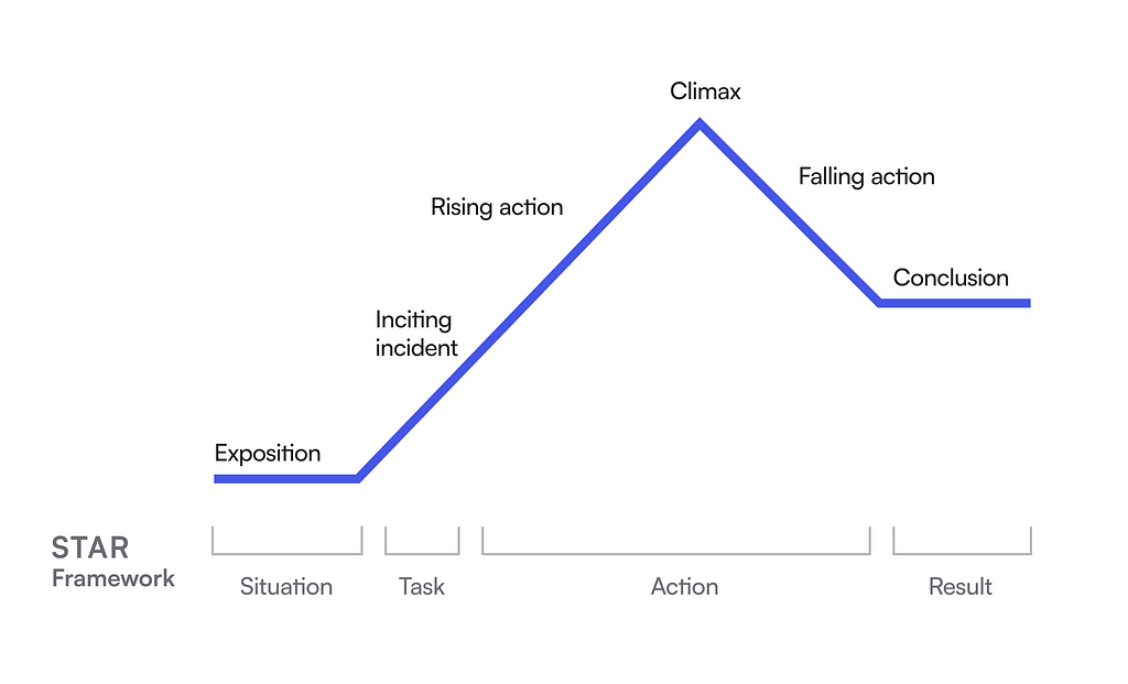
The argument that the stories are linear is partly true — they almost always follow the same structure, also called the story arc. It has five main ingredients: exposition, inciting incident, action, climax, and conclusion. That doesn’t mean that the hero in the story is almighty and they don’t face any challenges.
It means that you can use a structure to write your case studies but still include all the messy details. The structure that I recommend is the STAR framework, or Situation, Task, Action, and Result. It aligns well with the design process and the story arc. You can and should describe all the messy details in the Action part (Fig 2).

Here are a few tips on how to use the STAR framework and how to better present your work realistically, without embellishing everything to the point where it all looks perfect.
First of all, add enough context so that anyone can understand what you’re talking about (we don’t have your insider’s point of view). Tell the story as if you’re telling it to your friend, not your coworker (who already knows most of the details).
How to use the STAR framework:
- Situation: how did you learn about the problem, why was it a problem, and who did you work with? What was the goal? Why did you pick this problem to solve or this goal?
- Task: What did you decide to do? Why? How did you decide? What were your expectations?
- Action: How many potential solutions did you come up with? How many did you prioritise as possible solutions to explore? How did they work and look like? How did you validate the solutions? Which one was the winning one? Why? What surprised you and why? What didn’t work as expected and why? What did you do then? What did you learn, and how did you adapt? What would you do differently now? What challenges did you face when interacting with other stakeholders? How did you overcome them?
- Result: How did the solution perform in the end? How did you measure success? What did you learn from it? What would you do differently?
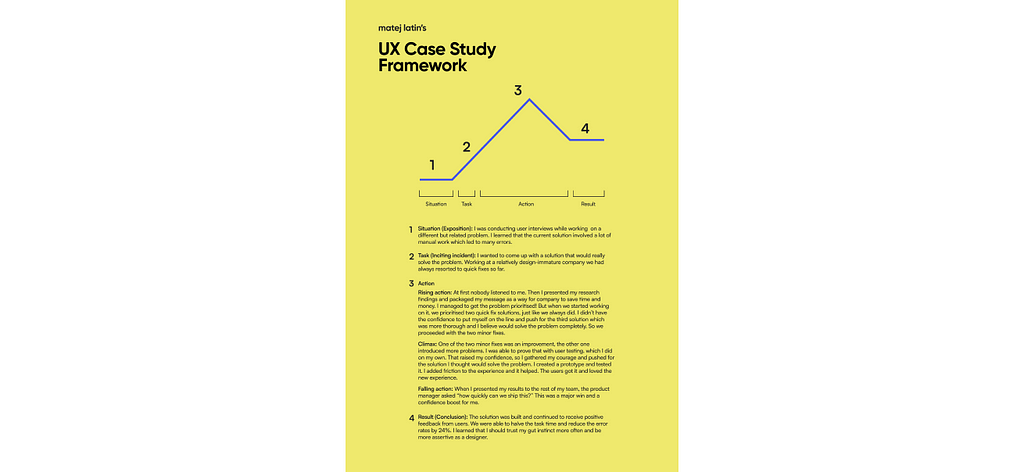
Get my printable case study framework
You can download a printable version of this framework, complete with an example that explains how to tell a good story in your UX case study (Fig 3).

Conclusion: Is the commoditisation of design to blame?
Is the UX hiring the problem? Recruiters looking at portfolios and checking off the “required” parts? Partly yes, there’s only a fraction of them who are specialised in recruiting designers. So of course those who aren’t will have a checklist for candidates to check against. But on the other hand, designers can write a case study that will satisfy both recruiters and design managers. Adding details and explaining how you had to go a few steps back in the process because you learned something doesn’t mean you have to completely abandon a typical structure of a case study.
Here’s my most important advice, the one where most designers fail. When it comes to case studies and your portfolio, make an effort. Don’t just use a template, put some images in, replace the placeholder text with your own and think that that’s it. Your portfolio is also a reflection of how you design. If I see a poorly designed portfolio and badly written, cookie-cutter case studies, I’ll see that as a reflection of your design skills.
But most of all, junior designers need to learn about the flexibility and the messiness of design work and experienced designers must stop hiding the messy details of their work because they think it makes them look incompetent. The opposite is true. When it comes to case studies tell true stories, not some cookie-cutter fantasy.
Read also:
🤫 Psst! My new online course UX Buddy helps designers create their UX portfolio, find, and get an awesome UX design job with a UX/design-mature company. It’s now live and enrolment is open for a couple more days. Check it out!
90% of designers are unhirable? was originally published in UX Collective on Medium, where people are continuing the conversation by highlighting and responding to this story.