As we move into 2024, WordPress’s FSE continues to have a real impact on web design, especially in terms of accessibility and user experience. With FSE, customizing every corner of a website is more intuitive, offering an integrated design experience.
These innovations are not just enhancing the aesthetic appeal of websites but also their functionality, making web content more accessible and engaging for a diverse audience.
How WordPress Full Site Editing Enhances Accessibility
In the context of WordPress Full Site Editing (FSE), accessibility refers to designing websites in a way that all users, including those with disabilities, can easily navigate and interact with the content.
WordPress FSE enhances accessibility in several ways. Here are the 6 aspects we’ll be discussing today:
- Keyboard Navigation: A vital aspect of web accessibility is keyboard navigation. WordPress FSE themes ensure that all controls, like navigation menus and form fields, are accessible via keyboard. This is essential for users who rely on keyboards over a mouse or touchpad.
- ARIA Landmark Roles: These roles define areas of a page (like banners, navigation, main content) in a way that screen readers can understand. FSE themes allow developers to assign these roles to various blocks, improving the site’s navigation for screen reader users.
- Contrast and Visibility: FSE themes are required to meet certain standards for color contrast between text and background, making content readable for users with visual impairments. This adherence to contrast ratios is aligned with the Web Content Accessibility Guidelines (WCAG) 2.0.
- Understandable Link Text: Links within content must be clearly distinguishable and understandable. In FSE, links are typically underlined, and the use of repetitive non-contextual text strings for links is discouraged to ensure clarity.
- Accessible Forms: Forms in FSE themes, including search and comments, must have visible focus outlines and appropriate labels, ensuring they are accessible to all users, including those using screen readers.
- Headings and Structure: Proper use of HTML headings is a must-have for screen readers to work properly. FSE themes encourage a logical heading structure, helping users navigate content more effectively.
Now, let’s dig into each of these aspects in more detail.
Keyboard Navigation
Keyboard navigation is a key part of any accessible interface and is a must for those who rely on assistive technologies.
FSE incorporates keyboard navigation innately.
Here’s how:
Navigation Mode
Introduced in the Block Editor, the Navigation mode is an important feature for screen reader users and those who depend on keyboard navigation. It allows people to efficiently navigate through the editor using Tab and arrow keys. This mode enables quick access to desired blocks without the need to scroll through large chunks of content, saving time and improving accessibility.
Navigating Nested Blocks
The latest version of Navigation mode in the Block Editor makes it so you can move between parent and child (nested) blocks and between blocks at the same level. Entering navigation mode is as simple as selecting a block and pressing the ESC key. Within this mode, you can use the UP or DOWN arrow keys to navigate within the same level, the LEFT arrow key to go into a nested level, and the RIGHT arrow key to go out of a nested level.
Keyboard Shortcuts
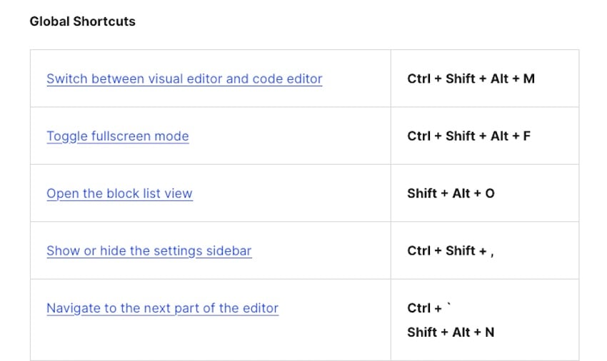
To further enhance efficiency and accessibility, the block editor includes several keyboard shortcuts. These shortcuts facilitate tasks like inserting new blocks above or below selected blocks and moving blocks up and down the page. This feature is particularly beneficial for screen reader users who rely on keyboard commands.
Usability Improvements
The block editor in WordPress FSE also includes usability improvements like the List View and breadcrumbs. These features provide multiple ways to access blocks, improving the platform’s usability for people with diverse abilities.
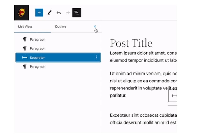
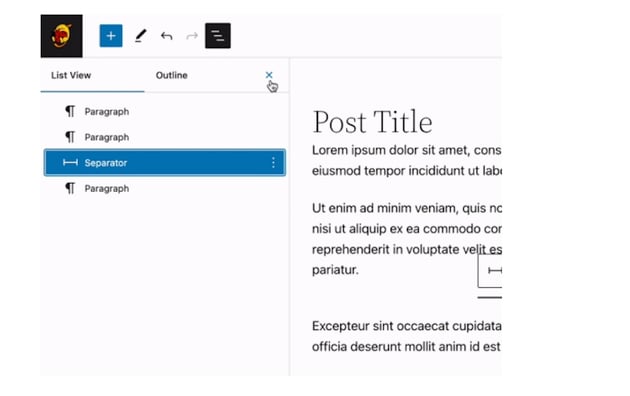

The List View, for instance, shows an outline list of all blocks used on the page, so you can jump to any block in the editor with a simple click.
Skip Links
A vital feature for accessibility, skip links are automatically added in block themes if the page contains a <main> element. These links, which are the first focusable item on a page, allow users to skip to the main content, bypassing repetitive navigation.
ARIA Landmark Roles
ARIA (Accessible Rich Internet Applications) landmark roles help to enhance the accessibility of WordPress Full Site Editing themes, especially for screen reader users. They serve as navigational aids and make it easier to find and move through significant areas of a webpage.
Here’s how WordPress FSE incorporates ARIA landmark roles:
-
Default Roles in HTML5 Elements: In WordPress, many HTML5 elements inherently define ARIA landmark roles. For example, the
<nav>element is automatically identified as a navigation landmark. This intrinsic association simplifies the process of creating accessible websites, as developers can rely on these default roles. - Assigning Roles to Content Areas: For a website to be accessible, all content must be contained within elements that have ARIA landmark roles. This ensures that no content is missed by screen reader users. Key roles include banner for headers, main for primary content areas, complementary for sidebars, and navigation for menus.
-
Manual Role Assignment: While HTML5 provides default landmark roles, older browsers or certain assistive technologies may not always recognize them. In such cases, developers can manually assign roles, like
<header role="banner">. This ensures compatibility across a wide range of technologies. -
Unique Labeling for Repeated Roles: If the same role appears more than once on a page, such as multiple navigation sections, it’s important to use the
aria-labelattribute to differentiate them. This helps screen reader users distinguish between different sections, like “Top navigation” and “Bottom navigation.” - Role Limitations and Guidelines: While there’s no strict rule on the number of landmarks a page should have, too many landmarks can lead to user confusion. WordPress themes are encouraged to use a reasonable number of landmarks and are required to support HTML5 navigation widgets for landmark semantics.
Contrast and Visibility
Ensuring proper contrast and visibility is another way to create an accessible and user-friendly website. Full site editing incorporates these priorities well through the use of:
Global Style Presets
FSE includes a feature that allows users to access and modify global style presets, which includes typography, colors, and layout. This means you can make sure text and other elements on the site are easily readable and accessible.
Color Contrast
Ensuring adequate contrast between text and background colors is vital for readability, especially for those with visual impairments. FSE and its themes are designed to comply with WCAG for color luminosity. This includes maintaining a minimum color contrast ratio of 4.5:1 for regular text. A high enough color contrast can be verified by using the built-in color selection tools in the block editor. These tools provide warnings if the contrast is too low, helping maintain accessibility standards.
Typography and Readability
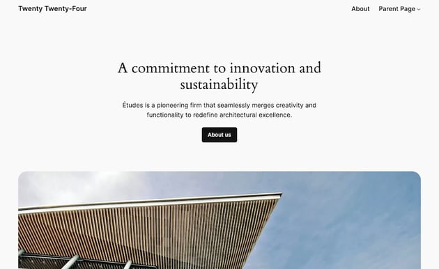
Customization options for typography, such as font family, size, and line height, are available in the block editor and site editor views. These settings play a significant role in ensuring text readability across different devices and for users with varying visual capabilities. Themes like Twenty Twenty-Four provide these customization options, so you can adjust font sizes with ease.


Managing Backgrounds and Layout
Recent updates in WordPress, like in version 6.4, introduced features for managing background images in blocks, such as the Group block. These features include background size and repeat options, which can make for a convenient way to maintain visibility and readability of text over background images.
Understandable Link Text
Links within large sections of text, like post content or comments, must be underlined to be clearly distinguishable from surrounding content. This requirement makes it so links are easily identifiable, which is important for both sighted users and screen reader users.
The underline is the only accepted method for indicating links within content in FSE themes.
Accessible Forms
The responsibility for providing accessible blocks, including those used in forms, lies with WordPress itself. This shift means that theme developers need to use these blocks correctly without compromising their accessibility features. Forms created using blocks such as Search and Comments are designed to be accessible, by default.
Likewise, comment forms must have appropriate field labels, with all content within form tags explicitly associated with a form control. This clarity is essential for screen reader users to understand and interact with forms properly.
And for forms like comment submission forms, it’s vital that post-submission responses, such as errors or confirmations, are perceivable by all users. Keyboard navigation is incorporated here to ensure those who’ve used an assistive device to fill out a form are directed back to the main site post-submission without issue.
Learn More
Interested in learning more about how to prioritize accessibility in your web designs? We’ve covered this subject extensively:
Looking Ahead: Accessibility in Future WordPress Themes
As we look towards the future of WordPress themes, it’s clear that accessibility will continue to be a key focus — as it should be. The advancements in Full Site Editing have already laid a strong foundation for creating more inclusive and user-friendly websites.
And as the Block Editor, Full Site Editing, and WordPress itself evolves, they stand a chance to empower web creators with more tools and options that push the web toward a more accessible space for everyone.