Figma dropped some huge new features this month and you need to embrace them

Figma has had a big year. Sure, it surpassed 4 million users and a $10B valuation over the last 12 months, but even more notable is that Figma was also hard at work behind the scenes to drop a whole load of new features that they unveiled at this year’s third annual ConFig conference. While the list of new features is long, ranging from the functional Auto-layout update to the cosmetic dark mode, the one that stood out to me the most was a new concept — Component Properties — that augments what was already my favorite feature: variants. I work a lot with design systems, from applying existing design systems to enrich and align UX flows to creating new components that compose a design system’s design library. When Figma introduced variants in 2020, so many things became easier. But for a couple of specific things, variants became my biggest frustration. Now, after a long wait, Component Properties are here to solve those problems.
Text Overrides
For as great as variants are, one major flaw of that feature was that it required careful attention to the layers and structures of your components. If you had some piece of text in your library component — for example, placeholder text that says “Button name” — and then change the text in your local instance to say “Confirm,” and then switched your instance to another variant with a different layer structure, you would lose that text override and the instance would default to “Button name” again. This is a very hard problem to explain in words, but Ridd recorded a comprehensive video describing how and why this happens, and how to prevent it from happening.
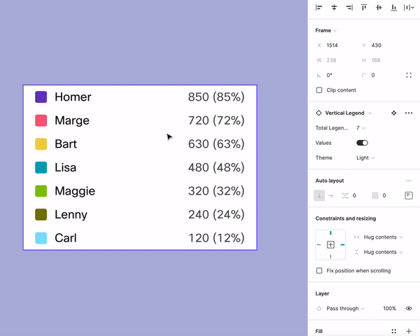
The example above demonstrates what became a big problem in the chart and graph component library I had published. I created a chart legend component and used variants to enable switching between the number of items in the legend and to toggle the numerical values on and off. Because my version of the component with values had a different layer structure than the version of the component without values, when I used that toggle, I would lose the values I had already filled in. On a number of occasions, I would update some screens, toggle some variants on and off, and without realizing, suddenly my page was full of placeholder text rather than the realistic values I needed in a high-fidelity prototype.
By the time my team understood this problem, we had already built a complex design library with components that were vulnerable to this override weakness. We embarked on a long-term plan to eventually update our components using Ridd’s Mighty Fine Variants method, but now with Figma’s new updates, there’s an even easier solution to the problem.
Variant Bloat
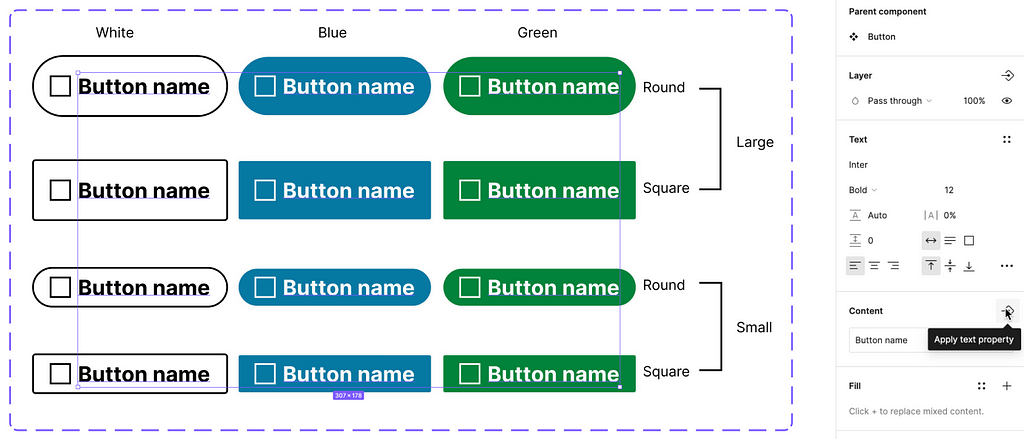
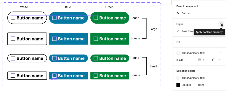
Before I explain the new lifesaving features of the new Figma release, I want to address the other major problem I had had with my component library: variant bloat. Variants are great because they condense all of the variations of one component into a set of parameters. If a button has four states, like Rest, Hover, Selected, and Inactive, then those become four variants of the button. But these variants multiply. If these buttons also have a large and small size, that’s now 4×2=8 variants. Add in a dark theme and now this is 16. I once built a complex component that had 512 variants.
In addition to the actual work it takes to create so many complex components, it also becomes very difficult to keep track of all of the variations to make sure each one is accounted for. In the example above, I had to take each of the four boolean type variants and treat them as binary numbers to make sure I had all 16 combinations of Trues and Falses without repeating any.
body[data-twttr-rendered=”true”] {background-color: transparent;}.twitter-tweet {margin: auto !important;}
function notifyResize(height) {height = height ? height : document.documentElement.offsetHeight; var resized = false; if (window.donkey && donkey.resize) {donkey.resize(height);resized = true;}if (parent && parent._resizeIframe) {var obj = {iframe: window.frameElement, height: height}; parent._resizeIframe(obj); resized = true;}if (window.location && window.location.hash === “#amp=1” && window.parent && window.parent.postMessage) {window.parent.postMessage({sentinel: “amp”, type: “embed-size”, height: height}, “*”);}if (window.webkit && window.webkit.messageHandlers && window.webkit.messageHandlers.resize) {window.webkit.messageHandlers.resize.postMessage(height); resized = true;}return resized;}twttr.events.bind(‘rendered’, function (event) {notifyResize();}); twttr.events.bind(‘resize’, function (event) {notifyResize();});if (parent && parent._resizeIframe) {var maxWidth = parseInt(window.frameElement.getAttribute(“width”)); if ( 500 < maxWidth) {window.frameElement.setAttribute("width", "500");}}
Fortunately, thanks to the new Figma updates, this headache will become a lot simpler moving forward.
Text Properties
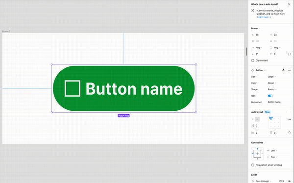
In Figma’s latest update, the concept of variants now sits parallel to three other properties of a component: text properties, boolean properties, and instance swap properties. These allow you to set customizable parameters on a component without needing to create additional variants. It’s a great concept, but it can be difficult to understand at first. I had my own doubts at first until I fully understood how these new properties worked.
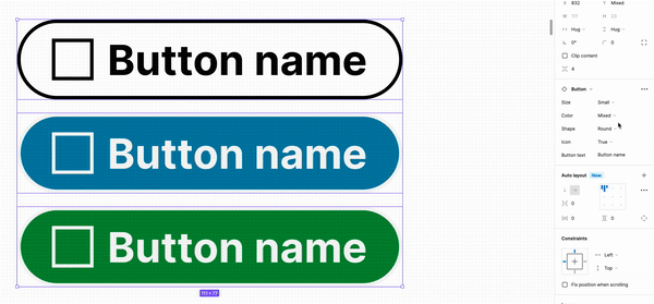
What’s great about text properties is that any time you have variable text — a button name, a chart legend, an input label — that text layer can be given a “text property,” which is essentially a key:value pair you can customize in your local instances. In the case of a button, you can now select the text layer that says “Button name,” create a text property called “Button text,” and then once you publish that component, it carries with it a property that’s set as Button text = Button name.
Another designer can take that library component, insert it into their mockup, and then change the property to say Button text = Submit, or any other text they want. This “override” will hold unless the designer later chooses to reset the component properties to their defaults. This means that no matter that happens at the top level to the library component or variant swapping, the local instance will maintain its custom text.
Boolean Properties
Boolean properties were created to turn your components into minimalist specimens. In so many use cases, variants were used to show two versions of an object: one with a particular visual element and one without. This might be a button with and without an icon, a header with or without a search bar, or an text input with or without an error message. If you were a keen observer of Figma in the past, you might have thought to yourself, “if this variant is only showing me the lack of something, is it really necessary?” And you would be correct. Figma understood this and fixed it for us.
Now, if you have a button with an icon that can toggle on and off, you only need to create one version where the icon is showing. You can select the icon object, apply a boolean property, and your component will now give you a toggle to toggle the visibility of that icon object on or off.
Once you apply this boolean property and give it a name, the toggle switch will automatically appear in your properties panel along with the other variant properties of your component.
Boolean properties, at least for now, are limited to cases where the variation of the component is simply a matter of layer visibility, but even then, it’s a big help. In my example above, where I had more than 500 variants of a component, most of those variants were simply a matter of turning subtitles and sections on and off, and those can all now be classified as boolean properties.
I’ve been really excited about these new Figma features and I’m only beginning to explore them. I’m still learning my way around instance swap properties and how I can apply them to my library components in a functional way. I’m not affiliated with Figma in any way, so I have no idea how these features, or any others, will continue to grow and improve. But as they do, you can expect me to be just as enthusiastic about how they make my life easier. I can’t wait to see what they come up with next.
Why component properties will save your design system was originally published in UX Collective on Medium, where people are continuing the conversation by highlighting and responding to this story.