But you can’t recall when did you learn them.

Have you ever stopped for a moment and thought about how many icons we use on a daily basis?
The play icon on Netflix, the search icon on Google, the Instagram heart… the answer is probably over a hundred. Every single day.
Now, which is even more impressive, have you ever realized these icons are used in a wide variety of apps and companies? Some of them do have common meanings across fields, companies, and cultures.
And just a few have found their own way to become Universal icons.
There are some of these little elements that have a meaning for themselves. Anyone — whoever they are and wherever they come from — can easily understand them. However, these icons are not something we are already born with. We all had a period of learning.
In today’s modern society, as we are daily bombed with thousands of inputs and different digital interfaces, it is almost impossible not to learn them by heart.
Icons are visual representations of objects, concepts, or ideas. When used correctly, they can educate, communicate and increase usability.
They are small and meaningful elements that solve numerous problems and have become little keys to usability and intuitive navigation. And some of the most successful icons are those that are universally recognized around the globe.
Details matter, it’s worth waiting to get it right — by Steve Jobs
According to Rachee Jacobs, the most widely recognized icons and symbols are rarely looked at for more than 2 seconds before understanding what the intention is. This means that we don’t give them much attention, because they naturally blend in.

Of course, any designer knows how much time and effort is needed to make them simple, helpful, and expressive. This is why today I wanted to discuss a little bit about the most universal icons that surround us and how they have become so.
Let’s start with 5 of the most ubiquitous icons that I am pretty sure you will deeply know — and intensively use.
1. Media Controls: Play, Stop, Pause and Rewind 🎥
As modern consumers, we interact with media controls more often that we’d dare to admit: YouTube, Spotify, Netflix, your car’s touchscreen display or even your microwave. Media Controls can be found literally everywhere. Media Controls are composed by 4 basic icons:
This Play Arrow was first seen around 1963 on portable Philips reel-to-reel cassette machines. It denoted the direction of tape travel from the left to the right. Today it has become so implanted in modern culture worldwide that has been the primary icon of digital services such as QQmusic, Spotify, or YouTube.
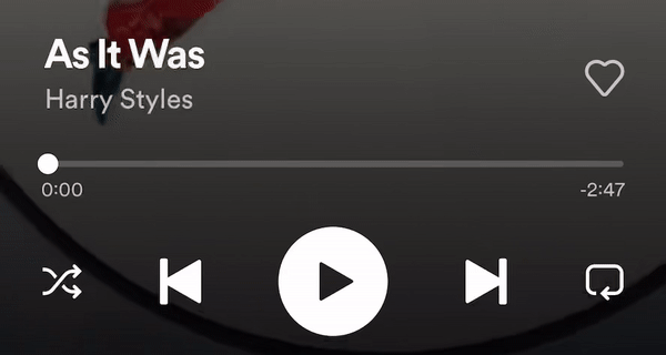
Having the opposite meaning to the Play icon, the square Stop symbol is this very same icon with the arrow removed — meaning nothing is happening.
In written poetry two vertical lines denote a pause in the middle of a verse — effectively a type of punctuation. These two vertical lines are known as a caesura mark and are also seen in musical notation displayed as oblique lines similar to two slashes. They mean something has been paused.
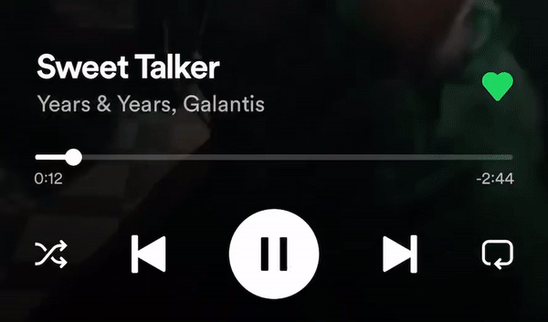
- Rewind and Fast Forward Symbols ⏭ ⏮
Fast Forward and Fast Rewind functions on reel-to-reel cassette machines were a practical solution to avoid tedious manual winding of the tape between two reels — and once again, arrows denote the direction of tape travel. Today we use them to skip or go back when listening any media content.

Next time you tap on one of these familiar symbols within your favourite media players, you’ll have a little more insight into how — and when — they came to be.
2. The Email Envelope ✉️
We’re still in the point at which many symbols within technology still have physical meanings. Even though typewriters, telephones and even envelopes are disappearing from common sight, they are still contained in those familiar icons we see on our devices every day — which in design terms it’s called skeumorphism. There are many other examples as the call and the shopping cart icons.
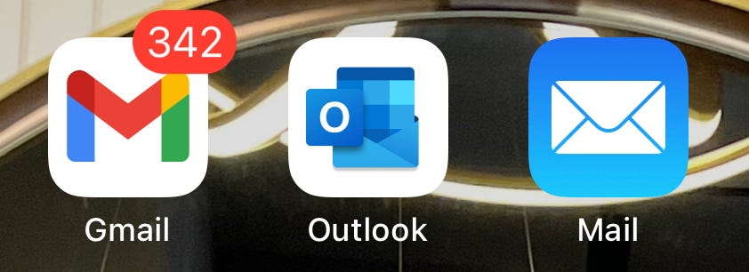
Envelopes, as we know them today, originated shortly before the turn of the 19th century when the manufacturing process was able to pre-gum paper, but it was the enforcement of the diamond-shaped sheet (initially a novelty hand-cut shape) as a postal standard by the British Government around 1840 that placed the envelope firmly into global consciousness.
3. The Google Maps Location Pin📍
Jens Rasmussen created the Google Maps pins, which was the first mainstream use of this icon shape associated with mapping and location.
He wanted the pin to accurately mark a point on a map without obscuring the location. The main body of the pin is circular at the top, but tapers into a point at the bottom, forming an inverted teardrop shape.
Today it is widely used across different companies and countries due to its simplicity and easy-to-remember meaning.
4. The magnifying glass search Icon 🔎
The Search icon with the magnifying glass seems so familiar nowadays. Wherever we go in the digital world, if we need to find something, we are automatically looking for this common symbol — the magnifying glass.

The search icon represented as a magnifying glass was created by interface designer Keith Ohlfs, who worked as a designer and illustrator for NeXT company founded by Steve Jobs after he left Apple.
It went mainstream when this trend was caught on by Apple’s Newton OS and Palm OS. Given it was really well received by users, both coming Operative Systems Windows 95 and Mac OS 9 decided to follow this trend, making the symbol become one of the most recognized worldwide.
5. Closing Cross ❌
The closing cross is such a powerful symbol. It is capable of closing windows and popups, toolbars and tabs and anything else that might otherwise be cluttering up your screen.

The first closing icon using a X appeared on the early operative system Atari TOS 1.0. This actually is an example of an American company borrowing from Japanese culture. The use of X for close and O for open comes from the Japanese symbols batsu and maru. Batsu (X) is the symbol for incorrect, and can represent false, bad, wrong or attack, while maru (O) means correct, true, or good.
However, it wasn’t until it was implemented on Windows 95 that this symbol became worldwide famous.
These are for me the most known and worldwide recognized icons. Have you missed any worldwide famous icon on this list?
Just feel free to share your thoughts and experiences in the comments! ✨