Create this simple poster created with layers of photos and shapes. In this Photoshop tutorial, you will learn how to use a combination of Photoshop brushes, images, and custom shapes to create this contemporary poster.
What you will need
Step 1
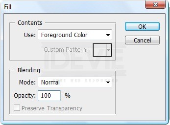
Create a new document with dimensions; 1500 x 2000px. Now change the foreground color to a light grey, I used #e5e5e5. Go Edit>Fill and select foreground color. This will fill the background layer with a light grey.
Step 2
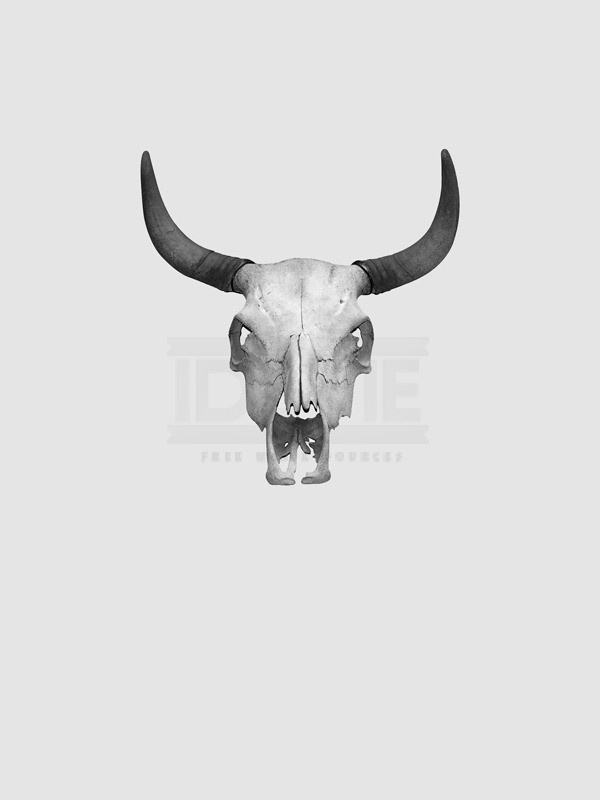
Now go here and copy the image into your document then scale it down until it looks like the image below. Select the magic wand tool and change the tolerance to 40.
Now click outside the skull then hit Delete to get rid of the white background from the skull image, do the same for the other white bits like inside the eyes and the mouth. The last thing to do is to make sure the layer is selected then hit Shift+Ctrl+U, this will desaturate the layer.
Now click outside the skull then hit Delete to get rid of the white background from the skull image, do the same for the other white bits like inside the eyes and the mouth. The last thing to do is to make sure the layer is selected then hit Shift+Ctrl+U, this will desaturate the layer.
Step 3
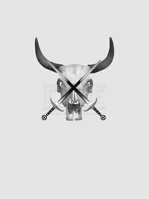
Next go and copy another image from here, this time of a sword. Place it into the document, first desaturate it in the same way that we did with the skull then scale and rotate the sword. Now get rid of the white background using the magic wand tool, this time with a tolerance of 10. Now duplicate this layer (Ctrl+J) then go Edit>Transform>Flip-Horizontal. Then move this layer so the swords form an X shape.
Step 4
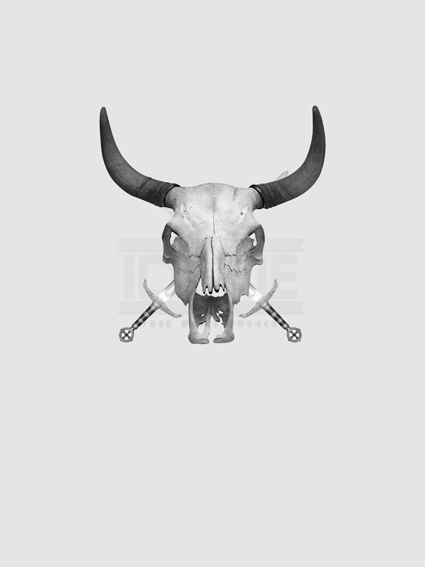
In the layers panel select both the sword layers using Ctrl then hit Ctrl+E to merge these layers. Now we want the swords behind the skull, so just drag this layer down below the skull layer in the layers panel. I also increased the brightness of the layer by going Image>Adjustments>Brightness/Contrast and increasing the brightness a bit.
Step 5
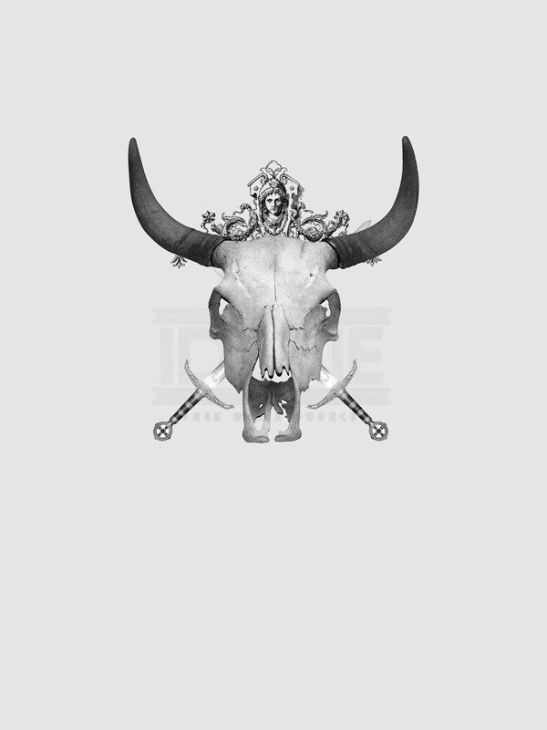
Create a new layer between the skull layer and the swords layer then select the brush tool then in the main toolbar click the arrow next to the word brush then click the other arrow within the box that pops up and choose the architectural ornaments brush set. Change the foreground color to black then add a few of these into your image, I ended up only putting one in as you can see in the image below.
Step 6
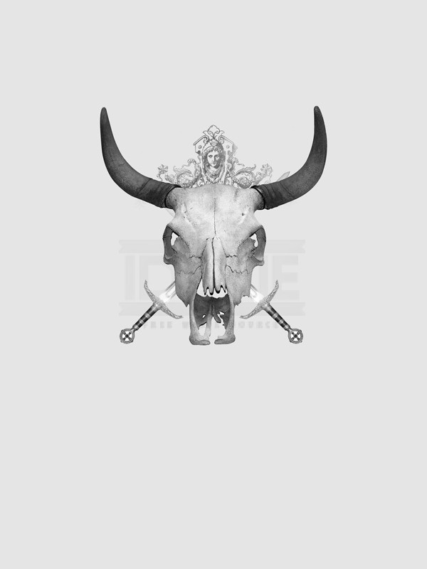
Now change the opacity of this layer to about 60% just to tone it down a bit.
Step 7
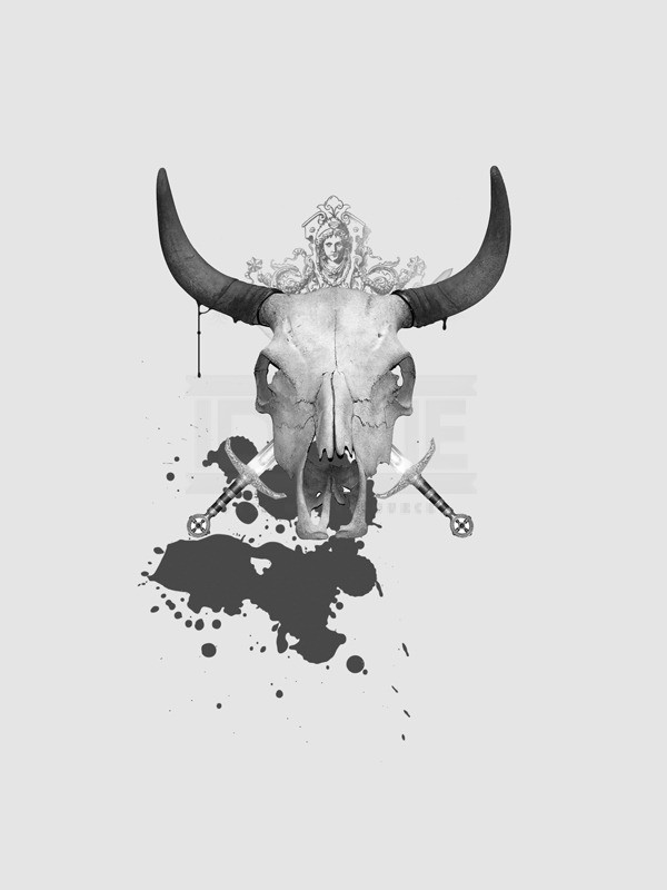
Create a new layer below the swords layer then select the brush tool and choose the splatter brush set in the same way we did in step 5. Make sure the foreground color is black then add a big splatter just below the skull. Now change the opacity of this layer to 75%. You’ll notice i also added some drips to the horns, this was just with a small round brush and is optional.
Step 8
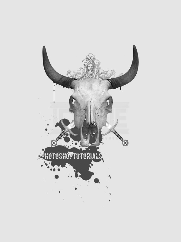
Select the type tool then choose a grungy font if you have one, also change the color to the same color as the background. Now just type your text and position it over the splatter and resize it if necessary.
Step 9
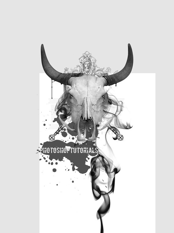
Now that we’ve done the foreground, we’ll move onto the background. So we don’t get our layers mixed up, it is a good idea to create a new layer group, do this by clicking the button at the bottom of the layers panel that looks like a folder. Drag the folder so it is directly above the background layer. Now we need an image of smoke, the one I used can be found here so paste it into your document and desaturate it in the same way we did with the skull. Scale and position it as shown in the image below.
Step 10
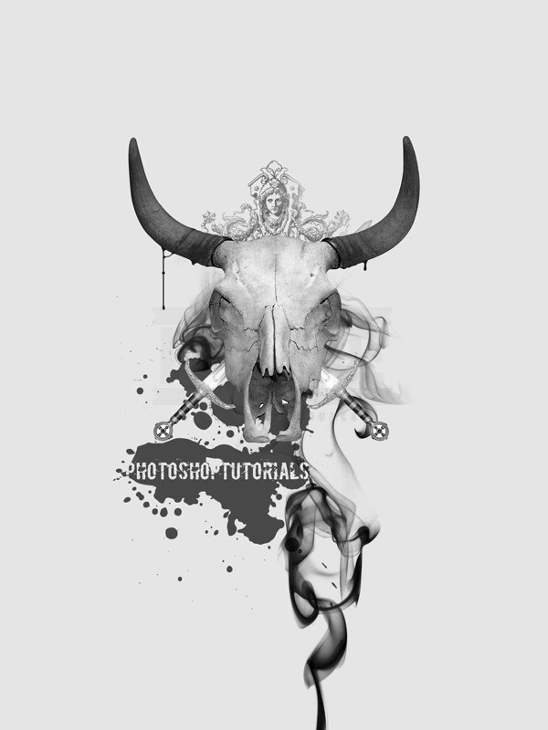
Change the blend mode of this layer to multiply, now you’ll notice that this smoke image has some sharp edges at the top, we need to get rid of these. We can either use the eraser tool or the layer mask tool, I recommend using a layer mask, but if that’s too complicated for you then just use the eraser tool. Click the layer mask button at the bottom of the layers panel (circle inside a rectangle) then change the foreground color to black then select the brush tool. Choose a soft round brush with a diameter of about 400px and an opacity of about 40% then just brush over the parts of the smoke that you want to hide and you’ll get something like in the image below
Step 11
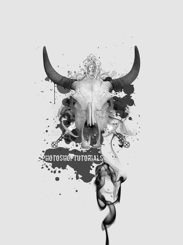
Next I added a few more splatter brushes behind the skull, I did this in a new layer above the smoke layer, I think I used three different brushes then I changed the opacity of the layer to about 70%.
Step 12
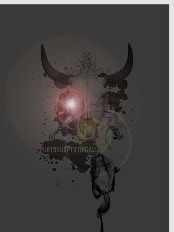
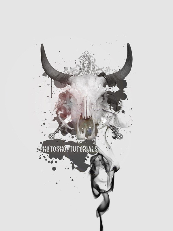
Now we’re going to add a bit of color to the skull, so create a new layer at the very top of the layer stack then fill it with black (go Edit>Fill). Now go Filter>Render>Lens-Flare, hit ok then change the opacity of this layer to 75% then move it so the centre of the lens flare is on the skulls eye.
Step 13
Now change the blend mode of this layer to screen then if you think the centre of the lens flare is too bright then you can remove it a bit with the eraser tool.
Step 14
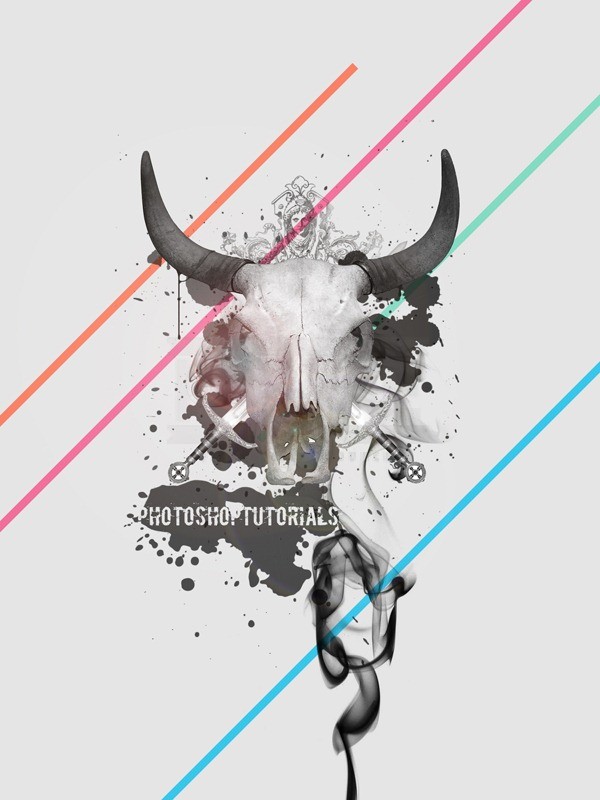
I left the foreground almost totally grayscale so that I could add some bright colors to the background to give a contrast. Create a new layer below the background layer group then change the foreground color to a bright color. Select the line shape tool and change the weight to 20px then holding Shift, make a line at 45°. Repeat this step until you have a few more lines of different colors.
Conclusion
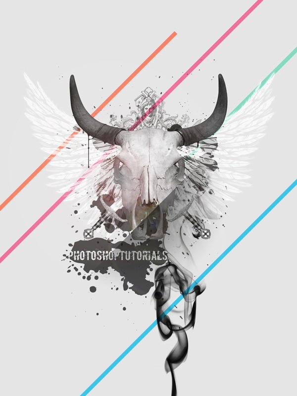
That’s as far as we’ll go in this tutorial but there is still a lot more you could do to your image. For example I added some white vector wings in, and a few wee gradients here and there but I’d encourage you to keep on experimenting with it an I hope you learned something new.
source: http://urly.us/cI