
The Petersham Nurseries is an online store dedicated to an internationally-prized garden center has been nominated and recently received the title “Site of the Day” from the respectable Awwwards’ jury.
The site was rated far above average and got quite impressive numbers in all presented factors that cover design, usability, creativity and content. So, what makes it so special and memorable, let’s get down to brass tacks.
Landing Page
Of course, the inner structure of this e-commerce site is not much different from any other shopping website. You won’t find any extraordinary solutions and ingenious approaches that have been brought to life. Everything obeys the basic rules of creating a good, sensible store that showcases products with a help of a classic tile-style layout. What really matters is the landing page, that under a closer look opens at a completely new angle.
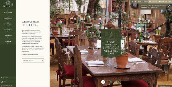
When you first stumble upon the homepage, it seems that the designer has actually overdone it. The page that takes up only a screen of a basic browser window includes everything you can imagine. There is a huge side menu, full-height slider, tagline, description box, call-to-action button and extra navigation at the top of the page. Although it may sound cluttered, the pragmatic and conservative approach of using space is just perfect.
Pragmatism in Action
The front page is really well thought out, structured and balanced. The content is wisely split into three main sections that have vertical orientations. Each area has as much space as it will need for clearly displaying data that is backed by an aesthetically pleasing format. You can instantly specify functional zones such as a menu, welcome box and image slider.
Menu
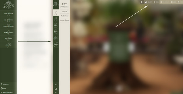
The primary navigation abides by current trends; it occupies the left side of the page and has a sleek and smooth slide out effect. It includes a logotype, vertical drop-down menu and extra links. Elegant icons and sleek typography are worth mentioning too, since they are chiefly responsible for providing a truly pleasant experience.
The secondary navigation is placed in the top-right of the page, and is comprised of helpful links, account details, social media and basic tools for customers. Though everything is tightly-packed, the designer managed to make each menu item readable and neat. This relatively small horizontal block contributes to usability. Thanks to it and the main menu, everything lies on a surface. You are able to move to any page without penetrating deep into the site structure, and it’s really important.
Welcome Widget
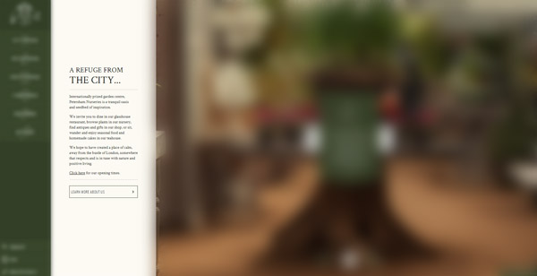
The greeting area with a small yet inspiring description and eye-catching clean CTA button immediately follows the previous area. It stands in a stark contrast to each section due to a solid light-colored backdrop, sharp typography and plenty of whitespace to effectively set the text off from the canvas. Unlike neighboring elements, it is static and steady, becoming a focal point in a sea of moving sliders and dynamic menus.
Slider
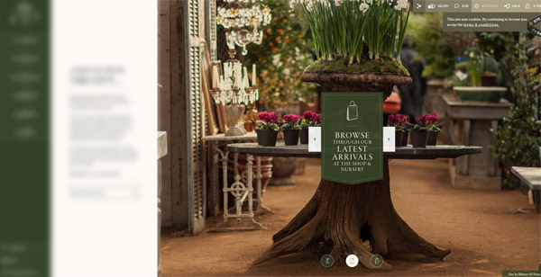
The last logical division of the page is a huge slider that takes up most of the screen area and displays picturesque shots of the garden center. It is stretched to the full height and employs subtle icons for navigation. This is the main visual that sparks users to visit the place.
As you can see, it is really hard to say what is the centerpiece here; everything looks sophisticated and elaborate, even a small line-style CTA button gets attention, having a charm of its own. You can consider every major area both as standalone component and an integral part of the whole composition that produces a strong visual impact.
Creativity Hidden in Simplicity
Of course, we couldn’t but help mentioning design aspects, namely color palette, graphics, typography and layout organization skillfully pull the design together and create a harmonious and delightful appearance. The use of the flat style is quite strategic, since when you have a bunch of data to demonstrate you need to strip away all extra textures, graphics and other ornamental stuff. The simple coloring, outline visuals and whitespace is an ideal option. As a result, the website of The Petersham Nurseries has definitely got “sculpted facial features” that unobtrusively force you to derive pleasure from it.
One More Thing …
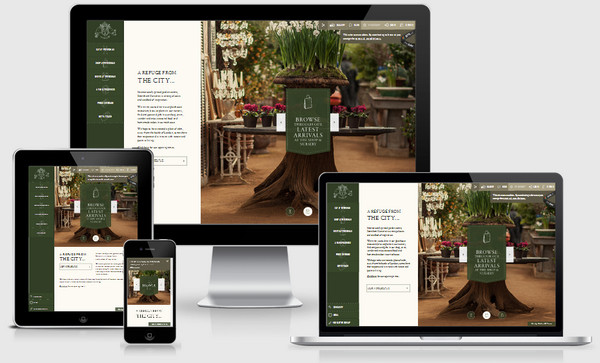
The website complies with current web requirements. It is responsive, beautifully displayed on tablets and mobile devices, which is a great bonus for an e-commerce website. Going responsive and being mobile and tablet friendly means to effectively boost conversion rates, and as a consequence potentially increase revenues; and second, it provides a better user experience.
Enjoyable Experience
The website was made with love to the visitors and the place itself. It’s quite evident that lots of creative and highly professional people have their hands in it. Every tiny element radiates of refinement and delight. Moreover, the mood and atmosphere is particularly complex here, since you can’t say for sure what exactly caused such effect. However one is certain, everything aims to make a presence in the site engaging, friendly and satisfying. The design, information hierarchy, navigation patterns, usability and even content are tailored to make it the best place to stay.
Conclusion
The great thing is that this website is not just an a good example of a modern e-store but it is also capable of providing users with a pleasant pastime. It also makes us think about the way we should prototype such websites, building them not only with users in mind but also with fun and enjoyment.