A startup company is a partnership or temporary organization designed to search for a repeatable and scalable business model. They are usually looking for both investments and partners to get their ideas off the ground, and the internet has become a breeding ground for such ventures, particularly, but not limited to, mobile apps.
There are many, many startups out there, some heading successfully in the right direction, others not so much. Many are destined to failure, few will become huge successes bringing the partners massive returns on their investment. The whole idea could be looked at as the stock market of the internet these days. Here we have scouted out some great ideas that are presented on beautiful website designs.
Startup Ideas and their Website Designs
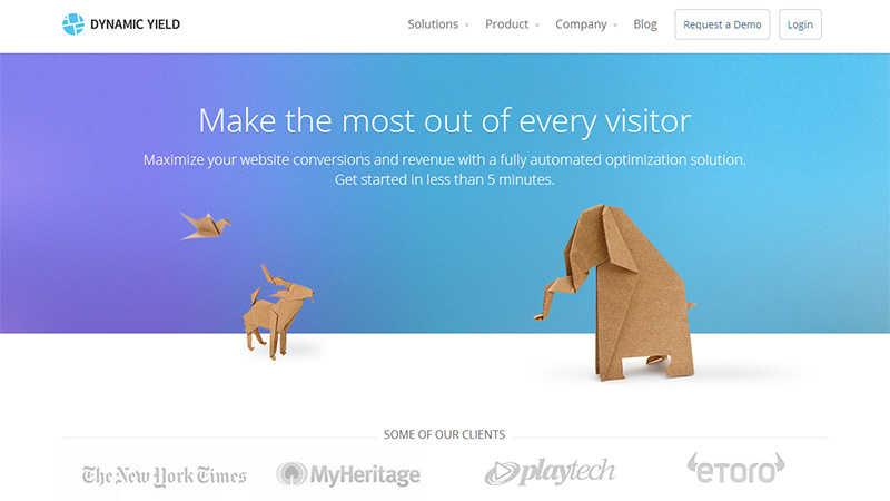
Dynamic Yield
Dynamic Yield was founded in 2012. It helps marketers create the highest yielding landing pages, promotions, calls-to-action, campaigns and content, personalized per user in real-time. It empowers marketers to quickly take data-driven decisions and easily customize their CMS. Their website design is quite minimal and simple, featuring origami animals, presumably representing freedom.
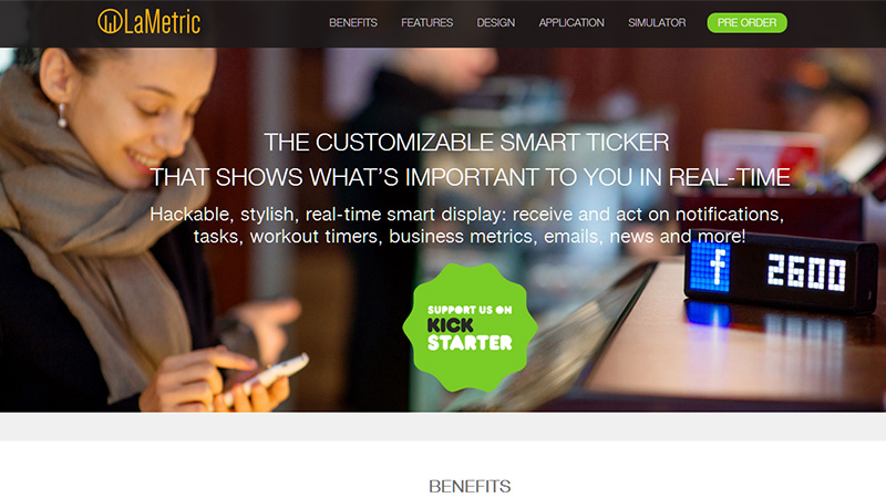
LaMetric
LaMetric is the first highly customizable ticker that shows what’s happening in your life or business. Out of the box LaMetric tracks things including: current weather and warnings, subject and time until the nearest meeting, headers and amount of new emails, etc. LaMetric is available to pre-order, although all of the earlybird offers are finished. The website design is flat and stylish, using a full width image with white headline text and the rest of the page, as you scroll down, is presented similarly.
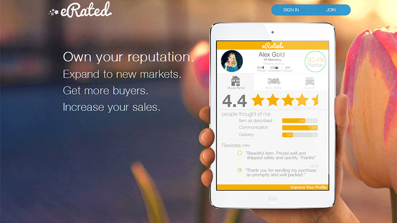
eRated
eRated is a credit scoring solution for P2P transactions tackling a large, fragmented market of an estimated 100 million sellers across some 1,000 marketplaces worldwide. Their website design uses a full screen image, which is kind of out of perspective in just about every way – the mobile device looks the wrong size in the hand, and the flower in the background is completely out of perspective with the hand also – but somehow, this give the image a certain charm!
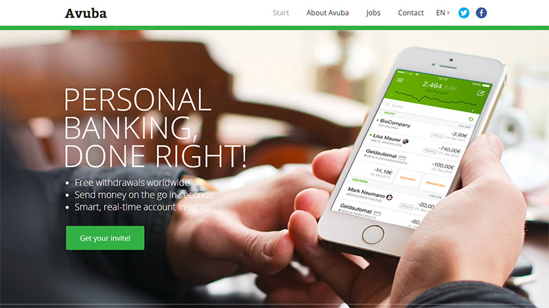
Avuba
Avuba is a mobile-first banking account that makes it easy and quick to carry out online banking transactions like transferring money, paying bills, as well as a tracker to let you see how you are spending your money. This app is still currently in the beta stage, but they say you are already able to save yourself a lot of time by using it – and it’s free. Their website design uses a green and white color scheme and is very clean and simple – reinforcing their claim that the app is simple to use.
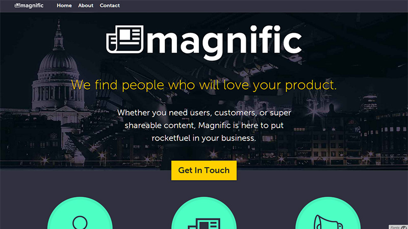
Magnific
Magnific is based in London, and they provide content and viral marketing services to businesses around the world. Their website design is very dark, with brightly colored elements.
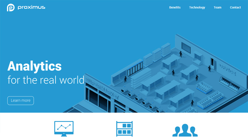
Proximus
Proximus is a startup in the business of helping brands and retailers track consumer data in-store, literally showing where customers go in the store and what they do. Their website landing page is completely blue and white, using flat design and hollow/ghost buttons.
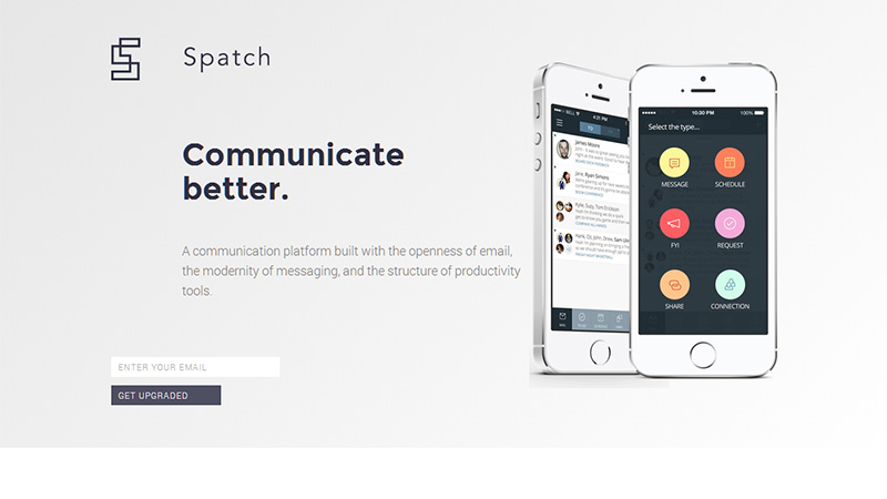
Spatch
Spatch analyses the content of an email message and surfaces the things that require actions. These come up as highlights and also buttons at the top of the email. If you have composed the email within Spatch, the recipient doesn’t have to have it to see the actions. The website design, like many others, uses a simple interface to promote the simplicity of use of the app.
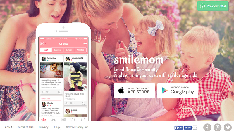
Smile Mom
This mobile app connects mothers with others in their local area. The website design uses a background image that has an Instagram-style filter, making the whole thing very pink-looking.
Pubble
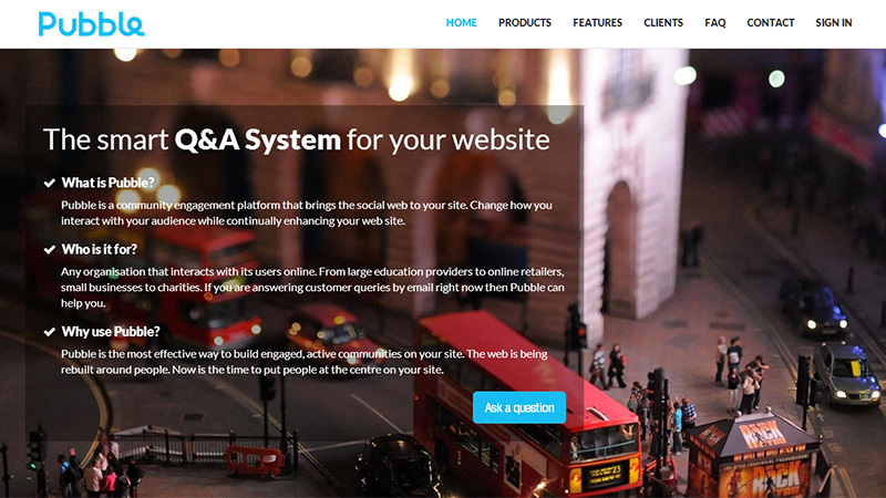
Pubble is a platform that lets you collect and answer customers’ questions by using algorithms, creating a ‘knowledge platform’ by tapping into previous questions and answers and by indexing what’s been asked previously on your own site, or on Twitter, for example. Their site design uses a dark background image of London with a transparent block with white text. The rest of the site design is flat and there are some scrolling animation effects.
Lingvist
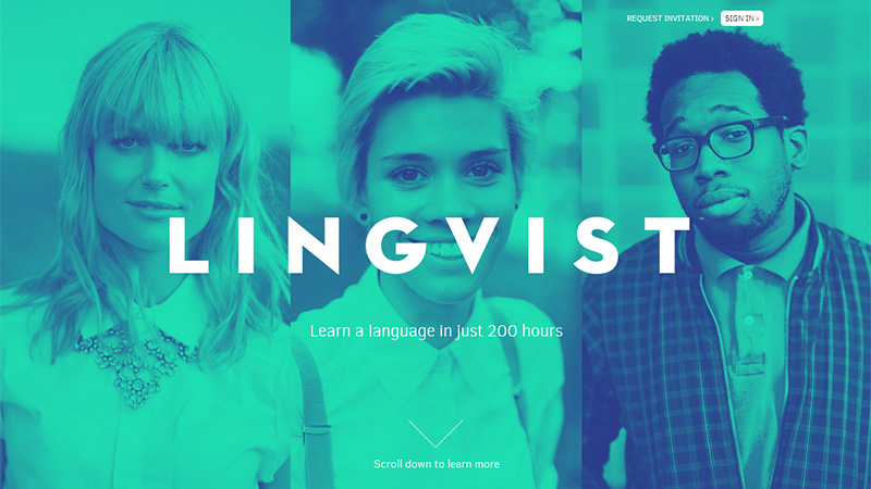
Currently in private beta, Lingvist is an adaptive language learning app that claims to speed up learning a foreign language by up to 10 times. Their site design is very green and very minimal. Presumably there will be a lot more content when the app is freely available.
Zzish
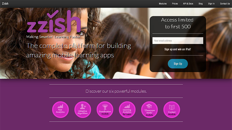
This is an infrastructure as a service for developers to build e-learning apps, targeting educational publishers and smaller developers. Their site design uses purple as a main color, with some transparency, flat icons and a video presentation.
Shortcut
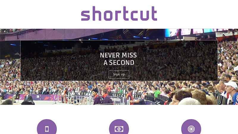
Shortcut (eatinmyseat.com) is an app, e-commerce platform and dashboard for event venues that lets customers pre-order food and other products from their seats. The design, like so many startups, is minimal and flat, reinforcing the idea of simplicity.
Cruise
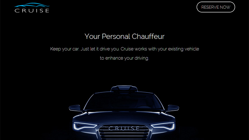
Cruise has built the first highway autopilot system tht installs on your existing vehicle. It uses sensors and advanced machine vision technology to keep you in your lane and a safe distance from the car in front. It is currently only available for use on California highways, and will set you back a mere $ 10k! Their site design is sophisticated yet simple, with some good effects. The screenshot below shows the car with its lights semi-lit – scroll down a little further and they will fully light.
Satellogic
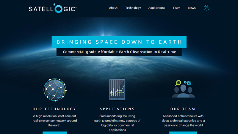
This Argentinian startup wants to launch a network of hundreds of satellites in Low Earth orbit. Here is what they say on their about page:
We are building a constellation of satellites to image any spot on Earth every few minutes. For the first time in history, we will be able to provide real-time coverage of the living earth: from global commercial activity, to the health of the planet, social conflict and natural events. Our constellation will make possible an unprecedented stream of highly valuable data.
They have so far lauched 3 satellites. Their site design uses a topical full screen background image with flat images and white typography.
Blockscore
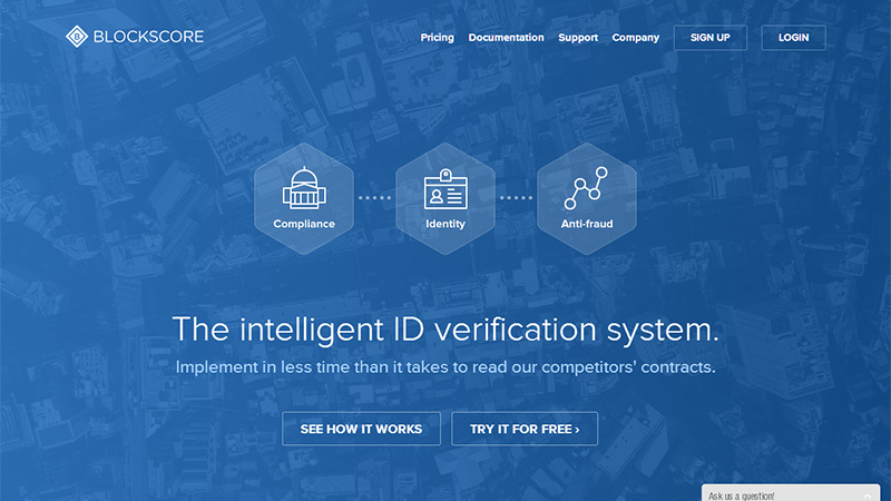
BlockScore is an identity verification startup that addresses and helps to solve the problem of identity theft. Their site design uses a large background cityscape image with a blue transparent filter over it, with transparent hexagons, white text and ghost buttons.
TapSense
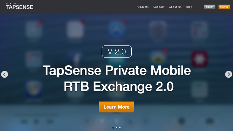
TapSense is an independent mobile advertising exchange founded in 2011. The website design starts with a slide show, and as you scroll down the page, the design is beautifully constructed. You have to go and look at this one!
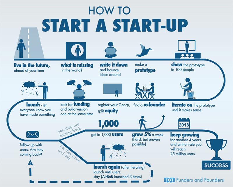
How to Start a Startup
And finally, a little light reading… here is a small infographic on how to start a startup – just for fun!
Conclusion
Startups are currently all over the internet and all are looking for investors, donations, partners or sponsors. Would you ever consider getting involved in someone else’s startup? Have you created a startup, and if so, was it successfully financed and launched? Have you ever pre-ordered a service or product from a startup?

