Most musicians and bands have a dedicated focus on building a strong brand and I large tribe of fans. Having a great fan or band website design is critical these days, so people can go online and find general information, pictures, event calendars and tracks. It is also important to link it up to social media websites like Facebook and twitter, as this is where a lot of the conversation is taking place.
This article is a collection of cool band website designs you can use as inspiration for designing your own or a client’s music website layout. Many of the website created for musicians are unique and use strong colors and many images with a lot of activity. They have quite complex designs with news-feeds, video and music players etc. Other artists have decided to go 100% commercial and use web channel more or less as a sales page. I hope you find this resource inspiring and that you will share it with your friends.
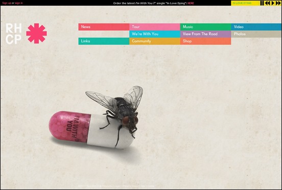
Red Hot Chilipeppers – MORE INFO
Red hot Chilipeppers have a great minimalistic design with a full screen background image (this is a classic and popular design approach) that immediately catch visitors interest. They have strong images in the navigation.. and notice the top bar with a music player and a “order latest single” call to action!
The band use a similar design approach on the Facebook fan page and this is where fans can keep track of live events and band news.
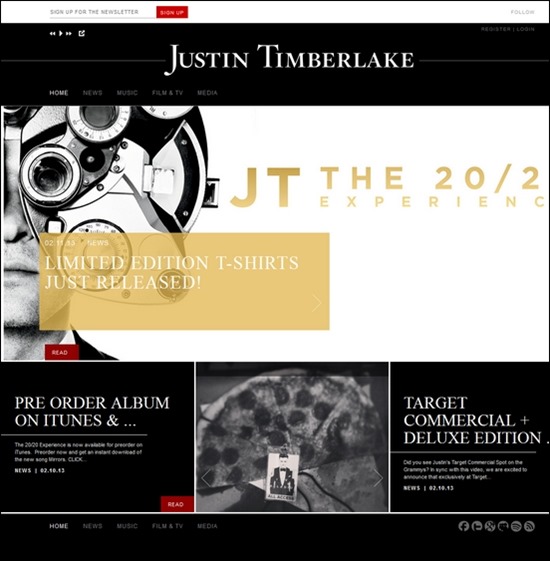
Justin Timberlake – MORE INFO
When you have passed the 2-3 annoying offer pages popping up before you can enter the site you will find another sales page filles with call to action. Clearly Justin is not just in this for making good music… it is a sales engine… !
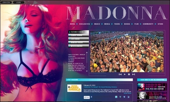
Madonna – MORE INFO
Madonna is showing off as we know her on her web page. There is a autostarting video with a crowd of screaming fans setting the scnene when visitors enter. Colors are hot and almost sleazy.
U2 – MORE INFO
U2 use a mimimalistic magazine grid style web design to deliver news, videos, recent tracks, comments, fan feed and much more…
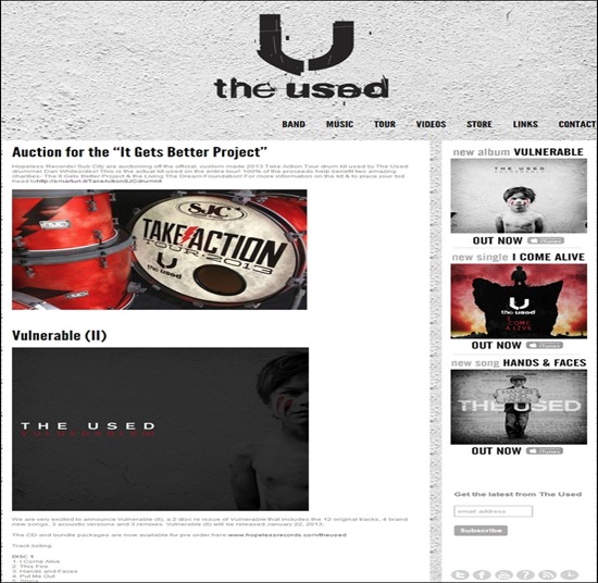
The Used – MORE INFO
Snow Patrol – MORE INFO
Jamie Cullum – MORE INFO
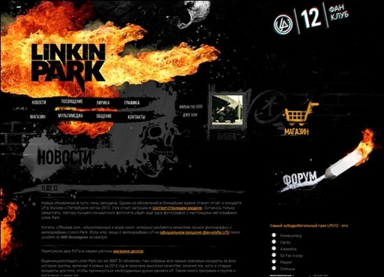
Linkin Park – MORE INFO
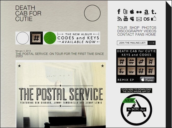
Death Cab For Cutie – MORE INFO
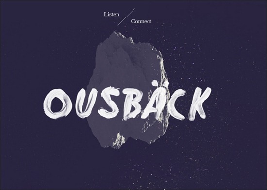
Ousback – MORE INFO
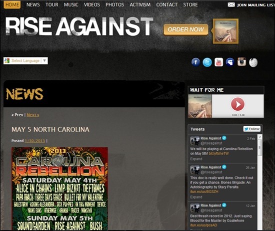
Rise Against – MORE INFO
Jennifer Hudson – MORE INFO

Green Day – MORE INFO

Arctic Monkeys – MORE INFO
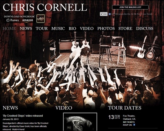
Chris Cornell – MORE INFO
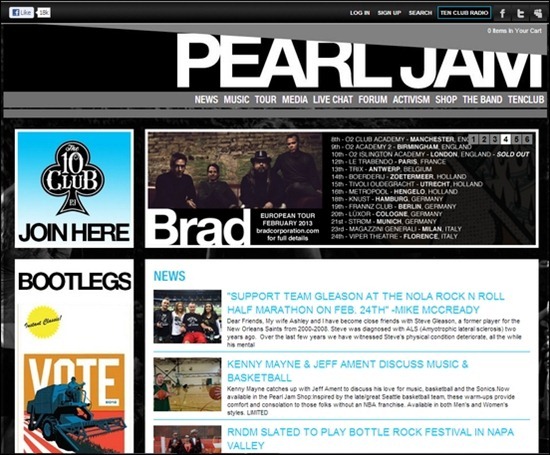
Pearl Jam – MORE INFO
Muse – MORE INFO
Zac Brown Band – MORE INFO
Maxwell – MORE INFO
Nickelback – MORE INFO
System Of A Down – MORE INFO
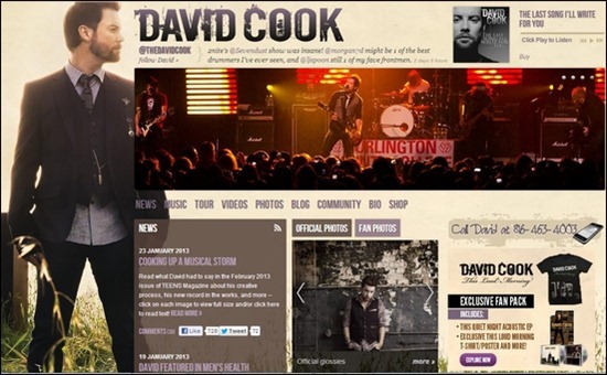
David Cook – MORE INFO
Slipknot – MORE INFO
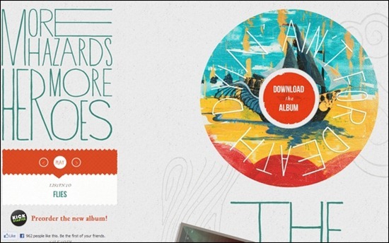
More Hazards – MORE INFO
Flight Of The Conchords – MORE INFO
Puddle Of Mudd – MORE INFO
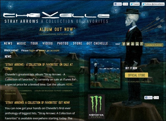
Chevelle – MORE INFO
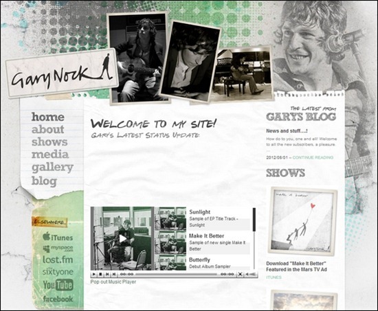
Gary Nock – MORE INFO
Francesca Battistelli – MORE INFO
Oh Land – MORE INFO
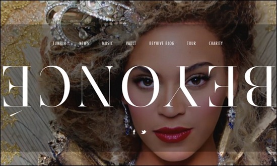
Beyonce – MORE INFO
Jonathan Levy – MORE INFO
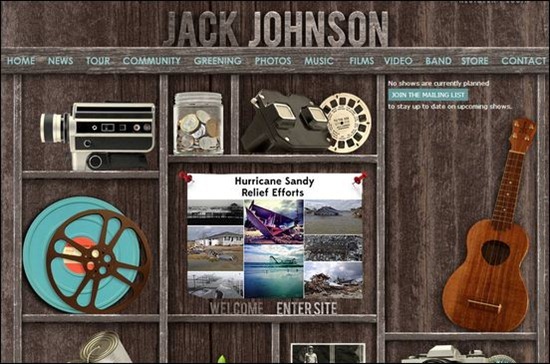
Jack Johnson – MORE INFO
Hanging Up The Moon – MORE INFO
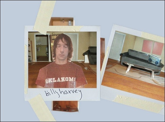
Billy Harvey – MORE INFO
Cat Power The Greatest – MORE INFO


