In this tutorial, you will learn how to control the order in which items are placed using the Grid Layout module. After that, we will discuss how to control the alignment of different items in the grid.
In the past, we covered a few important Grid-related topics. We began by learning about different ways of placing elements in a Grid Layout and then moved on to the steps followed by the Grid auto-placement algorithm as it automatically places different items.
If you’d like to follow along with the demos in this article, I recommend you use the latest Firefox (version 52 at the time of this writing) or Chrome (version 57 at this time). Both have just been released with Grid Layout support by default.
How the Order Property Works in Grid Layout
The order property can be used to specify the order in which different items should be placed inside a grid. By default, the items are placed in the order in which they appear in the DOM. For example, if item A is above item B in the actual source document, it will also be placed in the grid before item B. Depending on your project, this may or may not be the desired behavior.
The order property can be very useful, especially when there are lots of items or the items are being added dynamically. In such cases, if you want an item to be placed always at the end of the grid, you can do so easily using the order property.
Items with the lowest order value are placed first in the grid. Items with higher values are placed later. Items which have the same order value will be placed in the order in which they appear in the source document.
Let’s take a look at an example.
This is our markup:
<div class="container">
  <div class="item a">A</div>
  <div class="item b">B</div>
  <div class="item c">C</div>
  <div class="item d">D</div>
  <div class="item e">E</div>
  <div class="item f">F</div>
  <div class="item g">G</div>
  <div class="item h">H</div>
  <div class="item i">I</div>
  <div class="item j">J</div>
</div>
Here is the CSS for placing the grid items:
.c {
  grid-row-start: 1;
  grid-row-end: 2;
}

.e {
  grid-row-start: 1;
  grid-row-end: 3;
}

.b, .j {
  order: 2;
}

.a, .i {
  order: 3;
}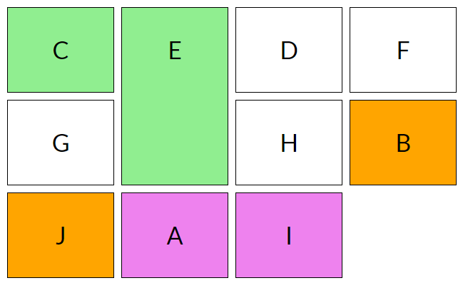
If you recall the steps from the auto-placement algorithm tutorial, you know that the algorithm will place the items with an explicitly specified row position before placing items with no definite position. So, even though item D, without a definite row or column position, comes before item E in the actual document, it will still be placed after item E (which has a definite row position: grid-row-start: 1 and grid-row-end: 3).
Among the items with no definite position, items with the lowest order value will be placed first. That’s why items D, F, G and H are placed before items A and B. B and J have the same order value, therefore they are placed in the same order in which they appear in the document. Please note that both B and J are still placed before placing A and I because they have a lower order value.
See the Pen The order Property in Grid Layout by SitePoint (@SitePoint) on CodePen.
You need to keep accessibility in mind before reordering grid items using the order property. This property does not affect ordering of items in non-visual media. It also does not affect the default traversal order when navigating the document using sequential navigation modes like tabs. Therefore, don’t use this property unless the visual order of elements needs to be out-of-sync with the speech and navigation order.
Performing logical reordering of the grid items using the order property will make the style sheets non-conforming.
Aligning Content Along the Row Axis in Grid Layout
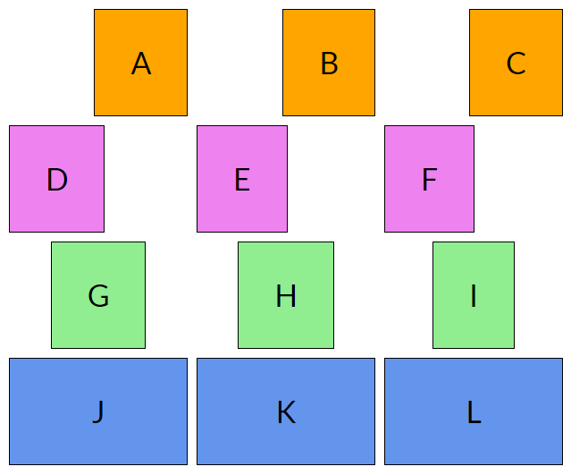
You can control the alignment of different grid items along the row axis using justify-self and justify-items .
The justify-self property aligns the content of a single grid item while justify-items aligns all the items in the grid.
The justify-self property can have four possible values:
endaligns content to the right of the grid areastartaligns content to the left of the grid areacenteraligns content to the center of the grid areastretchfills the whole width of the grid area
The default value of justify-self is stretch.
The justify-items property also aligns items with respect to the row axis and takes the same four values as the justify-self property. The default value is also stretch.
Here’s a demo to illustrate how justify-self works:
See the Pen Aligning Content Along Row Axis by SitePoint (@SitePoint) on CodePen.
Aligning Content Along the Column Axis in Grid Layout
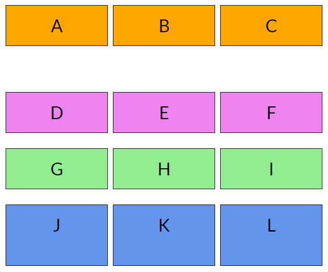
You can also align content along the column axis using align-self for single grid items and align-items for all the items in the grid.
Just like the previous two properties, both align-self and align-items can have four possible values: start, end, center and stretch.
More from this author
The start and end values align the content to the top and bottom of the grid area respectively. The center value aligns the content to the center of the grid area and justify fills the whole height of the grid area.
The extra space between the first and second row in the demo occurs because the items in the first row are aligned to the top and the items in the second row are aligned to the bottom.
Below is align-self to align content along the column axis in action.
See the Pen Aligning Content Along Column Axis by SitePoint (@SitePoint) on CodePen.
Aligning the Whole Grid
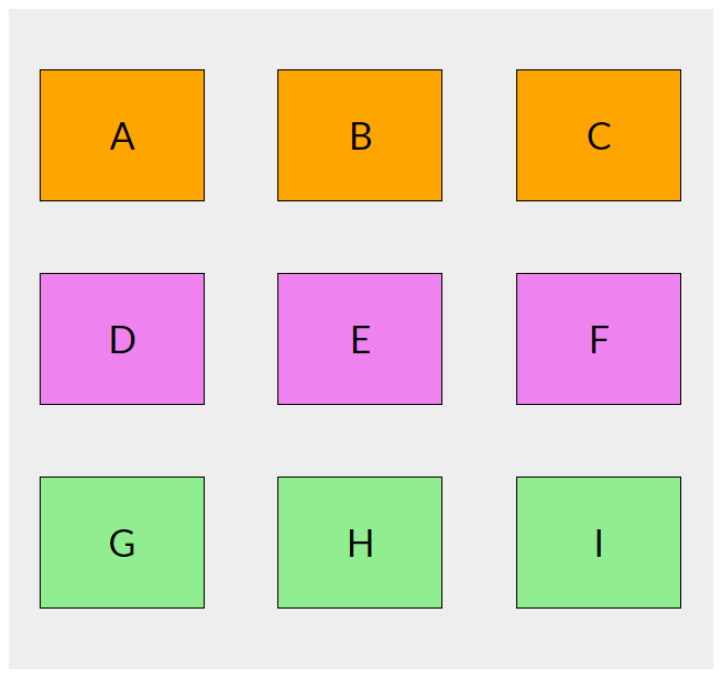
Sometimes, the outer edges of the grid may not align with the outer edges of the container. This can happen when the grid rows or columns have a fixed size. In such cases, you may want to align the grid in a specific direction.
Just like the previous properties, alignment along the row axis can be achieved using the justify-content property and alignment along the column axis can be achieved using the align-content property.
Both these properties are applied to the container grid and besides the usual start, end, center and stretch values, they also accept space-around, space-between and space-evenly as valid values.
space-aroundplaces an equal amount of space between each grid track and half of that space between the outer edges of the grid and its containerspace-betweenplaces an equal amount of space between each grid track and no space between the outer edges of the grid and its containerspace-evenlyplaces an equal amount of space between each grid track as well as the outer edges of the grid and its container.
The default value of both justify-content and align-content is start.
I have used the CSS below to align the grid items in the following demo:
.container {
  justify-content: space-around;
  align-content: space-evenly;
}
See the Pen Aligning the Whole Grid by SitePoint (@SitePoint) on CodePen.
Aligning items this way can also have some unintended side effects like adding extra width or height to grid items that span more than one column or row respectively. The amount of width and height that gets added to a grid item in this case depends on the number of gutters that the item crosses in each respective direction.
Conclusion
In this tutorial, we have covered all the basics of ordering and aligning items in Grid, which can help you to gain precise control over your Grid-based layouts.
If you have any questions about this tutorial, let me know in the comments.