One of the most common elements of your website is typography. After all, it is for reading the content that visitors typically look to visit your web-pages.
Undoubtedly, graphics and layouts are also key components of a webpage but you simply cannot ignore line heights, type size, and column width in their favor. When it comes to providing easily readable content to the visitors and also earning their unconditional trust, web typography is a seemingly unparalleled but widely underestimated aspect of website design.
As far as the professional designers are concerned, they need to be aware of the basic rules that define a good typography layout.
Designers usually find it very useful to effectively communicate with their users. This allows them to build a creative website that visitors find easy to use and work with. Majority of the content that is seen on the Internet is based on site text so it becomes an exciting challenge for designers to define the type.
What To Do And What Not To Do In Web Typography?
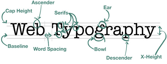
It is extremely important to ensure that your selected text is readable. It is also vital that you provide some visual indications between the website texts. Not only will it make the text look powerful but it will also serve to attract a large number of readers. This is an extremely useful tool that encourages your readers to quickly go through the important information. It is also useful for establishing a bond between the large paragraphs so that readers find it very easy to grasp.
However, web designers who are experienced in their work are well aware about handling website typography so that the content can look beautiful. On the other hand, spare a thought for those who are new to the game. So let us now take a look at some of the do’s and dont’s that need to be followed as far as web typography is concerned.
#1. DO: Create a typographic structure
Always ensure that your website typography is structured properly. The type can be arranged by making use of different methods such as weight, contrast, size, bold, and color. It will become more helpful for the users in finding the required content. When the content is given a proper structure, scanning and reading the same becomes very easy for the user. If you keep all of the content of the same size, it becomes difficult for the readers to distinguish between content body and related headings.
DON’T: Keep text size small
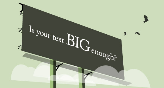
If you keep the body text too small, readers will find it very difficult to read. Keep your default text size large so that readers find it easy to read what has been written. The recommended text size is usually 14-16 points. Having a large text will create a good impression for your website because not everyone finds it easy to read small text. However, other readers can easily adjust text size from the comforts of their computer screen. Moreover, have the headings in large fonts so that the readers are able to distinguish as soon as they see it.
#2. DO: Adjust Text spacing
If you are working on a really important project, you should manually adjust the spacing between the characters and the lines. Large paragraphs should be given a proper spacing so that it looks worthy. For example, if you are looking to design a logo for your client website, it is necessary to adjust each character so that when visitors read it, every single letter looks adorable.
DON’T: Make use of tools such as Photoshop
Undoubtedly, Photoshop is one of the best tools in the world as far as website design is concerned. However, once it is used for adjusting the space it will do so by guessing the best possible adjustment for your site text content. There exists a number of options that let you set a mode for the relevant text adjustment. However, they are not always accurate. This is because different typefaces involve a different type of tweaking while the many software are designed accordingly to be in tune with the necessary adjustments. The most important texts on the website should ideally be adjusted manually.
#3. DO: Have spaces in your text
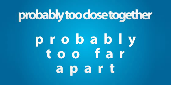
If you are looking to make your website content easily readable for everyone, negative spacing is really crucial. Not giving any room between the texts will mean that readers will be lost in following content text from one line to another. The best way to avoid this is by increasing the line heights so that everyone finds it easy to read. Remember to use negative spacing to your own advantage so that the readers can be totally focused on the available content.
DON’T: Use all caps for text
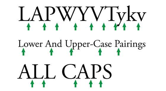
When website content is provided in all caps, it becomes difficult for readers to focus on and read the material that has been provided. It leads to a bad impression as if you are shouting out to your visitors in an aggressive manner. When you are promoting any of your services or products, readers may feel that using all caps is a form of spam. As a result, your work will become completely worthless. Thus it is important to have a close control over how and when to use all caps for your text.
#4. DO: Use creativity in the underlines
You should aim to implement some amount of creativity in the underlines that you put below the various words of your text content. Having the underlines under control makes for a good impression to the readers. Some of the things that you can experiment with are: transform the lines in different shapes, create double strokes, change the stroke weight, etc. Underlines usually give an emphasis to the word so they should be good enough for creating that sort of emphasis.
DON’T: Keep a default underline
A very ordinary thing nowadays is having the underline set to default. It may not form the appropriate fit with the word and in turn destroy the emphasis that you would have loved to have. Default underlines tend to look excessively awkward, while you are aware of the beauty of your word the system is not. So if you have any word you want to draw reader attention to, make sure you customize their underlining process.
#5. DO: Keep the lines in your paragraph short
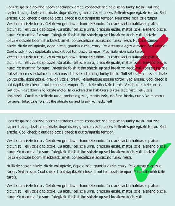
Readers can easily loose focus on the content text when they have to read through long lines of paragraphs. On the other hand, keeping too short lines of text is also a bad technique as it upsets the flow and rhythm of the reader. They may miss out on words when you have very short lines for them to study. Experts, typically, suggest that the length of a paragraph should be somewhere between forty to sixty characters for every line.
DON’T: Allow your content to have centered-text
Owing to uneven edges of text block, readers may find it very difficult to understand centered text present on your website. If you have every line starting from a new point, readers will find it quite hard to scan the content. It is considered an unprofessional approach to use centered-text because they fail to align properly with other elements on the page. Left aligned text should be used as default and in case you need to make use of centered text, it should be done with proper control.
#6. DO: Use Web Safe fonts
While downloading a suitable collection of fonts for your website, ensure that you use only the ones that are regarded as safe on the web. Safe web fonts are the ones that have a guaranteed installation on different browsers, so ensure that you check this before downloading. By choosing web safe fonts for your website, it will be transferred from the original fonts to the ones that have been installed by your visitors.
DON’T: Have a font overloading on your website
Having too many fonts for your webpage is the worst thing that you can do to your website. It is not possible to impress your visitors when they are welcomed with different font types for every single thing that they come across. It leads to a very un-professional and cheap impression among the visitors as far as your website is concerned. When you have too many fonts on your site page, readers find it very difficult to focus on any particular content.
#7. DO: Adjust contrast between background and text
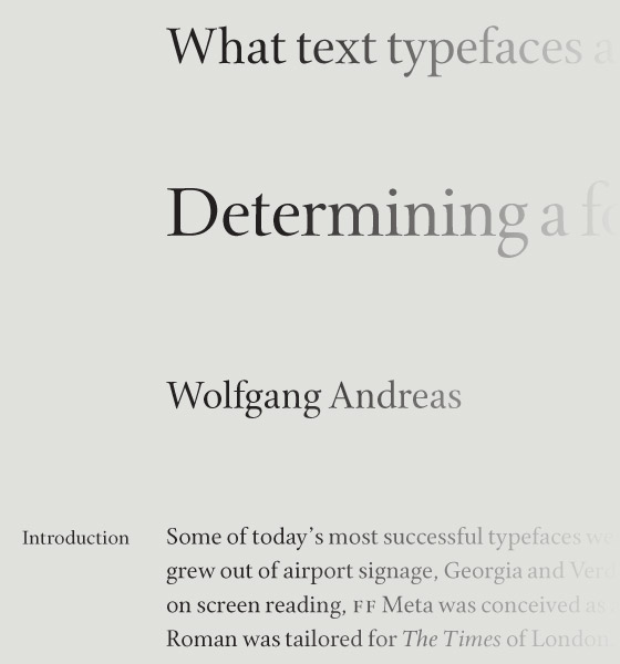
Although your font size is perfect, text is legible, and all other aspects are perfect, readers are still unable to read your content. Ever wondered why that is so? This is because the background contrast is poor, thus making it difficult for the readers to focus. The contrast plays a very important role in making the text clearly readable for everyone. An off-white background would be recommendable because it is extremely smooth and everyone can read everything on it.
DON’T: Give stress to your text
One of the best techniques is to lay emphasis only on those words that are very much in need of getting italics, underline, or bold makeover. When you have content that is full of unnecessary emphasis on text, readers will find it extremely awkward to go through. Making use of keywords is a technique that many writers are heavily dependent upon. This allows them to concentrate on the content rather than emphasize too much on any particular paragraph.
#8. DO: Utilize the grid style
Grid style is extremely useful as far as providing a nice readability experience to your visitors is concerned. Moreover, it lends a natural and attractive look to your website design. While you must keep an eye on the visuals, you should also remember to keep a balance in the font sizes. This is because your page will only go with the flow when everything forms a balance from top to bottom.
DON’T: Leave out the accent characters
Accent characters are extremely important in lending a professional look to the websites. It makes for a bad impression among the visitors when they wish to add an accented character to their comment but are unable to do so because your site lacks that feature. Accent characters should be utilized correctly so that the site can display comment properly.
Thus we have successfully compiled a list of the do’s and dont’s with regards to typography that every website designer and developer should remember while working on client projects. If you are looking for a professional design of your business website, it is ideal that you hire expert developers from a reputed hire services company. These people have the requisite level of skills that will help in taking your business the very top levels of success.

