The new WordPress editor (codenamed Gutenberg) is due for release in version 5.0. Now is the perfect time to get to grips with it before it lands in WordPress core. In this series, I’m showing you how to work with the Block API and create your very own content blocks which you can use to build out your posts and pages.
In the previous post, we saw how to use the create-guten-block toolkit to create a plugin containing a sample block ready for us to work with. We can easily extend this as required, but it’s a good idea to know how to create a block from scratch to fully understand all aspects of Gutenberg block development.
In this post we’ll create a second block in our my-custom-block plugin to display a random image from the PlaceIMG web service. You’ll also be able to customize the block by selecting the image category from a drop-down select control.
But first we’ll learn how block scripts and styles are enqueued before moving on to the all-important registerBlockType() function, which is fundamental to creating blocks in Gutenberg.
Enqueueing Block Scripts and Styles
To add the JavaScript and CSS required by our blocks, we can use two new WordPress hooks provided by Gutenberg:
enqueue_block_editor_assetsenqueue_block_assets
These are only available if the Gutenberg plugin is active, and they work in a similar way to standard WordPress hooks for enqueueing scripts. However, they are intended specifically for working with Gutenberg blocks.
The enqueue_block_editor_assets hook adds scripts and styles to the admin editor only. This makes it ideal for enqueueing JavaScript to register blocks and CSS to style user interface elements for block settings.
For block output, though, you’ll want your blocks to render the same in the editor as they do on the front end most of the time. Using enqueue_block_assets makes this easy as styles are automatically added to both the editor and front end. You can also use this hook to load JavaScript if required.
But you might be wondering how to enqueue scripts and styles only on the front end. There isn’t a WordPress hook to allow you to do this directly, but you can get around this by adding a conditional statement inside the enqueue_block_assets hook callback function.
add_action( 'enqueue_block_assets', 'load_front_end scripts' );
function load_front_end scripts() {
    if( !is_admin() {
        // enqueue front end only scripts and styles here
    }
}
To actually enqueue scripts and styles using these two new hooks, you can use the standard wp_enqueue_style() and wp_enqueue_scripts() functions as you normally would.
However, you need to make sure that you’re using the correct script dependencies. For enqueueing scripts on the editor, you can use the following dependencies:
- scripts:
array( 'wp-blocks', 'wp-i18n', 'wp-element', 'wp-components' ) - styles:
array( 'wp-edit-blocks' )
And when enqueueing styles for both the editor and front end, you can use this dependency:
One thing worth mentioning here is that the actual files enqueued by our my-custom-block plugin are the compiled versions of JavaScript and CSS and not the files containing the JSX and Sass source code.
This is just something to bear in mind when manually enqueueing files. If you try to enqueue raw source code that includes React, ES6+, or Sass then you’ll encounter numerous errors.
This is why it’s useful to use a toolkit such as create-guten-block as it processes and enqueues scripts for you automatically!
Registering Gutenberg Blocks
To create a new block, we need to register it with Gutenberg by calling registerBlockType() and passing in the block name plus a configuration object. This object has quite a few properties that require proper explanation.
Firstly, though, let’s take a look at the block name. This is the first parameter and is a string made up of two parts, a namespace and the block name itself, separated by a forward slash character.
For example:
registerBlockType(
    'block-namespace/block-name',
    {
        // configuration object
    }
);
If you’re registering several blocks in a plugin then you can use the same namespace to organize all your blocks. The namespace must be unique to your plugin, though, which helps prevent naming conflicts. This can happen if a block with the same name has already been registered via another plugin.
The second registerBlockType() parameter is a settings object and requires a number of properties to be specified:
-
title(string): displayed in the editor as the searchable block label -
description(optional string): describes the purpose of a block -
icon(optional Dashicon or JSX element): icon associated with a block -
category(string): where the block appears in the Add blocks dialog -
keywords(optional array): up to three keywords used in block searches -
attributes(optional object): handles the dynamic block data -
edit(function): a function that returns markup to be rendered in the editor -
save(function): a function that returns markup to be rendered on the front end -
useOnce(optional boolean): restrict block from being added more than once -
supports(optional object): defines block-supported features
Assuming we’re using JSX for block development, here’s what an example registerBlockType() call could look like for a very simple block:
registerBlockType(
    'my-unique-namespace/ultimate-block',
    {
        title: __( 'The Best Block Ever', 'domain' ),
        icon: 'wordpress',
        category: 'common',
        keywords: [ __( 'sample', 'domain' ), __( 'Gutenberg', 'domain' ), __( 'block', 'domain' ) ],
        edit: () => <h2>Welcome to the Gutenberg Editor!</h2>,
        save: () => <h2>How am I looking on the front end?</h2>
    }
);
Notice how we didn’t include an entry for the description, attributes, useOnce, and supports properties? Any fields that are optional (and not relevant to your block) can be safely omitted. For example, as this block didn’t involve any dynamic data, we don’t need to worry about specifying any attributes.
Let’s now cover the registerBlockType() configuration object properties in more detail one by one.
Title and Description
When inserting or searching for a block in the editor, the title will be displayed in the list of available blocks.
It’s also displayed in the block inspector window, along with the block description if defined. If the block inspector isn’t currently visible then you can use the gear icon in the top right corner of the Gutenberg editor to toggle visibility.

Both the title and description fields should ideally be wrapped in i18n functions to allow translation into other languages.
Category
There are five block categories currently available:
commonformattinglayoutwidgetsembed
These determine the category section where your block is listed inside the Add block window.
The Blocks tab contains Common Blocks, Formatting, Layout Elements, and Widgets categories, while the Embeds category has its own tab.
Categories are currently fixed in Gutenberg, but this could be subject to change in the future. This would be useful, for instance, if you were developing multiple blocks in a single plugin and you wanted them all to be listed under a common category so users could locate them more easily.
Icon
By default, your block is assigned the shield Dashicon, but you can override this by specifying a custom Dashicon in the icon field.

Each Dashicon is prefixed with dashicons- followed by a unique string. For example, the gear icon has the name dashicons-admin-generic. To use this as a block icon, just remove the dashicons- prefix for it to be recognised, e.g. icon: 'admin-generic'.
However, you aren’t just limited to using Dashicons as the icon property. The function also accepts a JSX element, which means you can use any image or SVG element as your block icon.
Just make sure to keep the icon size consistent with other block icons, which is 20 x 20 pixels by default.
Keywords
Choose up to three translatable keywords to help make your block stand out when users search for a block. It’s best to choose keywords that closely relate to the functionality of your block for best results.
keywords: [
    __( 'search', 'domain' ),
    __( 'for', 'domain' ),
    __( 'me', 'domain' ),
]
You could even declare your company and/or plugin name as keywords so that if you have multiple blocks, users can start typing your company name and all your blocks will appear in search results.
Although adding keywords is entirely optional, it’s a great way to make it easier for users to find your blocks.
Attributes
Attributes help with managing dynamic data in a block. This property is optional as you don’t need it for very simple blocks that output static content.
However, if your block deals with data that could change (such as the contents of an editable text area) or you need to store block settings, then using attributes is the way to go.
Attributes work by storing dynamic block data either in the post content saved to the database or in post meta. In this tutorial we’ll only be using attributes that store data along with the post content.
To retrieve attribute data stored in post content, we need to specify where it’s located in the markup. We can do this by specifying a CSS selector that points to the attribute data.
For example, if our block contained an anchor tag, we can use its title field as our attribute as follows:
attributes: {
    linktitle: {
        source: 'attribute',
        selector: 'a',
        attribute: 'title'
    }
}
Here, the attribute name is linktitle, which is an arbitrary string and can be anything you like.
For example, we could use this attribute to store the link title <a title="some title"> that’s been entered via a textbox in block settings. Doing so suddenly makes the title field dynamic and allows you to change its value in the editor.
When the post is saved, the attribute value is inserted into the links title field. Similarly, when the editor is loaded, the value of the title tag is retrieved from the content and inserted into the linktitle attribute.
There are more ways you can use source to determine how block content is stored or retrieved via attributes. For instance, you can use the 'text' source to extract the inner text from a paragraph element.
attributes: {
    paragraph: {
    source: 'text',
    selector: 'p'
    }
}
You can also use the children source to extract all child nodes of an element into an array and store it in an attribute.
attributes: {
    editablecontent: {
        source: 'children',
        selector: '.parent'
    }
}
This selects the element with class .parent and stores all child nodes in the editablecontent attribute.
If you don’t specify a source then the attribute value is saved in HTML comments as part of the post markup when saved to the database. These comments are stripped out before the post is rendered on the front end.
We’ll be seeing a specific example of this type of attribute when we get into implementing our random image block later in this tutorial.
Attributes can take a little getting used to, so don’t worry if you don’t fully understand them first time around. I’d recommend taking a look at the attributes section of the Gutenberg handbook for more details and examples.
Edit
The edit function controls how your block appears inside the editor interface. Dynamic data is passed to each block as props, including any custom attributes that have been defined.
It’s common practice to add className={ props.className } to the main block element to output a CSS class specific to your block. WordPress doesn’t add this for you inside the editor, so it has to be added manually for each block if you want to include it.
Using props.className is standard practice and is recommended as it provides a way to tailor CSS styles for each individual block. The format of the generated CSS class is .wp-block-{namespace}-{name}. As you can see, this is based on the block namespace/name and makes it ideal to be used as a unique block identifier.
The edit function requires you to return valid markup via the render() method, which is then used to render your block inside the editor.
Save
Similar to the edit function, save displays a visual representation of your block but on the front end. It also receives dynamic block data (if defined) via props.
One main difference is that props.className isn’t available inside save, but this isn’t a problem because it’s inserted automatically by Gutenberg.
Supports
The supports property accepts an object of boolean values to determine whether your block supports certain core features.
The available object properties you can set are as follows.
-
anchor(default false): allows you to link directly to a specific block -
customClassName(true): adds a field in the block inspector to define a customclassNamefor the block -
className(true): adds aclassNameto the block root element based on the block name -
html(true): allows the block markup to be edited directly
The useOnce Property
This is a useful property that allows you to restrict a block from being added more than once to a page. An example of this is the core More block, which can’t be added to a page if already present.

As you can see, once the More block has been added, the block icon is grayed out and can’t be selected. The useOnce property is set to false by default.
Let’s Get Creative!
It’s time now to use the knowledge we’ve gained so far to implement a solid working example of a block that does something more interesting than simply output static content.
We’ll be building a block to output a random image obtained via an external request to the PlaceIMG website, which returns a random image. Furthermore, you’ll be able to select the category of image returned via a select drop-down control.

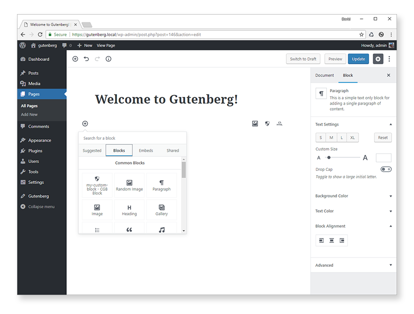
For convenience, we’ll add our new block to the same my-custom-block plugin, rather than creating a brand new plugin. The code for the default block is located inside the /src/block folder, so add another folder inside /src called random-image and add three new files:
- index.js: registers our new block
- editor.scss: for editor styles
- style.scss: styles for the editor and front end
Alternatively, you could copy the /src/block folder and rename it if you don’t want to type everything out by hand. Make sure, though, to rename block.js to index.js inside the new block folder.
We’re using index.js for the main block filename as this allows us to simplify the import statement inside blocks.js. Instead of having to include the path and full filename of the block, we can just specify the path to the block folder, and import will automatically look for an index.js file.
Open up /src/blocks.js and add a reference to our new block at the top of the file, directly underneath the existing import statement.
import './random-image';
Inside /src/random-image/index.js, add the following code to kick-start our new block.
//  Import CSS.
import './style.scss';
import './editor.scss';

const { __ } = wp.i18n;
const { registerBlockType, query } = wp.blocks;

registerBlockType( 'cgb/block-random-image', {
    title: __( 'Random Image' ),
    icon: 'format-image',
    category: 'common',
    keywords: [
        __( 'random' ),
        __( 'image' )
    ],
    edit: function( props ) {
        return (
            <div className={ props.className }>
                <h3>Random image block (editor)</h3>
            </div>
        );
    },
    save: function( props ) {
        return (
            <div>
                <h3>Random image block (front end)</h3>
            </div>
        );
    }
} );
This sets up the framework of our block and is pretty similar to the boilerplate block code generated by the create-guten-block toolkit.
We start by importing the editor and front-end style sheets, and then we’ll extract some commonly used functions from wp.i18n and wp.blocks into local variables.
Inside registerBlockType(), values have been entered for the title, icon, category, and keywords properties, while the edit and save functions currently just output static content.
Add the random image block to a new page to see the output generated so far.

Make sure you’re still watching files for changes so any block source code (JSX, ES6+, Sass, etc.) is transpiled into valid JavaScript and CSS. If you aren’t currently watching files for changes, then open a command line window inside the my-custom-block plugin root folder and enter npm start.
You might be wondering why we didn’t have to add any PHP code to enqueue additional block scripts. The block scripts for the my-custom-block block are enqueued via init.php, but we don’t need to enqueue scripts specifically for our new block as this is taken care of for us by create-guten-block.
As long as we import our main block file into src/blocks.js (as we did above) then we don’t need to do any additional work. All JSX, ES6+, and Sass code will automatically be compiled into the following files:
- dist/blocks.style.build.css: styles for editor and front end
- dist/blocks.build.js: JavaScript for editor only
- dist/blocks.editor.build.css: styles for editor only
These files contain the JavaScript and CSS for all blocks, so only one set of files needs to be enqueued, regardless of the number of blocks created!
We’re now ready to add a bit of interactivity to our block, and we can do this by first adding an attribute to store the image category.
attributes: {
    category: {
        type: 'string',
        default: 'nature'
    }
}
This creates an attribute called category, which stores a string with a default value of 'nature'. We didn’t specify a location in the markup to store and retrieve the attribute value, so special HTML comments will be used instead. This is the default behavior if you omit an attribute source.
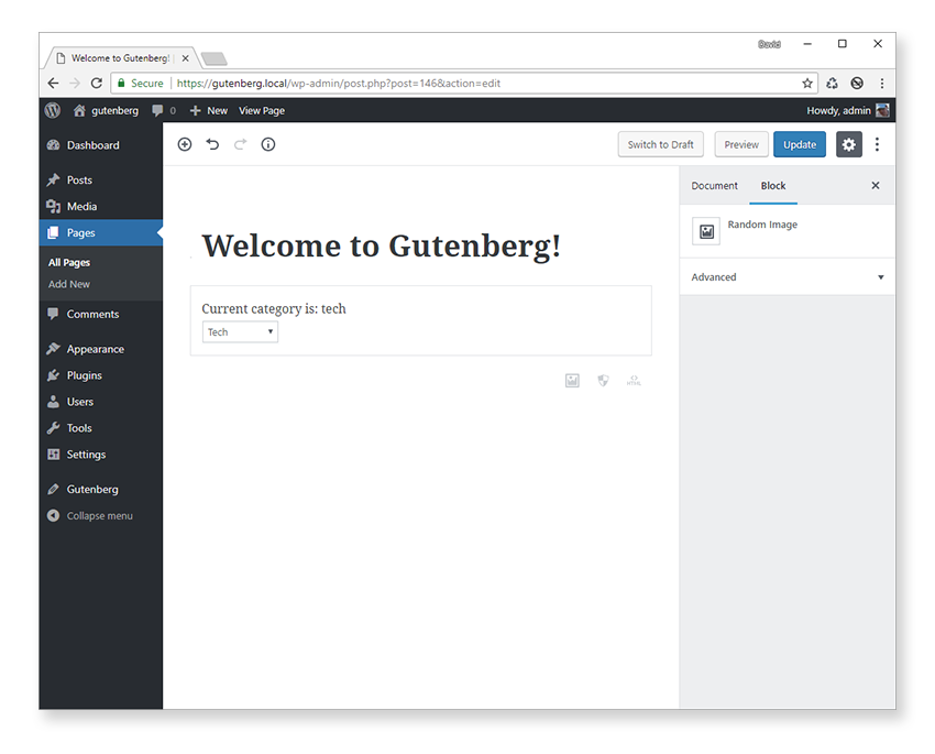
We need some way of changing the image category, which we can do via a select drop-down control. Update the edit function to the following:
edit: function( props ) {
    const { attributes: { category }, setAttributes } = props;
    function setCategory( event ) {
        const selected = event.target.querySelector( 'option:checked' );
        setAttributes( { category: selected.value } );
        event.preventDefault();
    }
    return (
        <div className={ props.className }>
            Current category is: {category}
            <form onSubmit={ setCategory }>
                <select value={ category } onChange={ setCategory }>
                    <option value="animals">Animals</option>
                    <option value="arch">Architecture</option>
                    <option value="nature">Nature</option>
                    <option value="people">People</option>
                    <option value="tech">Tech</option>
                </select>
            </form>
        </div>
    );
}
Here is what it will look like:

This is quite different from the previous static edit function, so let’s run through the changes.
First we’ve added a select drop-down control with several choices matching the image categories available on the PlaceIMG site.
When the drop-down value changes, the setCategory function is called, which finds the currently selected category and then in turn calls the setAttributes function. This is a core Gutenberg function and updates an attribute value correctly. It’s recommended that you only update an attribute using this function.
Now, whenever a new category is selected, the attribute value updates and is passed back into the edit function, which updates the output message.
We have to complete one last step to get the random image to display. We need to create a simple component that will take in the current category and output an <img> tag with a random image obtained from the PlaceIMG site.
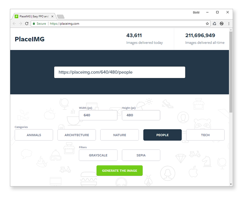
The request we need to make to PlaceIMG is of the form: https://placeimg.com/[width]/[height]/[category]
We’ll keep the width and height fixed for now, so we only have to add the current category onto the end of the request URL. For example, if the category was 'nature' then the full request URL would be: https://placeimg.com/320/220/nature.
Add a RandomImage component above registerBlockType():
function RandomImage( { category } ) {
    const src = 'https://placeimg.com/320/220/' + category;
    return <img src={ src } alt={ category } />;
}
To use it, just add it inside the edit function and remove the static output message. While we’re at it, do the same for the save function.
The full index.js file should now look like this:
//  Import CSS.
import './style.scss';
import './editor.scss';

const { __ } = wp.i18n;
const { registerBlockType, query } = wp.blocks;

function RandomImage( { category } ) {
    const src = 'https://placeimg.com/320/220/' + category;
    return <img src={ src } alt={ category } />;
}

registerBlockType( 'cgb/block-random-image', {
    title: __( 'Random Image' ),
    icon: 'format-image',
    category: 'common',
    keywords: [
        __( 'random' ),
        __( 'image' )
    ],
    attributes: {
        category: {
            type: 'string',
            default: 'nature'
        }
    },
    edit: function( props ) {
        const { attributes: { category }, setAttributes } = props;
        function setCategory( event ) {
            const selected = event.target.querySelector( 'option:checked' );
            setAttributes( { category: selected.value } );
            event.preventDefault();
        }

        return (
            <div className={ props.className }>
                <RandomImage category={ category } />
                <form onSubmit={ setCategory }>
                    <select value={ category } onChange={ setCategory }>
                        <option value="animals">Animals</option>
                        <option value="arch">Architecture</option>
                        <option value="nature">Nature</option>
                        <option value="people">People</option>
                        <option value="tech">Tech</option>
                    </select>
                </form>
            </div>
        );
    },
    save: function( props ) {
        const { attributes: { category } } = props;
        return (
            <div>
                <RandomImage category={ category } />
            </div>
        );
    }
} );
Finally (for now), add the following styles to editor.scss to add a colored border around the image.
.wp-block-cgb-block-random-image  {
    select {
        padding: 2px;
        margin: 7px 0 5px 2px;
        border-radius: 3px;
    }
}
You’ll also need some styles in style.css.
 .wp-block-cgb-block-random-image  {
    background: #f3e88e;
    color: #fff;
    border: 2px solid #ead9a6;
    border-radius: 10px;
    padding: 5px;
    width: -webkit-fit-content;
    width: -moz-fit-content;
    width: fit-content;

    img {
        border-radius: inherit;
        border: 1px dotted #caac69;
        display: grid;
    }
}
Whenever the page is refreshed in the editor or on the front end, a new random image will be displayed.

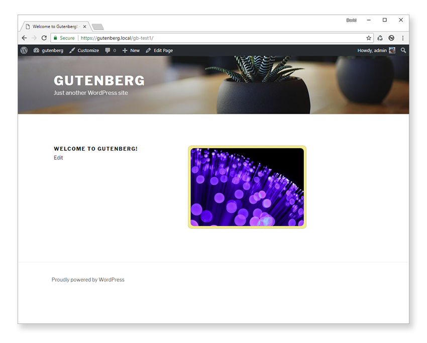
If you’re seeing the same image displayed over and over, you can do a hard refresh to prevent the image being served from your browser cache.
Conclusion
In this tutorial we’ve covered quite a lot of ground. If you’ve made it all the way through then give yourself a well-deserved pat on the back! Gutenberg block development can be a lot of fun, but it’s definitely challenging to grasp every concept on first exposure.
Along the way, we’ve learned how to enqueue block scripts and styles and covered the registerBlockType() function in depth.
We followed this up by putting theory into practice and creating a custom block from scratch to display a random image from a specific category using the PlaceIMG web service.
In the next and last part of this tutorial series, we’ll add more features to our random image block via the settings panel in the block inspector.
If you’ve been following along with this tutorial and just want to experiment with the code without typing everything in, you’ll be able to download the final my-custom-block plugin in the next tutorial.