Maximalism in graphic design has evolved over the decades. A style that often comes off as a trend has long endured the battle against minimalist design. In this article, we take a look at the effect it’s had on other design trends and styles and give tips to help you create your own maximalist designs.
Looking for more maximalism graphic design trend inspiration? Head over to Envato Elements.
What Is Maximalism in Design?
The maximalism graphic design trend is a direct reaction to minimalism. Maximalist graphic design is characterized by an abundance of design elements mashed up together. Under the motto of ‘more is more’ (in contrast to the ‘less is more’ minimalist philosophy), designers can create chaotic, maximalist graphic design pieces that embrace diversity.
Maximalism also blends many different design styles, challenging taste, rules, and many of the design principles. Through a mixture of styles, the maximalism graphic design trend inspires openness to spontaneity, walks a fine line between reality and fantasy, and advocates freedom of expression.


Maximalism Through Time
The maximalist trend is certainly not new. Artists and designers have made use of it for decades. In the way that it mixes different design trends and design elements, we can trace maximalism in graphic design all the way back to the Arts and Crafts movement.
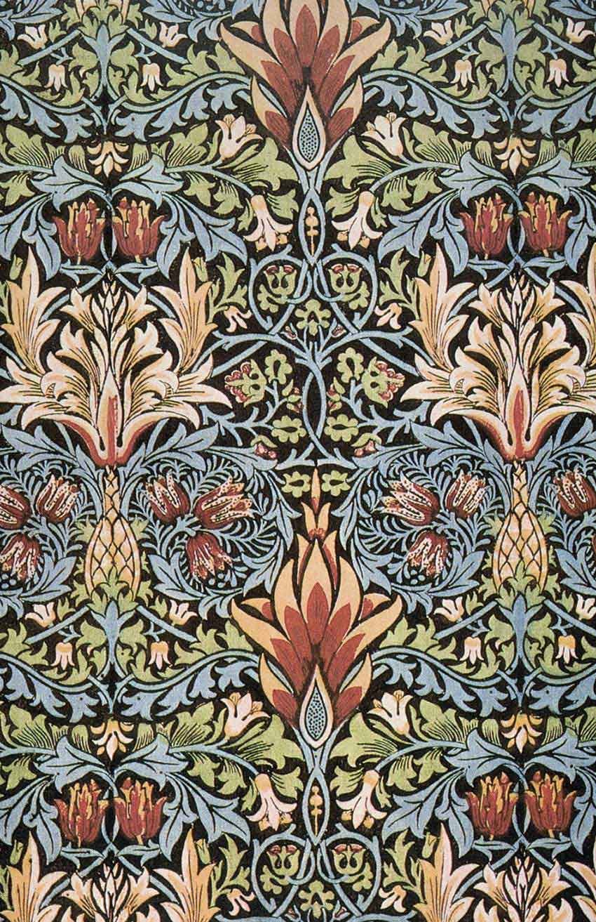
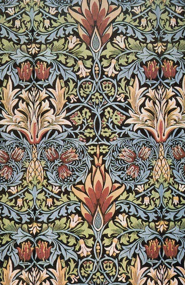
The Arts and Crafts movement was all about craftsmanship and decorative ornamentation. Inspired by medieval and romanticism, the design pieces included extreme embellishment, highly ornate typography, and rich details. It didn’t only apply to graphic design but also spanned furniture design, sculpture, jewelry, and much more. William Morris’s textiles were a huge influence during the late 1800s, when the movement was at its peak. Here, we can see maximalism through the intricate floral designs. It was all about excess.
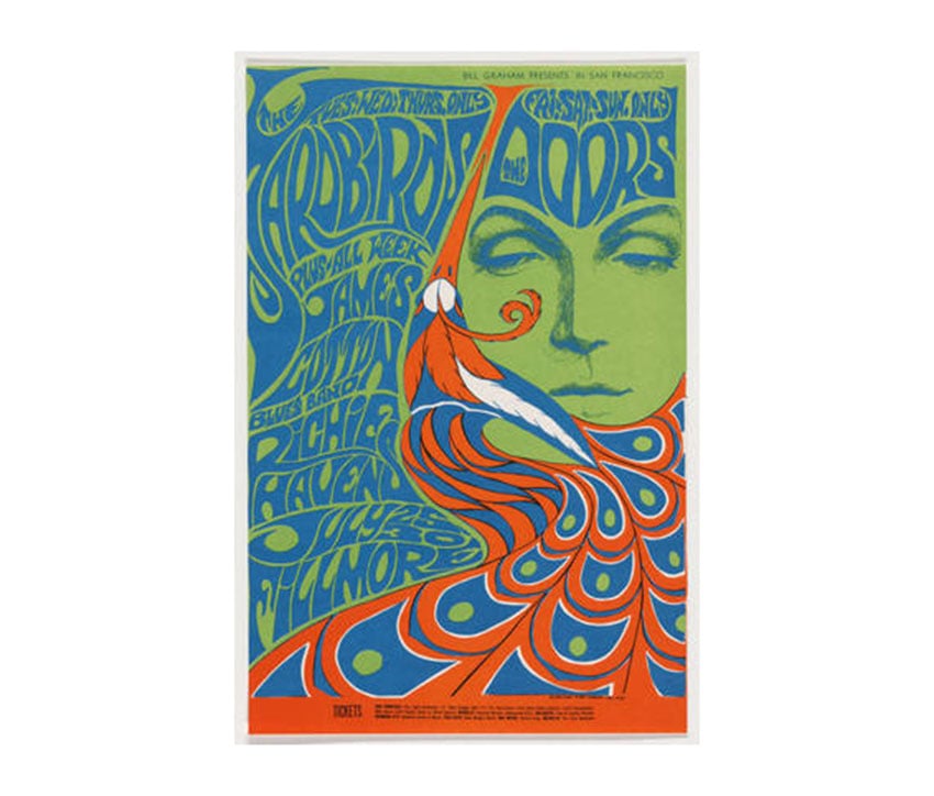
Decades later, we saw the Art Nouveau revival. While the original movement came right after the Arts and Crafts style, this new type of Art Nouveau came around in the late 1960s. The original Art Nouveau style was inspired by the female figure, botanicals, and dreamy settings. The Art Nouveau revival of the 60s and 70s took it to another level by adding complex psychedelic effects and integrated hand-drawn typographic elements. We can see chaotic maximalism in graphic design through the layering of graphic elements and the kitschy feel.

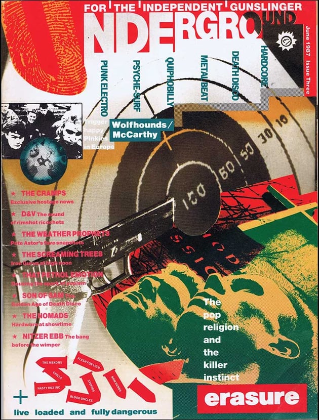
In the 80s, another trend was characterized by maximalist ideas. The New Wave and its anti-design spirit threw every design rule out of the window. These designs had no grid structure, plenty of intentional distortions, and even challenging readability. This aesthetic was very unconventional.

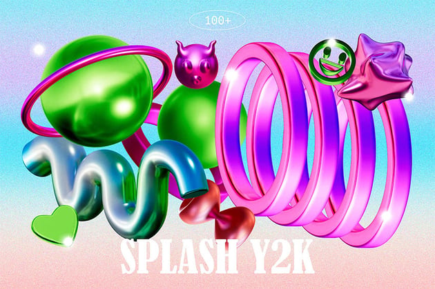
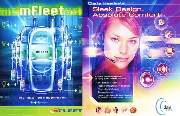
While the 90s were characterized by some of the most minimalist designs, Y2K also reinforced the use of white backgrounds and minimalism. Nevertheless, the new millennium wasn’t strange to maximalist designs. Fashion and music influenced design with their extravagant styles. There was plenty of bling and highly ornamented blackletter typography, which was disorienting and very different from the corporate designs we saw during this time.


More Is More
As we can see, maximalism is more than just a trend. It’s become a style that has lasted for a long time and keeps coming back. Over time, the maximalist style has developed specific characteristics to create designs that include clashing colors, bold layouts, and competing elements. Let’s take a look:
- Intricate patterns: While the point of maximalism is to create chaos, designers also need to have a level of taste, so make sure that the patterns don’t clash but instead complement each other.
- Mixing eras to create a new eclectic style. Maximalism thrives when there are blends of past trends; it gives designers the opportunity to convey different messages.
- Layers are key to the maximalism graphic design trend. You’ll notice many of the designs have a collage feel to them. Layering elements like different images, patterns, and typography allows you to create dynamic compositions.
- Vibrant colors and contrasting colors create an interesting layout. Mix colors in unexpected ways to create interesting visual effects.
- As a rule of thumb, using multiple fonts is a no-go. But when it comes to maximalism, you’re encouraged to use typography creatively. Experiment with different fonts, colors, and sizes.
- Combining all of the elements above can lead to a fantasy/kitschy undertone in a design piece. Maximalism can help create a new eclectic style that’s never the same, and that’s a great way to put out something that’s never been seen before.

Maximalism vs. Minimalism vs. Brutalism
In the last few years, we’ve seen multiple trends that are either completely opposite or very alike. Some of these are Maximalism, Minimalism, and Brutalism. All three of these trends are sometimes mixed or contrasted. Let’s take a look:
Maximalism vs. Minimalism
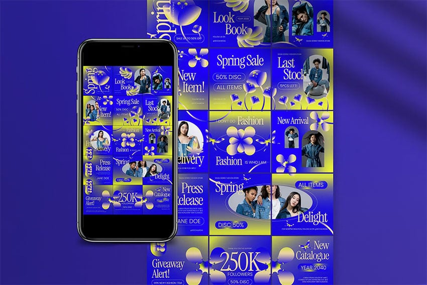
The complete opposite of maximalism is minimalism, with its simple and barebones aesthetic. These two styles are a reaction to each other, so when we see one, we’ll surely see the other one pop up too. Minimalism is characterized by a limited color palette, only necessary graphic elements, and plenty of negative space. It can often look sleek and modern.
Maximalism, being the total opposite, can look whimsical, daring, and more interesting due to its collage-like aesthetic, with multiple layers of colors and graphic elements. Maximalism is more complex and has more depth.


Maximalism vs. Brutalism
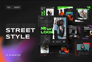
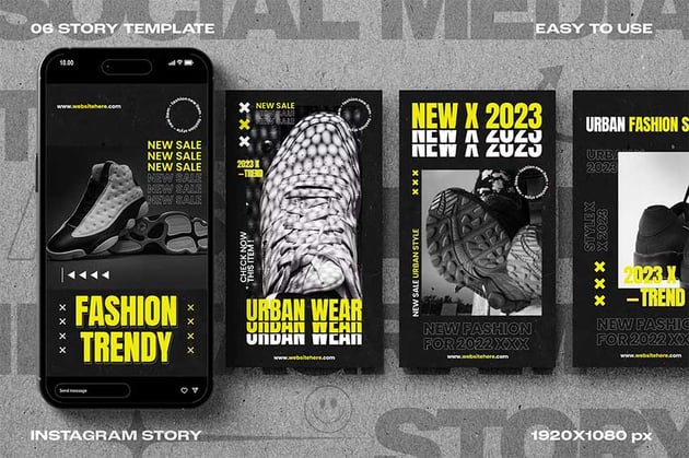
Brutalism can often be mistaken for both maximalism and minimalism. Both styles are characterized by an anti-design aesthetic. Brutalism celebrates raw materials, both in architecture and design. In graphic design, we can see this translated as monochromatic designs and modular grids. Where most people get confused between maximalism and brutalism is in the extreme layering of graphic elements.


What Is the Future of Maximalism in Graphic Design?
Maximalism is one of the wildest boundary-pushing design styles we’ve seen over the decades. Styles and trends are usually a response to what’s happening culturally. For many years, trends used to happen one at a time, but now, thanks to social media, we see multiple styles happening at once.
While maximalism in graphic design looks like a contemporary trend, we can see it’s more of a style than just a trend since it’s endured many, many decades. The impact this style has had speaks volumes as to how versatile it can be as long there’s good taste. Opulence and abundance might seem like easy things to accomplish in design, but it all comes down to balance to capture attention and create intrigue.

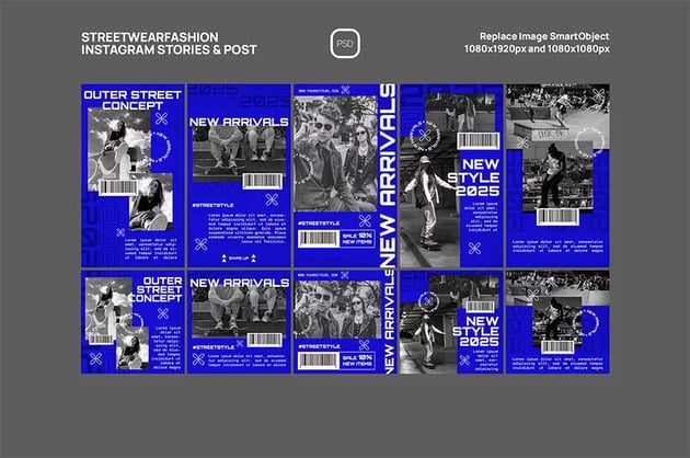
I think maximalism will continue to evolve, maybe not as a response to another style but for its own development. As other design styles progress, maximalism has the opportunity to take elements from those and make them its own. Maximalism is such a dynamic style that it can always grab cues from popular culture to evolve and reshape itself.
Tips on Creating Maximalist Designs
Maximalism in graphic design is all about being too much, but tastefully. We’ve already talked about the general graphic elements we find in maximalist designs, so let’s take a look at some tips that can help you polish off a design:
- While it has unconventional ways of organizing and mixing elements, maximalism relies heavily on typographic size, weight, and most importantly, repetition. Repeating elements to emphasize their visual importance might seem like too much, but done the right way, it can reinforce a message.
- Little negative space is key: maximalism is all about opulence. While other styles like to cut back on graphic elements, maximalism likes to fill up every space. Do more with more, and overload to the max.
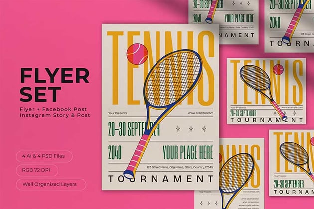
- Abundance is another synonym for maximalism. Work on achieving density through collage-like layering and compositions. If this isn’t properly done, the design can look cluttered and confuse the audience. Tasteful collages create the right amount of tension, balance, and richness.
- Maximalism challenges many design rules, including taste through chaos. This style uses unusual ways to achieve what traditional graphic design achieves through rules. Leaning into the loud, sometimes tacky, and even kitschy, is a good bet for creating a successful maximalist design.


Conclusion
In this article, I showed you how the maximalist graphic design trend is more than just a passing trend. This style has survived through many decades, influencing and confronting the minimalist style. From the Arts and Crafts movement through the 60s psychedelic style, the 80s New Wave, and the anti-design Y2K trend, the maximalist graphic design trend has made its mark with chaotic yet balanced, kitschy yet tasteful pieces. I can’t wait to see where this style is going and how it’ll evolve as social media influences everything. How do you think the maximalist graphic design trend will affect design?
If you liked this article, you might like: