
I like to use a
typography.css
in my projects; a separate file which houses all the basic structural typographic styles I’ll need. A lot of what’s found within it is obvious stuff (heading sizes, for example) but it also contains less obvious things which I don’t want to forget. Let’s work our way through the checklist..
A Separate CSS File
Splitting up your CSS files is a sensible workflow when building a website. If you use a preprocessor (like Sass) then splitting files into “partials” comes very naturally. If you prefer to write old-school vanilla CSS, then there are still tools to help you compile them into a final build.
Breaking your CSS into partials means you can easily reuse chunks of styling for new projects and it makes maintenance a breeze.
We’re going to build a typography.css so that, even if we use an aggressive CSS reset, our typography will always begin solidly.
Cross Browser Optimizing
Fonts render differently depending on the browser and platform being used. We can never make everything look the same everywhere, but let’s begin by optimizing our typography wherever possible.
Text Rendering
Many fonts include luxurious extras to improve readability. Ligatures, kerning and geometric precision won’t often be used by browsers under normal circumstances, but can be used if you specifically instruct the browser to do so.
Browsers running on Mac OS X will usually do their best to render fonts well, and rendering engines on various platforms will sometimes play ball for type at 20px or larger (displaying small type accurately is understandably more difficult).
Here’s the CSS:
body {
	text-rendering: optimizeLegibility;
}
This tells the browser that, whenever possible, it should strive to render the additional font features to improve readability. There is a small performance cost, however. If you need to go for speed over quality sometimes, you can additionally use the optimizeSpeed value on certain elements:
.foo {
	text-rendering: optimizeSpeed;
}
Where will this actually work? Those kind chaps at Mozilla have put together a browser support table to anaswer that.
Font Smoothing
The default font rendering in modern browsers is considered by many to be.. lacking. Characters are often rendered a “bit thick” (particularly on OS X) owing to the additional subpixels which are used to smoothen edges. For this reason, many people use the following:
body {
	-webkit-font-smoothing: antialiased;
}
Alternatively, you could use:
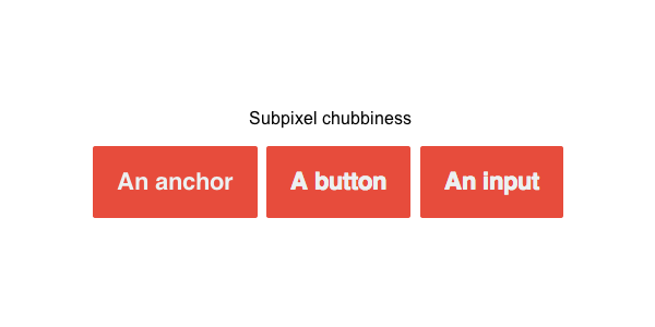
-webkit-font-smoothing:none;
-webkit-font-smoothing:subpixel-antialiased;
As we’ve mentioned, subpixel-antialiased is what modern browsers tend to use as default, none will turn off smoother rendering altogether.
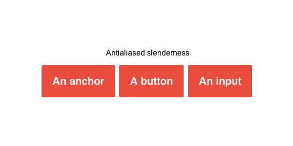
Stick to antialiased and your designs will lose a few kilos, but as James Koster points out, inputs and buttons will sometimes ignore your instructions.
In order for inputs and buttons to play along, you’ll need to be more specific:
body,input,button  {
	-webkit-font-smoothing: antialiased;
}
Base
Getting down to business, you’ll probably begin your typographic boilerplate by setting the base font size, line-height and font-family. We usually perform this on the <html> or the <body> element with the shorthand statement:
html  {
	font: 100%/1.5 Arial,sans-serif;
}
This sets us up with our base size at 100% of the browser’s default (usually 16px), gives us a unitless 1.5 for the line-height, then sets up our font stack. You can read more about this “100%” default by checking out Taking Ems Even Further on Tuts+.
Headings
Moving on, the next typographic pitstop is often the headings. There are six to set up, each being used for headings with varying degrees of importance.
In order to determine what sizes your headings should be, you need to figure out a modular scale. We’re going to use an uncomplicated set of values, based on a legacy version of Nicolas Gallagher’s normalize.css (which you may be using anyway).
h1 	 {
	font-size:2em;
		/* 2*16 = 32 */
}
h2 	 {
	font-size:1.5em;
		/* 1.5*16 = 24 */
}
h3 	 {
	font-size:1.17em;
	/* 1.17*16 = 18.72 */
}
h4 	 {
	font-size:1em;
		/* 1*16 = 16 */
}
h5 	 {
	font-size:0.83em;
	/* 0.83*16 = 13.28 */
}
h6 	 {
	font-size: 0.75em;
	/* 0.75*16 = 12 */
}
These values are in ems, but you can see the equivalent pixel values noted in the comments.
Paragraphs
Paragraphs usually form the bare bones of an HTML document; their styling can make or break the readability of content. As a bare minimum, they require good line-height and good spacing.
p {
	line-height:1.5;
		margin: 0 0 1em;
}
Paragraph spacing in this way will give us this:
However, printed publications (like, you know… books) more often go with indented paragraphs, which we can get by using the following:
.indent p  {
	margin:0;
}
.indent p+p {
	text-indent: 2em;
}
This removes the margin, instead applying an indent on all but the first paragraph elements (using a sibling selector).
The only problem this presents is that there’s now no margin at the bottom of the final paragraph; any following elements would be squashed up against it. Thankfully, this can be solved. Harry Roberts suggests Mo Robust Paragraph Indenting and it’s a technique I love using:
p 	 {
		line-height:1.5;
				margin:0 0 1em;
}
.indent p+p {
	text-indent:2em;
					margin-top: -1em;
}
Here you can see we retain the original styling on our paragraphs, the margin at the bottom is still there on all of them. However, this time we apply an equal negative top margin on all but the first paragraph, which shunts the whole lot up to close the gaps.
Word Breaks
In this age of fluid layouts, our measures (line widths) are constantly changing. Unlike the static world of print, we can’t manually specify line breaks to keep things neat. CSS support for hyphenation isn’t great yet, so many people bury hidden characters within their content which act as soft hyphens (), suggesting where a word should be split if necessary. The practicalities of this are horrible.
Thankfully things are improving. The word-break property is supported by Chrome and older IE, plus future support is on the horizon for CSS3 Hyphenation. The specifics of all this are covered very well by Kenneth Auchenberg, but for the time being, here is cross-browser CSS hyphenation in all its glory:
p 	 {
	-ms-word-break:break-all;
				word-break:break-all;
				/* Non standard for webkit */ 			word-break:break-word;
				-webkit-hyphens:auto;
				-moz-hyphens:auto;
				-ms-hyphens:auto;
				hyphens: auto;
}
Slam on the Anchors
What do your hyperlinks look like? By default, most browsers will display an active link with an underline. This has become such an established norm, that you’d better have a good reason for removing it! Likewise, users expect underlined words within copy to link somewhere, so don’t underline random words for emphasis.
Also worth noting is the :visited state of links (a different colour is helpful, though that’s about all you can control) and the :hover state.
a,a:visited  {
	text-decoration:underline;
}
a:hover	 {
		text-decoration: none;
}
Note: There are no colors here, that’s perhaps for a different stylesheet.
Some people argue that an underline hinders readability of a link, so you could alternatively use a border-bottom instead, which would boost the space between line and letter.
One last note, whilst we’re on the subject of anchors, is that this might be a good place to setup styling for links of various types. If you want to, using CSS attribute selectors we can style external links differently, or perhaps links which lead to a download:
a[href$ =".zip"] {
	color: tomato;
}
Assumed Bits and Bobs
Unless you’ve reset all your styles to absolute zero, the browser probably has you covered here, but it’s a good idea to make sure of your bases. Do your strongs stand out? Are your ems emphasized?
strong  {
	font-weight:bold;
}
em 	 {
	font-style: italic;
}
Code Snippets
We use a *lot* of <code> elements on Tuts+, so it’s not something I’ll ever forget, but do yours have a code-like and readable style setup?
code,pre  {
	font-family:monospace,serif;
			font-size: 1em;
}
Very nice. Our good friend the Monospace font ensures that each character is easily distinguishable, hence its use in code editors the world over. We include the <pre> element selector here too; “code” should be used for inline snippets, “preformatted” should be used for blocks of code (line-breaks etc. are pleasantly observed).
As an aside, I always like the way Bootstrap styles its code elements:
This is stylistic of course, but give me a nice rounded background color on my inline snippets any day..
Blockquotes
You don’t need to go overboard with your <blockquote> elements, but setting them visually apart from the rest of your content is important. They punctuate the flow of an article, add interest and help with rhythm.
So as not to dive in too deeply with styles here, let’s just highlight the fact that they’re blockquotes:
blockquote {
		font-style:italic;
}
blockquote:before {
	content:"1C";
						display:inline-block;
						padding-right: .4em;
}
This gives them an italic style (hopefully the font used will have a specific italic variant, instead of leaving it to the browser to work out) then leans on a pseudo element for a quotation mark.
Simple. That quotation mark 1C will always be dynamically injected into our blockquotes from now on. Any further styling is entirely up to you!
Print Styles
Styling for the screen is one thing, but how often have you genuinely considered what happens when your users hit “print”? We tend not to see paper output, so we tend not to think about it.
Taking a leaf out of the HTML5 Boilerplate, we can apply a few styles to take care of those who like to read on paper. First, we nest everything within a print media type:
@media print { }
Paint it Black
Now let’s clear the board by making sure everything prints as black, removing any backgrounds (we don’t want to be wasting toner on them) and removing any superfluous shadows. And yes, we’ll be using !important, which is actually pretty useful in this case and will never need to be overwritten.
@media print {
	* {
		background:transparent !important;
		color:#000 !important;
		/* Black prints faster:h5bp.com/s */ box-shadow:none !important;
		text-shadow: none !important;
	}
}
Paging
A couple of other things I’m going to cherry-pick from HTML5BP relate to readability on the printed page. Again, these will be nested within our @media print, take a look:
p,h2,h3 {
	orphans:3;
	/* http://css-tricks.com/almanac/properties/o/orphans/ */ widows:3;
		/* http: //css-tricks.com/almanac/properties/w/widows/ */
}
These properties apply specifically to paged media (like our “print”) and won’t have any influence on the screen. They control the paging of a given document, preventing stray lines from sitting at the top of a new page, or wasting in solitary confinement at the bottom of an old page.
Chris Coyier sums it up nicely.
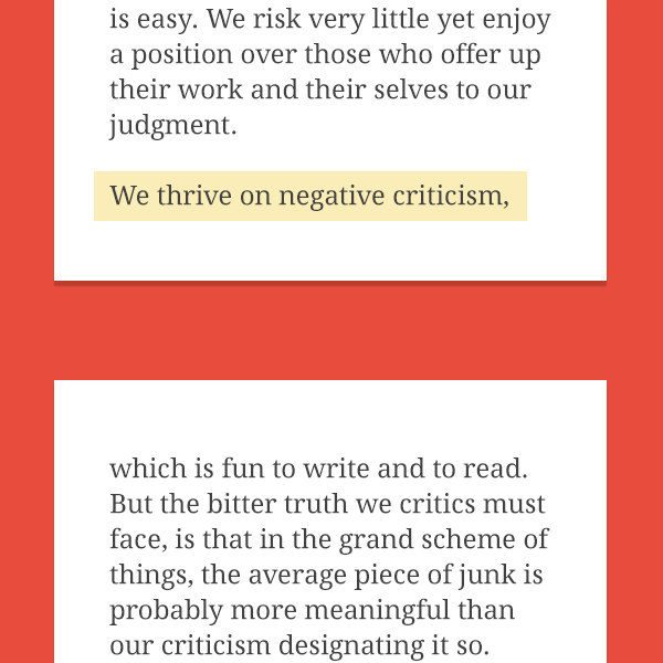
widows = minimum number of lines in a paragraph split on the new page.
orphans = minimum number of lines in a paragraph split on the old page.
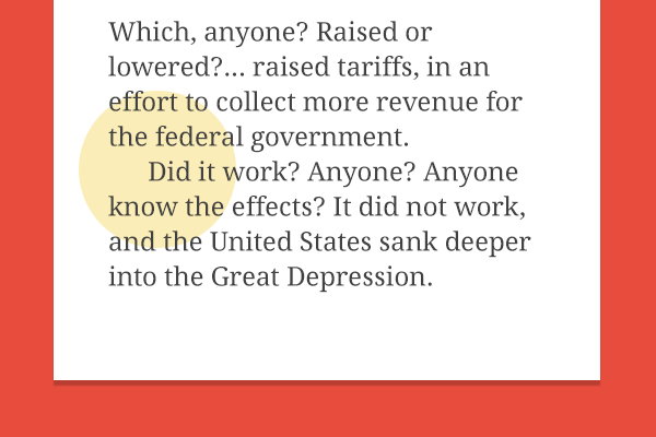
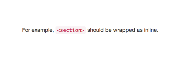
For example, widows are the final lines of a paragraph, found at the top of a new page:
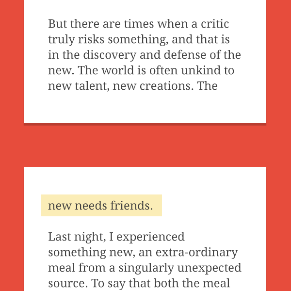
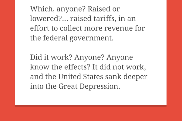
Whereas orphans are the initial lines of a paragraph, found at the end of a page:
Splitting a paragraph (or heading) in either situation breaks the reader’s flow, so the CSS rules noted above make sure that there’s a minimum of three lines in each case. If not, widows are bumped to the next page, paragraphs with insufficient orphans are pulled to the next page too.
Page Break
Lastly, let’s prevent the page from stopping immediately after a heading (which would look like this:)
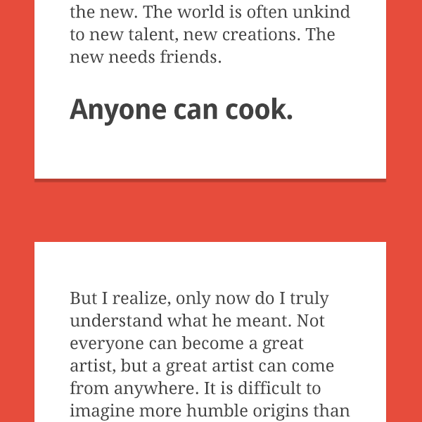
Again, we need the following to sit within our @media print section.
h2,h3 {
	page-break-after: avoid;
}
page-break-after can take a number of values. We’ve used avoid which prevents the page from breaking after the heading (by pulling the heading onto the next page). Be aware that this property will one day make way for break-after.
We’ll Leave it There
We could go on forever, but it’s now time to open up the floor and listen to the typographic base styles you all use. What’s missing from this boilerplate?