When designing a website, we often spend a good bit of time
considering which visual assets to use. Photos and illustrations, for example, can
have a large impact on a design. However, those aren’t the only assets we should
focus on.
One asset that can get easily overlooked is icons. There
are a lot of generic libraries floating around and they’re easy enough to use, but
there is something to be said for using a more custom solution. Indeed, the
right icons make for a more detailed and complete user experience.
So how do you go about deciding which icons to use? Let’s
take a look at some tips and best practices for making the right choice. We’ll include
some amazing examples that you can access with a subscription to Envato Elements, home to more than
5,500 icon sets, plus hundreds of thousands of top design resources.
1. Use Icons Relevant to Your Subject
So often we use icons that don’t really fit the subject
matter of our website. Thankfully, we don’t have to settle. Utilizing icons that
are relevant to an industry or concept is a better way to go. This provides a
more finished look while adding context for users.
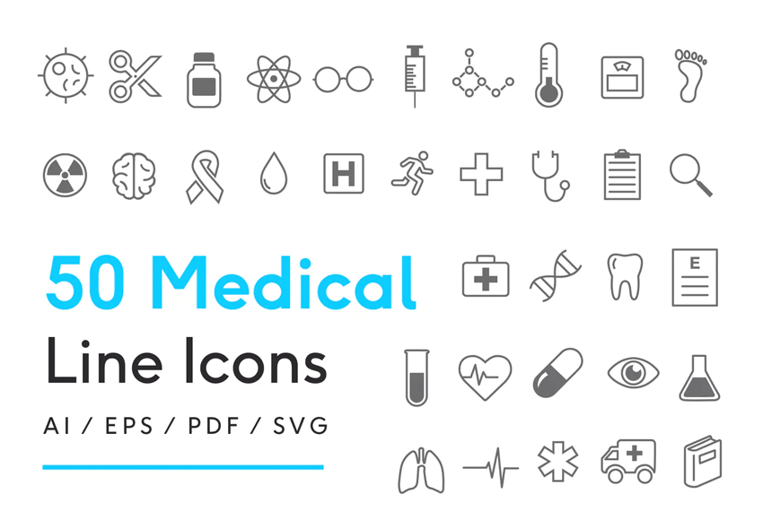
The medical field is a great example. Medical Line Icons
includes fifty, fully-editable icons that are available in a variety of formats. Each
image illustrates an industry-specific concept in a simple and straightforward
manner.
More industry-specific icon sets:
2. Reflect Your Branding and Style
Icons should add to, not take away from, your style. Look
for images that mesh with the overall tone and messaging of your site. That
means a site with a more buttoned-down, corporate feel should opt for icons
that promote a professional look. Likewise, a more casual website won’t want to
get too serious when it comes to imagery.
30 Fresh & Modern Avatars could be a great fit for blogs or startups that want to reflect
a fun atmosphere. Choose from a collection of interesting characters and edit
them to fit your personality.
More laid-back avatar icon sets:
3. Think About the Number of Icons You’ll Need
One of the challenges in using custom icons is that some
sets may not be very deep. There might not be options to fill every need. Therefore,
you’ll want to consider the potential number of icons you plan to use. Having a
good idea ahead of time will save you the trouble of switching directions or
attempting to mix and match different sets.
If you require a deeper library of icons, check out Modern Flat Icons.
The set contains 200 icons that are categorized by subject. They’re a good
choice for websites that plan on using a larger number of images that span a variety
of industries.
More extensive icon sets:
4. Consider Size and Editability
When it comes to size, not all icons measure up. Many sets
are available in vector formats that scale to any size and are easy to edit. But
you’ll also find collections that are relegated to lower resolutions and can’t be tweaked. This
should be an important factor when browsing through potential options.
For example, with 26 Colorful Vector Ice Creams, you’ll find an icon set that offers unlimited
sizing capabilities. Since it’s available in both vector (Ai, EPS) and raster
(PNG) formats, these icons will be a great fit at any size. Plus, you can make any
necessary edits to better fit in with your style.
More fully scalable, highly-detailed icon sets:
5. Look for the Unexpected
Let’s try a quick experiment. Close your eyes and think of
what an icon should look like. We all
have our own specific picture in our heads. But the exciting aspect of custom
icons is that they aren’t one-size-fits-all. Sometimes, they can take
unexpected forms that help to push our designs forward. They may not work for
every use case, but these mavericks may be just what you need.
This set of Handwritten Social Media Icons is anything but standard. Coming in both sketch and
outline styles, these hand-crafted beauties will help you stand out. They may
even change your idea of what an icon can be.
More unexpected icon sets:
Little Details That Make the Difference
Though they can be small in stature, icons have the
potential to do big things for your website. The key is in choosing the right
ones for your specific needs.
Look for icons that match your subject and style. Then,
consider how deep of a collection you’ll need and if you’ll want to perform any
resizing or editing. Finally, don’t be afraid to use images that break the
boundaries of traditional icons.
Keep those factors in mind and use icons that will help bring
your website to the next level.
