 This month we have a variety pack for you. There are all sorts, from the most conservative layouts and structures to more experimental navigation. And we see how even the most traditional and functional websites can connect with users through mood-enhancing color schemes, clever font choices, and illustrations.
Non-functional–that is, purely decorative–details can really improve the user’s reaction to a site when applied sparingly. Constant movement gets tiring, and adding too many elements can feel fussy and unfocused. Getting the balance right so that things are kept simple but not bare and boring can be difficult, but it is a skill worth mastering.
Enjoy!
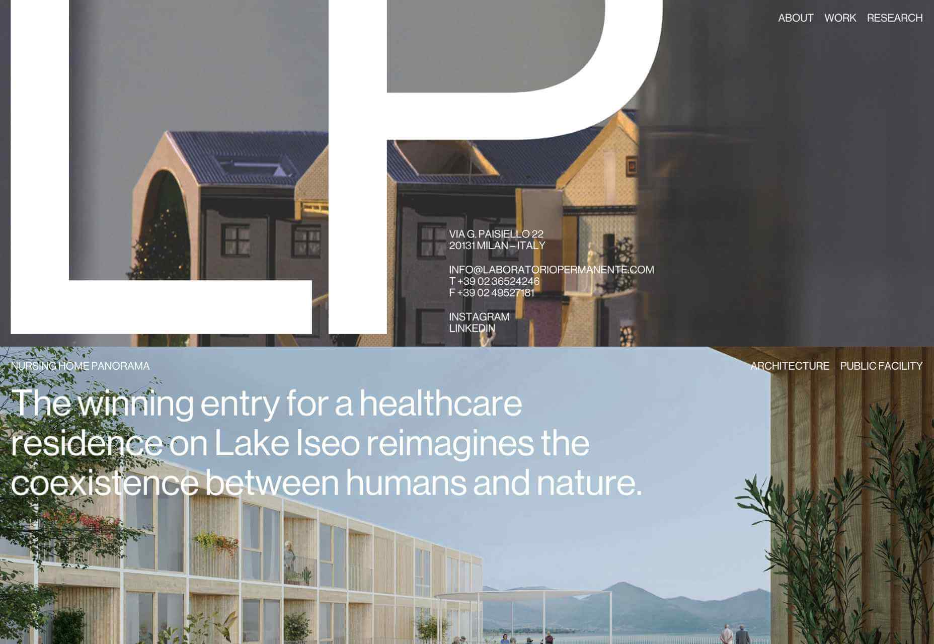
Laboratorio Permanente
The site for this multi-disciplinary architecture studio makes very nice use of a scrolling concertina effect.
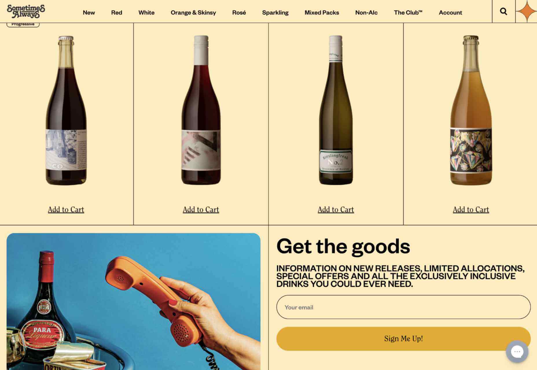
Sometimes Always
Wine sellers Sometimes Always have gone for a retro vibe with their color scheme and type.
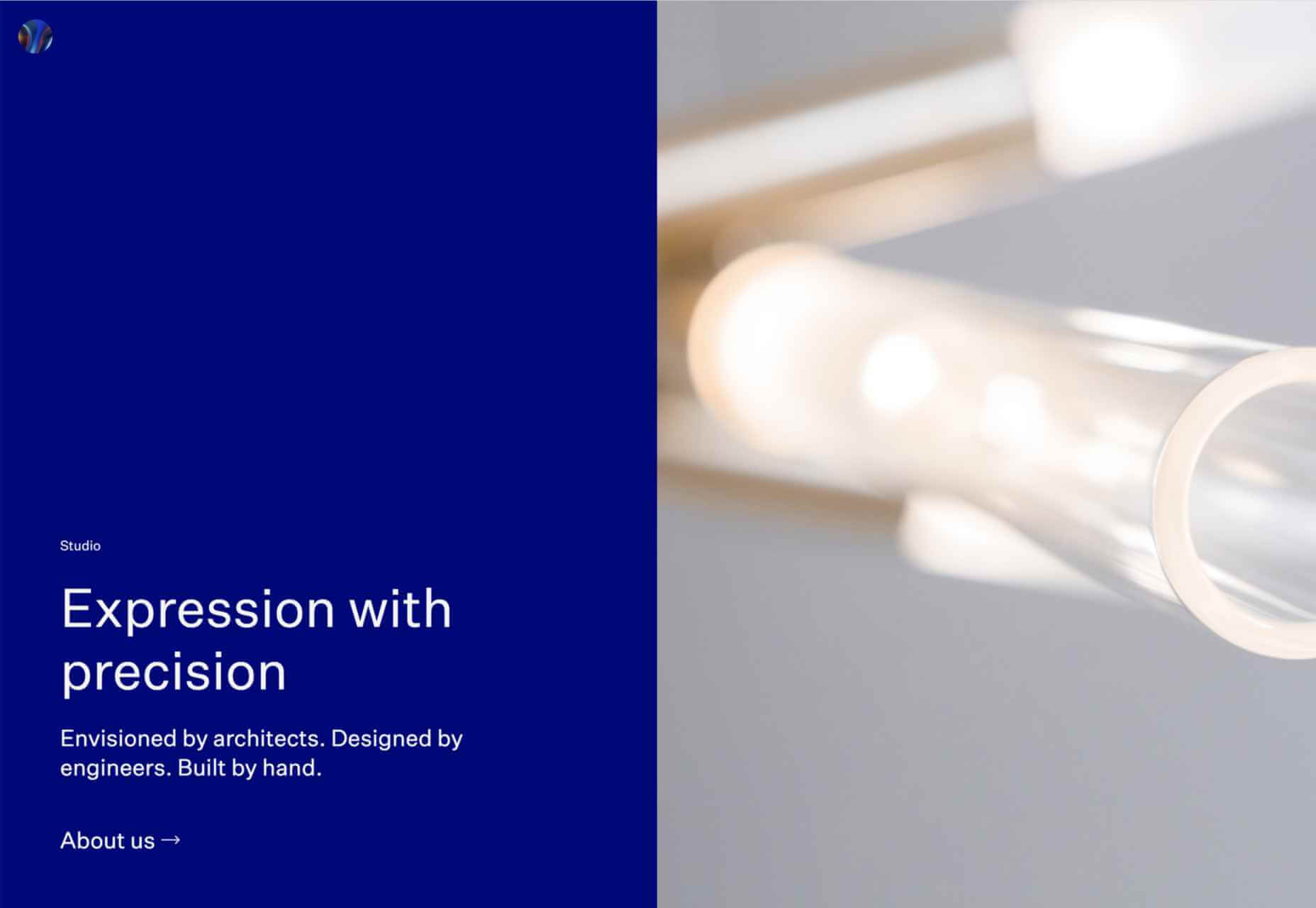
Empty State
Split-screen contraflow scrolling and the pop of bright blue against neutrals give Empty State’s home page impact, while the clean layout and clear navigation make the rest of the site pleasant to use.
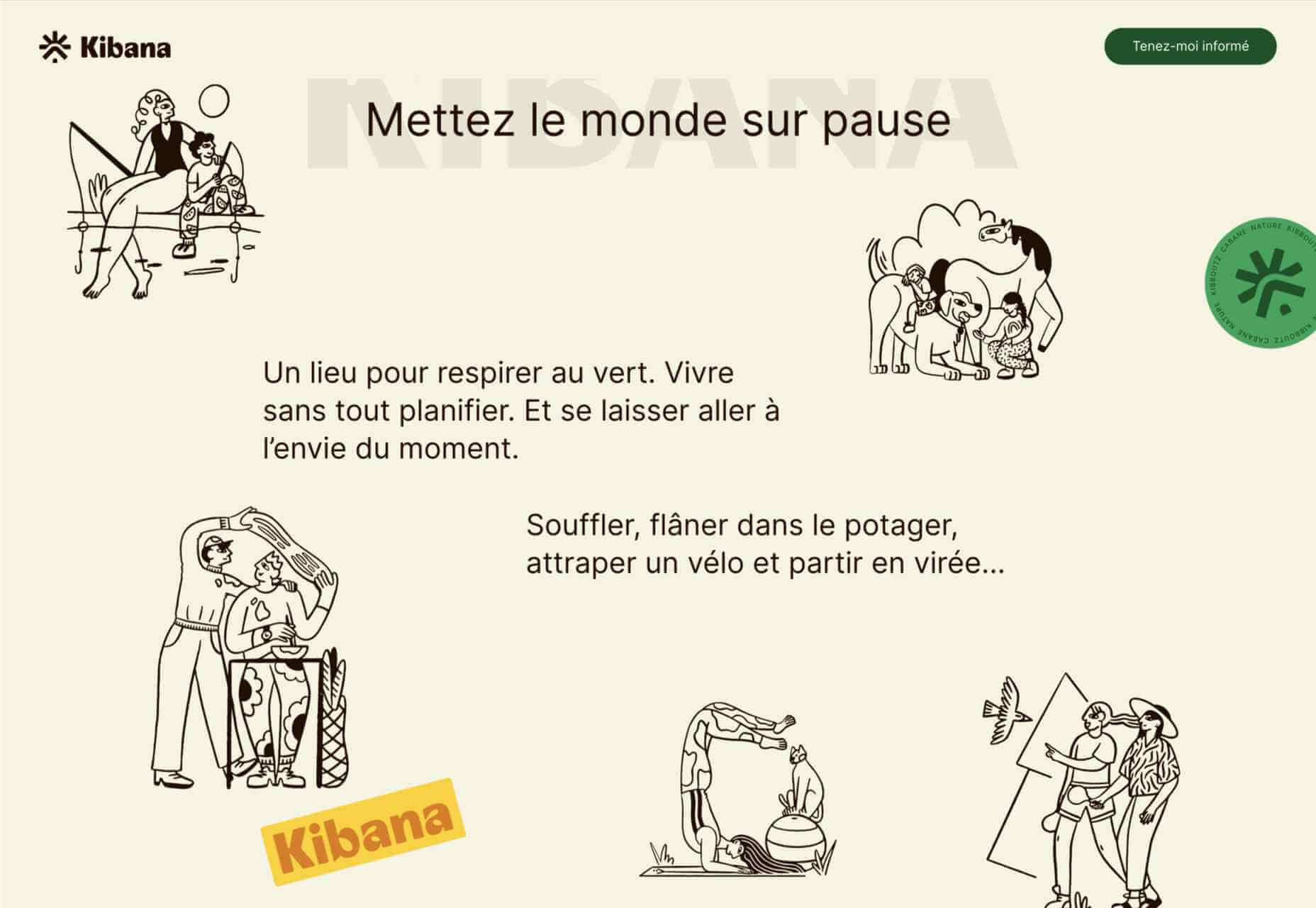
Kibana
Quirky display type and illustrations give this single-page site for Kibana lodge a friendly, welcoming feel.
For Good Design Lab
For Good Design Lab’s site is simple and bold; it makes a strong statement. And its design works even better on mobile.
Levitate
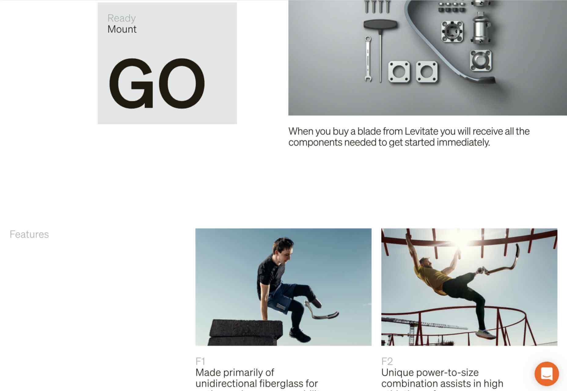
Levitate is a sports brand that makes an affordable running blade. Their site has a clean minimal feel, contrasting spaciousness with a sense of movement in the photography used.
Sunst-studio
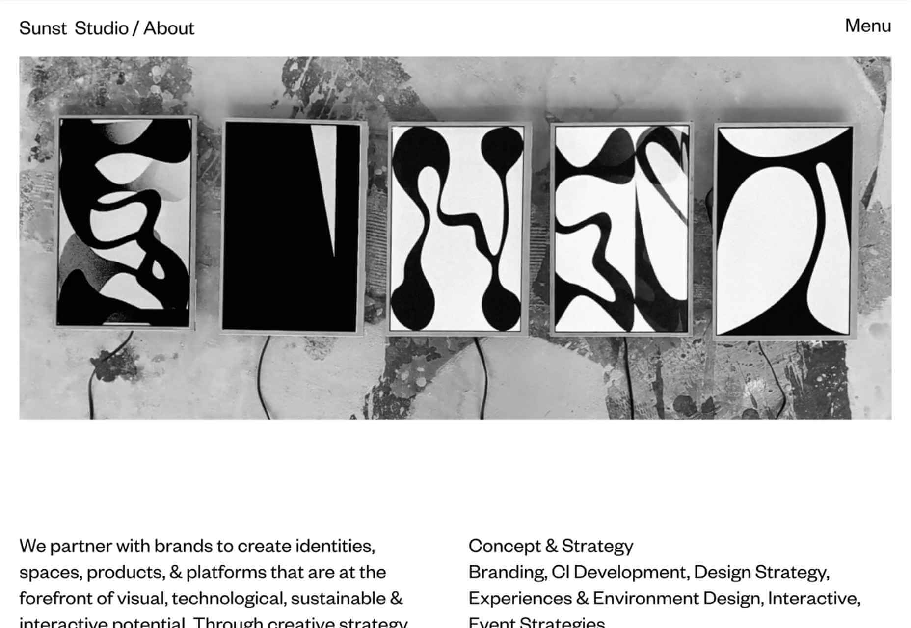
Multidisciplinary creative agency Sunst Studio keeps things simple but impactful with oversized black type on white and smaller images.
Made By Nacho
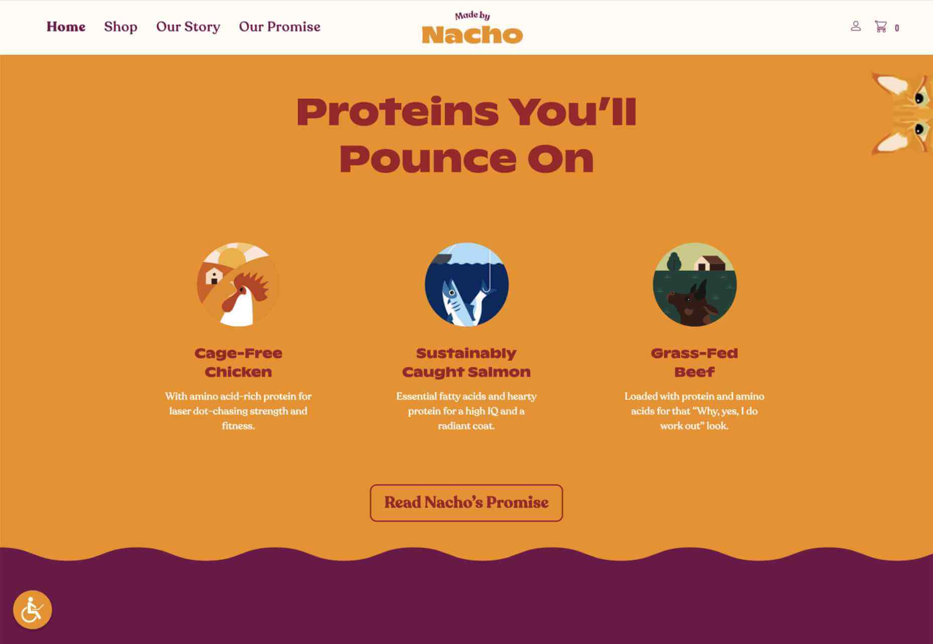
Strong colors and illustrations, with the occasional subtle animation, work well for Made By Nacho.
Flexe
Flexe are logistics experts, not the first industry that springs to mind when we think of great website potential, but this one is very appealing.
Friesday
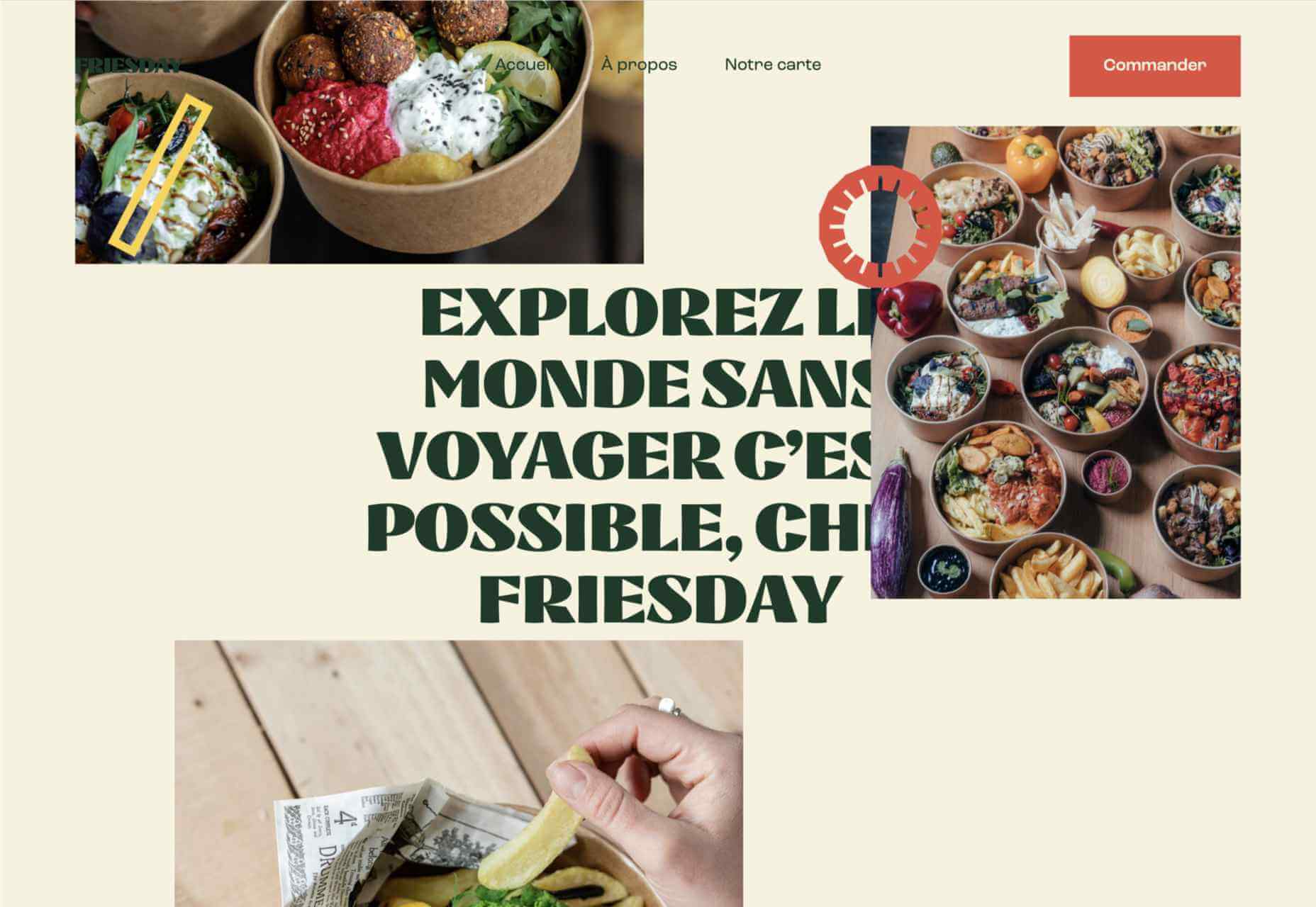
This site for Friesday restaurant/takeaway is lively, colorful, and fun.
Go out{side}
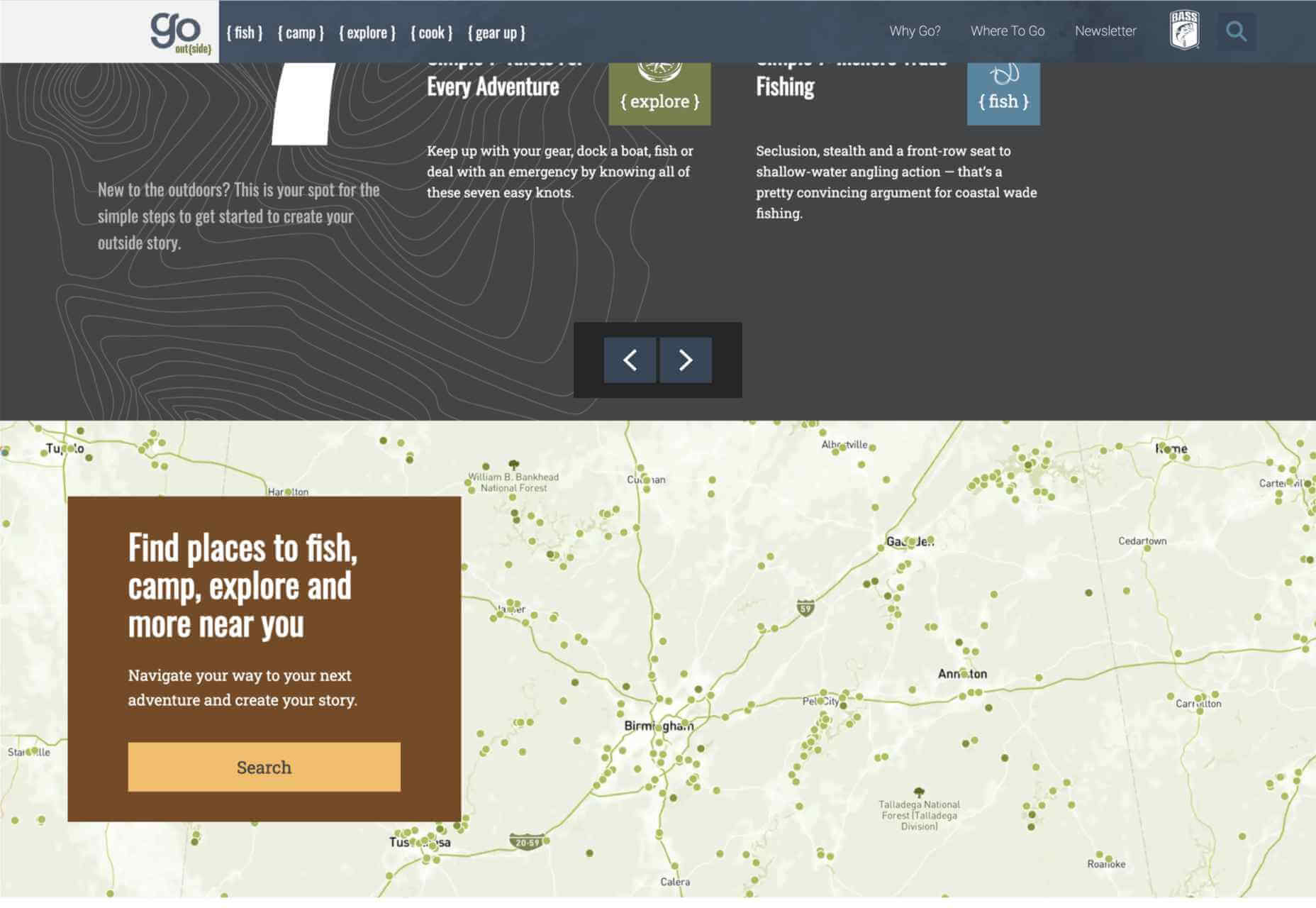
This offshoot site from B.A.S.S. (Bass Anglers Sportsman Society) aims to promote angling as part of an outdoor lifestyle. Earthy colors and a lively visual rhythm create energy.
Protos Car Rentals
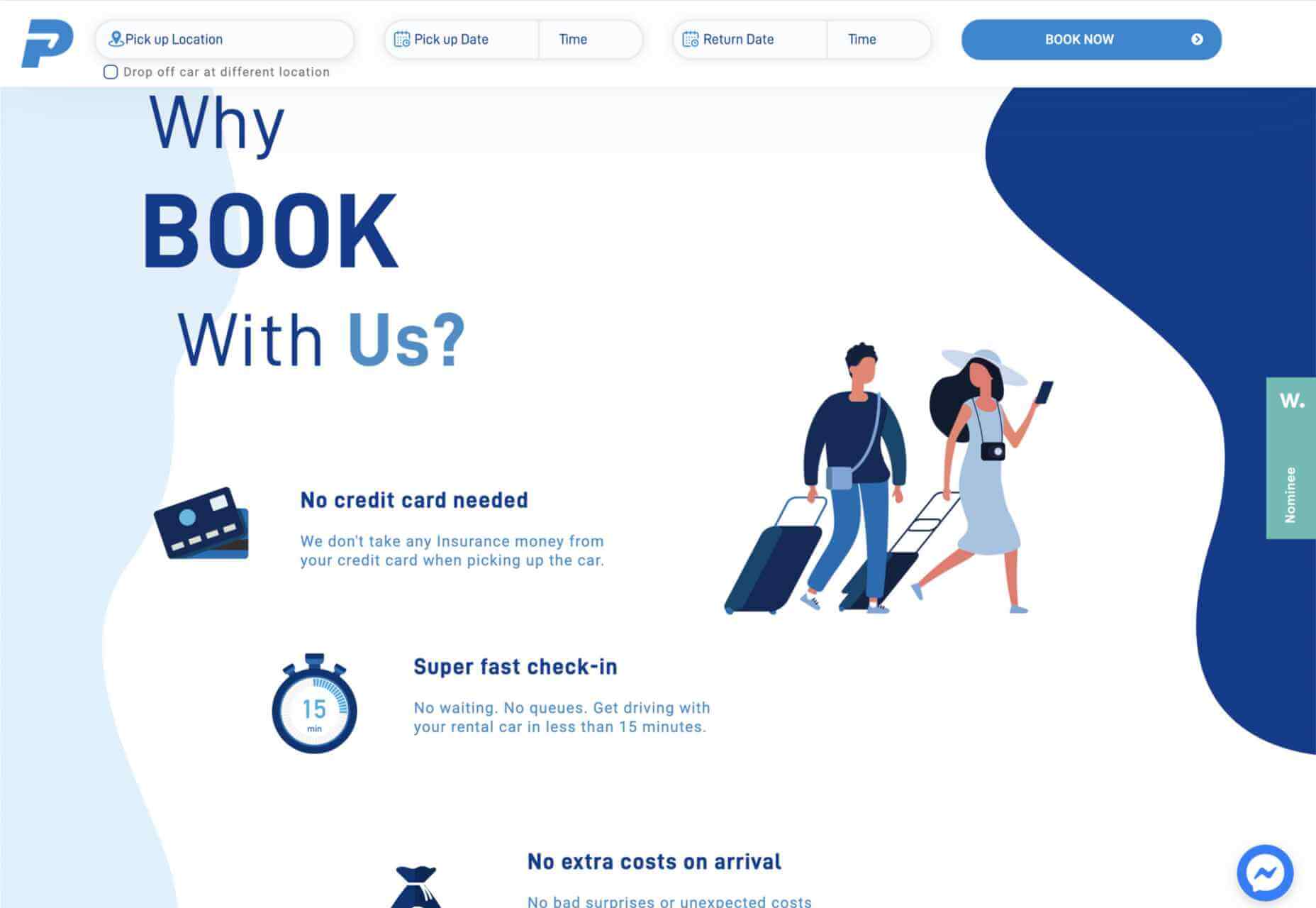
Illustration brings a touch of personality to this site for Protos Car Rentals, while attention to detail pays off in the usability.
21wallpaper
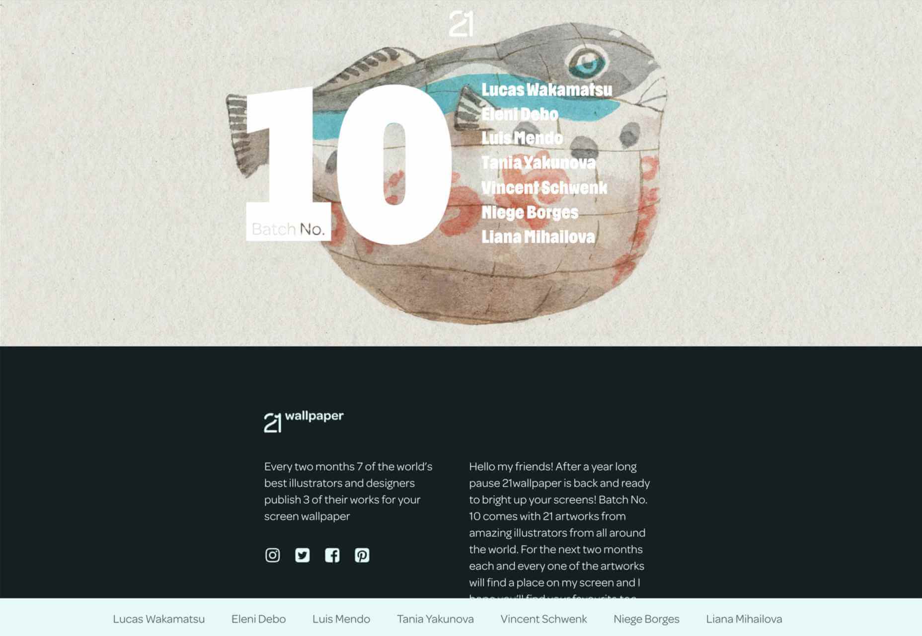
21wallpaper offers downloadable screen savers from different illustrators (7 artists, 3 designs each) regularly, which at the same time acts as a showcase for the artists.
Elon’s Toilet
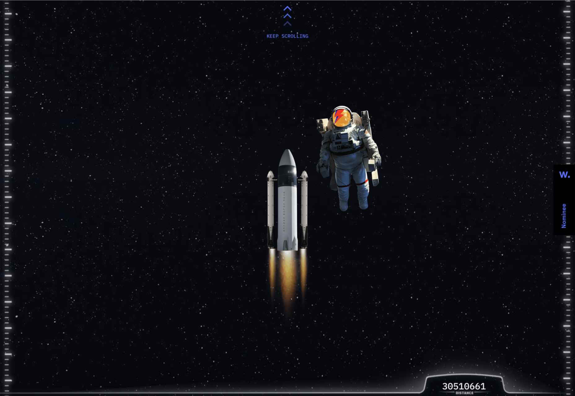
This is a brilliant and vital piece of marketing that succeeds in presenting a serious subject in a lighthearted and engaging way. You’ll have to find out for yourself what it’s about.
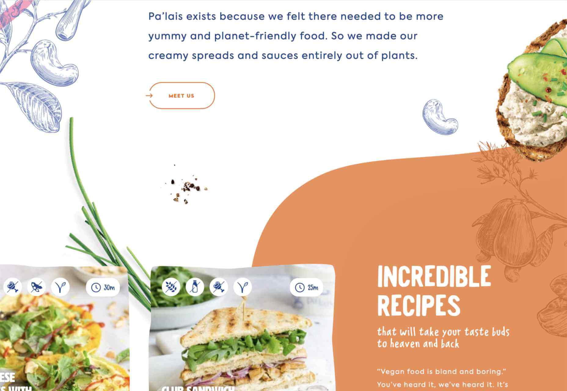
Pa’lais
A fresh feeling color scheme, a distinct lack of straight lines, and a scattering of illustration work well for the site for this vegan food producer.
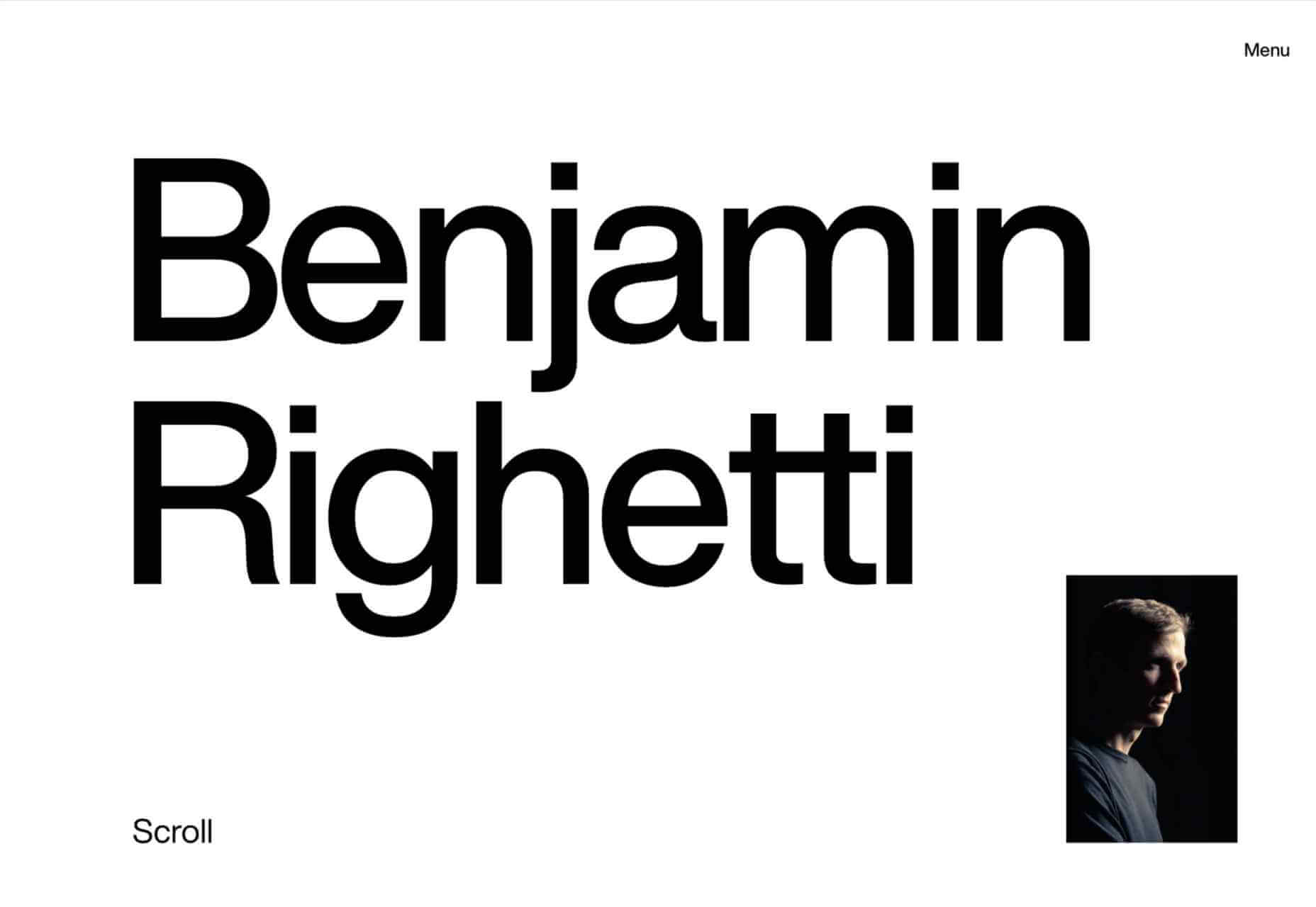
Benjamin Righetti
Using a primarily visual medium to effectively promote an artist whose medium is sound is not always easy. This website for organist Benjamin Righetti does an outstanding job.
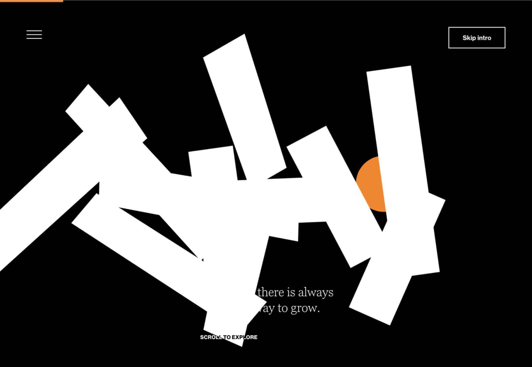
Wavemaker
Wavemaker is a creative media agency. Their site is strong and confident but with a playfulness that is engaging for the user.
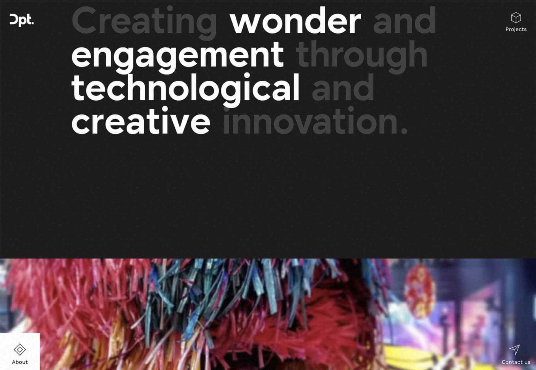
Dpt.
This site for Dpt. throws out the usual menu concept and has its navigation arranged around the screen. It can be a risky strategy, but here it works well.
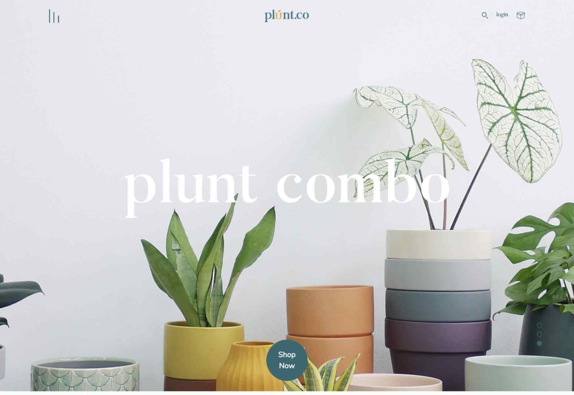
Plunt.co
Plúnt sells mix and match plant and planter combinations. The site’s core functionality is the combination chooser, which is pleasingly reminiscent of an animal flipbook.
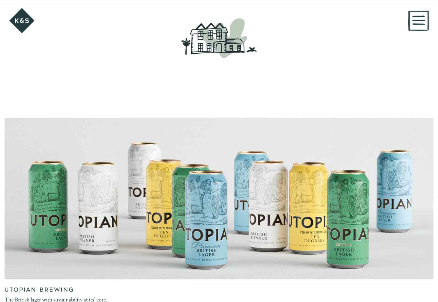
Kingdom & Sparrow
Branding agency Kingdom & Sparrow have gone for a fairly standard approach, but the little hand-drawn details here and there add just enough individuality without overdoing it.
p img {display:inline-block; margin-right:10px;}
.alignleft {float:left;}
p.showcase {clear:both;}
body#browserfriendly p, body#podcast p, div#emailbody p{margin:0;}
The post 20 Best New Websites, July 2021 first appeared on Webdesigner Depot.

