In this theme review we’ll take a look through a multipurpose Shopify theme called Roxxe. Shopify allows you to quickly create your own online store, and when armed with the right theme you can be up and running in no time. So let’s have a look at Roxxe, talk about its pros and cons, and see if it fits the bill!
Roxxe Multipurpose Shopify Theme Review
Check out this video review to see me install, setup, and use Roxxe to create a simple online store. Alternatively, scroll down for a written version of the review.
Where to Get the Roxxe Shopify Theme
Roxxe is available on Themeforest and is (at time of writing) discounted from $39 to $19:
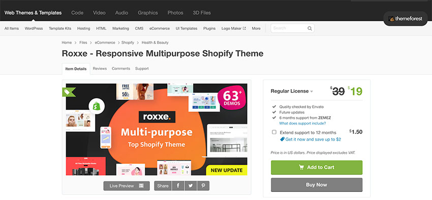
As mentioned, Roxxe is a mulitpurpose Shopify theme and it has a lot of demos to look at; scroll down on the preview page and you’ll see over 60 pre-built home page examples. These range from Fashion and Beauty, Electronics, to Gifts, and Pets; so no matter what niche your online store needs to be you can get a good idea of how Roxxe will suit your requirements. Each demo is effectively the same theme, but with a very distinctive look and feel.
And what’s really nice is that 4 or 5 new examples are released each month, so if you can’t see a demo for your specific niche yet, you probably soon will!
My Furniture Store Example
I’ve used the Roxxe theme to build, using its furniture pre-built demo, a Shopify furniture store. Here’s how it looks without having done much to it myself:
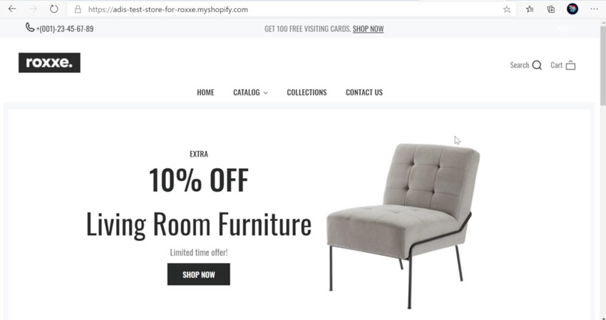
In a very short time I was able to create this home page, add some products, create some collections, and it all went very smoothly.
Style is an objective thing, but I always like clean and minimalistic themes, so I especially like the furniture store variant of Roxxe. It almost goes without saying that it’s a responsive theme too, so all the theme variants will look great on any device.
Mega Menu
Roxxe also has support for a mega menu, which I was quickly able to set up (though I didn’t add many options to it!)
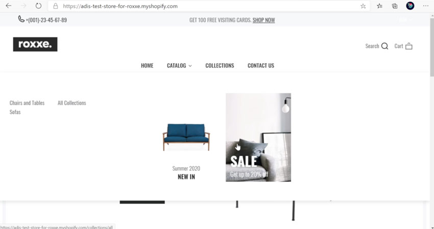
In the mega menu you can add simple links, images, and banners to take customers to different pages and collections.
Collection Page
On the collection pages themselves you can filter products by tags, sort results however you prefer, and view them in list or grid format. One nice feature here is the quick view option, which opens a pop up to show users more product details without having to leave the collection itself.
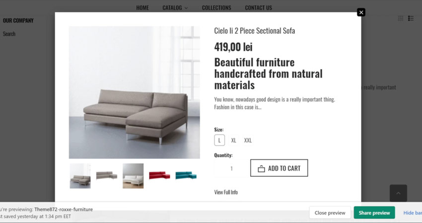
This, for me, is a feature every eCommerce theme should have.
Other Pages
The product page is very well laid out; images to the left, product information (including variants) to the right.
You also have some great templates for other pages such as a contact page, about us, wishlist page and so on. Roxxe also supports LTR (left to right) and RTL (right to left) languages.
If you use any of the most popular Shopify integrations like Trust Hero, Exit Intent Popup, Email Collection Bar, Roxxe works well with all of them. You can find a list of all Roxxe’s official Shopify app integrations on the Themeforest item page.
Working With the Roxxe Theme
With that quick tour done, how was my experience when working with the Roxxe theme? I found the user experience to be pretty good. I managed to create a quick furniture store without any difficulties and I think that’s within everyone’s power to do.
When you first download the theme you’ll be given an archive of files. To install it open default skin and locate the theme ZIP:
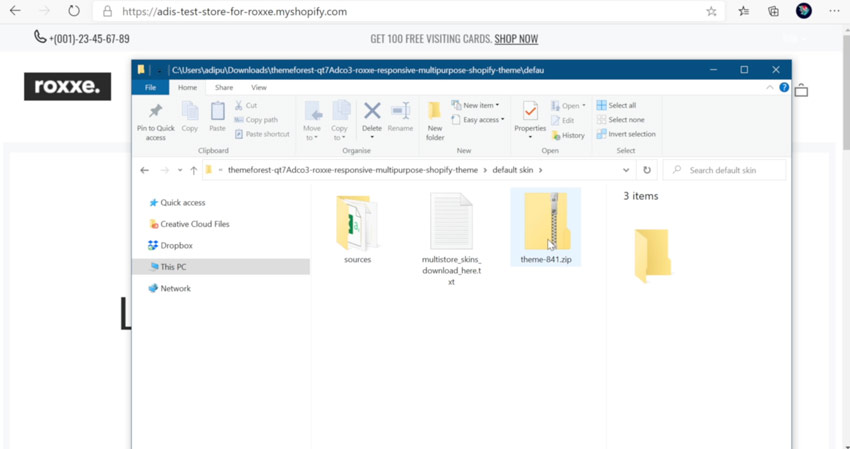
This is the ZIP file you need to upload to Shopify. Doing so will install the default theme. If you want one of the demos we discussed earlier you’ll need open the text document you can see in the screenshot above. In this file you’ll find links to all the themes, which you can download and install instead.
On the Themeforest item page, if you scroll all the way down, you’ll find a section promoting the One Click Demo Importer. As we discussed, it isn’t actually a “one click” demo install–but putting the name aside, following a link, downloading, and uploading is an easy process.
With the theme uploaded I had to add some products, some images, and edit the theme options. This was very easy. Go to the back end of your store and click on Themes > Customize.
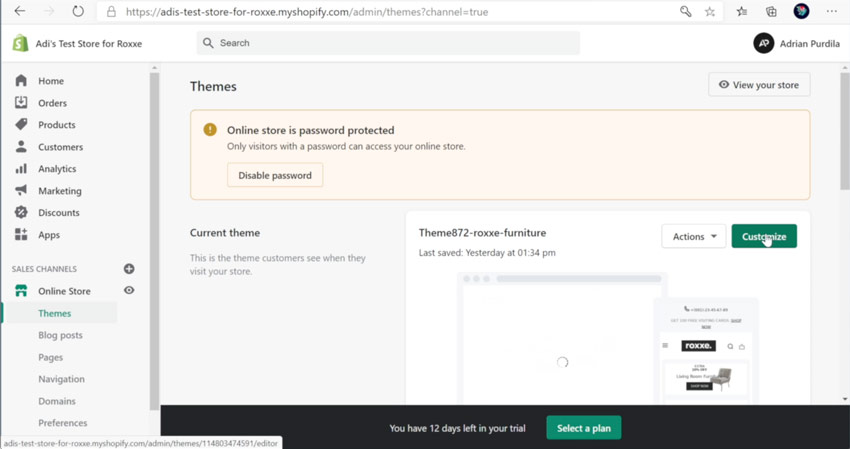
The theme settings are well organized, allowing you to change (for example):
- Typography
- Colors
- Favicon
- Sidebar
- Wishlist
- Pages & Layout
- Security
- Newsletter
If I were to mention one downside at this point, it’s that I don’t have access to all the heading sizes in the typography settings. Instead, what’s editable is quite selective (only the H3 size, for example).
The settings also hold really useful layout tools, such as this banner creator which is extremely easy to use:
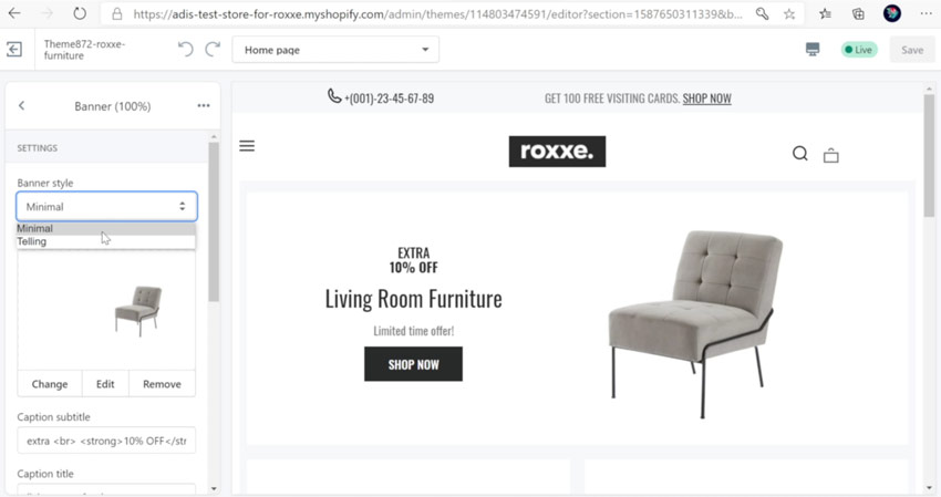
These layout tools also allow you to build the mega menu as we described earlier. For more details of how they work, check out the video embedded at the top of the post.
Overall, I was very happy with the user experience of installing, and setting up the Roxxe theme, and I think it’s equally usable for store owners who aren’t necessarily tech-savvy.
Performance
What about performance? Let’s look at the results from some theme testing I carried out. In these tests I looked at 3 things:
- Loading time
- Responsive test
- Chrome lighthouse audit
Using Chrome browser inspector I looked at the network tab, disabled the cache, and set things to emulate a fast 3G connection. This gave me a load time of 5.53s, which on a 3G connection isn’t too bad; on a regular 4G connection I saw around 3 second load time.
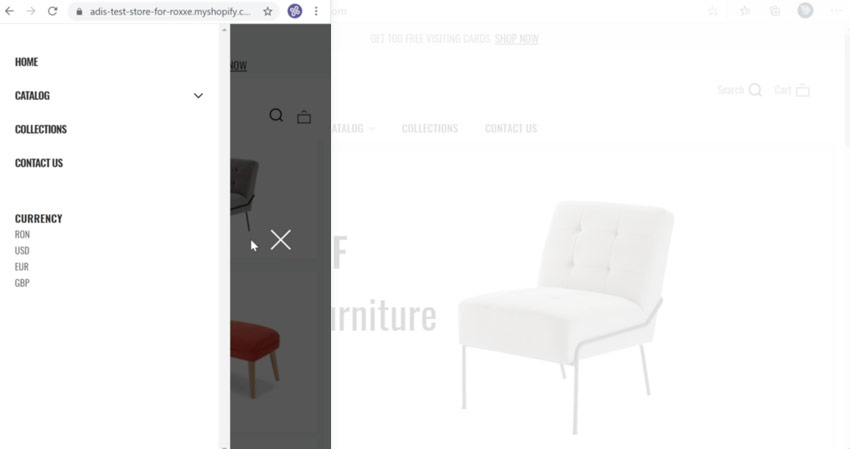
In terms of Roxxe’s responsiveness, its mobile layouts are clean and neat, with suitable icons instead of the text labels you’ll see on larger screens. There are some questionable alignments of icons, but we’re talking a matter of pixels so most users won’t notice anything.
The slide-in menu on mobile, along with its large close tab, is really nice and clear.
The Chrome Lighthouse Audit measures a few metrics of a website, like performance, accessibility, SEO and so on. Here you can see how my demo performed on mobile:
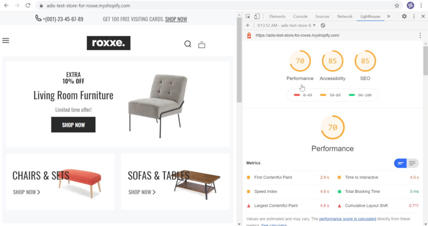
Not too bad, but you’ll notice even better scores for desktop:
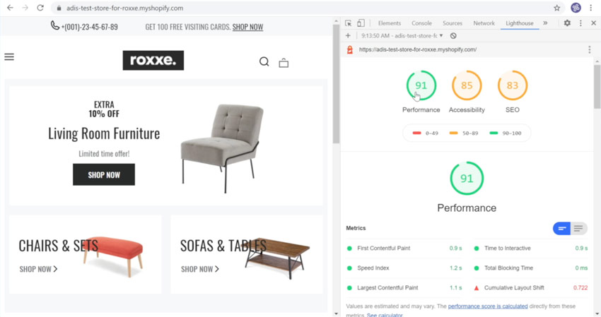
With some more tweaks (such as using smaller images etc.) these scores can be improved further.
That’s a Wrap!
Alright, that’s it for this quick look at the Roxxe Shopify theme. There are still some areas for improvement, but don’t forget that this is a young theme (just 6 months old at the time of writing) and will be updated and improved even more as time goes on.
Overall I think this is a very solid and flexible multipurpose Shopify theme. I wholeheartedly recommend checking it out and I look forward to seeing what updates and developments the authors make to it.
If you’d like to learn more about how to use Shopify, take a look at my free course on the Tuts+ Youtube channel.
