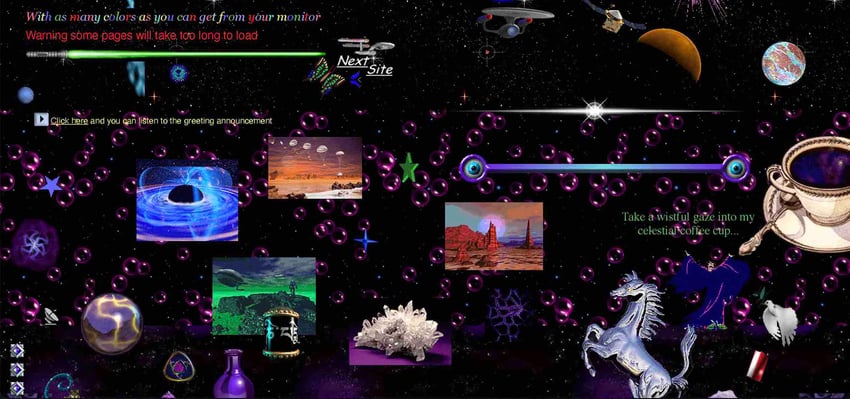
Back in the early stages of web development, websites ran rampant with all sorts of wacky features: galaxy-themed backgrounds, colorful fonts to the point of illegibility, and marquees galore.


Now we’ve more or less calmed down when it comes to web design but that doesn’t mean we can’t have fun features on our websites anymore. In this tutorial, we’ll look at how to make a custom cursor and add a personal touch to any website, firstly using a CSS-only approach, then a more interactive JavaScript method.
1. Adding a custom cursor with CSS
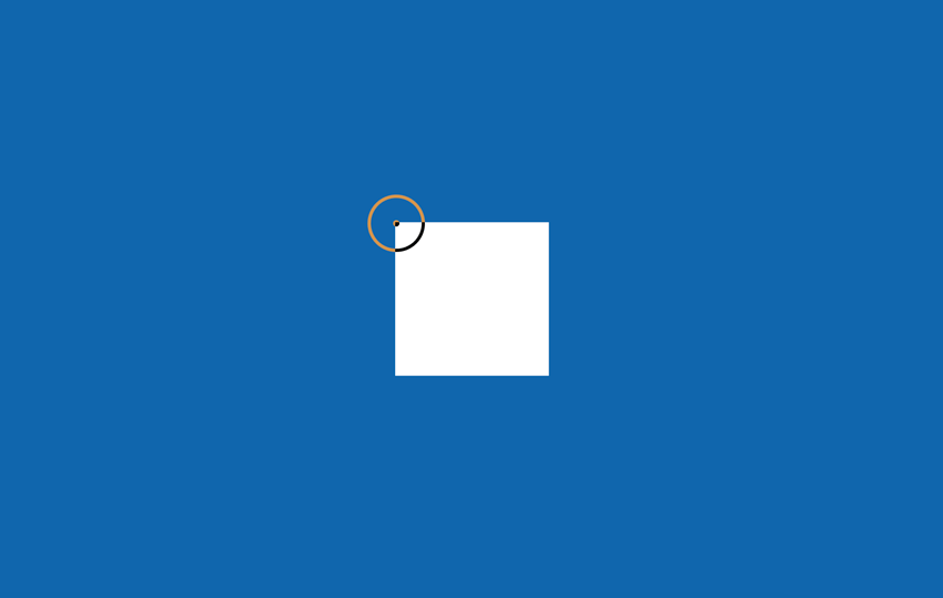
In this demo, we’ve implemented two different cursors on a page using only CSS. Hover over the pen to see what happens:
The CSS property cursor allows us to change our cursor to built-in keywords and it also allows us set an image as the cursor.
Our CSS code looks something like this:
1 |
main { |
2 |
cursor: url("data:image/svg+xml,%3Csvg xmlns="https://www.w3.org/2000/svg" height="16" width="16" style="fill-rule:evenodd;text-rendering:geometricPrecision;image-rendering:optimizeQuality;clip-rule:evenodd;shape-rendering:geometricPrecision" xml:space="preserve" viewBox='0 0 7.5 7.5'%3E%3Cpath d='M0 3.8a3.7 3.7 0 1 1 7.5 0 3.7 3.7 0 0 1-7.5 0zm.5 0a3.3 3.3 0 1 0 6.6 0 3.3 3.3 0 0 0-6.6 0zm2.9 0c0 .2.2.3.4.3a.4.4 0 1 0-.4-.3z' style="fill:currentColor;stroke:currentColor;stroke-width:.0419595"/%3E%3C/svg%3E") 8 8, pointer; |
3 |
}
|
4 |
|
5 |
.hover-container { |
6 |
cursor: url(https://cur.cursors-4u.net/nature/nat-11/nat1021.cur), default; |
7 |
}
|
We use the following values to style our cursor:
-
url(): The url function is used to set the image file for a cursor as long as it’s in an appropriate format and a maximum of 128px by 128px. In our main element, we set the cursor as an.svgwhile we use a.curfile in our hover container element. -
Coordinates: The x and y coordinate values are placed after the url function to specify which point the cursor should start from. By default, cursor images are placed in the top left corner of where the mouse cursor would be. In our main element, we set the x and y coordinates to
8 8to ensure our circle cursor is at the mid-point of where our mouse is pointing. - Fallback: The fallback value is the last keyword at the end of our cursor property. The fallback is set to one of the built-in cursor keyword values and is used if the image in the url can’t be loaded.
And that’s all there is to setting a custom cursor with CSS!
2. Adding a custom cursor with JavaScript
If we want our cursor to have more interactivity with our webpage, we can set it using JavaScript. Hover over the pen to see how the cursor changes:
To do this, first we’ll need an HTML element to act as our interactive cursor.
1 |
<div id="custom-cursor"> |
2 |
</div>
|
Next, we style our custom cursor CSS. We can pass in any image or styling property to the cursor element to make it look exactly like we want. In this tutorial, we’ll style a simple circle and us the ::after pseudo element to form a dot in the middle. Here’s the CSS styling:
1 |
#custom-cursor { |
2 |
width: 2px; |
3 |
height: 2px; |
4 |
border-radius: 50%; |
5 |
background-color: white; |
6 |
position: fixed; |
7 |
pointer-events: none; |
8 |
top: 0; |
9 |
}
|
10 |
|
11 |
#custom-cursor::after { |
12 |
content: ""; |
13 |
border-radius: 50%; |
14 |
position: absolute; |
15 |
top: -8px; |
16 |
left: -8px; |
17 |
border: 1px solid white; |
18 |
width: 16px; |
19 |
height: 16px; |
20 |
}
|
It’s important for our custom cursor to have the position: fixed and pointer-events: none properties. This is to ensure that the cursor is always positioned on the page by mouse movements and that we’re not able to interact with the cursor element.
A splash of color
We can add some color fun to our cursor by using the mix-blend-mode property. This will give the cursor an inverted color effect based on the background it’s hovering over.
1 |
#custom-cursor {
|
2 |
width: 2px; |
3 |
height: 2px; |
4 |
border-radius: 50%; |
5 |
background-color: white; |
6 |
position: fixed; |
7 |
top: 0; |
8 |
mix-blend-mode: difference; |
9 |
} |
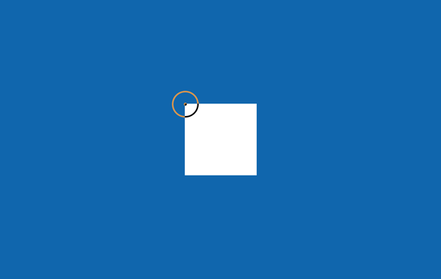
This is what we have so far:


Hide the original cursor
Next we want to hide our regular cursor and only show the custom cursor element when the page is being hovered:
1 |
body { |
2 |
cursor: none; |
3 |
}
|
4 |
|
5 |
body:hover #custom-cursor { |
6 |
opacity: 1; |
7 |
}
|
8 |
|
9 |
#custom-cursor { |
10 |
width: 2px; |
11 |
height: 2px; |
12 |
border-radius: 50%; |
13 |
background-color: white; |
14 |
position: fixed; |
15 |
top: 0; |
16 |
mix-blend-mode: difference; |
17 |
opacity: 0; |
18 |
}
|
Adding the JavaScript magic
Now we’ve gotten the styling out of the way, let’s set the cursor functionality with JavaScript.
Our functionality will handle positioning the custom cursor based on the mouse movement and also the cursor interaction with elements on the page.
The code for updating the cursor position is:
1 |
const customCursor = document.getElementById('custom-cursor'); |
2 |
|
3 |
const updateCursorPosition = (event) => { |
4 |
customCursor.style.top = `${event.clientY}px`; |
5 |
customCursor.style.left = `${event.clientX}px`; |
6 |
}
|
7 |
|
8 |
window.addEventListener('mousemove', (event) => { |
9 |
updateCursorPosition(event) |
10 |
})
|
We use the clientX and clientY values to set the cursor coordinates whenever the mouse is moved.
We can also update the cursor styling whenever it interacts with an element. We’ll add a zoom class to the cursor element when it hovers over the hover-container element.
Let’s update our CSS to include styling for the zoom class:
1 |
#custom-cursor { |
2 |
width: 2px; |
3 |
height: 2px; |
4 |
border-radius: 50%; |
5 |
background-color: white; |
6 |
position: fixed; |
7 |
top: 0; |
8 |
opacity: 0; |
9 |
pointer-events: none; |
10 |
mix-blend-mode: difference; |
11 |
transition: transform 500ms; |
12 |
}
|
13 |
|
14 |
#custom-cursor.zoom { |
15 |
transform: scale(3); |
16 |
}
|
We can use the .matches() function to target when the hover-container is being hovered (and this way we won’t have to attach another event listener to the element).
Here’s what the final JavaScript code looks like:
1 |
const customCursor = document.getElementById('custom-cursor'); |
2 |
const hoverContainer = document.querySelector('.hover-container'); |
3 |
|
4 |
const updateCursorPosition = (event) => { |
5 |
customCursor.style.top = `${event.clientY}px`; |
6 |
customCursor.style.left = `${event.clientX}px`; |
7 |
}
|
8 |
|
9 |
window.addEventListener('mousemove', (event) => { |
10 |
updateCursorPosition(event) |
11 |
|
12 |
if (hoverContainer.matches(':hover')) { |
13 |
customCursor.classList.add('zoom') |
14 |
} else { |
15 |
customCursor.classList.remove('zoom') |
16 |
}
|
17 |
})
|
Wrapping up
And with that, in addition to our simple CSS cursor, we’ve built a lightweight version of an interactive custom cursor, using only vanilla JavaScript.
Useful custom mouse cursor links
Want to take your web design to the next level? A custom cursor can add a unique touch and enhance user experience.
Discover valuable resources to master this design element and elevate your website’s personality.