The full screen splash is one of the most familiar patterns on the web at the moment. Some love it, some loath it, but whatever your feelings let’s take a look at some noteworthy examples and talk about best practices while we’re at it.
A Note on Design Convergence
The term “design convergence” refers to the way designs have a habit of becoming similar, converging, over time. Recently @jongold tweeted the following:
which one of the two possible websites are you currently designing? pic.twitter.com/ZD0uRGTqqm
— gold (@jongold) February 2, 2016
His point was that designers are lacking creativity these days, instead reaching for the nearest acceptable convention when designing web pages. The full screen splash is a perfect example of this. Are we, as designers, taking the easy route by using this pattern? Are we ignoring the opportunity to push boundaries and innovate? Is the web standing still because of laziness?
Or, as Paul Boag states, are we merely part of what’s a maturing web design scene? Are we building what users want; what they expect, and thereby making our products easier to use?
“The longer an object is around the more its design standardises” – Paul Boag
I’ll leave it up to you to decide. In the meantime, let’s take a look at some full-on full screen web designs!
Top to Bottom, Left to Right
Many full screen websites are precise about their dimensions, using JavaScript or CSS to make sure the initial visible section is exactly the same size as the current browser window. Once this is done, some CSS positioning can place elements at the extremes, even if the window is resized.
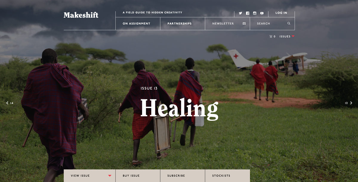
Makeshift use this pattern to stick a secondary navigation to the bottom of the screen, with some previous/next issue links left and right. The background image uses background-size: cover; on a massive figure element.
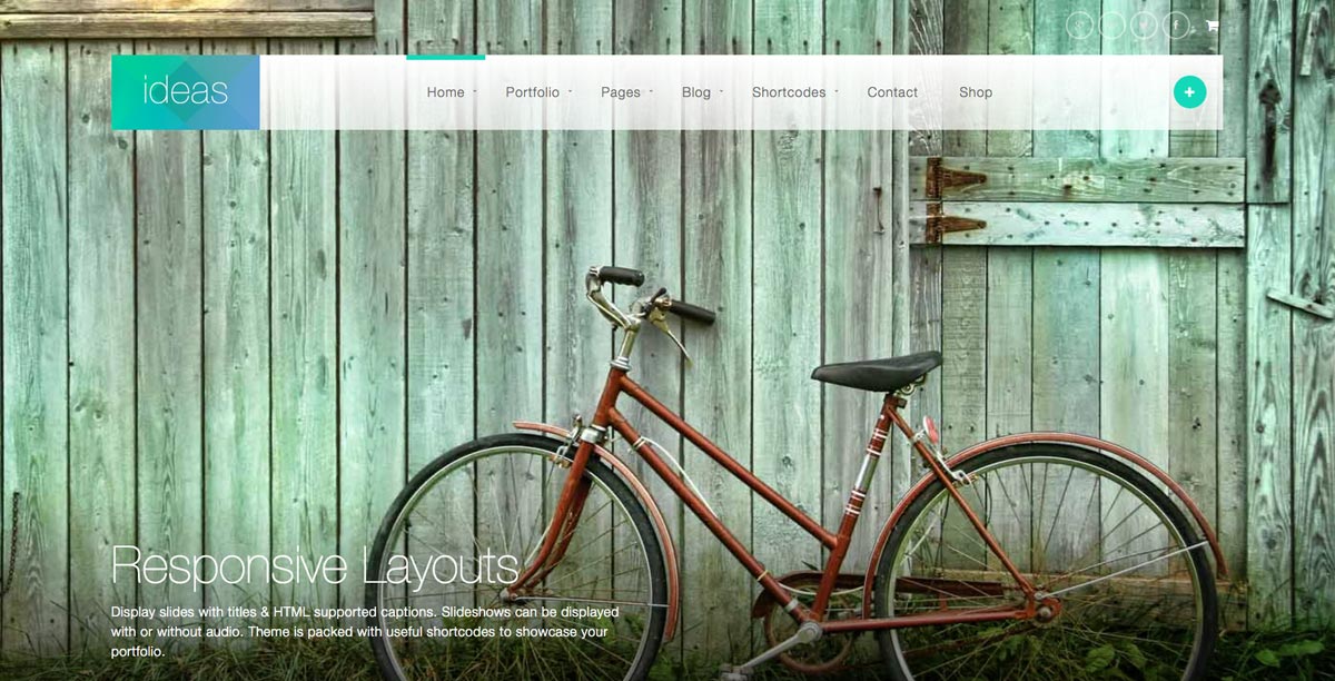
Ideas is a full screen WordPress theme with various options for slideshows, intros, homepage presentations etc. It uses a gradient positioned at the bottom of the screen to make the image title and description more readable.
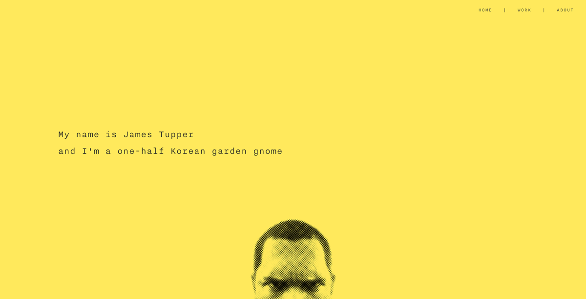
James Tupper peeks up from the bottom of the screen by having his face graphic positioned with background-position: center bottom;. The huge yellow splash is elegantly made equal to the viewport height using native CSS height: 100vh;.
Learn more about these two CSS techniques:

CSS
7 CSS Units You Might Not Know About
Jonathan Cutrell

CSS
Revisiting the CSS Background Property
Thoriq Firdaus
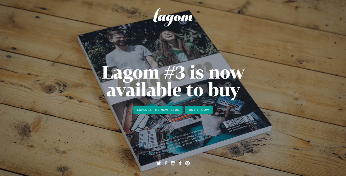
Lifestyle magazine Lagom, brainchild of Elliot Jay and Samantha Stocks, uses a homepage which fills the screen in its entirety. No scrolling here (unless viewed on a small screen). Lagom uses the bottom edge to house its social links.
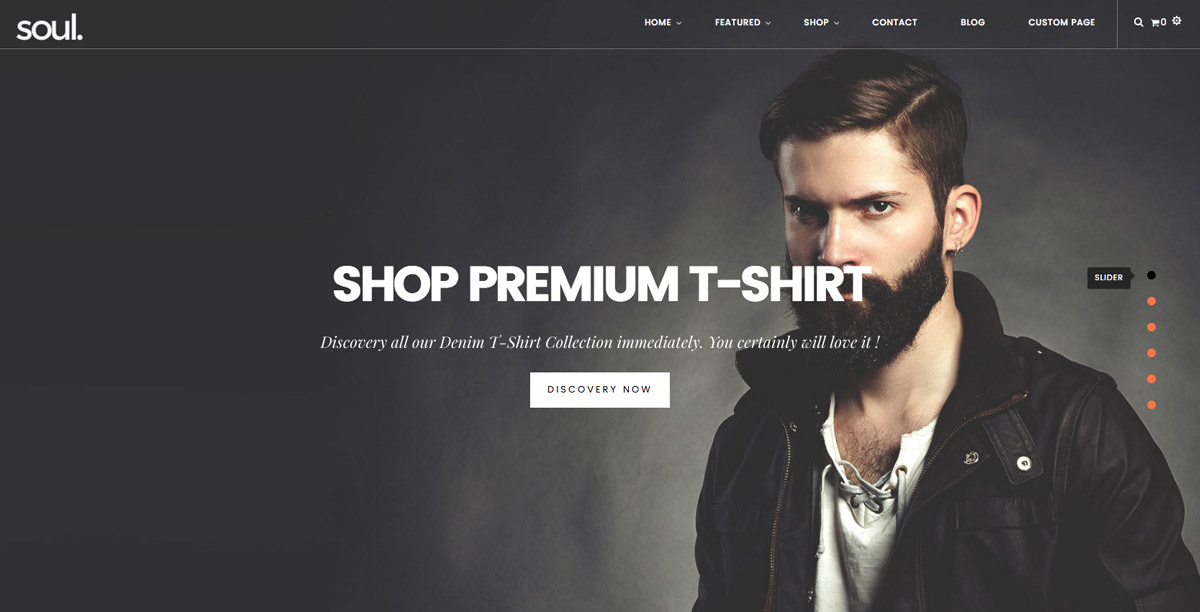
Soul is a Shopify template, and one of its layouts is a fullscreen slider with navigation links positioned on the right.
Keep Scrolling Please ↓
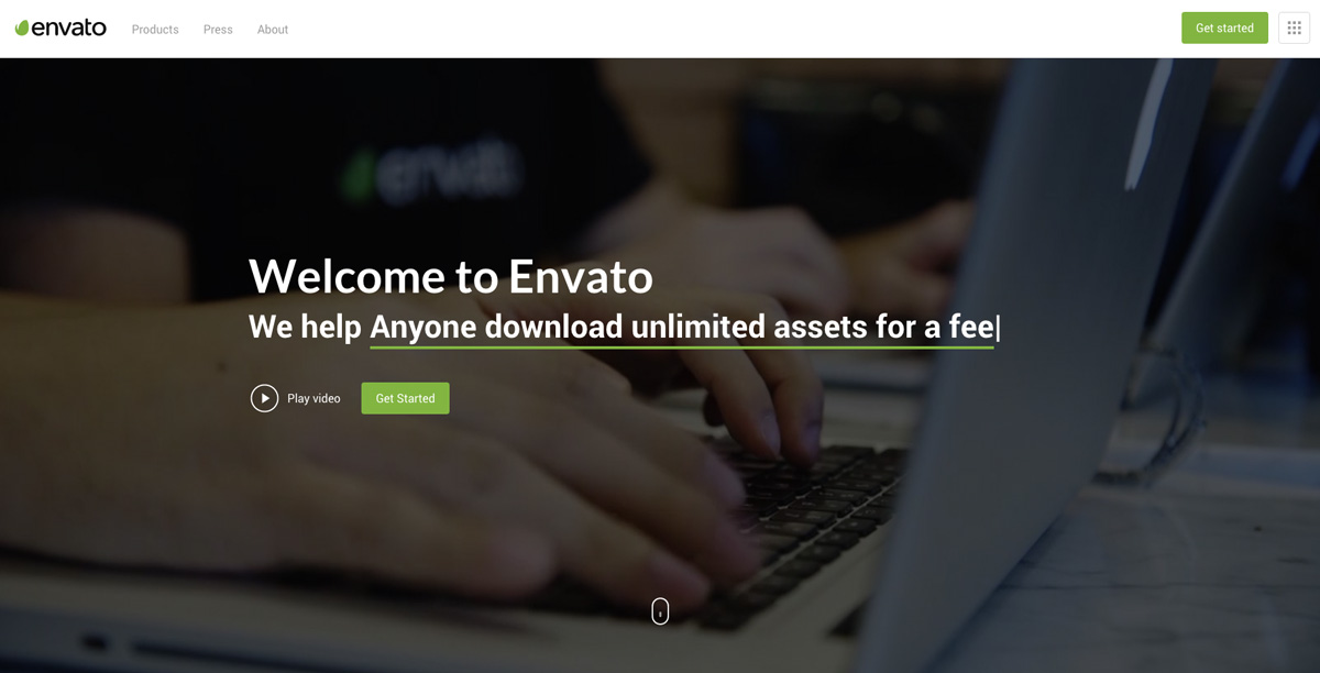
The danger with using the full screen as a form of introduction is that users may not realise there’s more to be found by scrolling. Our very own Envato home page negates this with a “scroll” icon, suggesting you should take a peek below the fold.
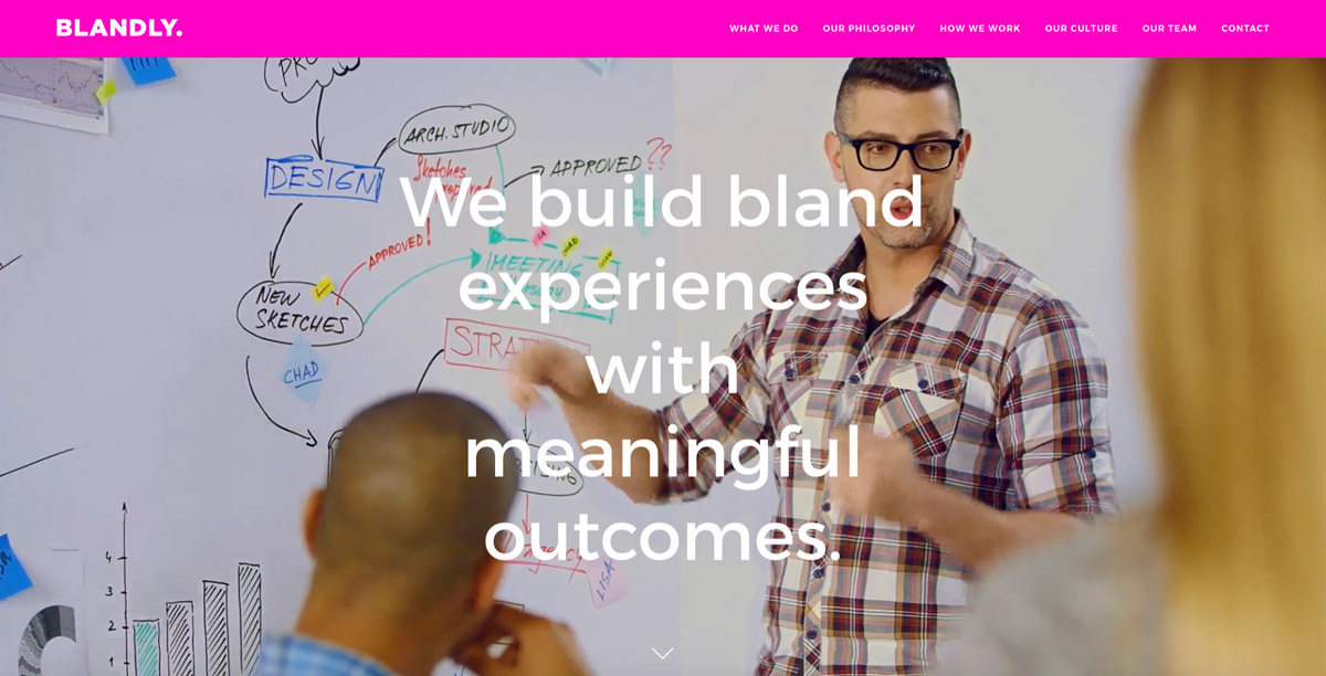
Blandly opt for the encouraging downward pointing arrowhead to say “look down here”.
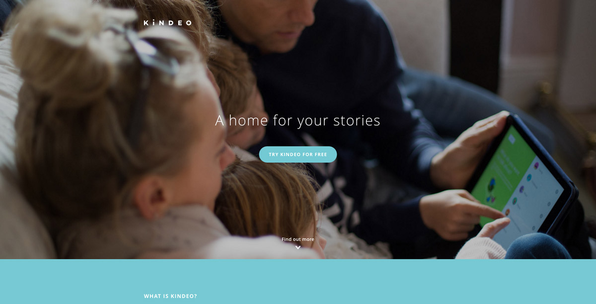
The Kindeo home page uses a technique I like; ensuring that a small slice of the next section is always visible at the bottom of the viewport. There’s also an arrow with “Find out more” so the user is never in doubt that there’s something to be found below the fold.
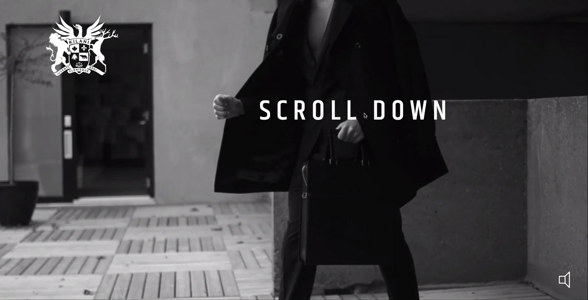
Kilani have taken the rather dubious approach of autoplaying sound; there’s a mute button at the bottom right of the screen. Their way of suggesting you scroll further is also interesting–pinning a “Scroll Down” instruction to the mouse cursor:
Video
Damir Kotorić, former UX designer at Envato, began Falcon Films as a result of his passion for aerial photography. It’s only reasonable that video play a big part in the Falcon Films home page; check out the background <video>, then watch the showreel for juicy Melbourne drone footage.
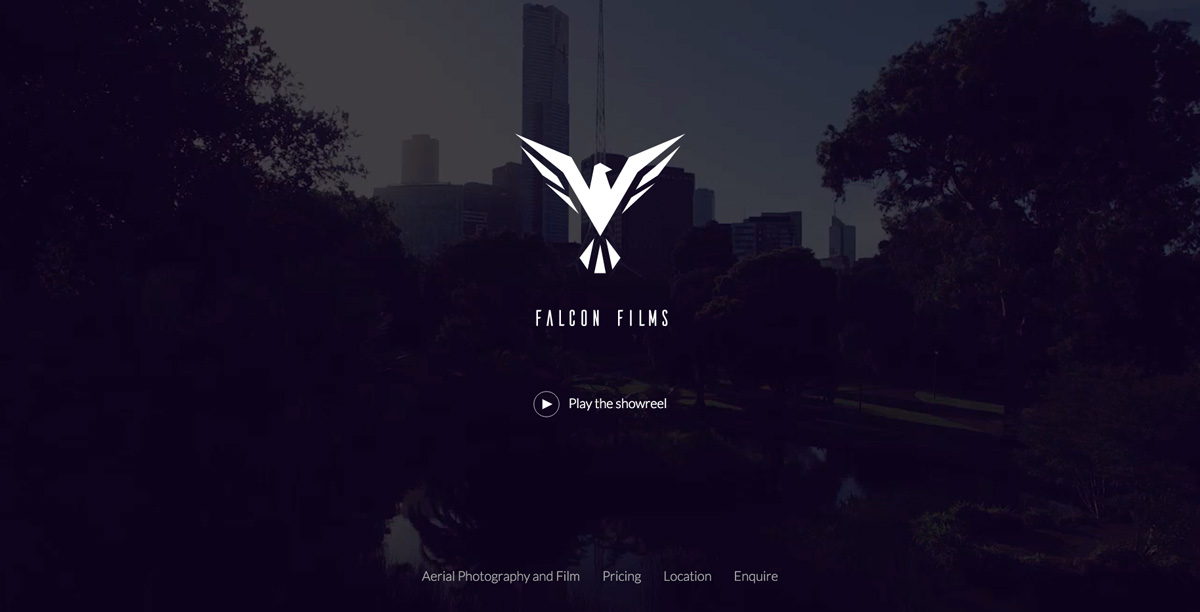
Again, Damir has used native CSS min-height: 100vh; to create a full screen hero section.
Landscape achieves much the same effect; a full screen, autoplaying video with additional showreel, but uses JavaScript to get the full screen. The autoplaying mp4 video file itself is 1.3Mb, but there’s nothing else to clog up your bandwidth.

Style
One thing we haven’t mentioned yet is what full screen affords us: a canvas! Using the space to present a product, a company, an idea, is the whole point of this pattern. It removes the clutter of the rest of the content and focuses on message and personality.
The Landscape example from earlier uses a beautiful cobalt blue (one of the reasons I love it) and Voog does something similar, which looks great.
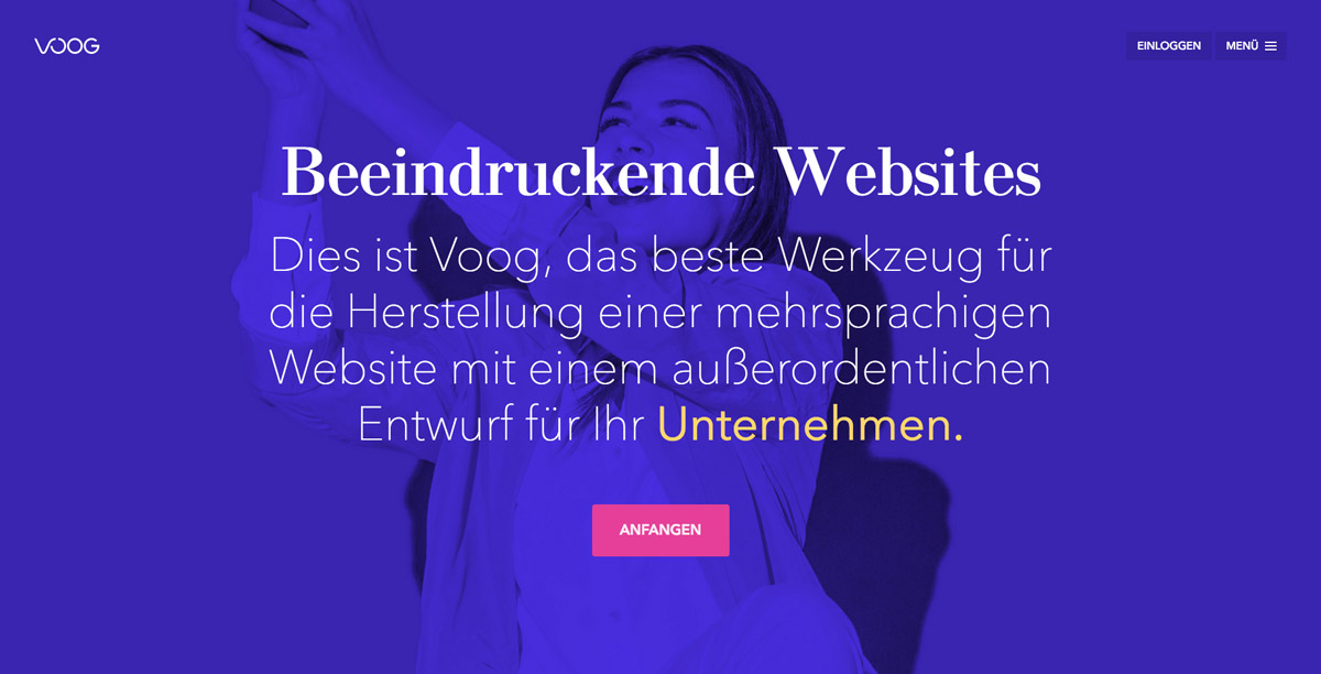
I always say it though–this image is duotone, so can have its current 540Kb easily chopped down to size. Some slight blurring, then reducing JPG quality to 50% brings it down to around 50Kb without compromising the effect at all.
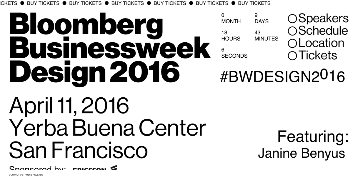
The Bloomberg Businessweek Design Conference (are you going?) uses an abstract typographic layout to make its point. Design convergence? Not here, mate.
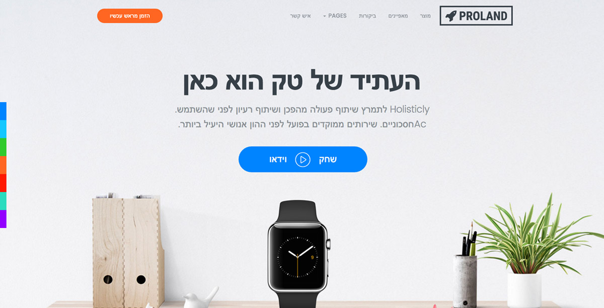
Have I ever mentioned the Envato Tuts+ Translation Project? Possibly.. Anyway, I love this theme’s demonstration of RTL script–check out Proland, a Bootstrap built landing page template with several full screen layout options.
Had Your Fill?
The full screen home page is a pattern we’re not likely to see disappear any time soon. And why should it? It’s an effective way of introducing users to websites of all kinds. What are some of your favourites? Where else have you seen this pattern used, for better or worse? Let us know in the comments!
