
This article is part of our “HTML5/CSS3 Tutorials series” – dedicated to help make you a better designer and/or developer. Click here to see more articles from the same series.
Today, we are going to doing an experiment with CSS3 Animation. In our previous post, we discussed how to re-create “marquee” effect using CSS3 Animation. This time, we will try to create a “notification bar” with bounce effect.


So, let’s get started.
Getting Started
Let’s create a new HTML document and add the following markup to structure the notification bar.
"><div class="css3-notification">
    <p>Hi, this is a notification and it bounces.</p>
</div>
Then, add some decorative styles to dress up the notification bar.
.css3-notification {
font-size:.8em;
text-align:center;
background-color:#111;
color:#fff;
box-shadow:0 1px 3px 0 rgba(0,0,0,.3);
text-transform:uppercase;
position:relative;
font-weight:700;
padding:10px;
}
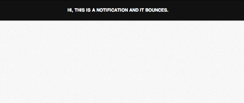
At this stage, this will give us the following result in browsers.
Writing CSS3 Animation Keyframes
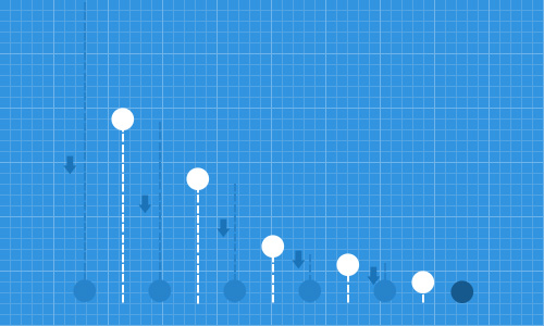
The basic idea on how the bounce will run is that when the object drops on the surface the first time, it bounces of the surface and will reach its highest level. Then it gradually reaches a lower point with every subsequent bounce, until the object stops bouncing. This is illustrated in the following figure.
Step 1: Creating Animation Keyframe
Now, let’s start writing on the CSS3 Animation Keyframe in the stylesheet. In this example, we simply name this keyframe bounce.
@keyframes bounce { }
Keep in mind that in this tutorial we will use the standard @keyframe syntax from W3C to make the codes look simpler. But, in order for the animation to work across the browsers, the vendor syntax (-webkit-, -moz-, -o-) should be included and you will find them, later on, in the source codes.
Step 2: Specifying Initial Position
First, we set the object to the top of its initial position. In CSS3 Transforms, we add negative value for the Y-axis. In the following code snippet, we set the position for 0% to 5% of the time frame. So, the notification bar will stay a little while in that position.
0%,5% {
transform:translateY(-100%);
opacity:0;
}
Step 3: Specifying the First Bounce
Then, from 5% to 15% of the time frame, the object start moving to its original position. We set the translateY property back to 0%. Typically, an object that bounces has elasticity.
When this object strikes a solid object, the side of that object that hits the surface, should be a little compressed or deformed. Thus, in our case, we will decrease the padding-bottom — from 10px to 5px.
15% {
transform:translateY(0);
padding-bottom:5px;
}
The object will bounce back upwards after hitting the surface. At this point, the object bounces at its highest point and we set it for 50% at 30% of the time frame.
30% {
transform:translateY(-50%);
}
Step 4: Specifying the Second Bounce
After reaching the peak, the object should be back to 0 position, or in other words, hitting the ground. The object will be less deformed than the previous hit. So, at this point, we decrease the padding-bottom of the object to only 6px.
40% {
transform:translateY(0%);
padding-bottom:6px;
}
Then it bounces.
This time, it will only reach the point lower than the first one; it moves upwards 30% from the current position.
50% {
transform:translateY(-30%);
}
Step 5: Countinuously Bouncing Until It Stops
These events repeat until the end of the time frame and the following are the rest of the Animation — from 70% to 100% of the time frame.
70% {
transform:translateY(0%);
padding-bottom:7px;
}

80% {
transform:translateY(-15%);
}

90% {
transform:translateY(0%);
padding-bottom:8px;
}

95% {
transform:translateY(-7%);
}

97% {
transform:translateY(0%);
padding-bottom:9px;
}

99% {
transform:translateY(-3%);
}

100% {
transform:translateY(0);
padding-bottom:9px;
opacity:1;
}
That’s all the codes we need right now, now you can view the bounce effect in action from the link below.
Further Resources
Below are good resources for digging into CSS3 Animation, Transformations and Bounce Effect further.
- Creating Advanced “Marquee” With CSS3 Animation — Hongkiat.com
- CSS3 2D Transforms — Hongkiat.com
- What are all the equations we use to calculate how bounces work? — StackExchange
- Bounce Effect with jQuery — jQuery.com
- 3D Bouncing Ball with CSS3 — Codrops