During this quick tutorial we’re going to implement a sticky menu with CSS, toggling its visibility with jQuery. It’s the perfect way to give visitors social links, additional places within a network of sites, or even personalize settings.


Step 1: Setting up the Page
Let’s start out by making a basic HTML page. We’ll load CSS into the <head>, then jQuery (at the bottom of the document) for the toggle animation.
<html>

    <head>
        <!DOCTYPE html>
        <title>Sticky Menu</title>
        <link rel="stylesheet" type="text/css" href="styles/main.css">
    </head>

    <body>
        <!--js-->
        <script src="http://code.jquery.com/jquery-1.9.1.min.js"></script>
    </body>

</html>
Step 2: Filling up the Page
Now let’s create some structural elements.
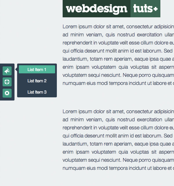
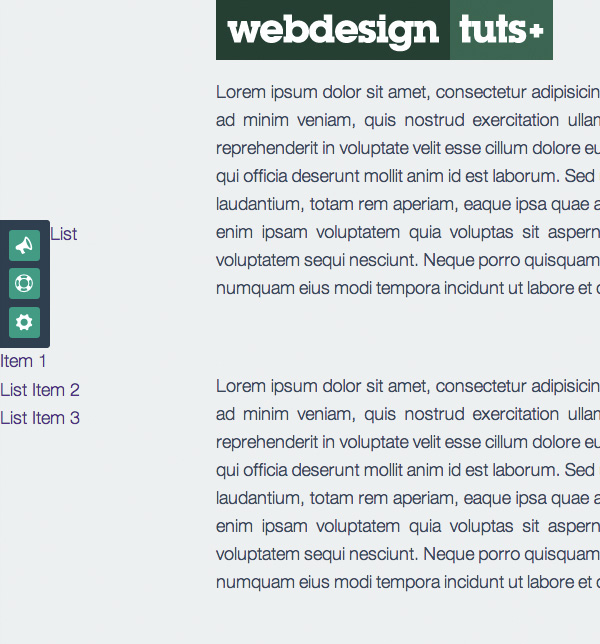
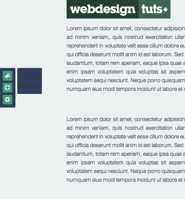
<div class="toolbar-wrapp">
<div class="sticky-toolbar">
<ul>
<li class="glyph" id="support">
<a href="#" data-icon="📣"></a>
</li>
<li class="glyph" id="help">
<a href="#" data-icon=""></a>
</li>
<li class="glyph" id="settings">
<a href="#" data-icon="⚙"></a>
</li>
</ul>
</div>
<!--/ sticky-toolbar-->
<div class="popup">
<div class="arrow"></div>
<ul>
<li><a href="">List Item 1</a>
</li>
<li><a href="">List Item 2</a>
</li>
<li><a href="">List Item 3</a>
</li>
</ul>
</div>
<!--/ popup-->
</div>
<!--/ toolbar-wrapp-->
We will use the data-icons attribute to specify our font icons. The font icons will be used to effectively decorate our main menu items. Font glyphs can be scaled and colored without loss of resolution, whereas using bitmap images offer less flexibility. We will talk about this more as we progress.
Step 3: Adding Filler Content
To highlight what’s going on, let’s add some dummy text and a logo. Make sure that there is enough content for you to scroll if you want to see the final result in its full glory..
<div class="wrapp">
    <img src="img/logo.jpg" class="logo">
    <p>Lorem ipsum dolor sit amet, consectetur adipisicing elit, sed do eiusmod tempor incididunt ut labore et dolore magna aliqua. Ut enim ad minim veniam, quis nostrud exercitation ullamco laboris nisi ut aliquip ex ea commodo consequat. Duis aute irure dolor
        in reprehenderit in voluptate velit esse cillum dolore eu fugiat nulla pariatur. Excepteur sint occaecat cupidatat non proident, sunt in culpa qui officia deserunt mollit anim id est laborum.</p>
    <p>Sed ut perspiciatis unde omnis iste natus error sit voluptatem accusantium doloremque laudantium, totam rem aperiam, eaque ipsa quae ab illo inventore veritatis et quasi architecto beatae vitae dicta sunt explicabo.</p>
    <p>Nemo enim ipsam voluptatem quia voluptas sit aspernatur aut odit aut fugit, sed quia consequuntur magni dolores eos qui ratione voluptatem sequi nesciunt. Neque porro quisquam est, qui dolorem ipsum quia dolor sit amet, consectetur, adipisci velit, sed
        quia non numquam eius modi tempora incidunt ut labore et dolore magnam aliquam quaerat voluptatem.</p>
</div>
<!--/ wrapp-->
Step 4: General Styles
First we will load up Eric Meyer’s Reset CSS, placing it at the top of our css file above others selectors:
body {
    font - family: "HelveticaNeue-Light",
    "Helvetica Neue Light",
    "Helvetica Neue",
    Helvetica,
    Arial,
    "Lucida Grande",
    sans - serif;
    font - weight: 500;
    font - size: 1.1em;
    color: #34495E;
    background-color: # ECF0F1;
}
div.wrapp {
    width: 70 % ;
    margin: 0 auto;
}
p {
    margin - bottom: 4em;
}.logo {
    max - width: 100 % ;
}
You’ll notice I’ve made the div.wrapp 70% wide, plus I’ve stated that images should be a maximum of 100% wide. This is a solid start when building a fluid layout.
Step 5: Styling the Toolbar
Next up, we’ll add some toolbar styles – first by fixing the wrapper to the side of the page, effectively removing it from the document flow.
div.toolbar - wrapp {
    position: fixed;
    display: block;
    top: 30 % ;
}
div.sticky - toolbar {
    position: relative;
    top: 30 % ;
    padding: .1em;
    background - color: #2C3E50;
    float: left;
  -webkit-border-radius: 0 .2em .2em 0;
  -moz-border-radius: 0 .2em .2em 0;
  border-radius: 0 .2em .2em 0;     }
Note: It’s very important to declare position: relative for div.sticky-toolbar as it will allow us to position other elements properly against it.
Step 6: @font-face Load
As mentioned earlier, we won’t be using bitmap images for our icons. Instead, we will use @font-face to pull in font files for use in the browser.
@font-face is a css rule which allows you to download a particular font from your server to render a webpage if the user hasn’t got that font installed. This means that web designers will no longer have to adhere to a particular set of “web safe” fonts that the user has pre-installed on their computer.
We’re going to use Entypo; an Open Source bundle of free icons for commercial and personal use. It has a PSD, EPS, PDF, OpenType, TrueType and various other files, so let’s download them for use in our project.
Here are our @font-face declarations, which we paste into our CSS file. Make sure that the paths correctly point to the font files within the project, otherwise they won’t show up.
@
font - face {
    font - family: 'Entypo';
    src: url('../font/entypo.eot');
    src: local('☺'),
    url('../font/entypo.woff') format('woff'),
    url('../font/entypo.ttf') format('truetype'),
    url('../font/entypo.svg#webfontIyfZbseF') format('svg');
}
We now select all elements within our markup with the data-icons attribute, tacking a :before pseudo element onto each one and filling that pseudo element with whatever characters are held within the data-icons value.
[data - icon]: before {
    font - family: 'Entypo';
    content: attr(data - icon);
}
For example, this is our first anchor:
<a href="#" data-icon="📣"></a>
and our CSS will use the value 📣 to fill its :before element.
Step 7: Styling the Toolbar Elements
Let’s add some cool looking effects to our icons..
div.sticky - toolbar ul li a {
    display: block;
    width: .8em;
    margin: 0.2em;
    line - height: 80 % ;
    font - size: 2.2em;
    text - align: center;
    color: #fff;
    background - color: #16A085;
 -webkit-border-radius: .1em;
 -moz-border-radius: .1em;   border-radius: .1em;
 -webkit-transition: all 0.1s ease-in-out;
 -moz-transition: all 0.1s ease-in-out;  transition: all 0.1s ease-in-out;
 -webkit-font-smoothing: antialiased;    }
Note: To maximize crisp and clear webfont icons (at least in webkit browsers), include a -webkit-font-smoothing: antialiased; to this section. You could also apply this to everything using the global selector: * { -webkit-font-smoothing: antialiased; }
Now add some hover effects, and you’re done.
div.sticky - toolbar ul li a: hover {
    background - color: #1ABC9C;    }
Step 8: Styling the Pop-up Menu
That’s dealt with our menu bar, now let’s add some styling to the pop-up menu:
div.popup {
    display: none;
    float: right;
    position: relative;
    left: 5 % ;
    background - color: #2C3E50;
-webkit-border-radius: .2em;
-moz-border-radius: .2em;
 border-radius: .2em;    }
Note: In its default state we have to hide this section with display: none;. Later on we’ll toggle the visibility with jQuery. You can leave the display value empty for now, until you finish the styling, but don’t forget to bring it back later.
Step 9: Styling the Pop-up Menu Elements
Onwards! Let’s add some styling for the menu elements:
     div.popup ul li a {
        position: relative;
        display: inline - block;
        font - size: .85em;
        color: #fff;
        padding: 0 2em 0 2em;
        margin: .4em;
        text - align: center;
        text - decoration: none;
        transition: all 0.1s ease - in -out; - webkit - border - radius: .2em; - moz - border - radius: .2em;
        border - radius: .2em;
    }
and a simple :hover effect:
div.popup ul li a: hover {
    background - color: #1ABC9C;    }

Step 10: Create an Arrow With CSS
Instead of creating a transparent .png arrow image, we’ll use a nice trick creating the same effect (though completely scalable) with CSS borders. It’s possible to use pseudo elements for this too, if you’d rather not muddy your markup up with additional elements:
.arrow {
    position: absolute;
    top: 10 % ;
    left: -.4em;
    width: 0;
    height: 0;
    border - top: .5em solid transparent;
    border - right: .5em solid #2C3E50;
    border-bottom: .5em solid transparent;  }
For more details on how this is achieved, check out this CSS Triangles quick tip by Joren Van Hee.
Step 11: Creating a Toggle Function

For the last step we will use a jQuery snippet, allowing us to toggle our pop-up menu. Add the following <script> section to the bottom of our document, underneath the call to jQuery itself.
Within the $ (document).ready function (to make sure all our page content is loaded and ready to go) we apply jQuery’s fadeToggle() method to the .popup, on the #support's click event:
<script type="text/javascript">
$(document).ready(function () {
$("#support").click(function () {
$(".popup").fadeToggle(150);
return false;
});
});
</script>
Note: Please make sure you’ve included the return false statement, which will prevent you returning to the top of the page every time you click on the icon.
Conclusion
An easy and quick approach to create something cool and functional in your next project. You can change it in any way you like, I look forward to hearing how you use it in the comments!