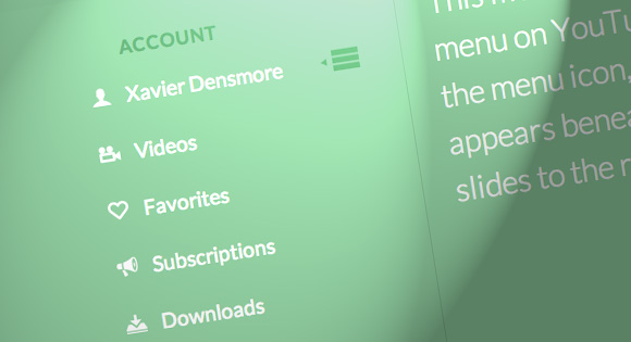


Today we’ll show you how to recreate the little menu effect that you can see in the left side-menu on YouTube when watching a video (where it says “Guide”). The menu is made of a little menu icon, a label and a list of menu items that appears when the label or menu icon is clicked. Once it’s clicked the menu icon slides to the right and the label moves up while the list items fade in sequentially. We’ll add some more style and effects to it in order to make it a bit more interesting.
So, let’s do it!
The Markup
For the HTML we will use a nav element and inside we’ll add a div that will contain the menu icon and the label. We’ll use an unordered list for the menu items:
 <nav id="dr-menu" class="dr-menu">
 	<div class="dr-trigger"><span class="dr-icon dr-icon-menu"></span><a class="dr-label">Account</a></div>
 	<ul>
 		<li><a class="dr-icon dr-icon-user" href="#">Xavier Densmore</a></li>
 		<li><a class="dr-icon dr-icon-camera" href="#">Videos</a></li>
 		<li><a class="dr-icon dr-icon-heart" href="#">Favorites</a></li>
 		<li><a class="dr-icon dr-icon-bullhorn" href="#">Subscriptions</a></li>
 		<li><a class="dr-icon dr-icon-download" href="#">Downloads</a></li>
 		<li><a class="dr-icon dr-icon-settings" href="#">Settings</a></li>
 		<li><a class="dr-icon dr-icon-switch" href="#">Logout</a></li>
 	</ul>
 </nav>
Each menu item will have a little icon, so we’ll give them all different classes for that. The icons that we’ll be using are from IcoMoon and we’ve created a custom icon set with their brilliant app.
Let’s take a look at the CSS.
The CSS
Note that the CSS will not contain any vendor prefixes, but you will find them in the files.
First, we will include our icon font:
 @font-face {
 	font-family: 'icomoon';
 	src:url('../fonts/icomoon.eot');
 	src:url('../fonts/icomoon.eot?#iefix') format('embedded-opentype'),
 		url('../fonts/icomoon.woff') format('woff'),
 		url('../fonts/icomoon.ttf') format('truetype'),
 		url('../fonts/icomoon.svg#icomoon') format('svg');
 	font-weight: normal;
 	font-style: normal;
 }
The main nav container will have some general styles, like font size, line-height, color and the dimensions. We want it to be flexible but we don’t want it to become too large or too small, so we’ll set a max-width and min-width:
 .dr-menu {
 	width: 100%;
 	max-width: 400px;
 	min-width: 300px;
 	position: relative;
 	font-size: 1.3em;
 	line-height: 2.5;
 	font-weight: 400;
 	color: #fff;
 	padding-top: 2em;
 }
The division that contains the menu icon span and the label link will be positioned absolutely and we’ll set the cursor to “pointer”. It needs a high z-index to guarantee that the unordered list does not stay on top of it:
 .dr-menu > div  {
 	cursor: pointer;
 	position: absolute;
 	width: 100%;
 	z-index: 100;
 }
The menu icon span in our trigger division will also be positioned absolutely and we’ll give it a transition:
 .dr-menu > div .dr-icon {
 	top: 0;
 	left: 0;
 	position: absolute;
 	font-size: 150%;
 	line-height: 1.6;
 	padding: 0 10px;
 	transition: all 0.4s ease;
 }
When we click on the trigger division, we will give a class called “dr-menu-open” to the nav. The menu icon will then slide to the left and we’ll also translate it for the maount of its own width so that it’s put back nicely into place without spilling over:
 .dr-menu.dr-menu-open > div .dr-icon {
 	color: #60a773;
 	left: 100%;
 	transform: translateX(-100%);
 }
In the end of the CSS we will add our icon classes from IcoMoon. The icon in the span for the menu icon will be a bit different, and we’ll use the pseudo class :after to add the little triangle. So, let’s define that as follows:
 .dr-menu > div .dr-icon:after {
 	content: "\e008";
 	position: absolute;
 	font-size: 50%;
 	line-height: 3.25;
 	left: -10%;
 	opacity: 0;
 }
The icon will be absolute and we’ll pull it into place by giving it a left of -10%. The initial opacity is set to 0 because we don’t want to see it initially when the menu is closed.
Once we open the menu, we will want it to become visible:
 .dr-menu.dr-menu-open > div .dr-icon:after {
 	opacity: 1;
 }
The label, which is an anchor in our HTML, will get some general styling and we’ll give it a padding so that it’s next to the menu icon. We’ll also add a transition because we want to animate it up, once we open the menu, which we will do by translating it on the Y-axis:
 .dr-menu > div .dr-label {
 	padding-left: 3em;
 	position: relative;
 	display: block;
 	color: #60a773;
 	font-size: 0.9em;
 	font-weight: 700;
 	letter-spacing: 1px;
 	text-transform: uppercase;
 	line-height: 2.75;
 	transition: all 0.2s ease-in;
 }

 .dr-menu.dr-menu-open > div .dr-label {
 	transform: translateY(-90%);
 }
The unordered list will initially be invisible by having a opacity of 0:
 .dr-menu ul {
 	padding: 0;
 	margin: 0 3em 0 0;
 	list-style: none;
 	opacity: 0;
 	position: relative;
 	z-index: 0;
 	pointer-events: none;
 	transition: opacity 0s linear 205ms;
 }
When we open the menu we want it to get visible and a high z-index so that the trigger div does not cover it:
 .dr-menu.dr-menu-open ul {
 	opacity: 1;
 	z-index: 200;
 	pointer-events: auto;
 	transition: opacity 0s linear 0s;
 }
The two transitions are for opening and closing the menu. When we open the menu, we want it to appear immediately without a delay and when we close it, i.e. remove the class, we want that it happens with a delay. That delay is defined by the delay of the last item in the list, as we will see shortly.
The list items will also be invisible and we’ll set a transition for the opacity:
 .dr-menu ul li {
 	display: block;
 	margin: 0 0 5px 0;
 	opacity: 0;
 	transition: opacity 0.3s ease;
 }

 .dr-menu.dr-menu-open ul li {
 	opacity: 1;
 }
Now, each list item will appear with a different delay: the first item will fade in immediately and the last item will appear in the end:
 .dr-menu.dr-menu-open ul li:nth-child(2) {
 	transition-delay: 35ms;
 }

 .dr-menu.dr-menu-open ul li:nth-child(3) {
 	transition-delay: 70ms;
 }

 .dr-menu.dr-menu-open ul li:nth-child(4) {
 	transition-delay: 105ms;
 }

 .dr-menu.dr-menu-open ul li:nth-child(5) {
 	transition-delay: 140ms;
 }

 .dr-menu.dr-menu-open ul li:nth-child(6) {
 	transition-delay: 175ms;
 }

 .dr-menu.dr-menu-open ul li:nth-child(7) {
 	transition-delay: 205ms;
 }
The links will have some padding and we’ll set them as inline-blocks:
 .dr-menu ul li a {
 	display: inline-block;
 	padding: 0 20px;
 	color: #fff;
 }
And we’ll change the color on hover:
 .dr-menu ul li a:hover {
 	color: #60a773;
 }
Last, but not least, let’s define the icon pseudo-elements:
 .dr-icon:before,
 .dr-icon:after {
 	position: relative;
 	font-family: 'icomoon';
 	speak: none;
 	font-style: normal;
 	font-weight: normal;
 	font-variant: normal;
 	text-transform: none;
 	-webkit-font-smoothing: antialiased;
 }

 .dr-menu ul .dr-icon:before {
 	margin-right: 15px;
 }

 .dr-icon-bullhorn:before {
 	content: "\e000";
 }

 .dr-icon-camera:before {
 	content: "\e002";
 }

 .dr-icon-heart:before {
 	content: "\e003";
 }

 .dr-icon-settings:before {
 	content: "\e004";
 }

 .dr-icon-switch:before {
 	content: "\e005";
 }

 .dr-icon-download:before {
 	content: "\e006";
 }

 .dr-icon-user:before {
 	content: "\e001";
 }

 .dr-icon-menu:before {
 	content: "\e007";
 }
And that’s all the style. Let’s take a look at the JavaScript.
The JavaScript
We’ll create a small script that will take care of the menu functionality. When we click on the trigger division, we want the menu wrapper to get the class “dr-menu-open”. Since we will be animating the label out and the menu icon to the right, we want the closing to happen only when we click on the menu icon, just like in the YouTube menu:
 var YTMenu = (function() {

 	function init() {

 		[].slice.call( document.querySelectorAll( '.dr-menu' ) ).forEach( function( el, i ) {

 			var trigger = el.querySelector( 'div.dr-trigger' ),
 				icon = trigger.querySelector( 'span.dr-icon-menu' ),
 				open = false;

 			trigger.addEventListener( 'click', function( event ) {
 				if( !open ) {
 					el.className += ' dr-menu-open';
 					open = true;
 				}
 			}, false );

 			icon.addEventListener( 'click', function( event ) {
 				if( open ) {
 					event.stopPropagation();
 					open = false;
 					el.className = el.className.replace(/\bdr-menu-open\b/,'');
 					return false;
 				}
 			}, false );

 		} );

 	}

 	init();

 })();
And that’s it! I hope you enjoyed this tutorial and find it useful!