


In this tutorial, I’m going to show you how to create portfolio page with filtering and also hover effect for each of your project item. We will be using a CSS3 and jQuery filter & sort plugin called MixItUp.
This script should work pretty well with our previously published tutorial – display images with shape masking and nifty zoom effect.
Alright, lets get it started. First of all this is the screenshot of what we are about to build:
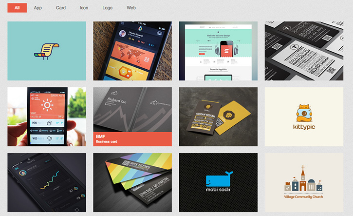
Based on the layout there are two main UI elements we need to build – Tab navigation for filtering and a grid of portfolio with hover effect. After that we will hook it up with MixItOut and our custom hover script.
HTML
First of all, we have the HTML markup for Tab navigation. It’s a UL list with data filter. data-filter is included because MixItUp needs it for its filtering.
<ul id="filters" class="clearfix">
	<li><span class="filter active" data-filter="app card icon logo web">All</span></li>
	<li><span class="filter" data-filter="app">App</span></li>
	<li><span class="filter" data-filter="card">Card</span></li>
	<li><span class="filter" data-filter="icon">Icon</span></li>
	<li><span class="filter" data-filter="logo">Logo</span></li>
	<li><span class="filter" data-filter="web">Web</span></li>
</ul>
Under the Tab navigation, we have portfolio list. We need to assign each portfolio a category in data-catattribute. By matching data-filter with data-cat, this is how MixItUp filters portfolios.
Other than that, we added label and hide it by default. We will show it on mouse hover.
<div id="portfoliolist">
	<div class="portfolio logo" data-cat="logo">
		<div class="portfolio-wrapper">
			<img src="img/portfolios/logo/5.jpg" alt="" />
			<div class="label">
				<div class="label-text">
					<a class="text-title">Bird Document</a>
					<span class="text-category">Logo</span>
				</div>
				<div class="label-bg"></div>
			</div>
		</div>
	</div>
	.........
</div>
CSS
We divided CSS into two parts – general styling for UI elements and responsive.
.container {
	position: relative;
	width: 960px;
	margin: 0 auto;
	/* You can see the purpose of transition by resizing the window.	*/
	-webkit-transition: all 1s ease;
  -moz-transition: all 1s ease;
  -o-transition: all 1s ease;
  transition: all 1s ease;
}

#filters {
	margin:1%;
	padding:0;
	list-style:none;
}

	#filters li {
		float:left;
	}

	#filters li span {
		display: block;
		padding:5px 20px;
		text-decoration:none;
		color:#666;
		cursor: pointer;
	}

	#filters li span.active {
		background: #e95a44;
		color:#fff;
	}

#portfoliolist .portfolio {
	-webkit-box-sizing: border-box;
	-moz-box-sizing: border-box;
	-o-box-sizing: border-box;
	width:23%;
	margin:1%;
	display:none;
	float:left;
	overflow:hidden;
}

	.portfolio-wrapper {
		overflow:hidden;
		position: relative !important;
		background: #666;
		cursor:pointer;
	}

	.portfolio img {
		max-width:100%;
		position: relative;
	}

	//hide its label by default
	.portfolio .label {
		position: absolute;
		width: 100%;
		height:40px;
		bottom:-40px;
	}

		.portfolio .label-bg {
			background: #e95a44;
			width: 100%;
			height:100%;
			position: absolute;
			top:0;
			left:0;
		}

		.portfolio .label-text {
			color:#fff;
			position: relative;
			z-index:500;
			padding:5px 8px;
		}

			.portfolio .text-category {
				display:block;
				font-size:9px;
			}
A simple responsive layout to make sure the grid display properly in different window dimension.
/* #Tablet (Portrait) */
@media only screen and (min-width: 768px) and (max-width: 959px) {
	.container {
		width: 768px;
	}
}

/*  #Mobile (Portrait) - Note: Design for a width of 320px */
@media only screen and (max-width: 767px) {
	.container {
		width: 95%;
	}

	#portfoliolist .portfolio {
		width:48%;
		margin:1%;
	}

	#ads {
		display:none;
	}

}

/* #Mobile (Landscape) - Note: Design for a width of 480px */
@media only screen and (min-width: 480px) and (max-width: 767px) {
	.container {
		width: 70%;
	}

	#ads {
		display:none;
	}

}
Javascript
Lastly, we have the Javascript. You can change its setting by visiting its documentation. Also, you can adjust the animation setting in hoverEffect function.
$(function () {

	var filterList = {

		init: function () {

			// MixItUp plugin
			// http://mixitup.io
			$('#portfoliolist').mixitup({
				targetSelector: '.portfolio',
				filterSelector: '.filter',
				effects: ['fade'],
				easing: 'snap',
				// call the hover effect
				onMixEnd: filterList.hoverEffect()
			});

		},

		hoverEffect: function () {

			// Simple parallax effect
			$('#portfoliolist .portfolio').hover(
				function () {
					$(this).find('.label').stop().animate({bottom: 0}, 200, 'easeOutQuad');
					$(this).find('img').stop().animate({top: -30}, 500, 'easeOutQuad');
				},
				function () {
					$(this).find('.label').stop().animate({bottom: -40}, 200, 'easeInQuad');
					$(this).find('img').stop().animate({top: 0}, 300, 'easeOutQuad');
				}
			);

		}

	};

	// Run the show!
	filterList.init();

});
Conclusion
Nowadays, designers tend to cut down the clutters and keep everything simple. With this tutorial, we created a simple filtering portfolio page with hover effect. Sometimes we don’t have to reinvent the wheel. With all sort of plugins available today, we can easily produce the effect we want by combining different javascript plugins.
Drop a comment if you have any questions. Enjoy!