Unfortunately, always displaying an alert takes up much-needed screen real estate. We can resolve this by making it dismissible. Today, we’ll build one from scratch using localStorage and JavaScript.
What We’re Creating
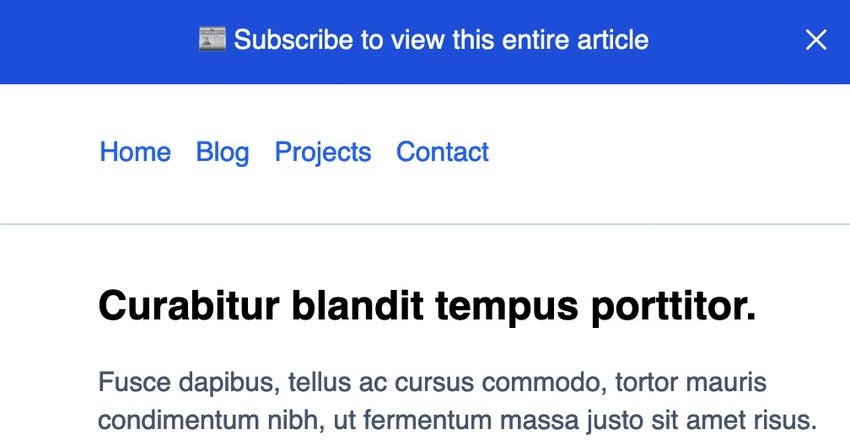
The example in this case is a primitive portfolio-like website with a footer, navigation, and content area. At the top of the viewport, we display an alert prompting the visitor to subscribe. In a fictitious world, the website we mockup up might have premium content only available to subscribers.
See how our alert works in the pen below; though once you’ve dismissed it you’ll no longer be able to see it in this browser, so there’s a screenshot underneath to remind you:


1. Add the Markup
At the top of the page, I’ll add the alert HTML markup. The code is positioned after the body tag in your HTML document.
<html>
  <body>
    <div class="alert" role="alert">
      📰 Subscribe to view this entire article
      <button>
        <svg
          xmlns="https://www.w3.org/2000/svg"
          width="24"
          height="24"
          viewBox="0 0 24 24"
        >
          <title>close</title>
          <g fill="none">
            <path
              stroke="#ffffff"
              stroke-linecap="round"
              stroke-linejoin="round"
              stroke-width="1.5"
              d="M17.25 6.75l-10.5 10.5"
            ></path>
            <path
              stroke="#ffffff"
              stroke-linecap="round"
              stroke-linejoin="round"
              stroke-width="1.5"
              d="M6.75 6.75l10.5 10.5"
            ></path>
          </g>
        </svg>
      </button>
    </div>
  </body>
</html>
The alert is a div with a role="alert" option which tells the browser and accessibility features that the content is meant to signal to the end-user.
We added a button element that is wrapping an SVG icon I copied from heroicons, an open-sourced icon library. The button element will be responsible for triggering the dismissal of the alert when clicked, and we’ll add the logic to make that work coming up.
Demo Content
Below the alert, we’ll add some placeholder content to mimic the portfolio website.
<header class="header">
  <nav aria-label="Main">
    <ul>
      <li><a href="#">Home</a></li>
      <li><a href="#">Blog</a></li>
      <li><a href="#">Projects</a></li>
      <li><a href="#">Contact</a></li>
    </ul>
  </nav>
</header>

<main class="main">
  <h2>Curabitur blandit tempus porttitor.</h2>
  <p>Lorem ipsum.....</p>

  <div class="callout">
    <a href="#">Sign in</a> or <a href="#">sign up</a> to view this article.
  </div>
</main>

<footer class="footer">
  <nav aria-label="Main">
    <ul>
      <li><a href="#">Home</a></li>
      <li><a href="#">Blog</a></li>
      <li><a href="#">Projects</a></li>
      <li><a href="#">Contact</a></li>
    </ul>
  </nav>
</footer>
We render shared navigation inside both the header and the footer blocks. Each nav has an aria-label="Main" attribute to signify they are the same controls in two locations.
The main element contains placeholder content and a div element with the callout class. The callout is an upsell for website visitors to see the content on the page.
2. Styling the Page
To keep things theme-able, I’ll leverage CSS variables in this guide so you can tweak colors on your end.
The alert styles follow the variables.
:root {
  --primary: #2563eb;
  --bg-light: #f1f5f9;
  --bg-alert: #1d4ed8;
  --bg-callout: #dbeafe;
  --border-base: #cbd5e1;
  --text-base: #475569;
}

.alert {
  background: var(--bg-alert);
  padding: 1rem;
  text-align: center;
  color: white;
  position: relative;
  transform: scaleY(1);
  transition: all ease-in-out 0.3s;
}

.alert button {
  border: none;
  background: transparent;
  width: 32px;
  height: 32px;
  border-radius: 50%;
  display: flex;
  align-items: center;
  justify-content: center;
  cursor: pointer;
  position: absolute;
  top: 8px;
  right: 5px;
}

.alert button:hover {
  background: rgba(255, 255, 255, 0.35);
}

.alert-hidden {
  opacity: 0;
  padding: 0;
  visibility: hidden;
  transform: scaleY(0);
  transform-origin: top;
  transition: all ease-in-out 0.3s;
}

.alert button:focus {
  box-shadow: inset 0 0 0 2px var(--border-base);
}
The .alert button element is absolutely positioned inside the .alert div. Our button fixes the button to the right side of the alert and offsets from the top slightly.
Neater Hiding of the Alert
You may notice a transform property on the .alert class. And the same transform property on the alert-hidden class. We’ll be toggling the alert-hidden class with JavaScript coming up. The transform property combined with transition gives us a more performant way to show and hide the alert with some nice animation. Using the scaleY(0) approach, we can gradually toggle the appearance.
It’s worth noting that we could toggle appearance with a display property but doing that with JavaScript leaves no room for any animations should you want to have those.
Additional Styles
Here are some additional styles to address the other components of the page. For the most part, they are fundamental. The callout container has some properties set to make it stand out more than the rest of the content on the page.
.header {
  border-bottom: 1px solid var(--border-base);
}

.header,
.footer {
  padding: 1rem;
}

.footer {
  background: var(--bg-light);
  padding: 1rem;
}

.header ul li,
.footer ul li {
  display: inline;
  padding: 0 5px;
}

.main {
  max-width: 767px;
  padding: 1rem;
  margin-left: 2.75rem;
  margin-bottom: 2rem;
}

.callout {
  background: var(--bg-callout);
  padding: 2rem;
  border-radius: 6px;
}

p {
  color: var(--text-base);
  line-height: 1.4;
}

ul {
  list-style: none;
}

a {
  color: var(--primary);
  text-decoration: none;
}
3. Dismissing the Alert
With JavaScript, we can hook into the browser’s Event API to listen for changes. A typical event used is the “click” event.
Before we can listen for the event, we need to tell JavaScript about the element it needs to look for in the DOM.
-
An
alertvariable: responsible for targeting the alert itself. -
A
dismissAlertButtonvariable: responsible for targeting thebuttonelement within the.alertdiv.
const alert = document.querySelector(".alert")
const dismissAlertButton = document.querySelector(".alert button")
Next, we need to listen for the “click” event mentioned before, so we know when to dismiss the alert. We can do that using the addEventListener() method on the button.
dismissAlertButton.addEventListener("click", (event) => {
  console.log("Clicked!")
})
We can use the handy console.log() utility to test things out. The button should log Clicked! to your browser’s console.
4. Preventing Default Logic
For any use of the addEventListener method, we get a free instance of the event object itself for use inside the method. This is important for cases where you might need to overwrite browser defaults. It’s typically a good idea to prevent the default logic of an element you’re targeting with JavaScript.
dismissAlertButton.addEventListener("click", (event) => {
  event.preventDefault()
})
Next, we should toggle the visibility of the alert. We can do this in a couple of ways, but as mentioned in the CSS section, we’ll leverage a more animated approach.
if (dismissAlertButton) {
  dismissAlertButton.addEventListener("click", (event) => {
    event.preventDefault()
    alert.classList.add("alert-hidden")
  })
}
Here we add the alert-hidden class, which effectively fades the alert out of sight when clicking the button. It works!
You may notice I added some conditional logic to check that the dismissAlertButton is not null. If there happened to be a page without the button, our JavaScript would render an error. To fix this issue, you can add a conditional check to ensure the element is on the page. A simple if statement should get the job done.
5. Saving Local State
Unfortunately, the alert shows again when you reload the page after clicking the dismiss button. We can address this with something called localStorage, built into modern browsers.
localStorage allows you to save a bit of browser data temporarily. It is not meant as a true datastore like a database but works similarly.
We’ll leverage localStorage to set a new key and value pair in the browser. Then we can check if that value is set before displaying the alert.
The API is relatively straightforward. In the end, here’s the final code.
const alert = document.querySelector(".alert")
const dismissAlertButton = document.querySelector(".alert button")

if (localStorage.getItem("hideAlert")) {
  alert.style.display = "none"
}

if (dismissAlertButton) {
  dismissAlertButton.addEventListener("click", (event) => {
    event.preventDefault()
    alert.classList.add("alert-hidden")
    localStorage.setItem("hideAlert", true)
  })
}
Here’s what’s happening:
- We’ll check if the dismiss button is present and if so, listen for a click event on it.
- If the click event fires, we add the
alert-hiddenclass to the alert. - With
localStorage, we call thesetItemmethod and pass in a key-value pair ofhideAlertandtrue. - If the page were to reload, we immediately hook into “localStorage” again to call the
getItemmethod targeting the same key and value pair set previously and hide the alert with CSS via JavaScript.
Some Limitations
localStorage is an excellent solution for simple things. As you work through my example, you may notice a slight flicker as a browser loads again, and localStorage values are set.
This is one drawback to the approach, as the HTML and CSS often load before executing the JavaScript. The only way around this is a server-side rendered solution where the code is dynamic relative to an actual database-backed value.
Closing Thoughts
Dismissible elements are a great way to capture attention and clean up much-needed screen real estate. Your website’s visitors appreciate the ability to dismiss something, even if it’s helpful to know!