Embracing the serendipitous as design process
Relinquishing control
Dictionary.com defines serendipity as “an aptitude for making desirable discoveries by accident”. My first acquaintance with serendipity as an element immersed within a design process was at a talk delivered by a photographer who would daily “put himself in the way of the world” as a means to document early morning encounters. Every morning, he would exit his studio to spend five minutes on the sidewalk, photographing the first person to happen by. After permission was granted to take a photo, an interesting conversation would ensue, and the day would begin with yet another portrait. He had been doing this for over ten years.
“Like a lot of creative work, design is most exciting when the author steps out of the scene and allows the elements to live on their own. It’s a hard thing to do and a hard thing to teach. It’s not a style or look, but a sensitive relationship to the work.” [1] — Martin Venezky
The word serendipity carries with it a sense of agency, a proactive action based on the decision to engage. For this reason I much prefer it over chance, which is defined as “the absence of any cause of events that can be predicted, understood, or controlled”. Chance conveys a complete absence of action on the part of the participant. Little can be systematically leveraged out of a relationship with chance, other than recording interesting developments resulting from events entailing from the everyday. And yes, I record mistakes, failures, actions in Illustrator or Photoshop which produce interesting results when incorrect commands have been input. But aside from this bank of interesting experiments gone wrong for potential future application, chance leaves little from which creative agency may be capitalized on. Serendipity, however, offers a vital design process ingredient: that of being engaged in the world in ways we might not have originally considered.


Processes of automation
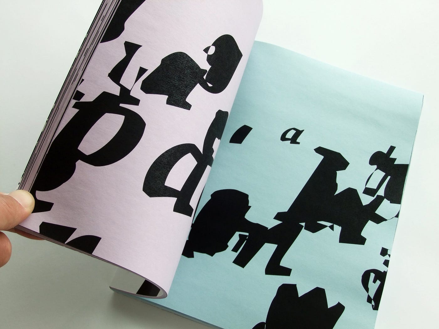
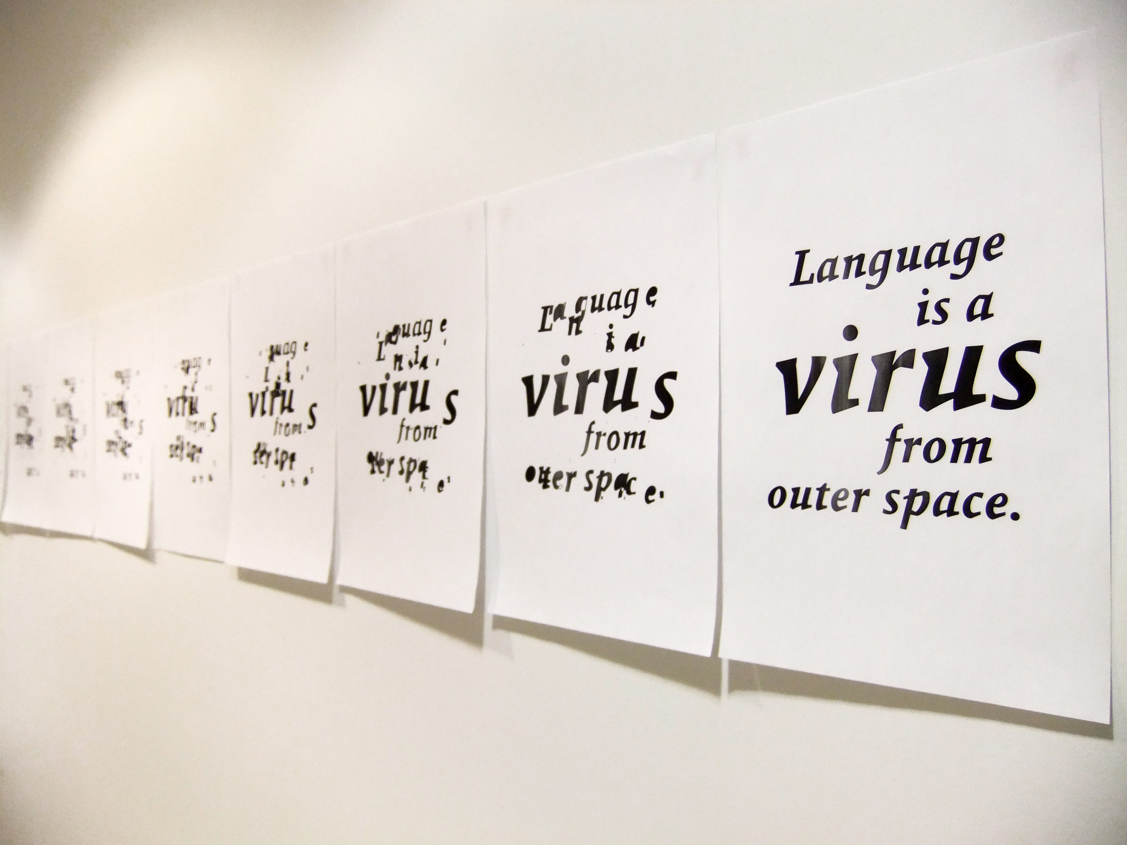
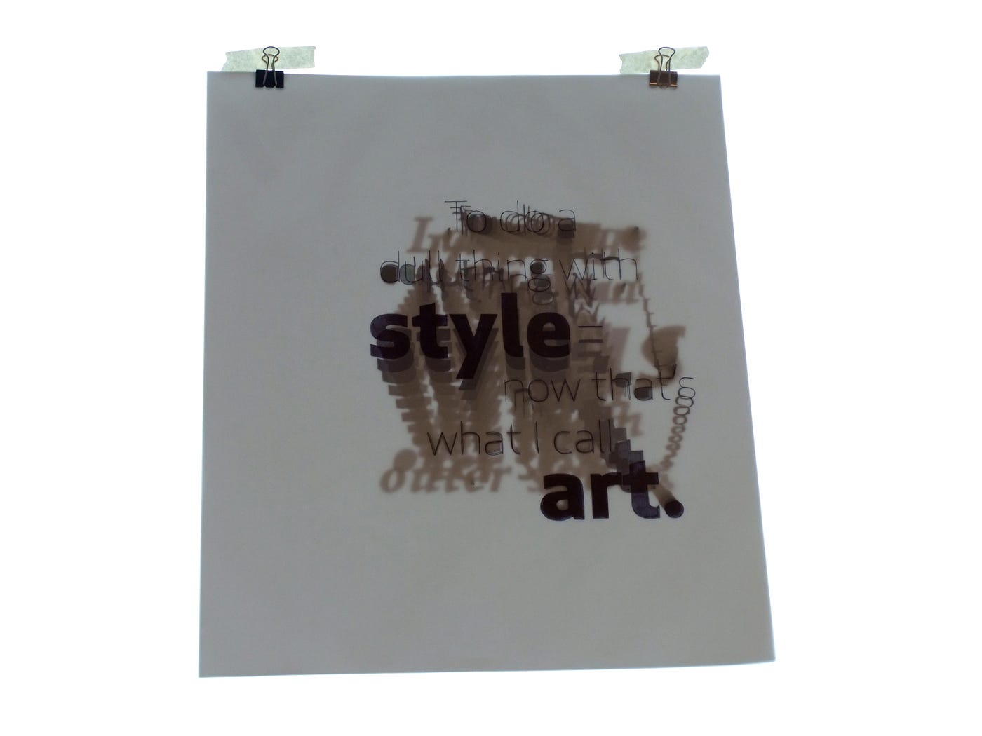
Starting with two short pieces of text, a quotation from William Burroughs was visually merged with a quotation from Charles Bukowski. “Language is a virus from outer space”, taken from Burroughs who was commenting on the human ability to develop / adopt language as a form of technology, was visually merged with Bukowski’s “To do a dull thing with style — now that’s what I call art,” a comment on how great things can be made through simple tactics. The project does not rely on these two quotations — the outcome isn’t dependent on these two pieces of text. Any written extract would have sufficed. These two texts were chosen for a number of reasons: they were namely selected for their focus on language visualized through typographic / alphabet systems, and their allusion to process, method, and efficacy.
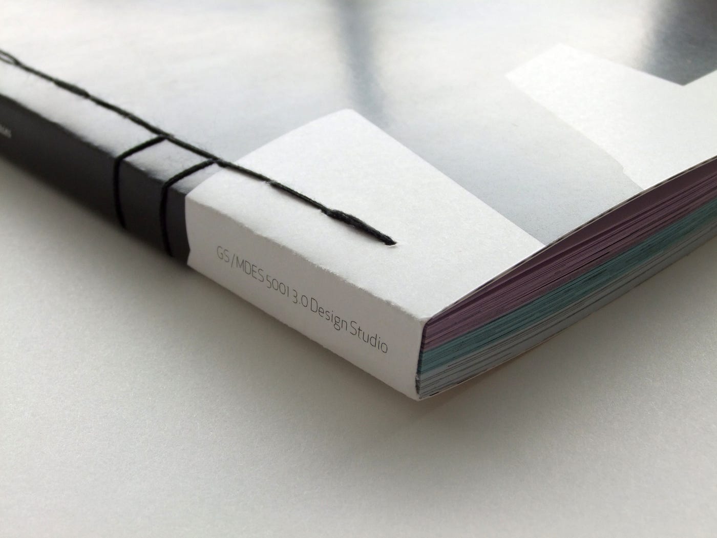
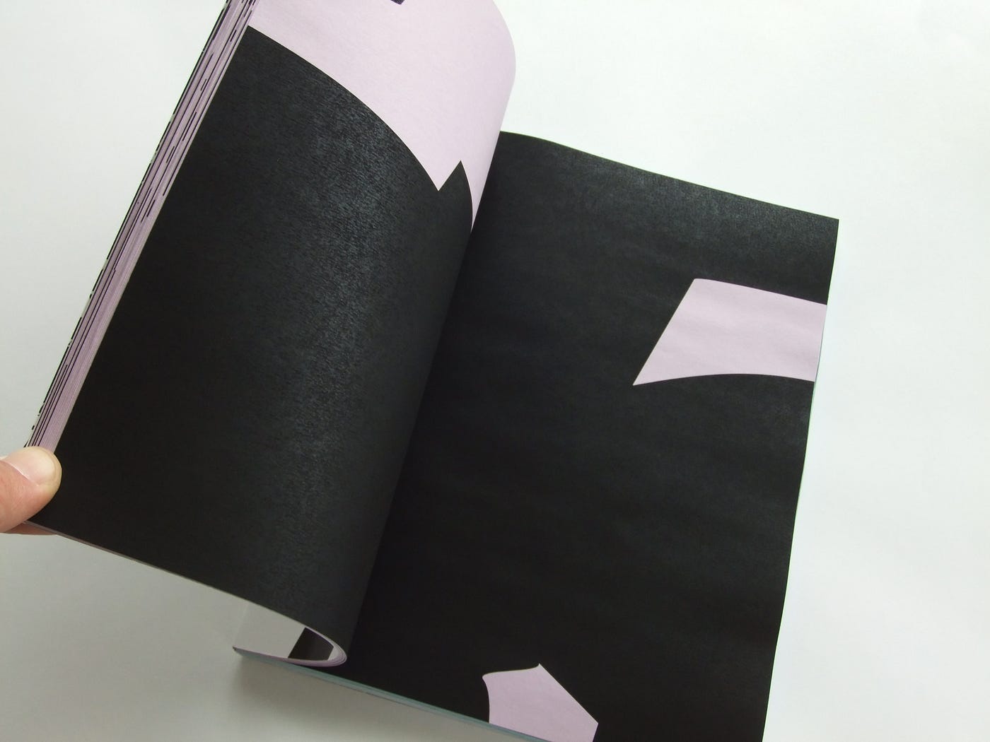
Within the book I had attempted to visualize the process in diagrammatic form. What the diagram had sought to communicate is that there are discernible phases within the process of blending two different elements. Within the first third and final third phases of the process of merging, recognizable characteristics can be perceived from each element being combined. The first third series of phases retain elements from one element, similarly within the final third series of phases from the second element. The interesting stuff happens within the middle third, where aspects from each starting element can be perceived—however noticeably altered. The resulting tertiary visual forms appear clumsy and awkward, unashamed of the unintentional structures, placement, and relationships in which they find themselves. This process, and the results that have come from it, were incredibly refreshing. The three stages would be visually defined within the book through the integration of three different page colours, which would function as a way-finding device or “contents page” expressed from the exterior of the book.
Once the stages of transformation were made (of which there were one hundred), an algorithm was designed for the sizing and placement of the visual elements into the page spreads. The combination of these algorithms produced surprising results. For instance, if a stage of artwork was defined as extra large while its placement was determined for the bottom right portion of a page spread, the odds were high that the majority of the artwork would bleed off of the page. Whereas stages where the artwork was defined as extra small in scale placed near the centre of the page spread would result in a large proportion of negative, empty space left surrounding the artwork, creating a very light page. The degrees of contrast from page spread to page spread was near infinite, creating an experience of very irregular pacing through the experience of reading the book. The radical juxtaposition materialized was produced through rules articulated ahead of time, and were the result of this methodology embracing the unexpected.
What should we expect from outliers?
What is design? Is it solely the domain of international corporations exerting their power and privilege through forms of visual intrigue and enticement? Are designers relegated to produce forms of communication exclusively through an approving corporate entity rationalizing a practice dictated by means of profit maximization? And if so, who are best equipped to certify how these forms of practice are engaged with in order to derive such results? Certainly not CEOs. Not uncreative managers who are only able to document time-in / time-out equalling productivity. And unquestioningly not business owners whose basis of judgement towards what is considered to be “good” is fortified by the uncreative, crass junk that permeates our visual landscape. Just because something is popular does not lend it credibility.
I am reminded of designer David Carson’s concern with communication and comprehension. “Don’t confuse legibility with communication. Just because something’s legible doesn’t mean it communicates. And more importantly, it doesn’t mean it communicates the right thing.” [2]
“It’s a very thin line between simple and clean and powerful, and simple and clean and boring.” [3] — David Carson
The wonderfully articulate Danny van den Dungen, collective participant with design agency Universal Jetset, coherently articulates his interpretation of the modernist integration of — what at that time was interpreted as — the most legible, neutral, denotative typeface that had ever been designed.
“For us, Modernism does have a much more subversive side… I think that whole image of Modernism—that is something primarily concerned with functionalism and utilitarianism — that is something that emerged much later. That is a more late Modernist theme. I think the early Modernist movements like Dadaism, Futurism, Surrealism, that sort of thing all had their more subversive sides and a more… how do you call them… more dialectical sides that went against something.” [4] — Danny van den Dungen
Re-evaluating outcomes
It is also worth mentioning that the work produced through a methodology that not only embraces mistakes but requires and showcases them presupposes that the lack of control imposes different sets of critique requirements upon assessing the output. Design implemented around processes of control — controlling craft, communication, clarity, connotation and denotation, and message — require that all unnecessary elements be removed in order to preserve intent. In short—eliminate anything that may impede the message. It is analogous to how one fashions a thesis: anything included within a written text obscuring the main focus of argument is antithetical to producing convincing results. However, within a form of making that relies on the unexpected, mistakes and interpretation are vested and intrinsic aspects supporting the work, requiring a different set of critical assessments.
It is also important to be able to situate this work within a larger context of the type of design produced over the period of reference. I had been very intrigued to look back over the work of design from the mid 1990’s through to the mid 2000’s. Within the work produced over that period was a much more pronounced interest to embrace mistakes, operate within more free working methodologies, and emphatically break historically-cherished rules of design. Designers whose work I was looking at included Martin Venezky, David Carson, P. Scott Makela, Jennifer Sterling (Sterling Studios), Karel Martens, and Stefan Sagmeister to name a few. Not only were these designers sources of inspiration for us attending art and design school through the mid 90’s, but they were also designers who largely continued to practice throughout my masters degree, well into the late 2000’s. From this perspective it was intriguing to look back over their long careers of operating at a very high level of design practice to observe the output of work as it transformed over time.
So from the standpoint of assessing experimental forms of design work, it would be a fool’s errand to leverage critique over this type of work with the language and criteria with which we would for, say, mass communication design. We assess the cultural work of David Carson with a different set of perspectives than we do the work of designers producing annual report publications for a company’s shareholders. The work is operating with different agendas and intentions. The work’s connotative and denotative intentions first need to be sorted out, and only then will a critical assessment provide useful results.
The advantages of hindsight
It is never a healthy exercise for designers to look back over work made in the past, believing it to be great work. Work made in the past, as good as it may be, is work made by a less experienced, less talented, less knowledgeable version of oneself. “You’re only as good as your last project”. I do believe this is a healthy way to position one’s sense of self and work within the broader context of one’s contribution, however there are good reasons for looking back and reflecting upon past production within the lens of new knowledge. For instance, a master’s degree can be interpreted as a traumatic experience. Everything one thinks they know is turned inside-out throughout the advanced degree experience. I’ve always perceived (at least for designers) that undergrad is a form of education designed to prepare students for practice. It is the ushering in of young designers through the door toward employment, experience, and the building up of a body of work. Essentially, undergrad produces individuals capable of having jobs within capitalist economies. I believe a good master’s degree challenges everything one has been taught. It is less about jobs and more about defining one’s own direction. Breaking rules, yes, but more importantly, it is a rigorous challenge for staking one’s claim over a form of practice that has not been uncovered before. It is also really, really difficult. A master’s degree sets aside two years for what is essentially accomplished in a four year PhD.


And so what seemed like a frenetic, mad rush of 18-hour days over a two and a half year period, in which near unreadable theory, unending writing, and massive amounts of making accrued, was essentially a trial-by-fire jumping in with both feet. Much of what I was exposed to at the time did not register. I was unused to writing, as I did very little in art and design school. While I had read theory, I was unprepared for the amount and depth of the texts we were introduced to throughout my post grad degree. The notion of making design work based on this nearly indecipherable theory was stressful, difficult, and quite honestly frustrating. I had never done this type of work before, and it was very challenging to embrace. But I managed. And so while the work being produced did feel as though I was wandering around in a dark room wearing sunglasses, little flashes of great stuff was surfacing. These are the little morsels which escaped me at the time that I now feel require re-assessment and reconsideration, as I now have a stronger grip on the theoretical component so necessary in the making of good design.


Looking back over these projects executed during my masters degree, I am seeing much work that technically is quite good. What is somewhat embarrassing is in the reading of the theoretical application. All of the concepts that I was introduced to throughout those two years were opaque. It is quite clear that I failed to grasp and control the theoretical application so vital within the making portion of the work. The ideas that this work is premised upon are strong, however the lack of confidence within their expression towards theory-based approaches to design methodology prevented sound cohesion between written text and formal work. Looking back over this portfolio provides me with fresh perspectives, supplanting newly-acquired knowledge, an understanding of philosophy, and theoretical discourses in how work and text might function together more effectively in dialog with one another.
Looking back is a two-way lens. It is helpful when the intent is to better understand difficult concepts left unfulfilled or misunderstood. It is toxic when the intent is to reinforce an identity premised upon skills which may have eroded or were never present. The ability for us all as entities capable of understanding our placement within time and space is powerful—abusing that power leads inevitably to toxic places.
This work was first articulated in Spring 2009. The images were taken over the Summer of 2009. The text from the initial publication has not been included here. The quotations in the work are set in Fedra Serif A Bold Italic. All images, design, and text are the property of Jayson Zaleski.
==
Jayson designs, draws, writes, and documents his world at jaysonzaleski.com. He can be reached at [email protected].
References
- Venezky, Martin. It Is Beautiful…Then Gone, (Princeton Architectural Press, 2005), pp.11–12.
2. Hustwit, Gary. Helvetica, (Swiss Dots / Veer, 2007), DVD.
3. Ibid.
4. Ibid.
The project in full is here for view