I wanted to tackle this as a design problem. I started thinking about this against a design framework.
What are the JTBD (Jobs To Be Done) here?
- Have a fulfilling trip
- Not miss out on an experience/activity due to lack of information
- Reduce transit time by staying close to where the activities are
- Reduce FOMO (fear of missing out on great stuff)
And what does a user need to do, to achieve the above?
User needs
- Easily see all interesting things to do in a city — attractions, activities & experiences
- Decide number of days to stay in a city for — have a relaxed vs packed stay
- Decide where to stay in a city — balancing price & proximity to the action
When you are planning a trip, when is a city or a location ‘confirmed’ on your itinerary? It is confirmed when you book your stay.
Current multi-city vacation planning behaviour

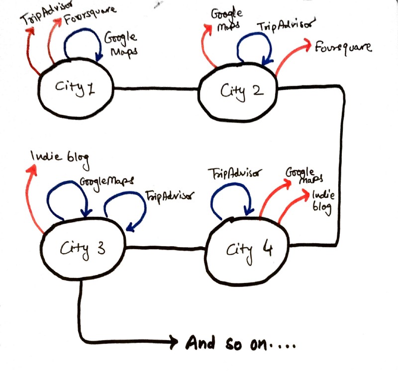
Current Airbnb booking flow goes on like this — user wanders off to 3–4 sites and comes back or gets tired and puts the whole thing off
User wants to plan a long family vacation. A typical process for this goes like this —
- User Googles around and finds the cities/towns worth visiting in the country he plans to visit, and creates a rough itinerary.
- User goes and enters dates in Airbnb to check stay availability in his/her budget, per city/town.
- If there’s stay available — user goes off to look for things to do, attractions to visit and mixes and matches days. During this exercise, user has to edit and modify travel dates by checking back and forth with other information sites, some of which are TripAdvisor, some indie travel blogs, train schedule websites and more.
Airbnb undoubtedly is a great place to check and compare various accommodation options and book, but there’s still constant info-fending required on other sites like TripAdvisor, Google Maps, Foursquare and all to make sure you are close to the action and are choosing the right number of days to stay.
That exercise is cumbersome and tiring. It takes up a lot of mental bandwidth and keeping track of information. There’s no AI involved that can yet make the process simpler by compiling all the useful information at a single place.
This rigmarole typically leads to 2 big negative outcomes —
- Many a times, user does not return to Airbnb to complete a booking, having gotten overwhelmed and sucked into information elsewhere
- User takes way too long (multiple sessions) to make a decision on purchasing a stay, ending up missing out on cheaper options due to unnecessary wait
Could Airbnb combine the whole planning experience into one coherent flow by making all the relevant information available at one single place, so you can use their product — booking a stay, in the most confident and efficient way?
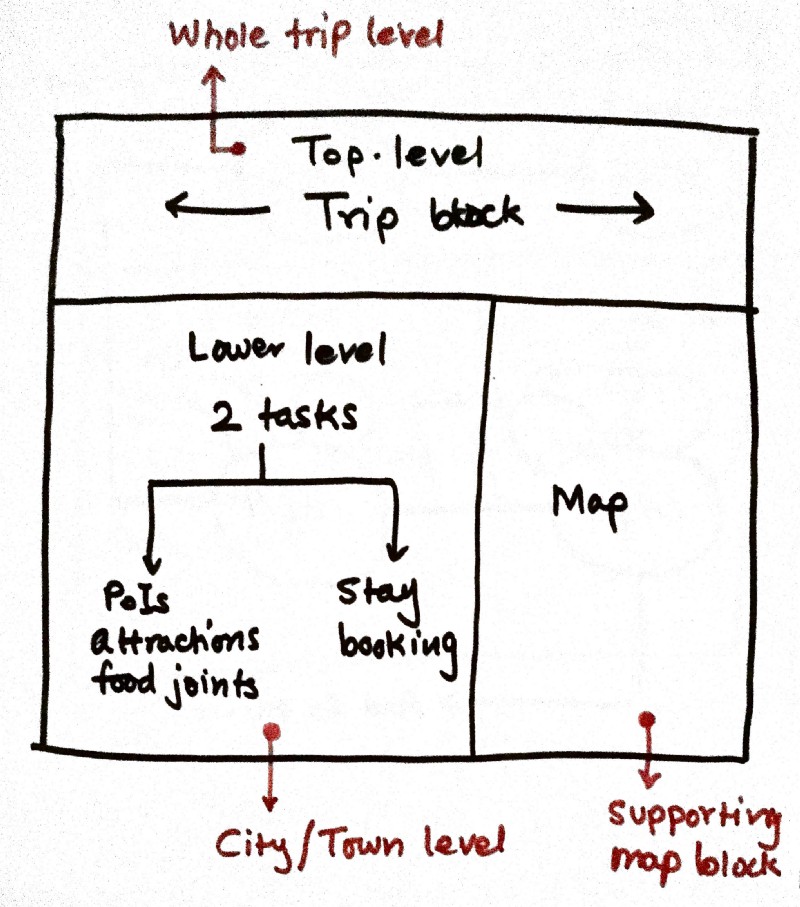
I tried out a few sketchnotes to see what such an experience would look like. How the information would be structured hierarchically into a meaningful trip-planning experience.
- I wanted to have a top-level ‘vacation’ view where you can see the whole trip at a glance — where all you are going, how many days you will spend at each location etc.
- The lower level is a city/town level view. Its purpose is twofold — first to tell me what the experiences and attractions are available, what all I can do in the city and second is to tell me what good stay options are available there.

Structural wireframe of a trip planning experience
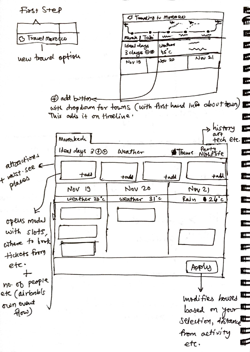
Exploring in more detail lead me to the following set of notes where I dug deeper into detailing out each block and the information it would contain.

Working towards a more complete iteration, I started seeing the fruits of the efforts — this could really become a better and more hassle-free seamless vacation-planning experience.
